Accessibility & Multi-Screen Design: Images
A presentation at #cos19 by Eric Eggert

Images Accessibility & Multi-Screen Design Eric Eggert — Accessibility & Multi-Screen Design – #cos19
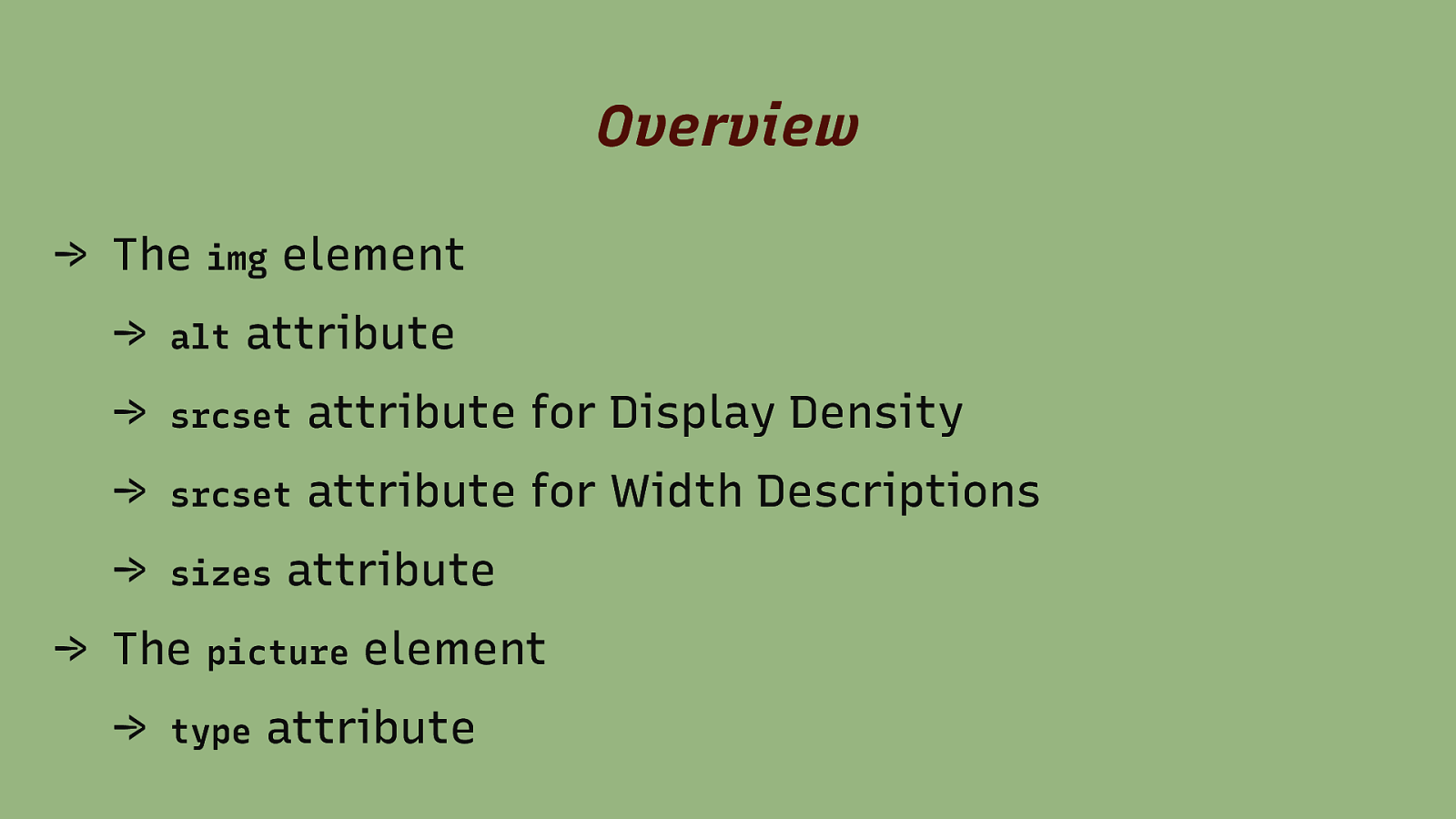
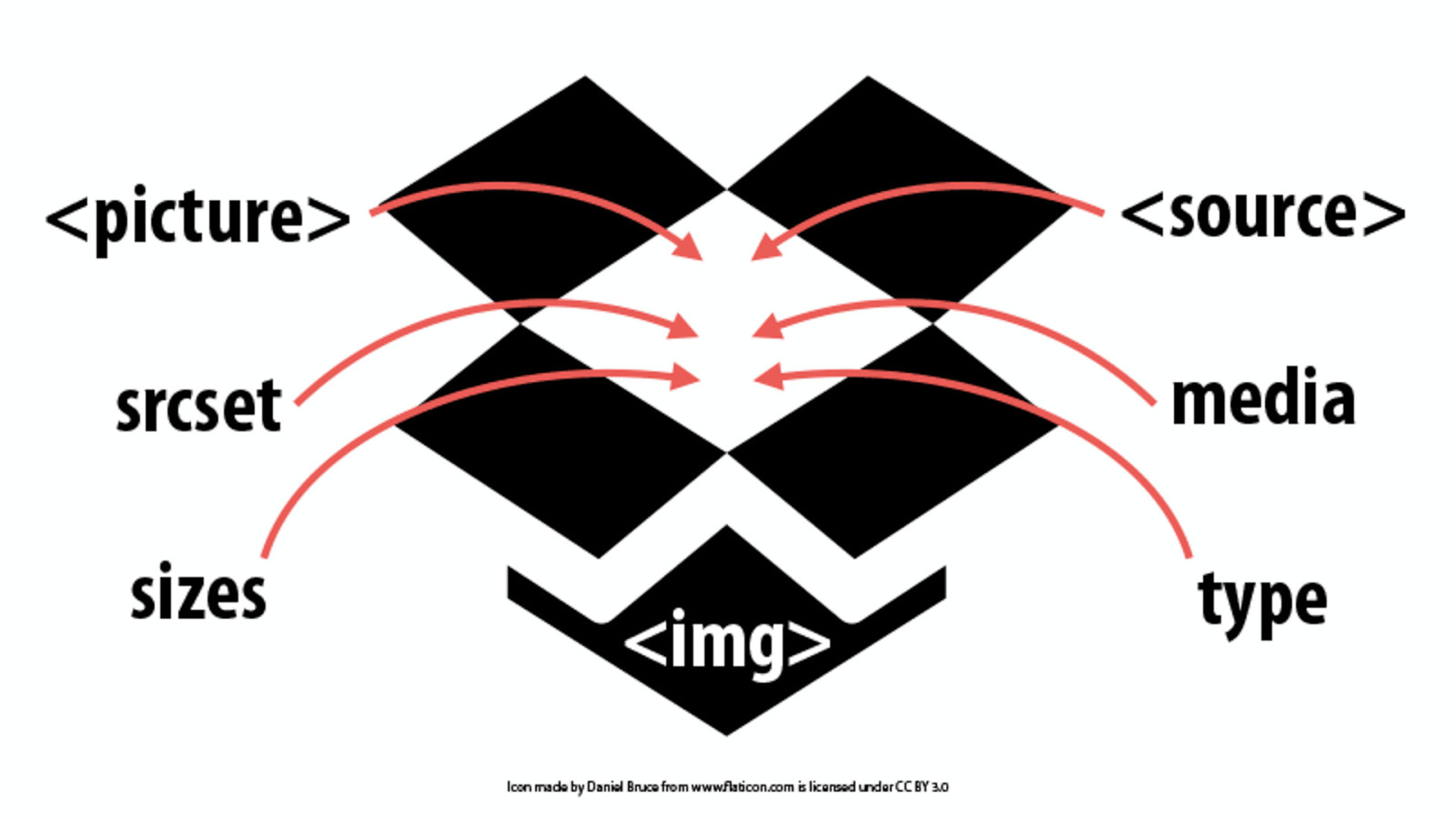
Overview → The img element → alt attribute → srcset attribute for Display Density → srcset attribute for Width Descriptions → sizes attribute → The picture element → type attribute
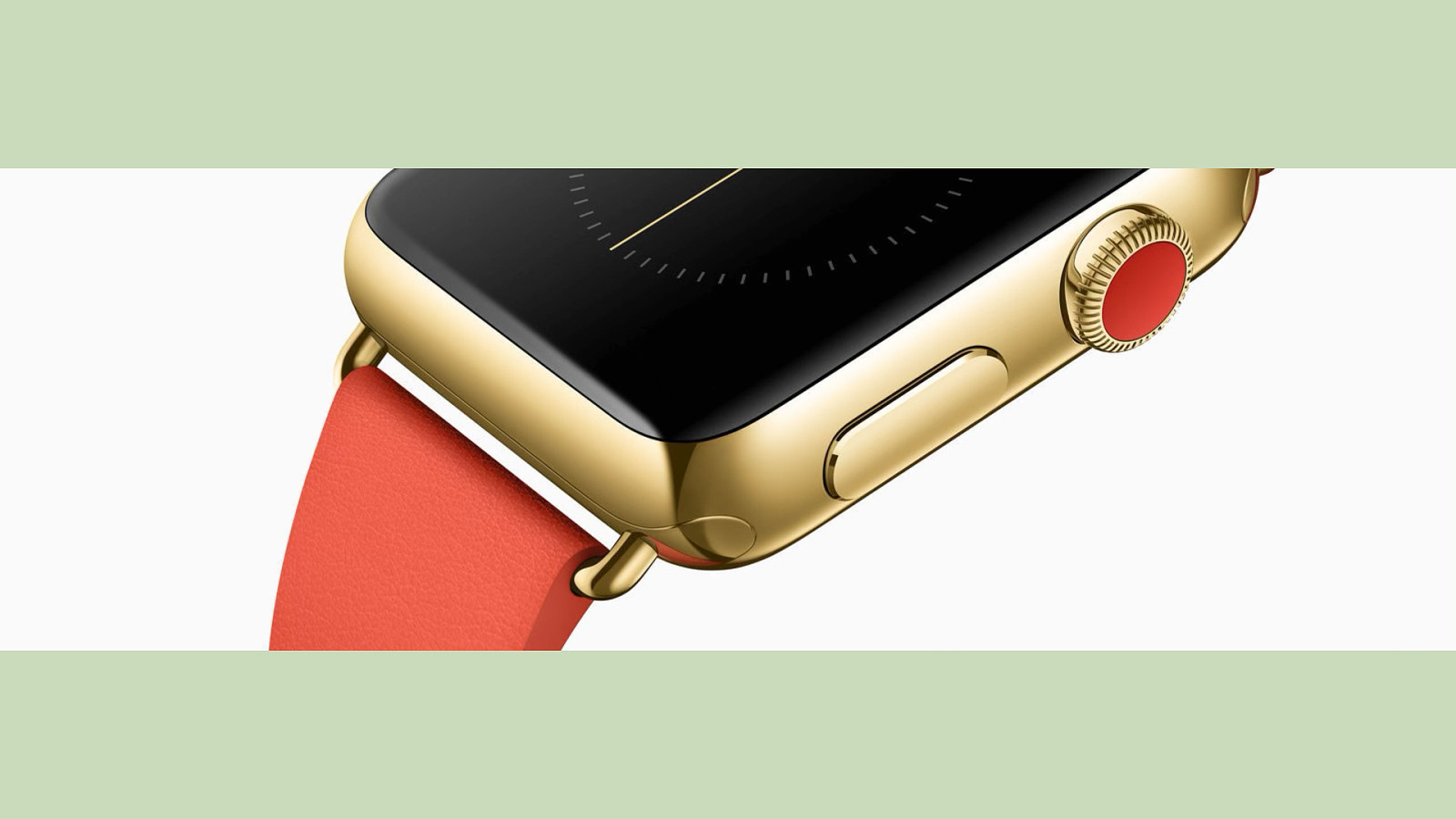
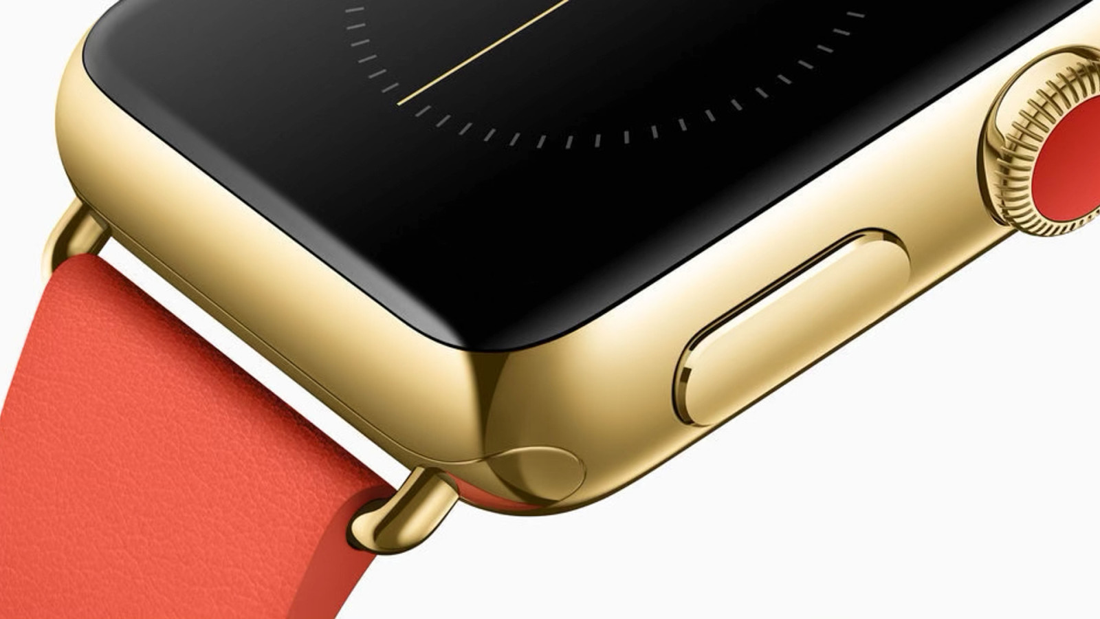
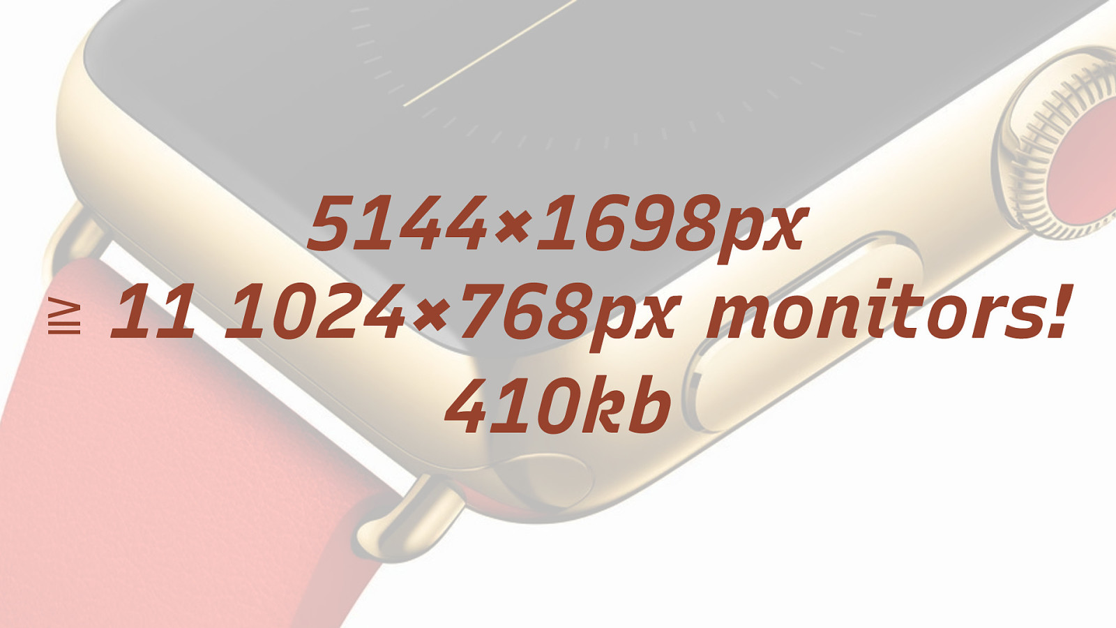
5144×1698px ≧ 11 1024×768px monitors! 410kb
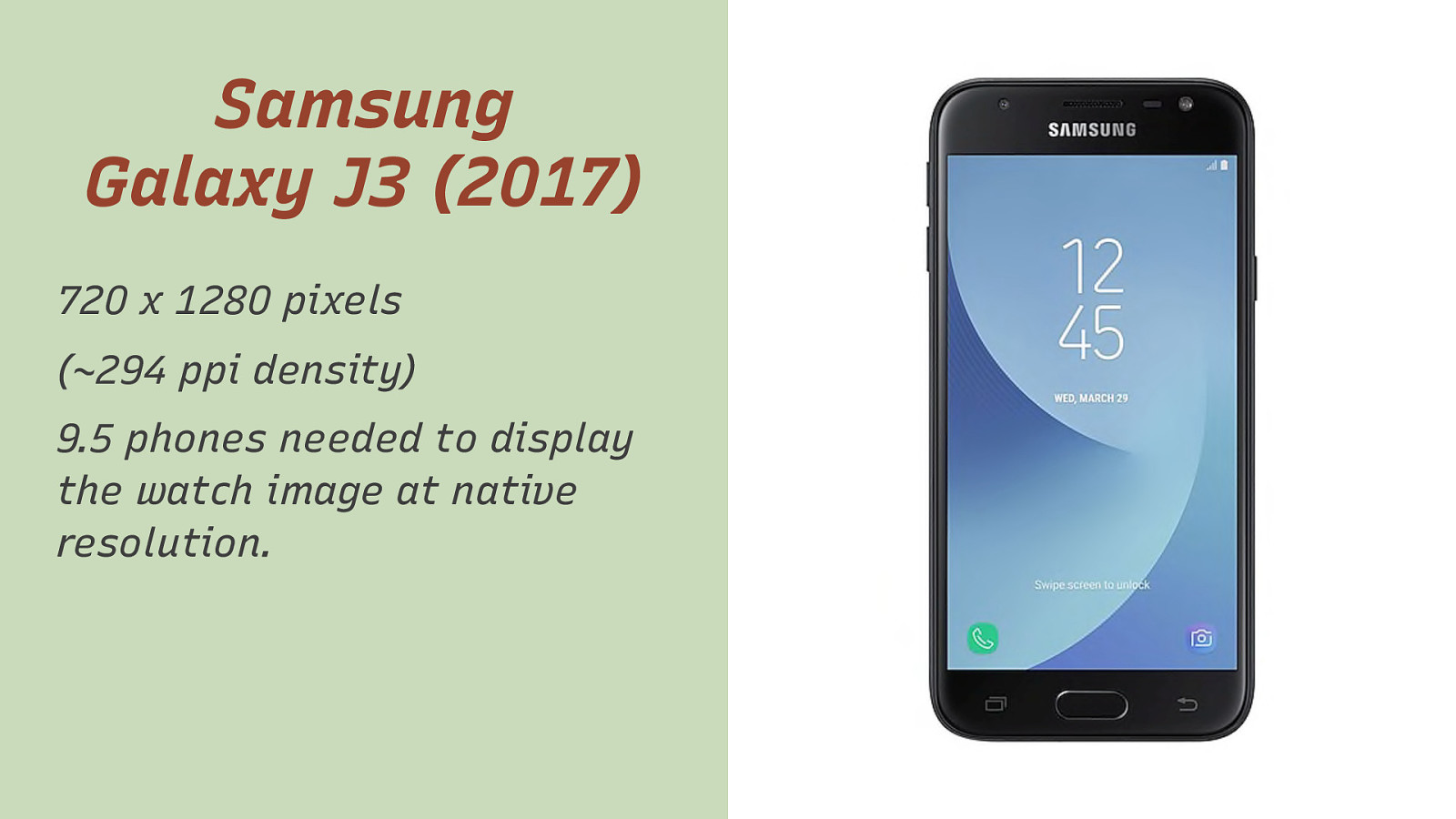
Samsung Galaxy J3 (2017) 720 x 1280 pixels (~294 ppi density) 9.5 phones needed to display the watch image at native resolution.

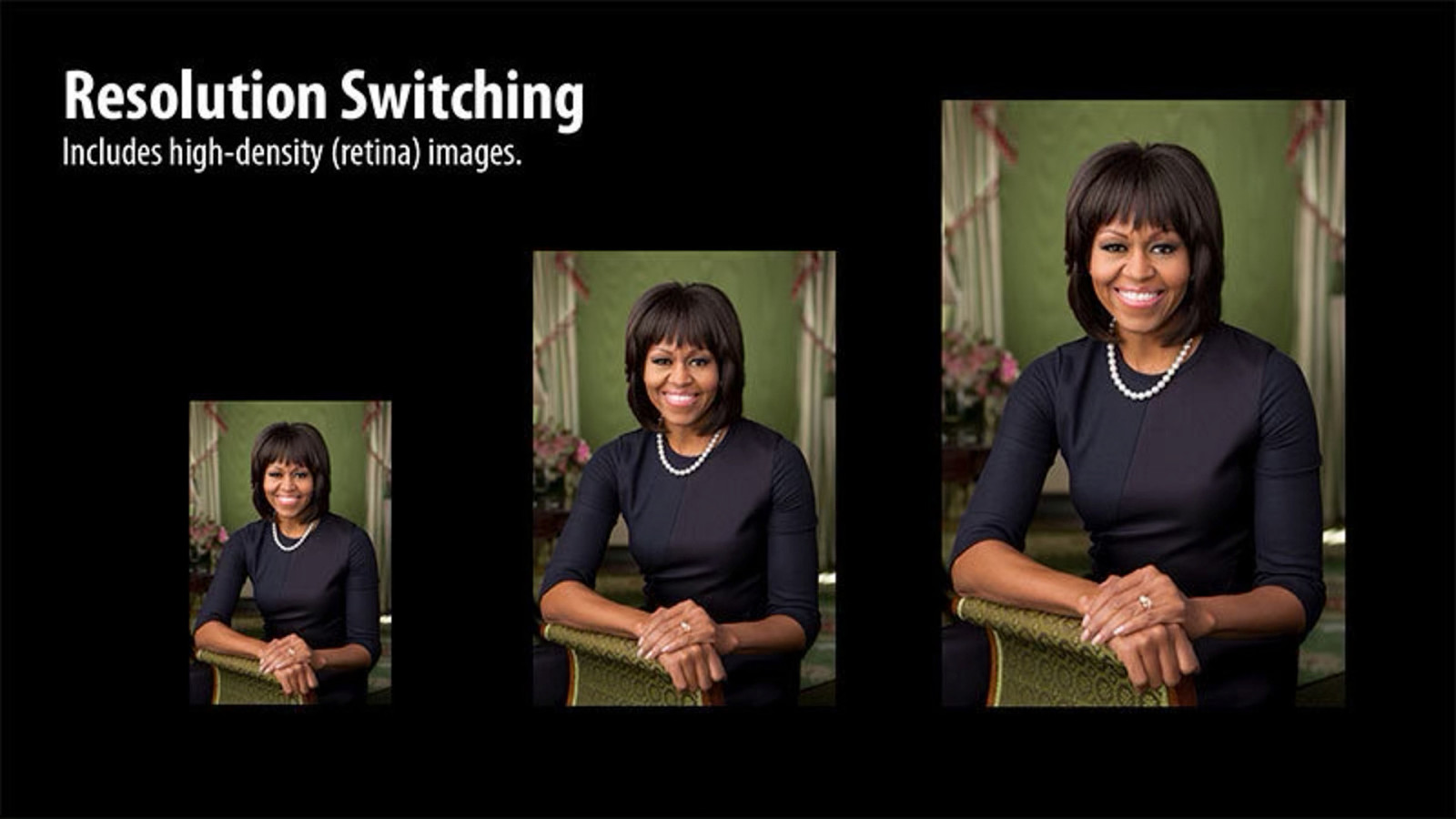
Two Main Use Cases for Responsive Images (More defined by RICG.)
- Switch Resolution & Density

- Art Direction


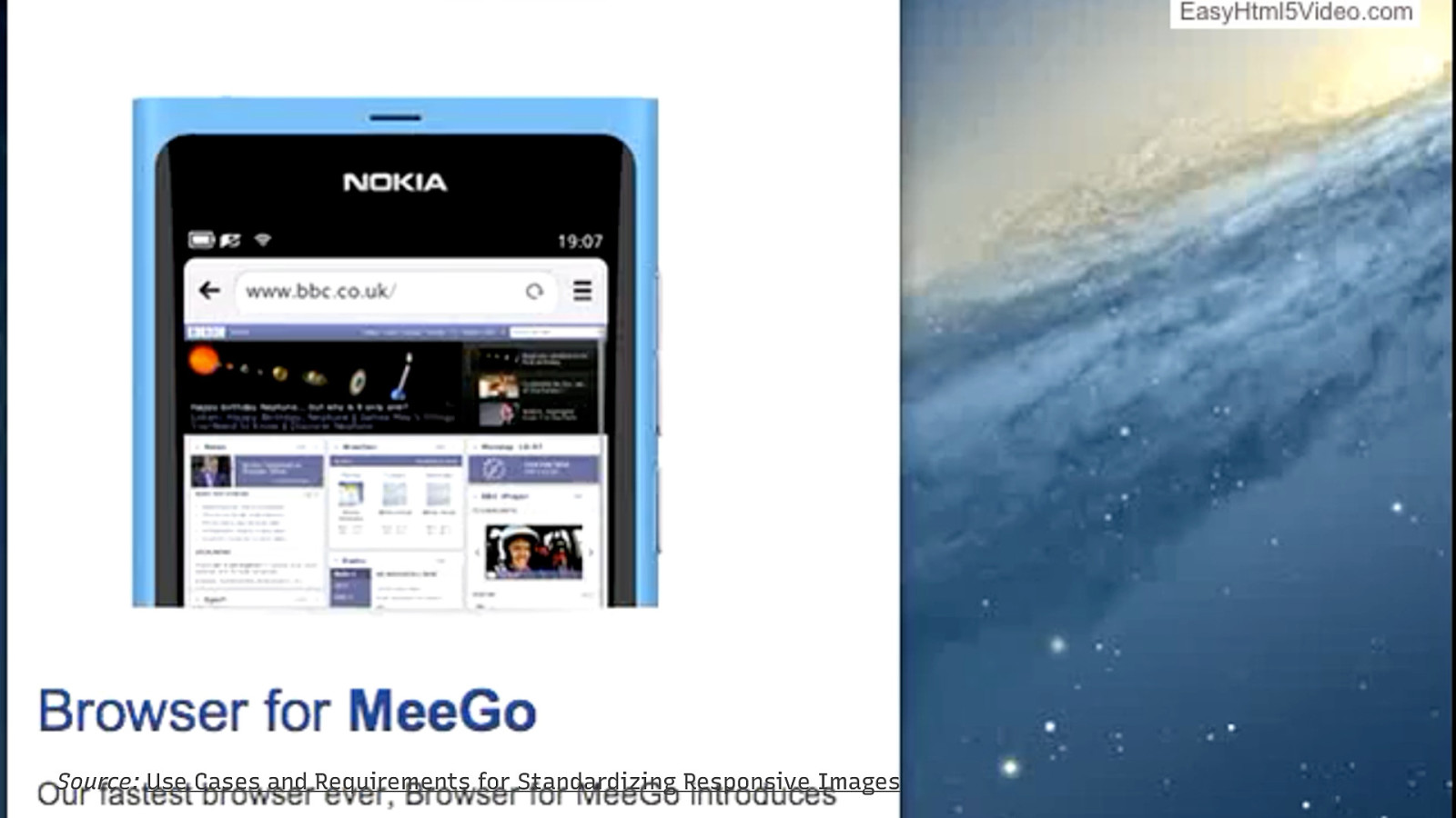
Source: Use Cases and Requirements for Standardizing Responsive Images

The img element
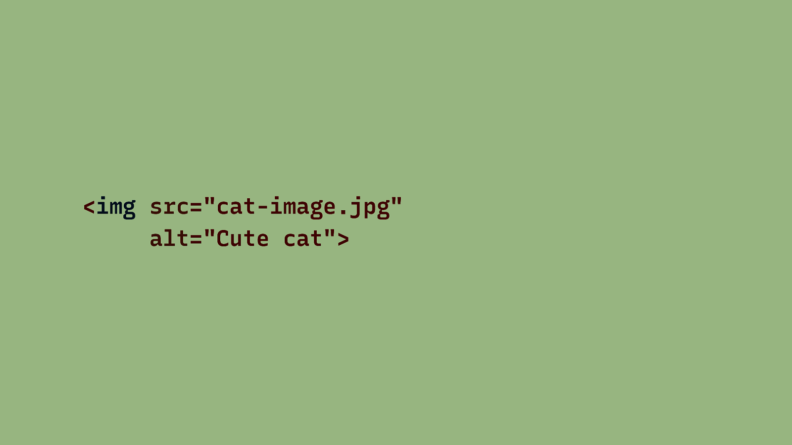
The alt attribute The alternative text (alt) describes an image in a way that the purpose or content of the image is clear without seeing the image.

WAI Images Tutorial
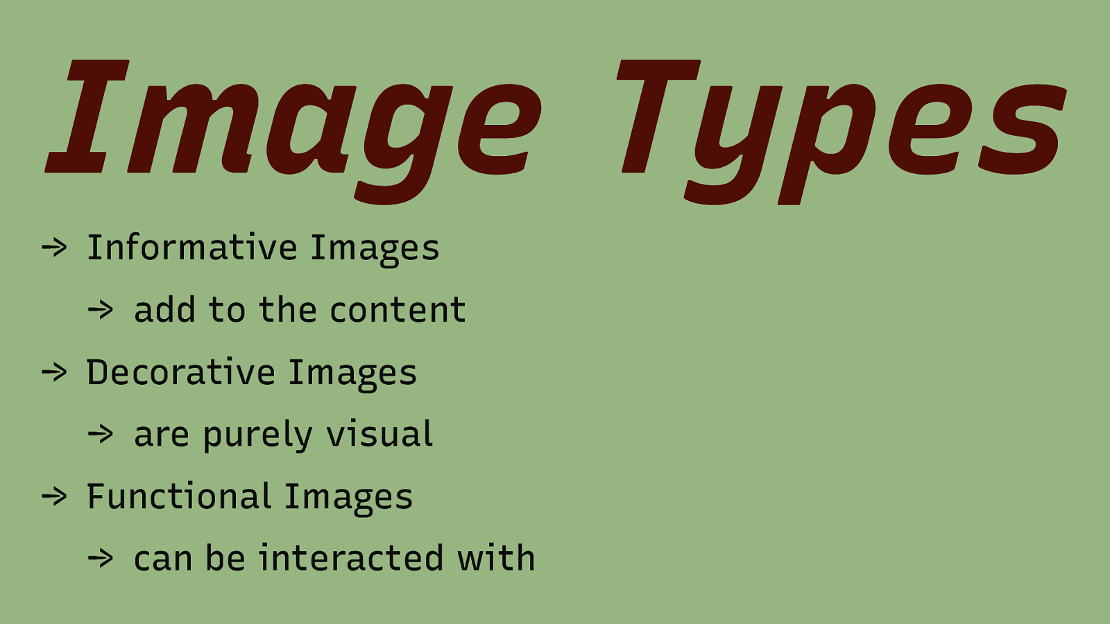
Image Types → Informative Images → add to the content → Decorative Images → are purely visual → Functional Images → can be interacted with
Informative Image <img src=”phone.png” alt=”Telephone:”> 0123 456 7890 <img src=”fax.png” alt=”Fax:”> 0123 456 7891 Source: https://www.w3.org/WAI/tutorials/images/informative/#images-used-to-label-other-information
Decorative Image <img src=”tropical.jpg” alt=”“> Source: https://www.w3.org/WAI/tutorials/images/decorative/#image-used-for-ambiance-eye-candy
Functional Image <a href=”https://www.w3.org/”> <img src=”w3c.png” alt=”W3C home”> </a> Source: https://www.w3.org/WAI/tutorials/images/functional/#image-used-alone-as-a-linked-logo
Functional Image (2) <a href=”https://www.w3.org/”> <img src=”w3c.png” alt=”“> W3C Home </a> Source: https://www.w3.org/WAI/tutorials/images/functional/#logo-image-within-link-text
Responsive Images Everything starts with an img element
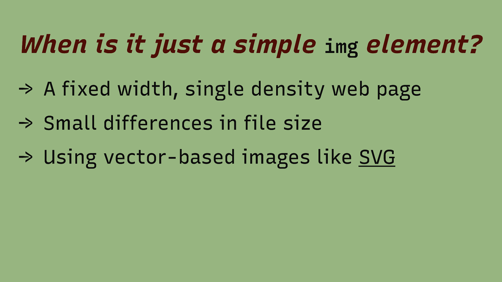
When is it just a simple img element? → A fixed width, single density web page → Small differences in file size → Using vector-based images like SVG

High Density Images
ppi = pixel per inch
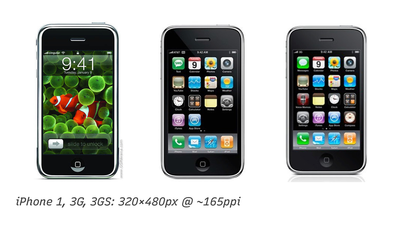
iPhone 1, 3G, 3GS: 320×480px @ ~165ppi
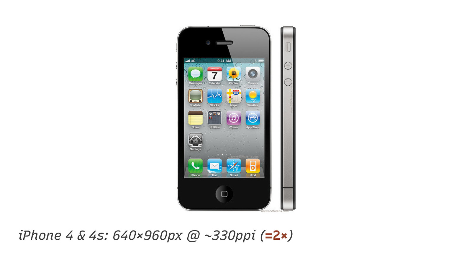
iPhone 4 & 4s: 640×960px @ ~330ppi (=2×)
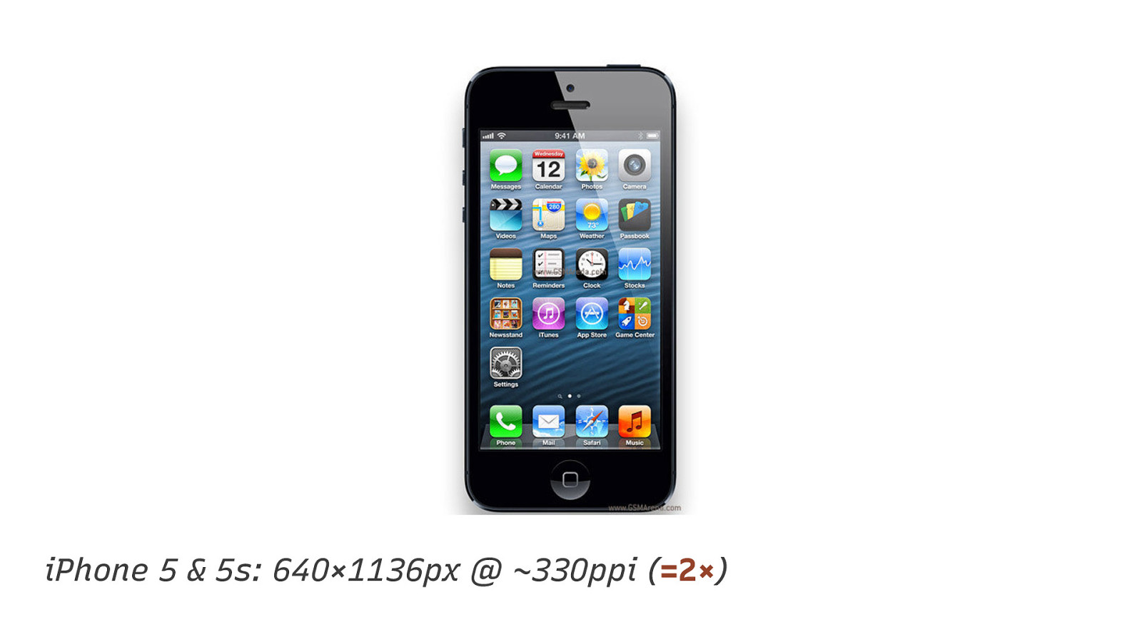
iPhone 5 & 5s: 640×1136px @ ~330ppi (=2×)
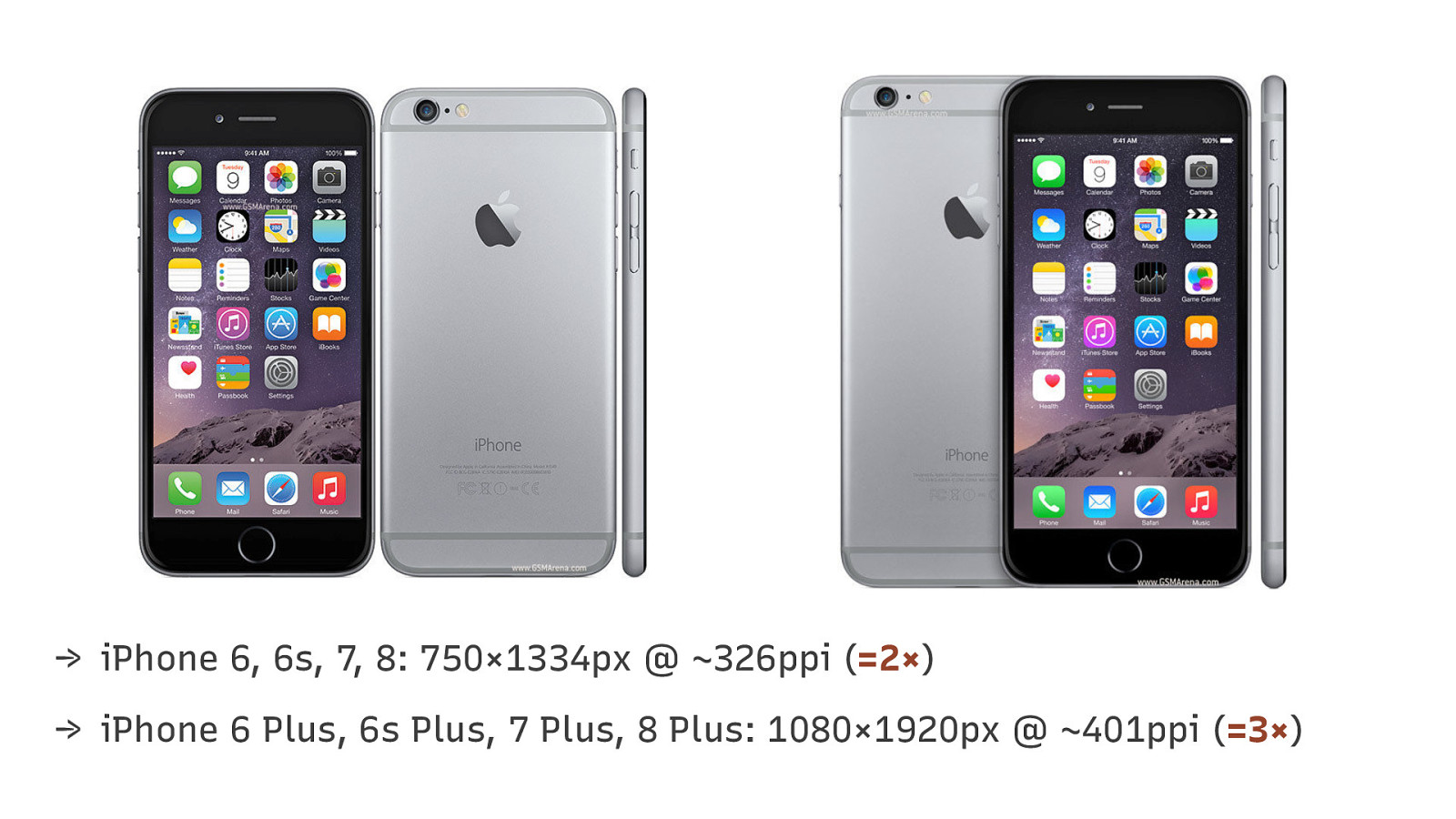
→ iPhone 6, 6s, 7, 8: 750×1334px @ ~326ppi (=2×) → iPhone 6 Plus, 6s Plus, 7 Plus, 8 Plus: 1080×1920px @ ~401ppi (=3×)
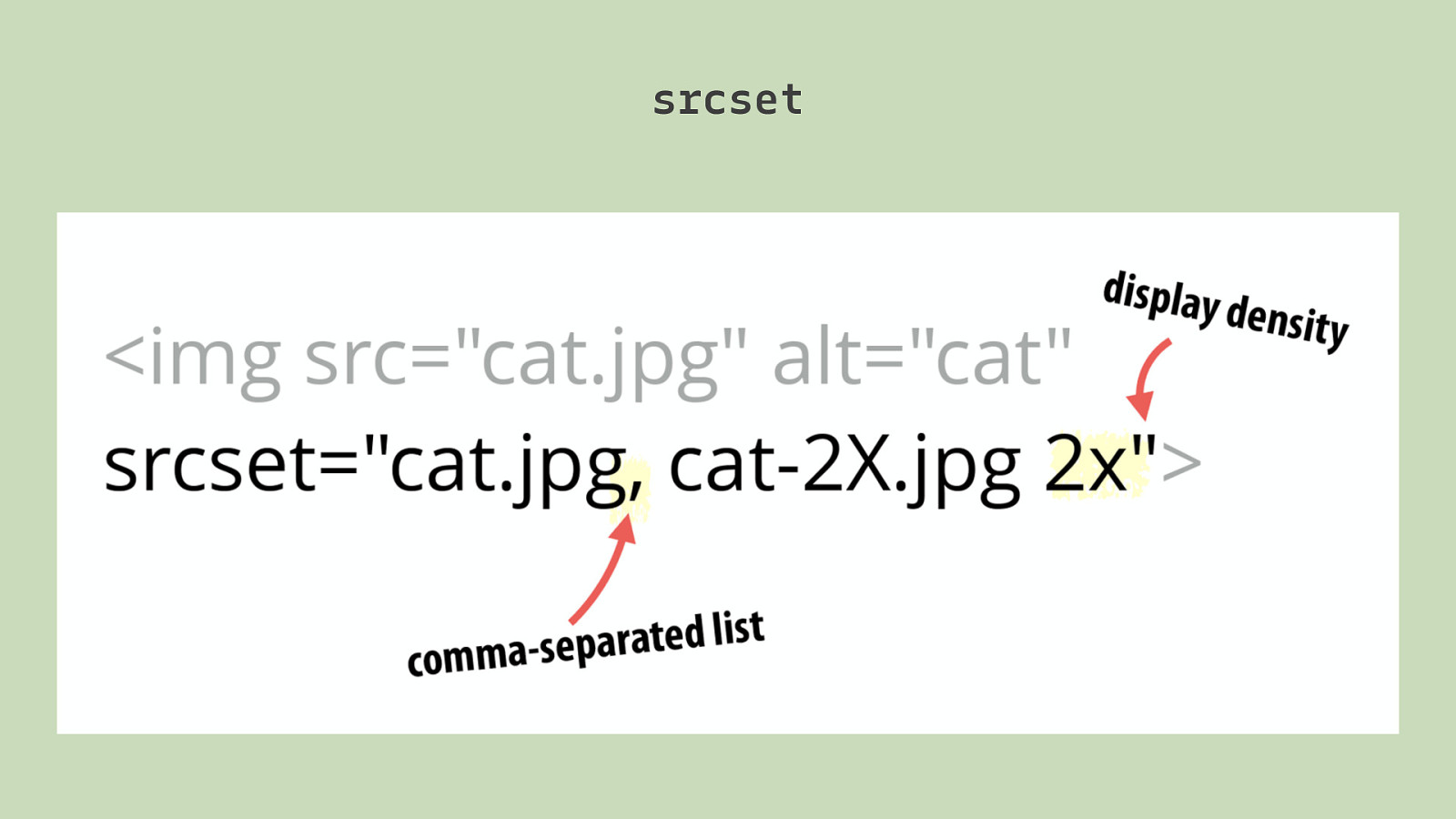
srcset
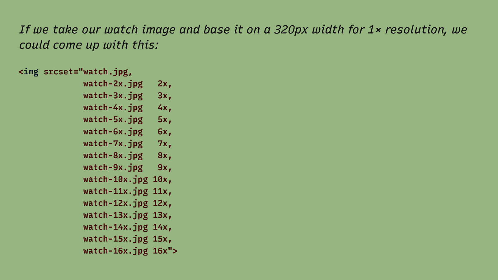
If we take our watch image and base it on a 320px width for 1× resolution, we could come up with this: <img srcset=”watch.jpg, watch-2x.jpg watch-3x.jpg watch-4x.jpg watch-5x.jpg watch-6x.jpg watch-7x.jpg watch-8x.jpg watch-9x.jpg watch-10x.jpg watch-11x.jpg watch-12x.jpg watch-13x.jpg watch-14x.jpg watch-15x.jpg watch-16x.jpg 2x, 3x, 4x, 5x, 6x, 7x, 8x, 9x, 10x, 11x, 12x, 13x, 14x, 15x, 16x”>

Best for fixed-width images * but insufficient for flexible images * You remember that flexible images are a core principle of RWD, right?
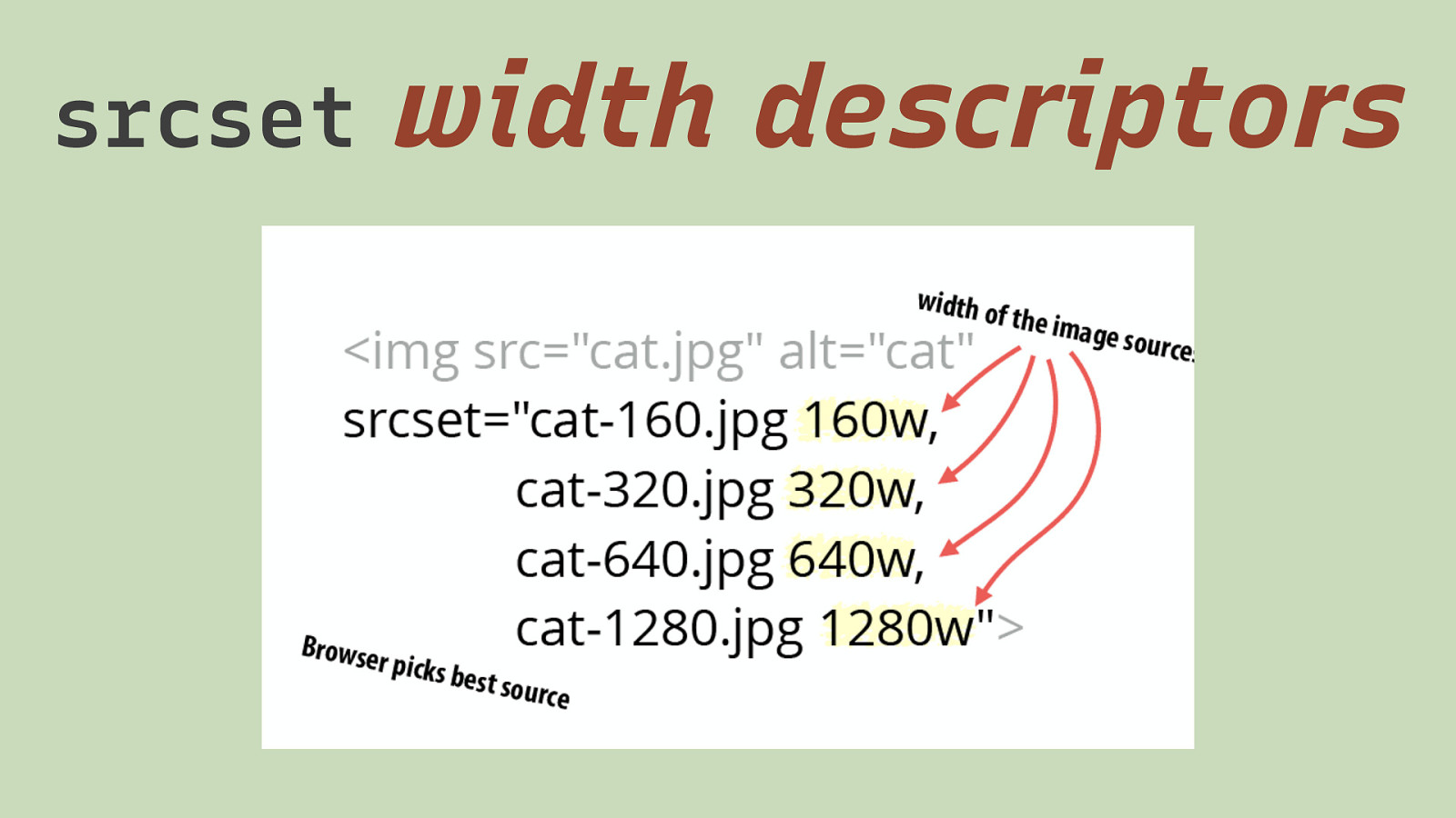
srcset width descriptors
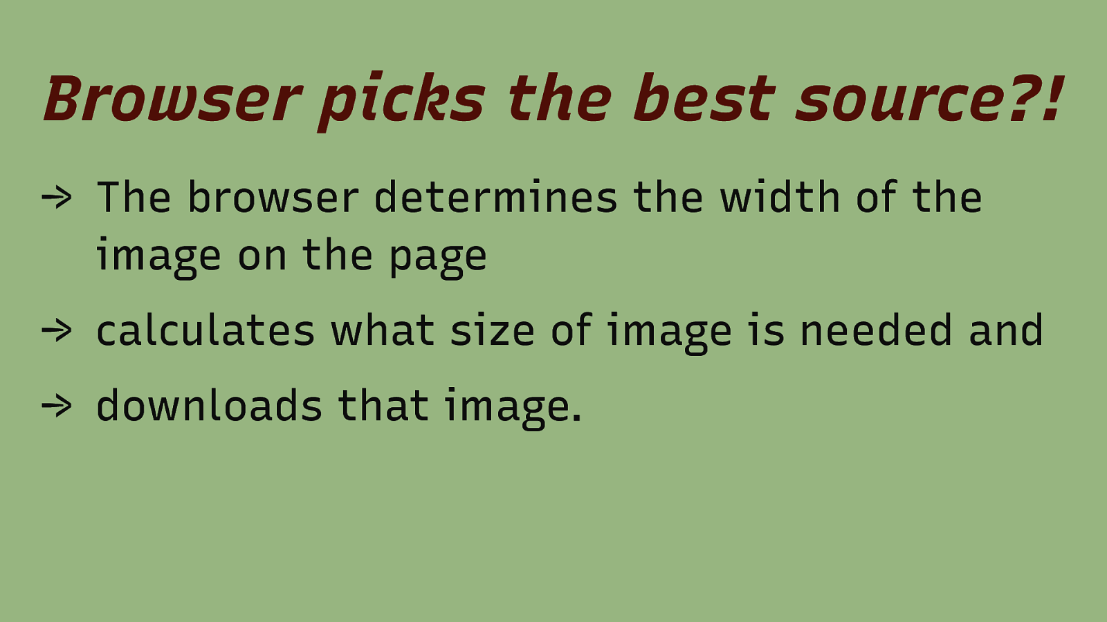
Browser picks the best source?! → The browser determines the width of the image on the page → calculates what size of image is needed and → downloads that image.
Of course it is not that easy: Prefetching → Browsers fetch images before they know how the website actually looks to make the web faster. → They fetch images before the CSS is loaded. → So initially, every image is as wide as the viewport.
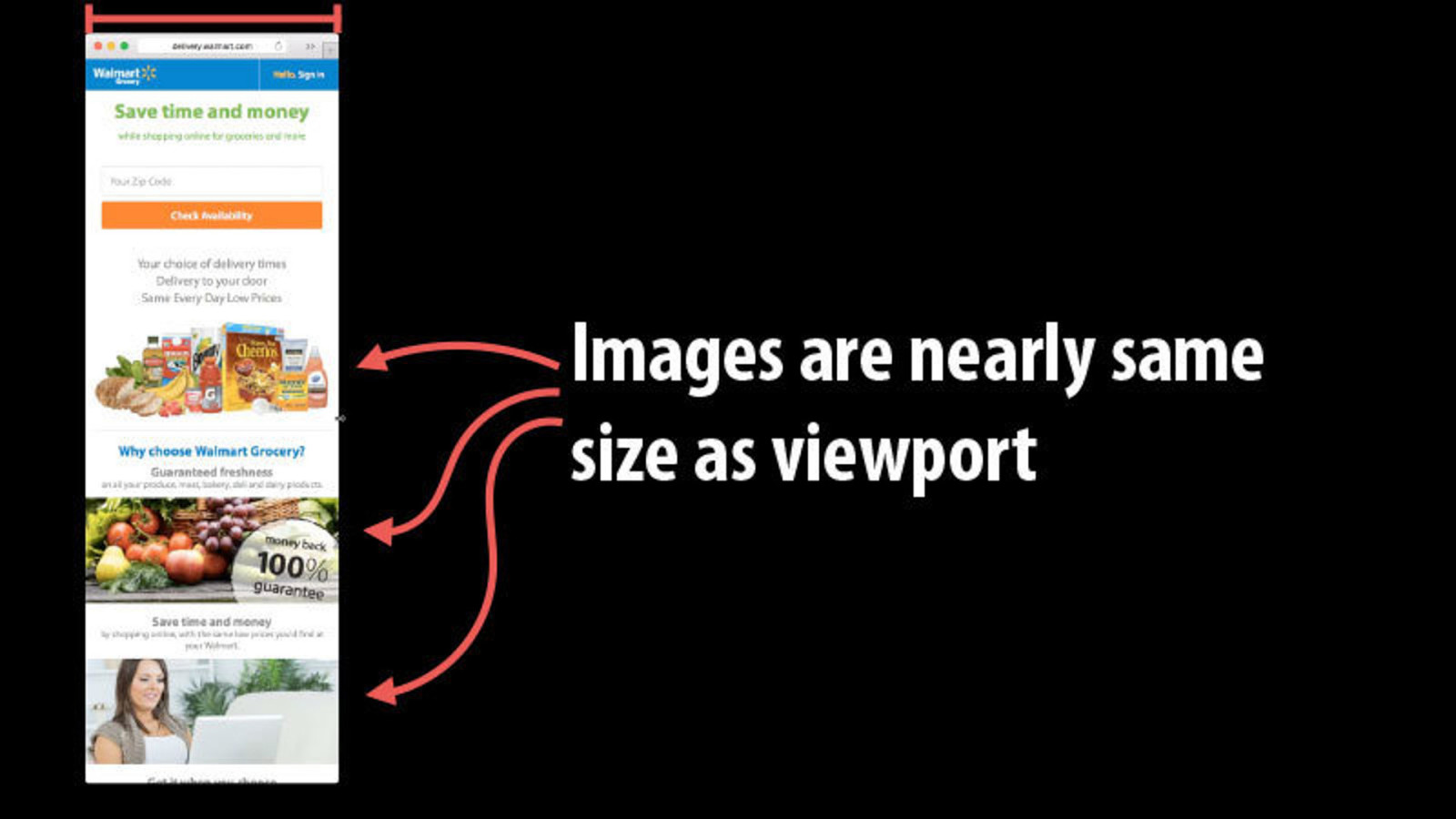
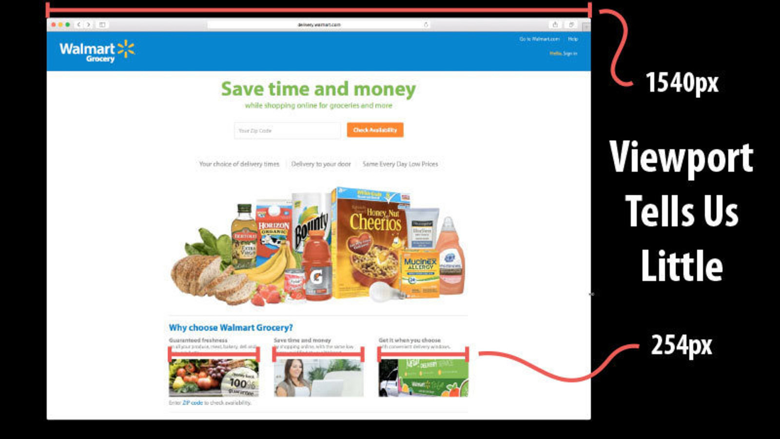

What to do?!
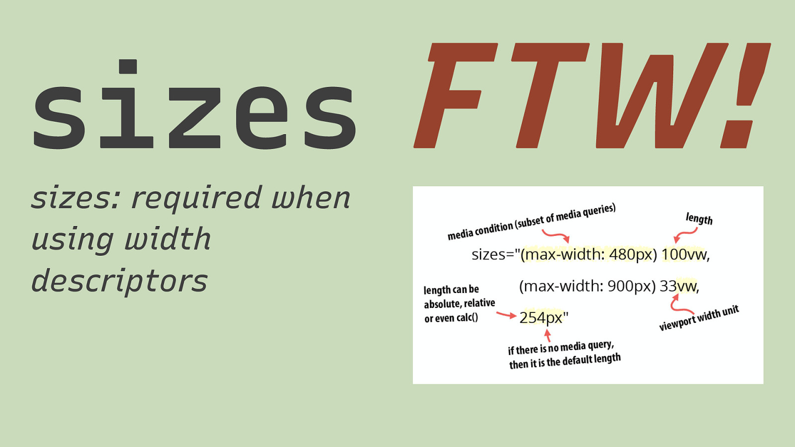
sizes sizes: required when using width descriptors FTW!
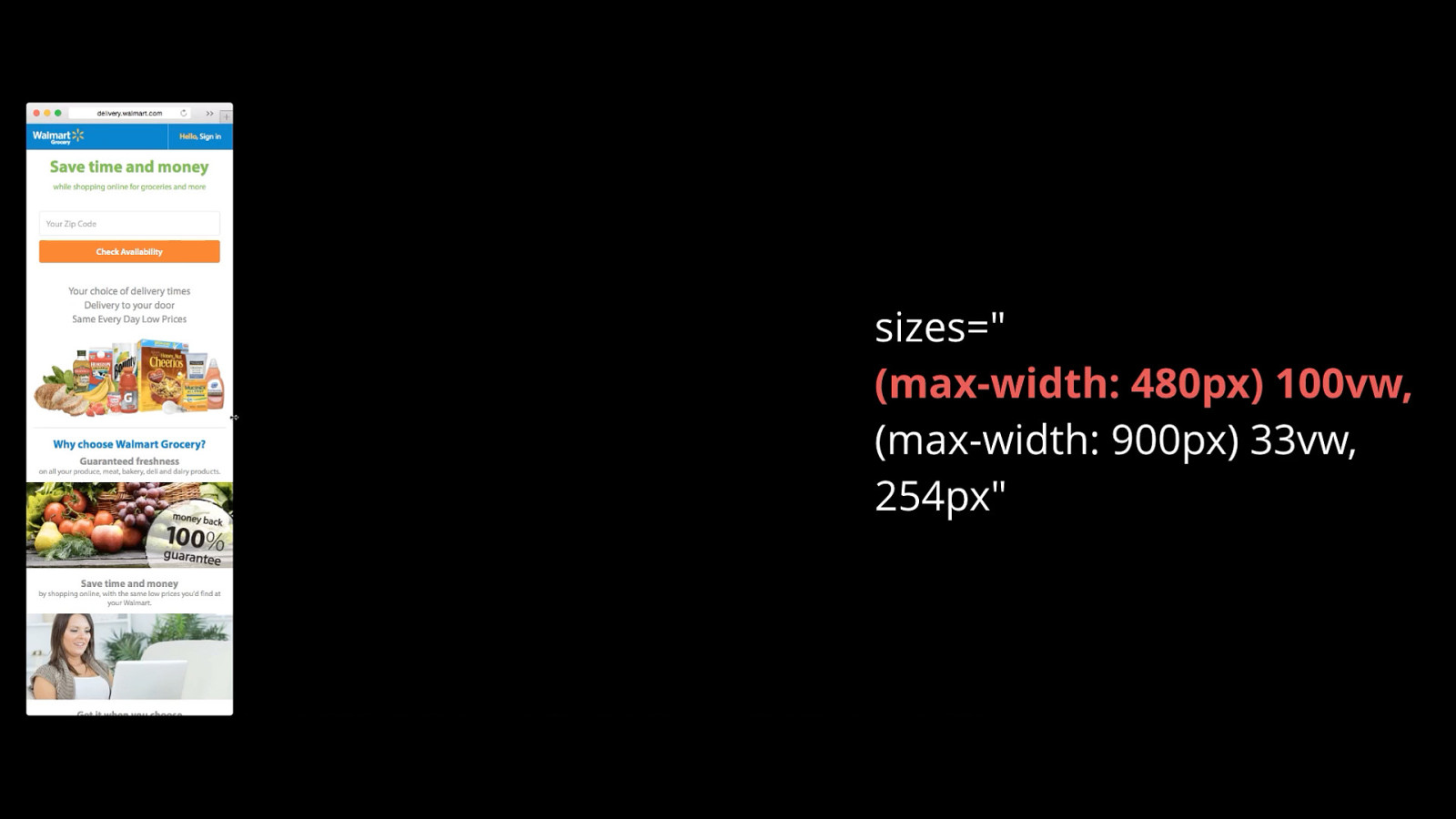
We tell the browser how wide the image is in relationship to the viewport (or absolutely).

We also tell the browser when that relationship changes.
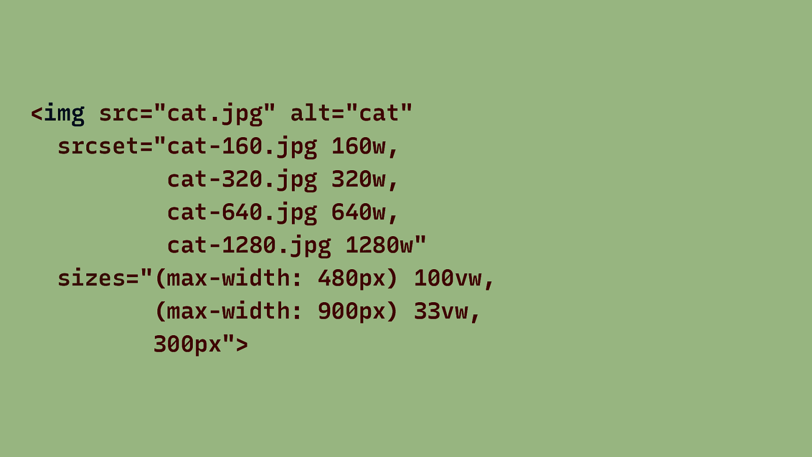
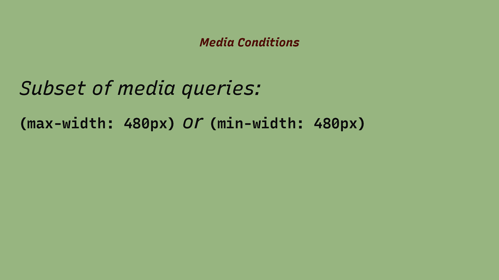
Media Conditions Subset of media queries: (max-width: 480px) or (min-width: 480px)
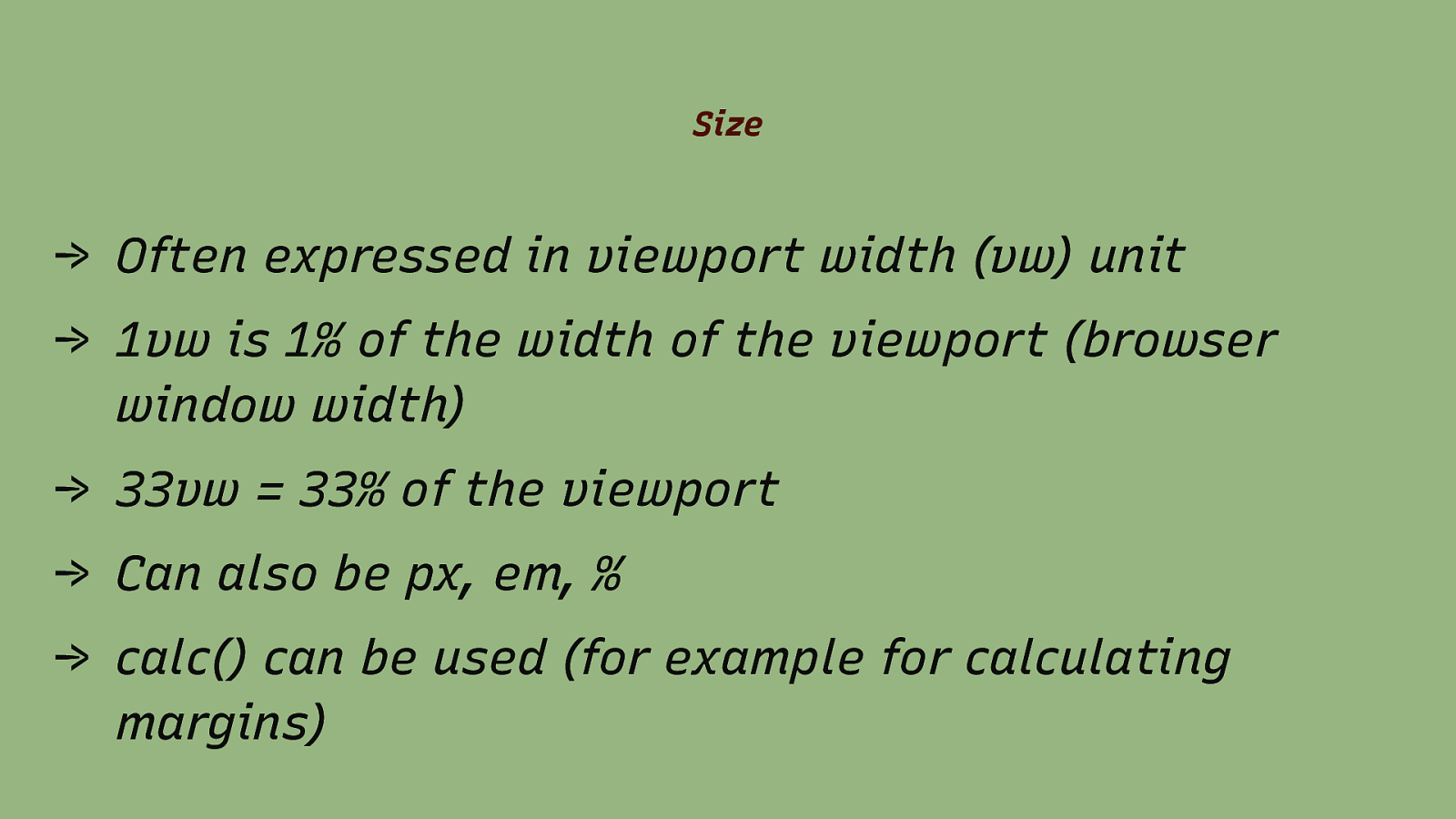
Size → Often expressed in viewport width (vw) unit → 1vw is 1% of the width of the viewport (browser window width) → 33vw = 33% of the viewport → Can also be px, em, % → calc() can be used (for example for calculating margins)
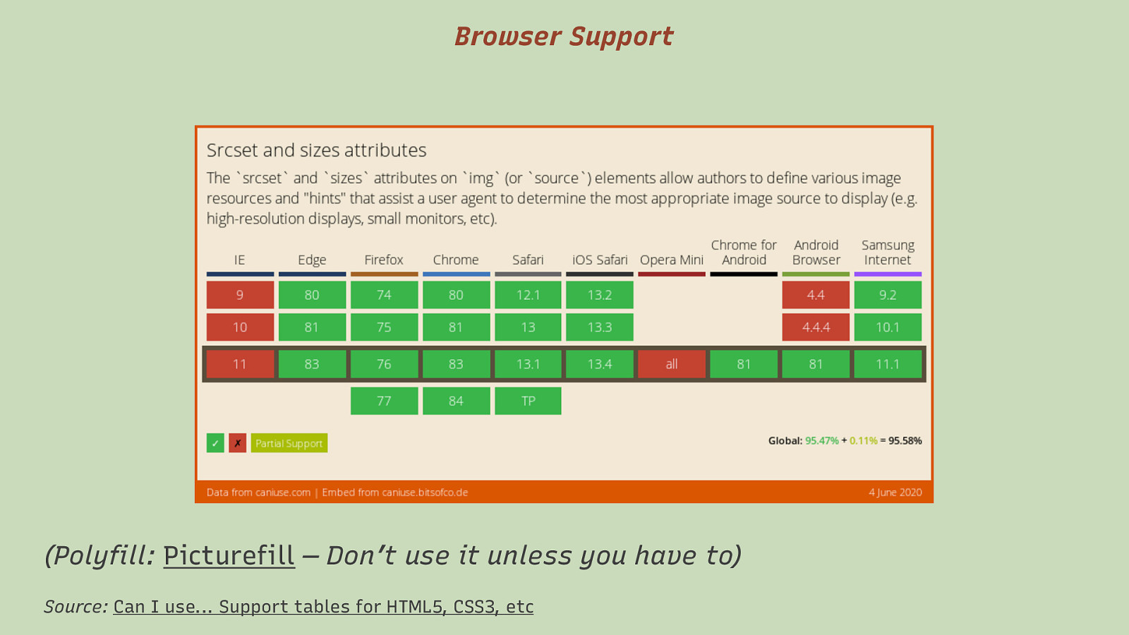
Browser Support (Polyfill: Picturefill — Don’t use it unless you have to) Source: Can I use… Support tables for HTML5, CSS3, etc

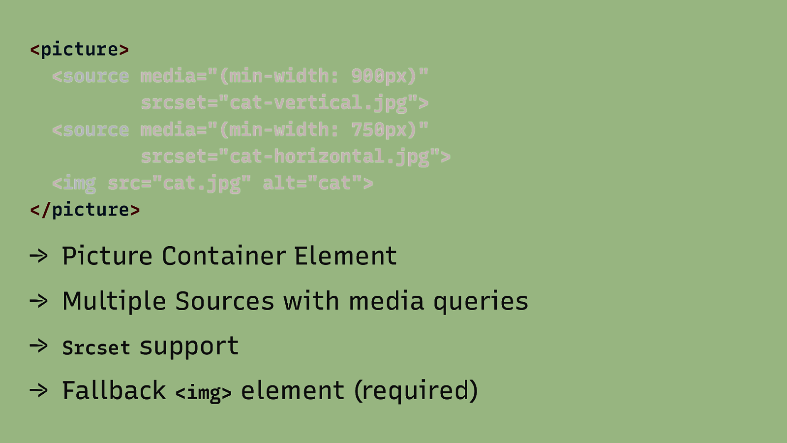
<picture> <source media=”(min-width: 900px)” srcset=”cat-vertical.jpg”> <source media=”(min-width: 750px)” srcset=”cat-horizontal.jpg”> <img src=”cat.jpg” alt=”cat”> </picture> → Picture Container Element → Multiple Sources with media queries → Srcset support → Fallback <img> element (required)
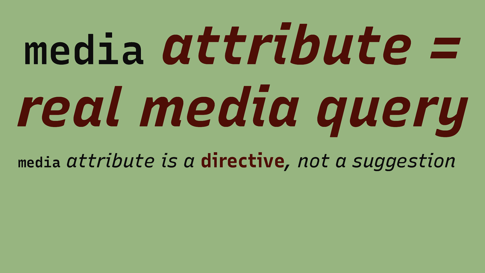
attribute = real media query media media attribute is a directive, not a suggestion

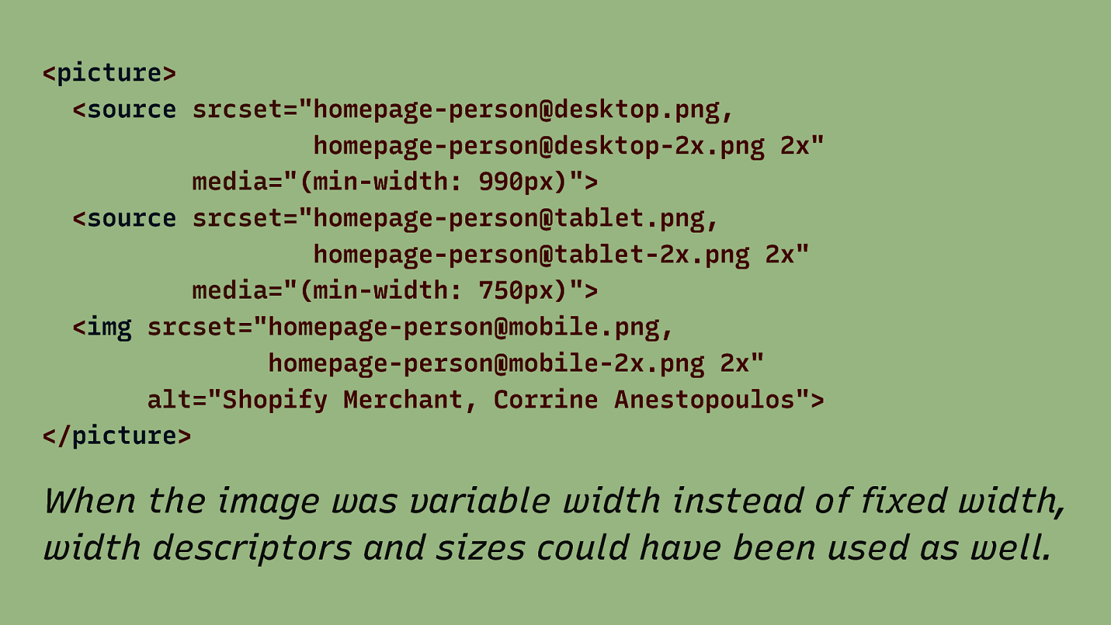
<picture> <source srcset=”homepage-person@desktop.png, homepage-person@desktop-2x.png 2x” media=”(min-width: 990px)”> <source srcset=”homepage-person@tablet.png, homepage-person@tablet-2x.png 2x” media=”(min-width: 750px)”> <img srcset=”homepage-person@mobile.png, homepage-person@mobile-2x.png 2x” alt=”Shopify Merchant, Corrine Anestopoulos”> </picture> When the image was variable width instead of fixed width, width descriptors and sizes could have been used as well.
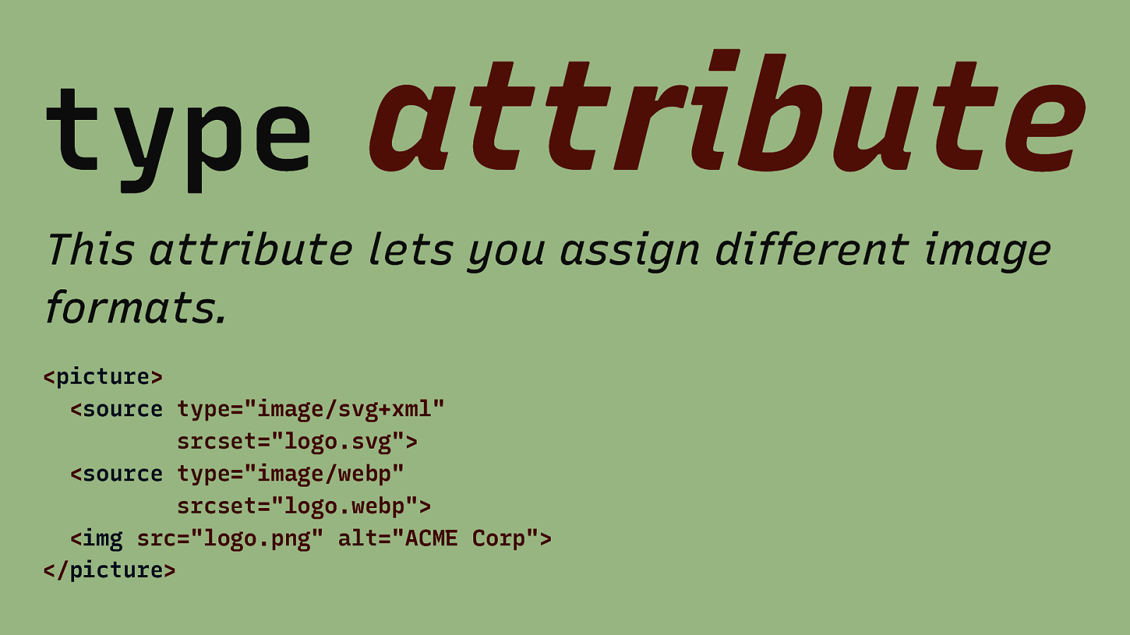
type attribute This attribute lets you assign different image formats. <picture> <source type=”image/svg+xml” srcset=”logo.svg”> <source type=”image/webp” srcset=”logo.webp”> <img src=”logo.png” alt=”ACME Corp”> </picture>

Summary

For most responsive images: Don’t use picture.

Always use <img src=”…” alt=”…”> for basic support.
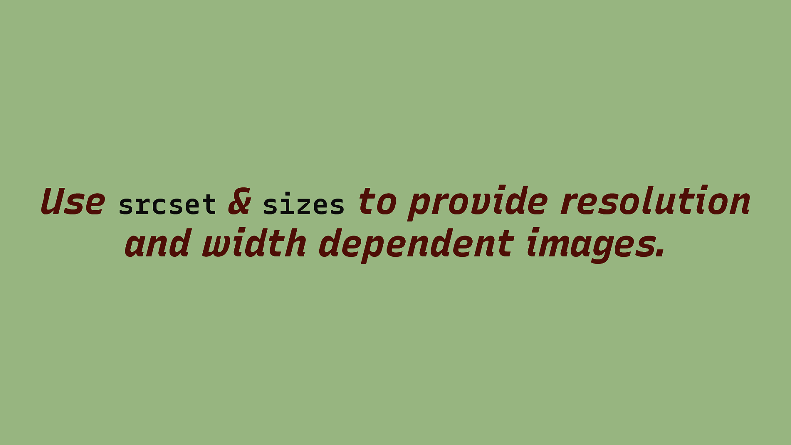
Use & sizes to provide resolution and width dependent images. srcset

Remember that picture locks in the choice, the media queries are not negotiable.


Thanks! Source: Jason Grigsby – Responsive Images 101
