Die Zukunft des Webs beginnt jetzt
A presentation at WebTech 2009 in in Karlsruhe, Germany by Eric Eggert
Die Zukunft des Webs beginnt jetzt Eric Eggert, @yatil, yatil.de
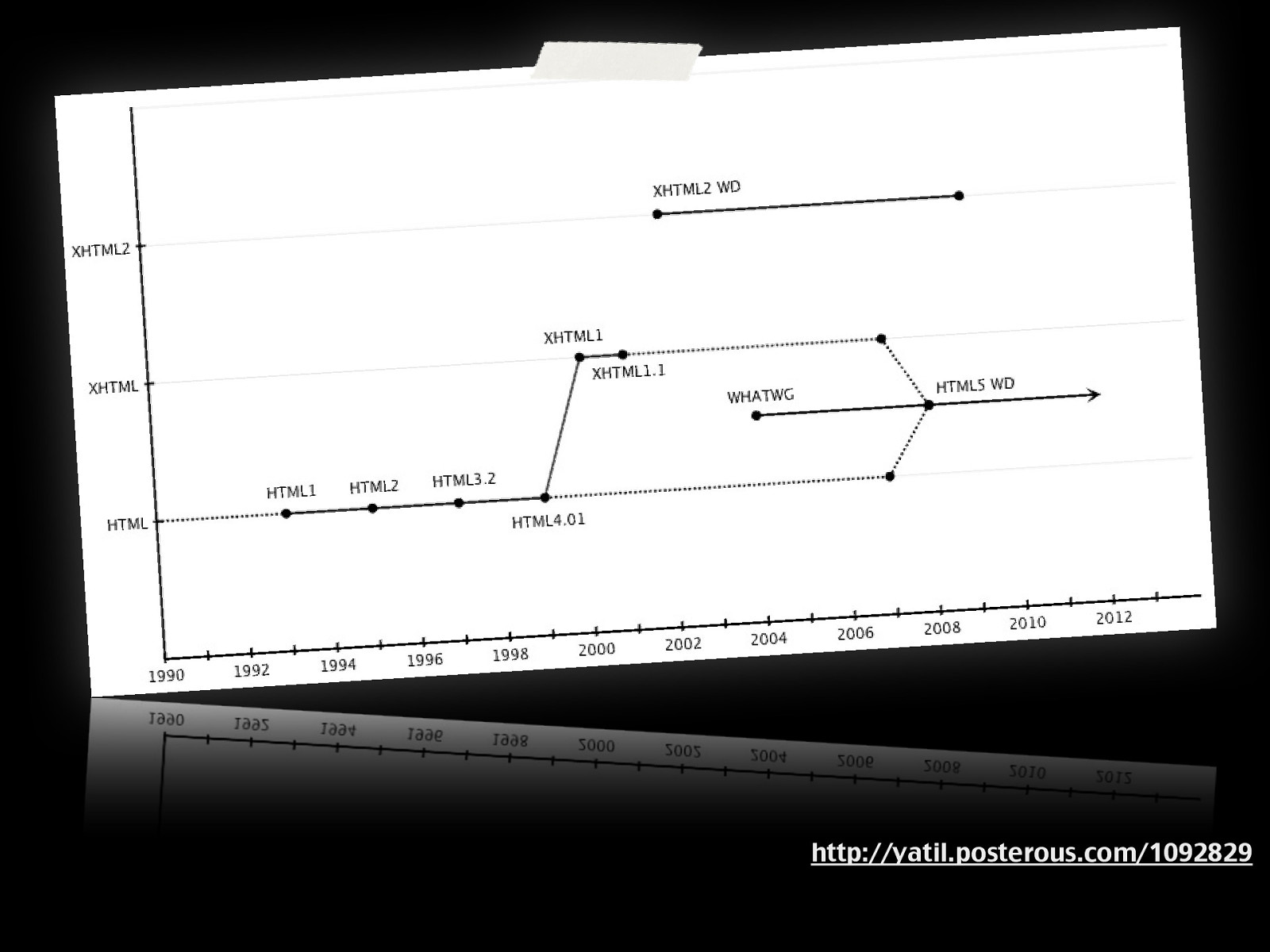
HTML5 HyperText Markup Language?
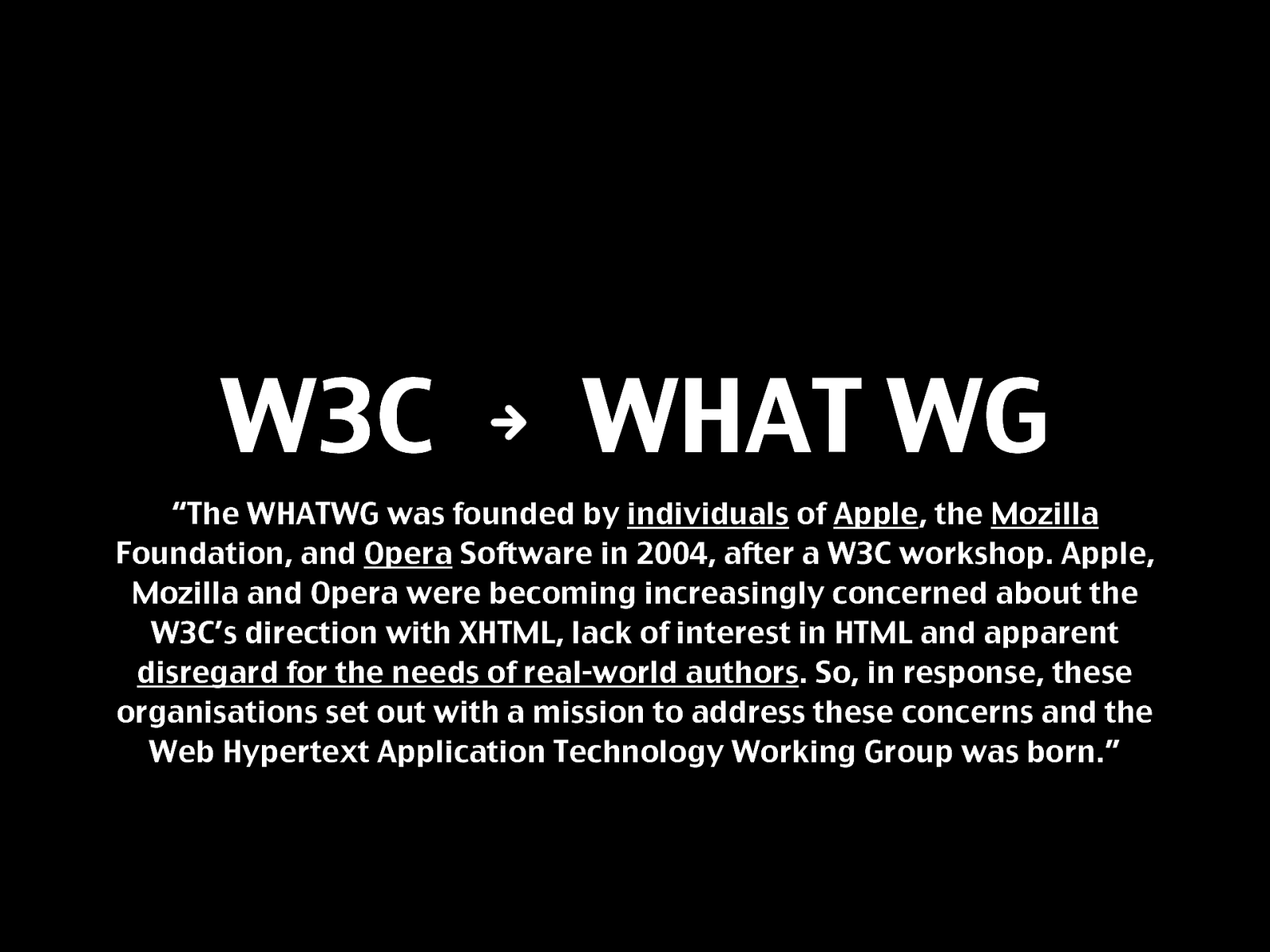
W3C N WHAT WG “The WHATWG was founded by individuals of Apple , the Mozilla
Foundation, and Opera Software in 2004, after a W3C workshop. Apple, Mozilla and Opera were becoming increasingly concerned about the W3C’s direction with XHTML, lack of interest in HTML and apparent disregard for the needs of real-world authors . So, in response, these organisations set out with a mission to address these concerns and the Web Hypertext Application Technology Working Group was born.”
Retro: XHTML2 FAIL!
http://yatil.posterous.com/1092829
Semantik
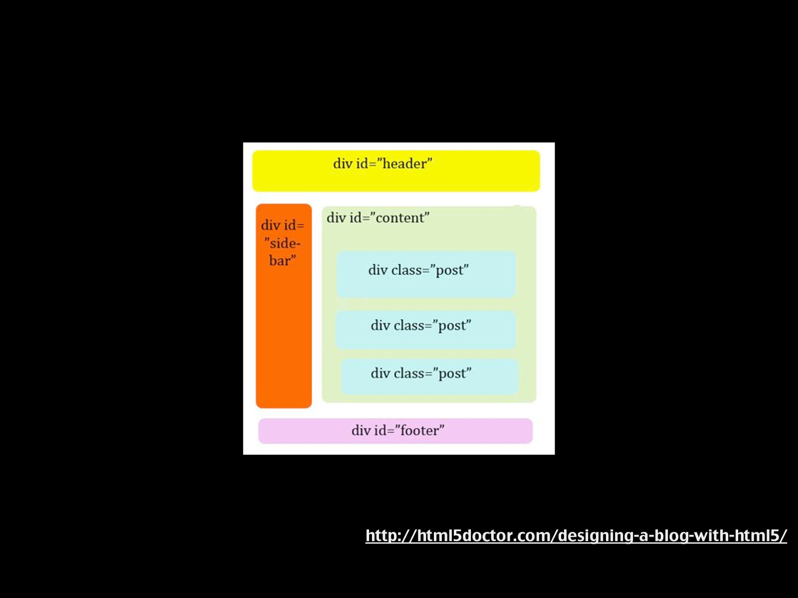
http://html5doctor.com/designing-a-blog-with-html5/
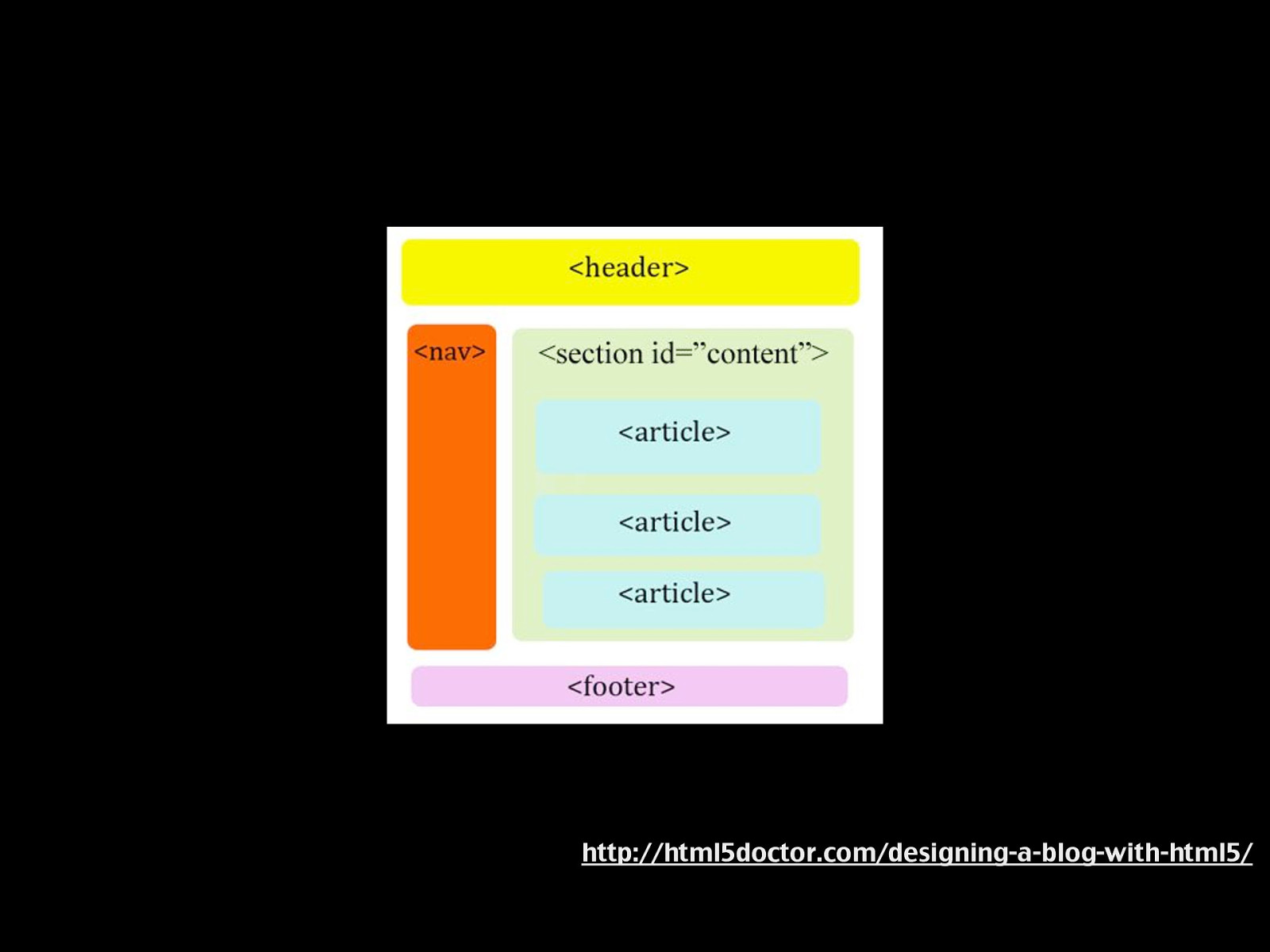
http://html5doctor.com/designing-a-blog-with-html5/
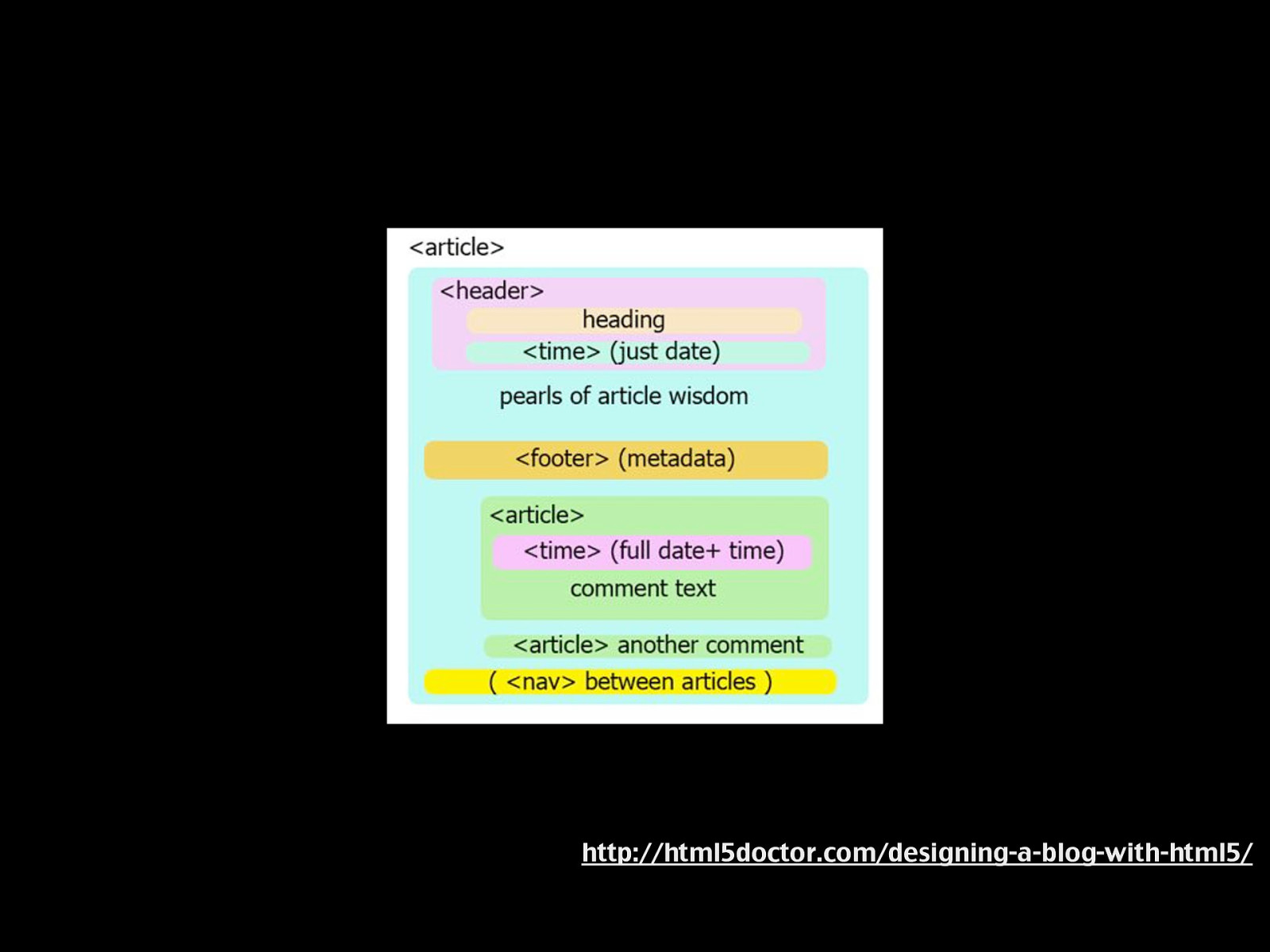
http://html5doctor.com/designing-a-blog-with-html5/
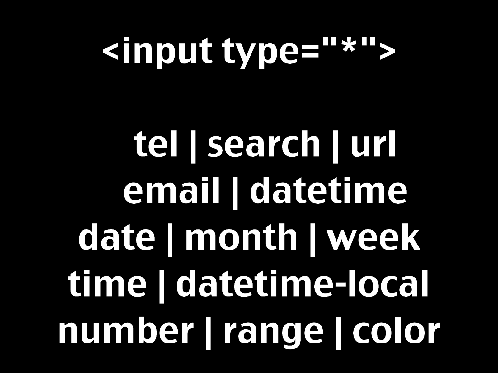
<audio>/<video> <canvas> <mark> <time> <meter>
Demo http://shwetankdixit.com/testpages/ webforms2demo.htm
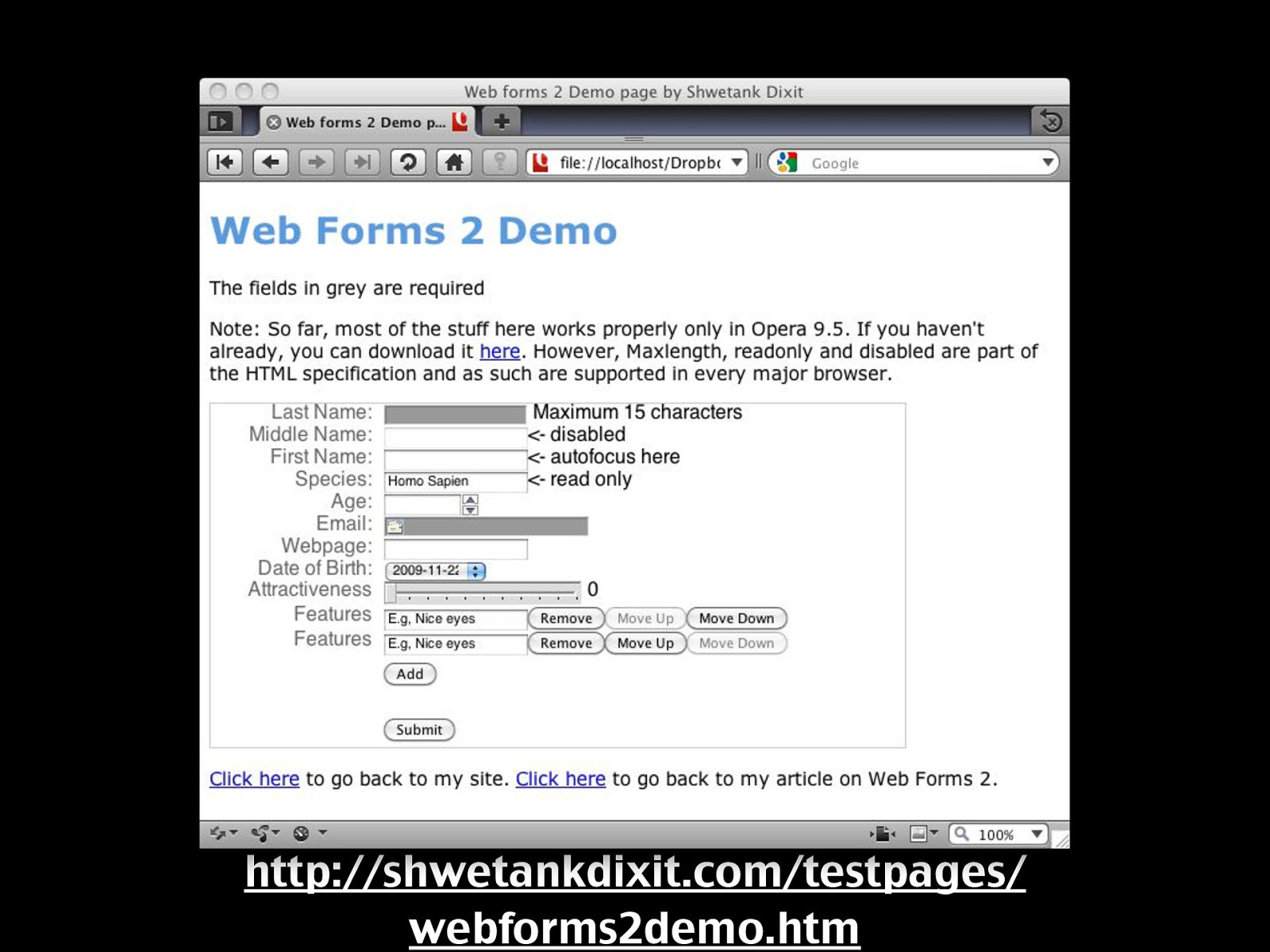
Demo http://shwetankdixit.com/testpages/ webforms2demo.htm
Browser APIs HTML5 & !HTML5
JavaScript
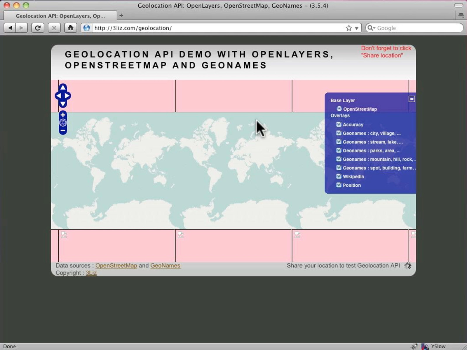
Geolocation
Geolocation http://3liz.com/geolocation/


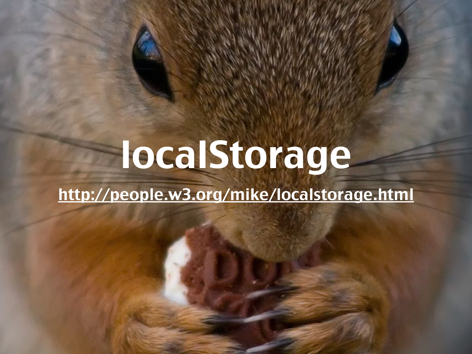
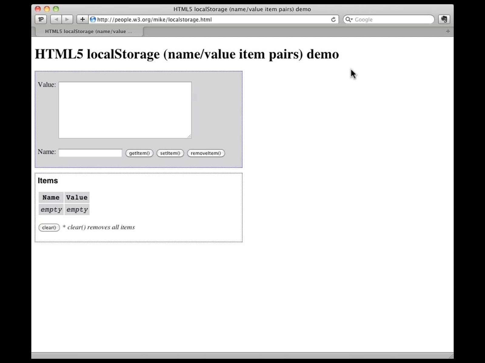
localStorage
localStorage http://people.w3.org/mike/localstorage.html
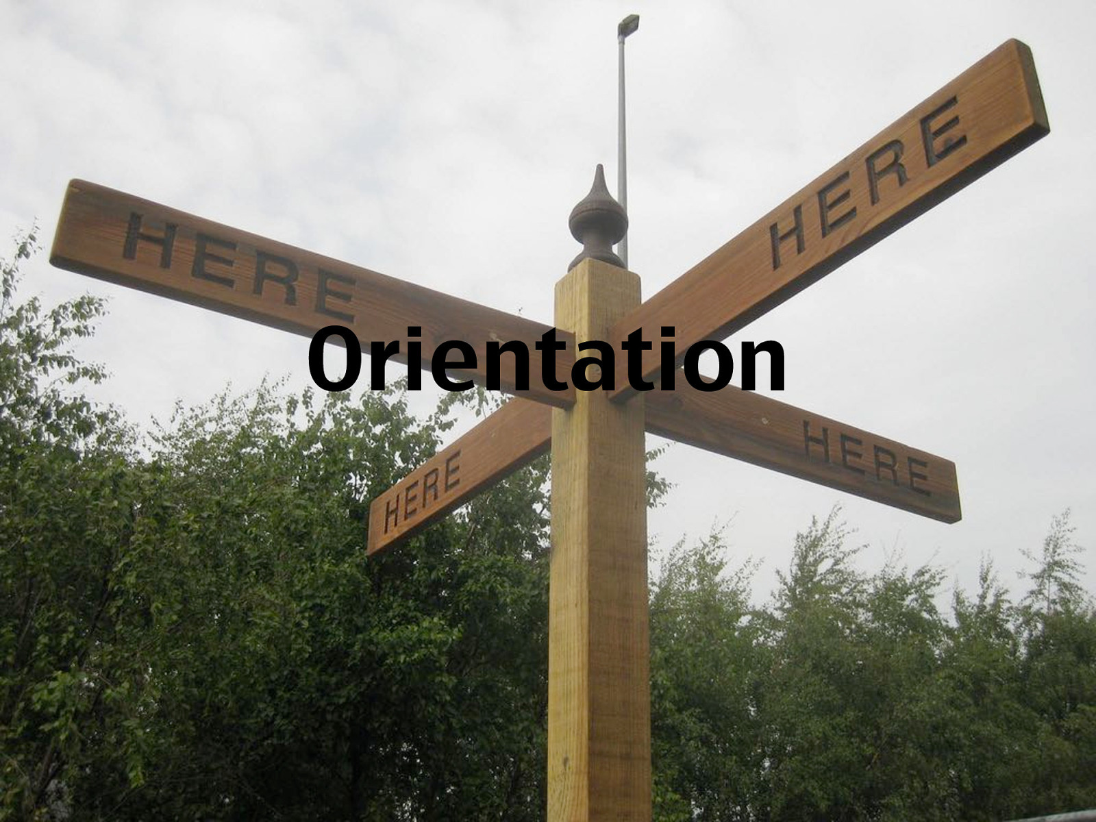
Orientation
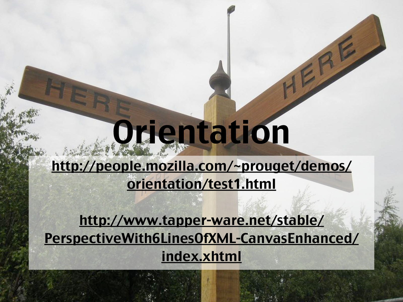
Orientation http://people.mozilla.com/~prouget/demos/ orientation/test1.html http://www.tapper-ware.net/stable/ PerspectiveWith6LinesOfXML-CanvasEnhanced/ index.xhtml
CSS
Borders & Boxes
Borders & Boxes Laaaaaaaaaaaaangweilig!
@font-face
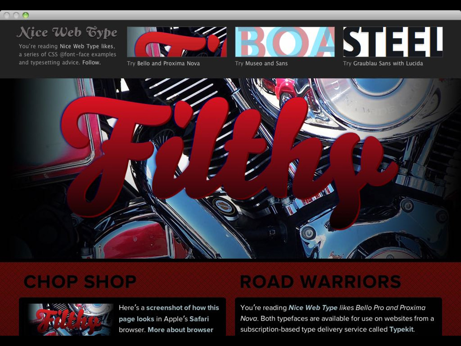
You’re reading
Nice Web Type likes
,
a series of CSS @font-face examples
and typesetting advice.
Follow.
Try
Bello and Proxima Nova
Try
Museo and Sans
Try
Graublau Sans with Lucida
Nice Web Type
likes Museo and Sans
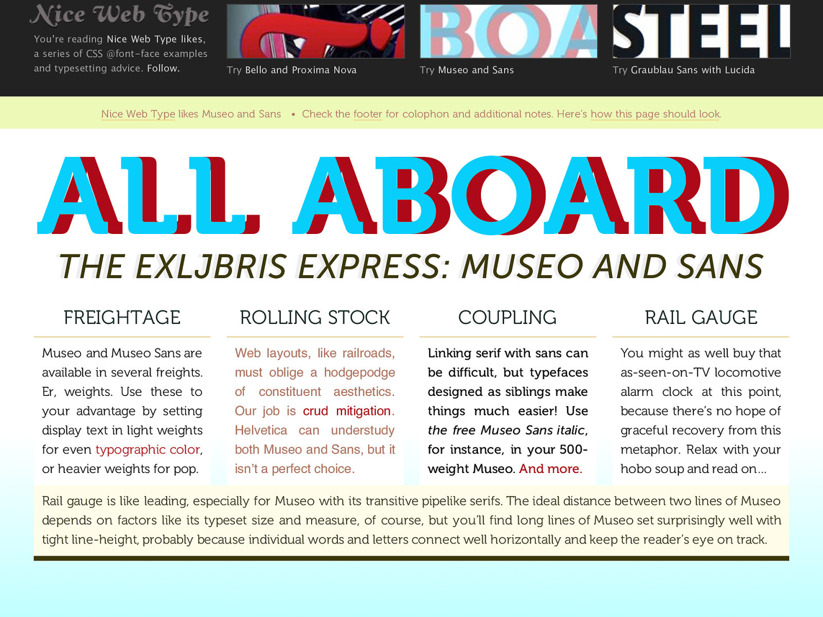
• Check the footer for colophon and additional notes. Here’s how this page should look . ALL ABOARD ALL ABOARD THE EXLJBRIS EXPRESS: MUSEO AND SANS THE EXLJBRIS EXPRESS: MUSEO AND SANS FREIGHTAGE Museo and Museo Sans are available in several freights. Er, weights. Use these to your advantage by setting display text in light weights for even typographic color , or heavier weights for pop. ROLLING STOCK Web layouts, like railroads, must oblige a hodgepodge of constituent aesthetics. Our job is crud mitigation . Helvetica can understudy both Museo and Sans, but it isn ʼ t a perfect choice. COUPLING Linking serif with sans can be difficult, but typefaces designed as siblings make things much easier! Use the free Museo Sans italic , for instance, in your 500- weig ht Museo. And more. RAIL GAUGE You might as well bu y that as-seen-on-TV locomotive alarm clock at this point, because there’s no hope of graceful recovery from this metaphor. Relax with your hobo soup and read on… Rail gauge is like leading, especially for Museo with its transitive pipelike serifs. The ideal distance between two lines of Museo depends on factors like its typeset size and measure, of course, but you’ll find long lines of M useo set surprisingly well with tight line-height, probably because individual words and letters connect well horizontally and keep the reader’s eye on track.
WRITING
WORK
WORDS
ABOUT
CONTACT
NOV 11, 2009
NOV 11, 2009
What You See Is What You Mean
On Donald Knuth and when WYSIWYG transforms to
WYSIWYM
:
As opposed to industry -standard page layout programs that implement a “What You
See Is What You Get” (WYSIWYG) paradigm,
TeX
produces “What You See Is What
You Mean” (WYSIWYM) by using plain text files and a semantic mark -up language
compiled on-the -fly to produce final pages.
Then:
This is where the moral objection comes in. Once the typographic decisions have been
passed over to software, then the information no longer is tied to any one specific
form. The possibilities multiply.
Also:
Plato reminds us that the very tool used to create books — writing — may have placed
us in this double bind for good, between remembering and forgetting, information on
or off, from zero to one and back.
(I still think he just needed a
thank you note
.)
Composition in performance, the future
Robin Sloan asks
, what if the magazine article of the future, the album of
the future, and the novel of the future are all the same thing,
live
Register
Register
Sign in
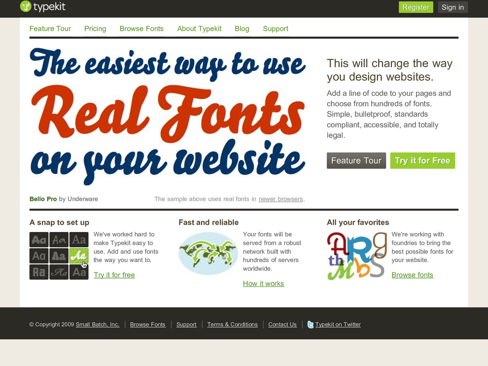
The sample above uses real fonts in
newer browsers
.
Bello Pro
by Underware
This will change the way
you design websites.
Add a line of code to your pages and
choose from hundreds of fonts.
Simple, bulletproof, standards
compliant, accessible, and totally
legal.
Feature Tour
Try it for Free Try it for Free A snap to set up We've worked hard to make Typekit easy to use. Add and use fonts the way you want to. Try it for free Fast and reliable Your fonts will be served from a robust network built with hundreds of servers worldwide. How it works All your favorites We're working with foundries to bring the best possible fonts for your website. Browse fonts Feature Tour Pricing Browse Fonts About Typekit Blog Support © Copyright 2009 Small Batch, Inc. Browse Fonts Support Terms & Conditions Contact Us Typekit on Twitter
LOG IN
JOIN US
BLOG
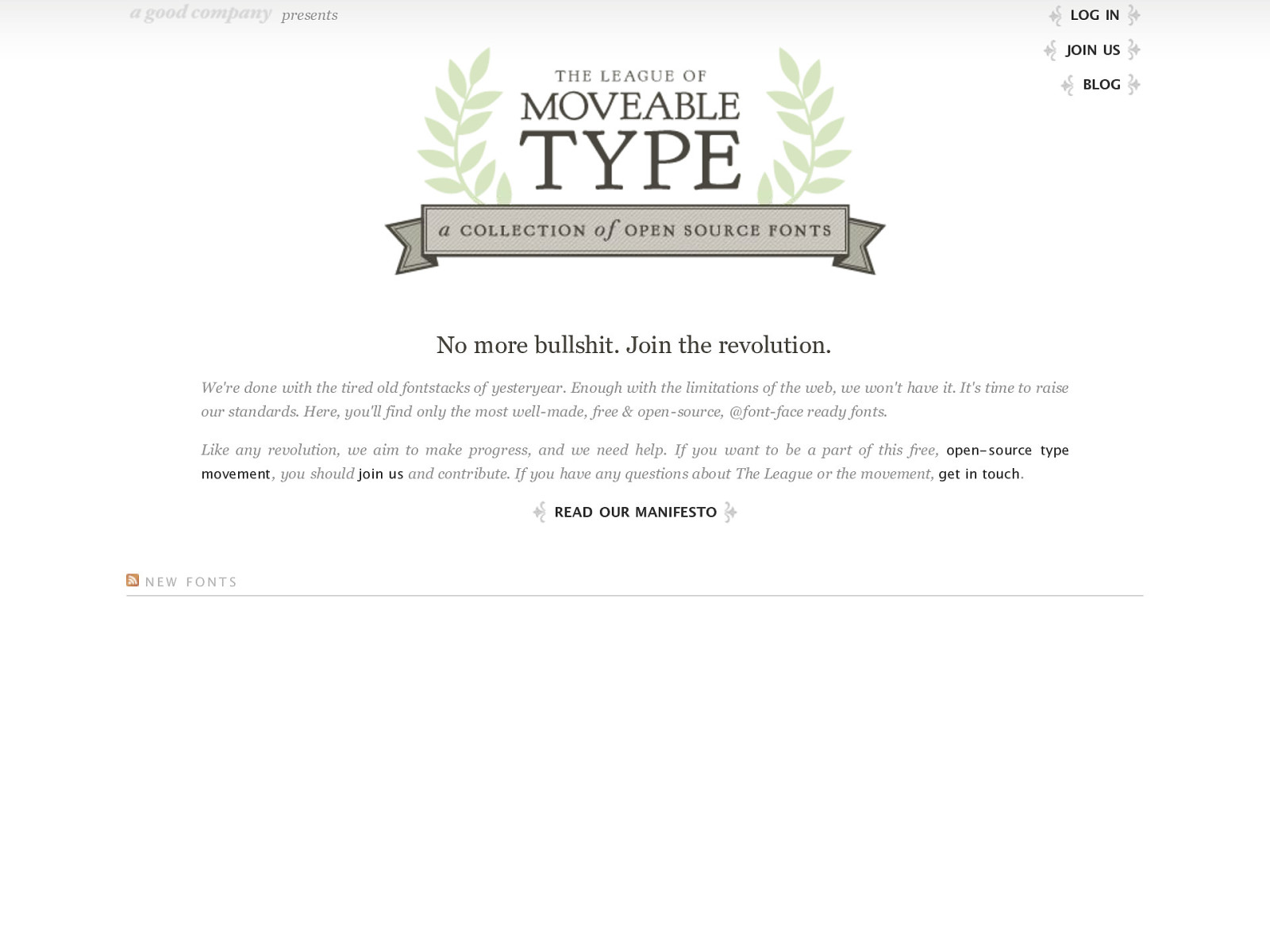
presents
No more bullshit. Join the revolution.
We're done with the tired old fontstacks of yesteryear. Enough with the limitations of the web, we won't have it. It's time to raise
our standards. Here, you'll find only the most well -made, free & open -source, @font-face ready fonts.
Like any revolution, we aim to make progress, and we need help. If you want to be a part of this free,
open- source type
movement
, you should
join us
and contribute. If you have any questions about The League or the movement,
get in touch
.
READ OUR MANIFESTO
NEW FONTS
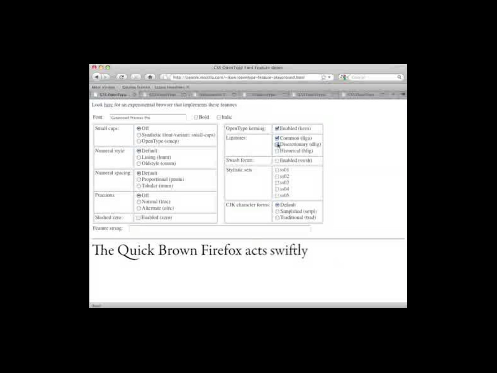
OpenType
Transitions
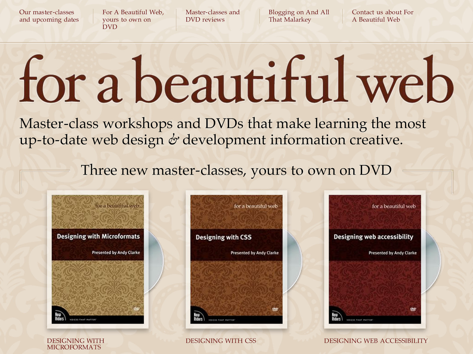
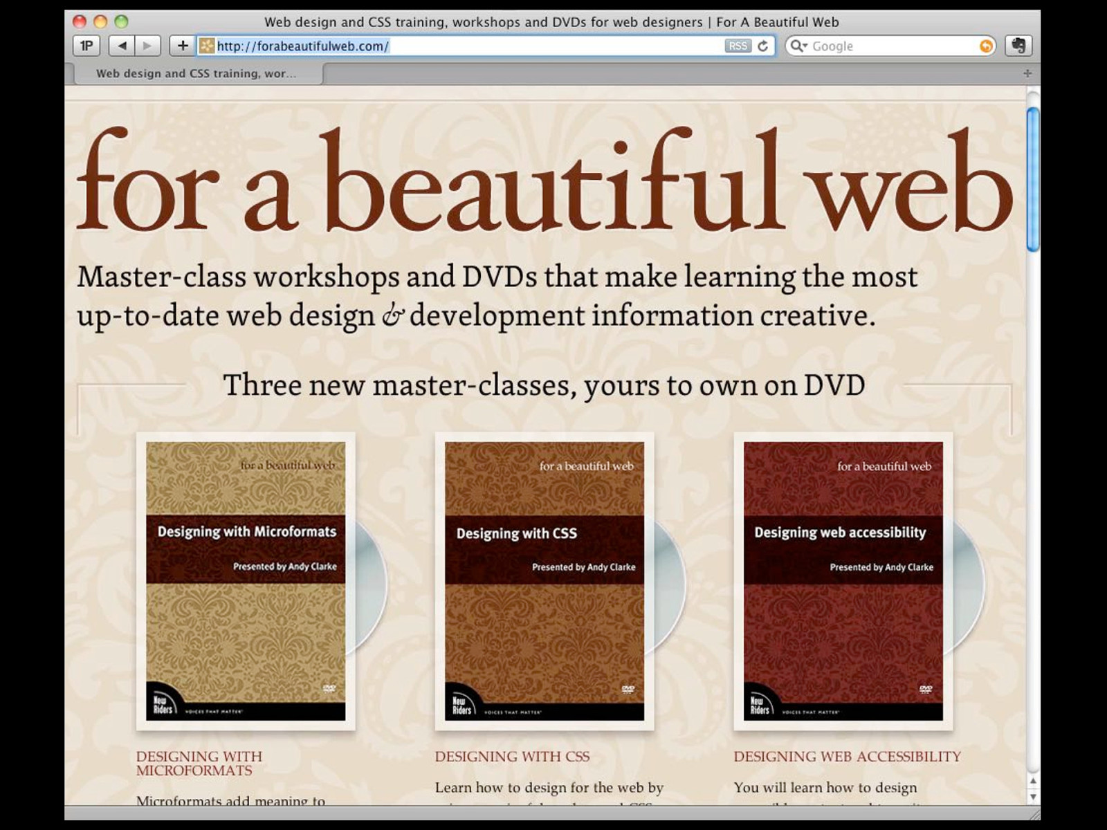
Our master -classes and upcoming dates For A Beautiful Web, yours to own on DVD Master-classes and DVD reviews Blogging on And All That Malarkey Contact us about For A Beautiful Web Master-class workshops and DVDs that make learning the most up-to-date web design & development information creative. Three new master-classes, yours to own on DVD DESIGNING WITH MICROFORMATS DESIGNING WITH CSS DESIGNING WEB ACCESSIBILITY
Danke Follow me: @yatil