Accessibility (& Multi-Screen Design) #COS20 Crash Course
A presentation at #cos20 by Eric Eggert
Accessibility Eric Eggert — Accessibility — #cos20
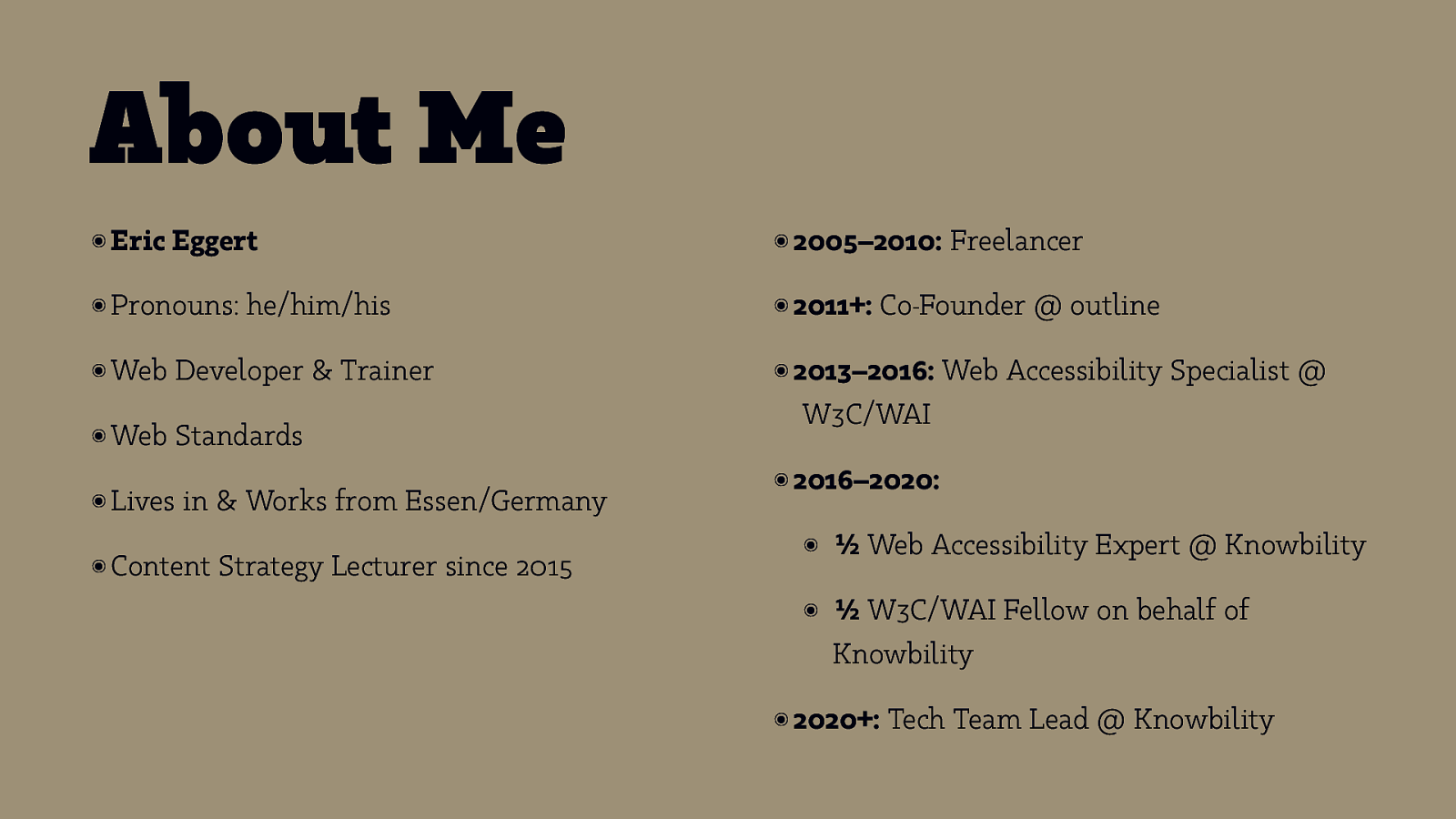
About Me ๏ Eric Eggert ๏ Pronouns: ๏ Web ๏ Web he/him/his Developer & Trainer Standards ๏ Lives in & Works from Essen/Germany ๏ Content Strategy Lecturer since 2015 ๏ 2005–2010: ๏ 2011+: Freelancer Co-Founder @ outline ๏ 2013–2016: Web Accessibility Specialist @ W3C/WAI ๏ 2016–2020: ๏ ½ Web Accessibility Expert @ Knowbility ๏ ½ W3C/WAI Fellow on behalf of Knowbility ๏ 2020+: Tech Team Lead @ Knowbility
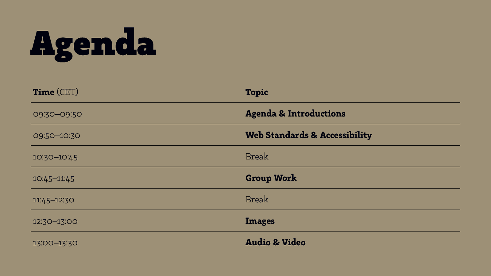
Agenda Time (CET) Topic 09:30–09:50 Agenda & Introductions 09:50–10:30 Web Standards & Accessibility 10:30–10:45 Break 10:45–11:45 Group Work 11:45–12:30 Break 12:30–13:00 Images 13:00–13:30 Audio & Video
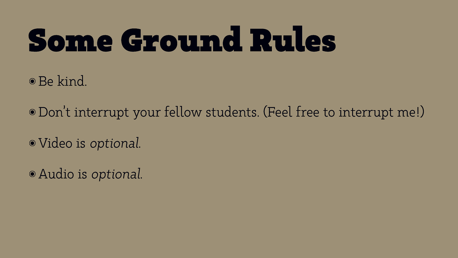
Some Ground Rules ๏ Be kind. ๏ Don’t interrupt your fellow students. (Feel free to interrupt me!) ๏ Video is optional. ๏ Audio is optional.
And who are you? Introduce yourself with: ๏ Your Name ๏ What ๏A you do when you’re not here fun fact about yourself or an object in the room you’re in
Web Standards
“The power of the Web is in its universality. Access by everyone regardless of disability is an essential aspect.” — Tim Berners-Lee, WWW Inventor
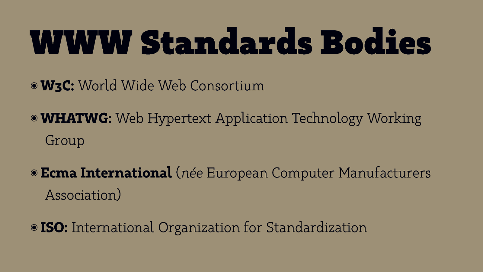
WWW Standards Bodies ๏ W3C: World Wide Web Consortium ๏ WHATWG: Web Hypertext Application Technology Working Group ๏ Ecma International (née European Computer Manufacturers Association) ๏ ISO: International Organization for Standardization

Technologies
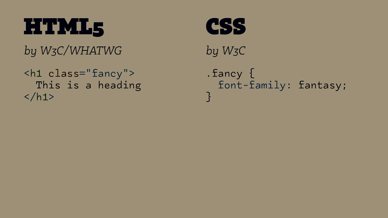
HTML5 CSS by W3C/WHATWG by W3C
<h1 class=”fancy”> This is a heading </h1> .fancy { font-family: fantasy; }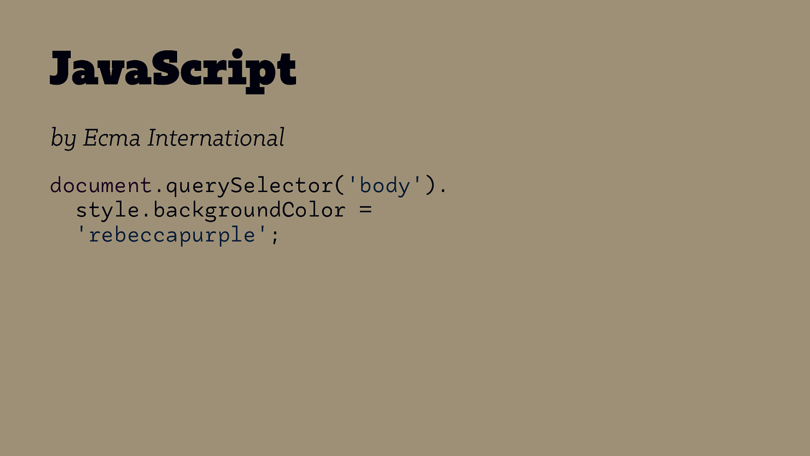
JavaScript by Ecma International document.querySelector(‘body’). style.backgroundColor = ‘rebeccapurple’;
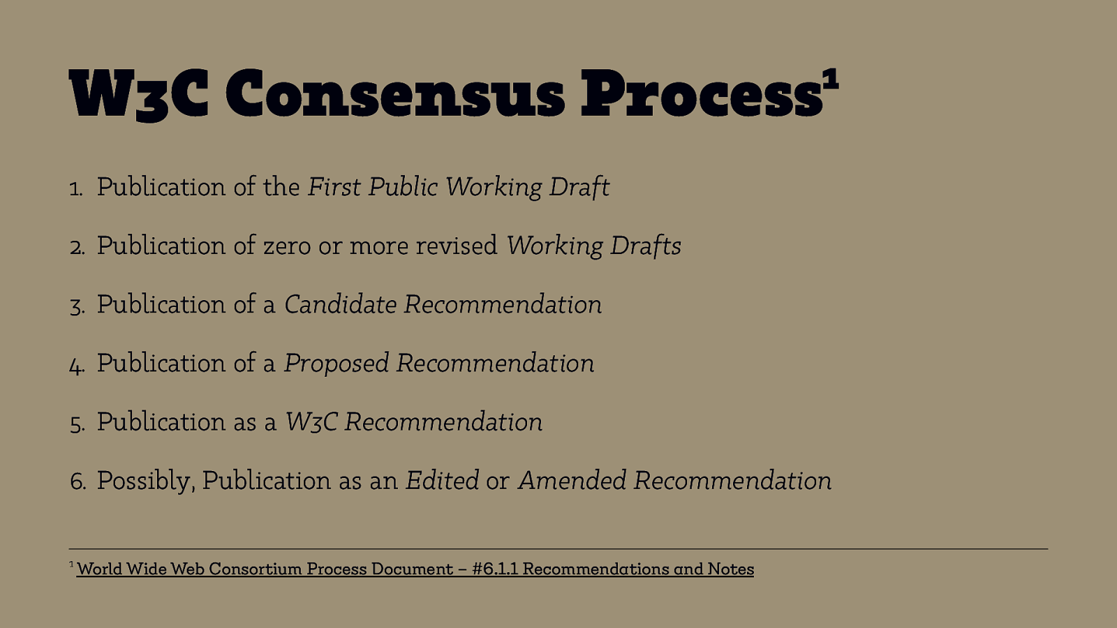
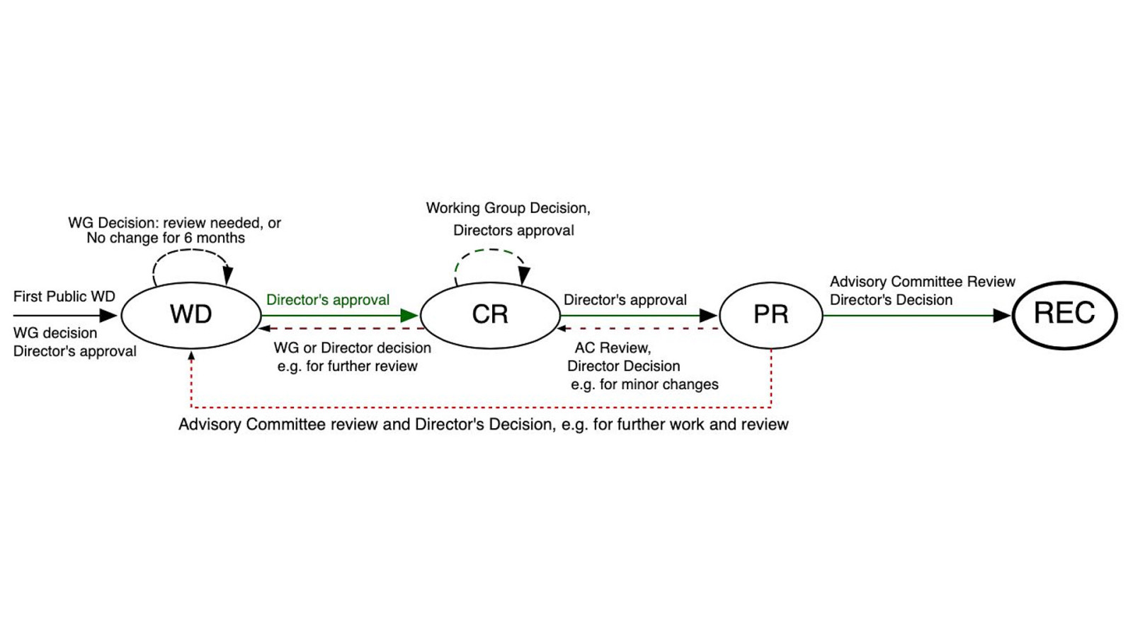
1 W3C Consensus Process 1. Publication of the First Public Working Draft 2. Publication of zero or more revised Working Drafts 3. Publication of a Candidate Recommendation 4. Publication of a Proposed Recommendation 5. Publication as a W3C Recommendation 6. Possibly, Publication as an Edited or Amended Recommendation 1 World Wide Web Consortium Process Document – #6.1.1 Recommendations and Notes
Accessibility

What is Accessibility? ๏ In German: „Barrierefreiheit“ ๏ People with Disabilities/Disabled People ๏ Access to content without obstacles ๏ Adapt the web to one’s needs ๏ Understand and interact with websites
Why Accessibility?
How many people with disabilities are on earth? Poll
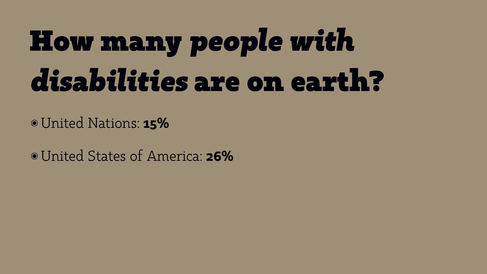
How many people with disabilities are on earth? ๏ United Nations: 15% ๏ United States of America: 26%
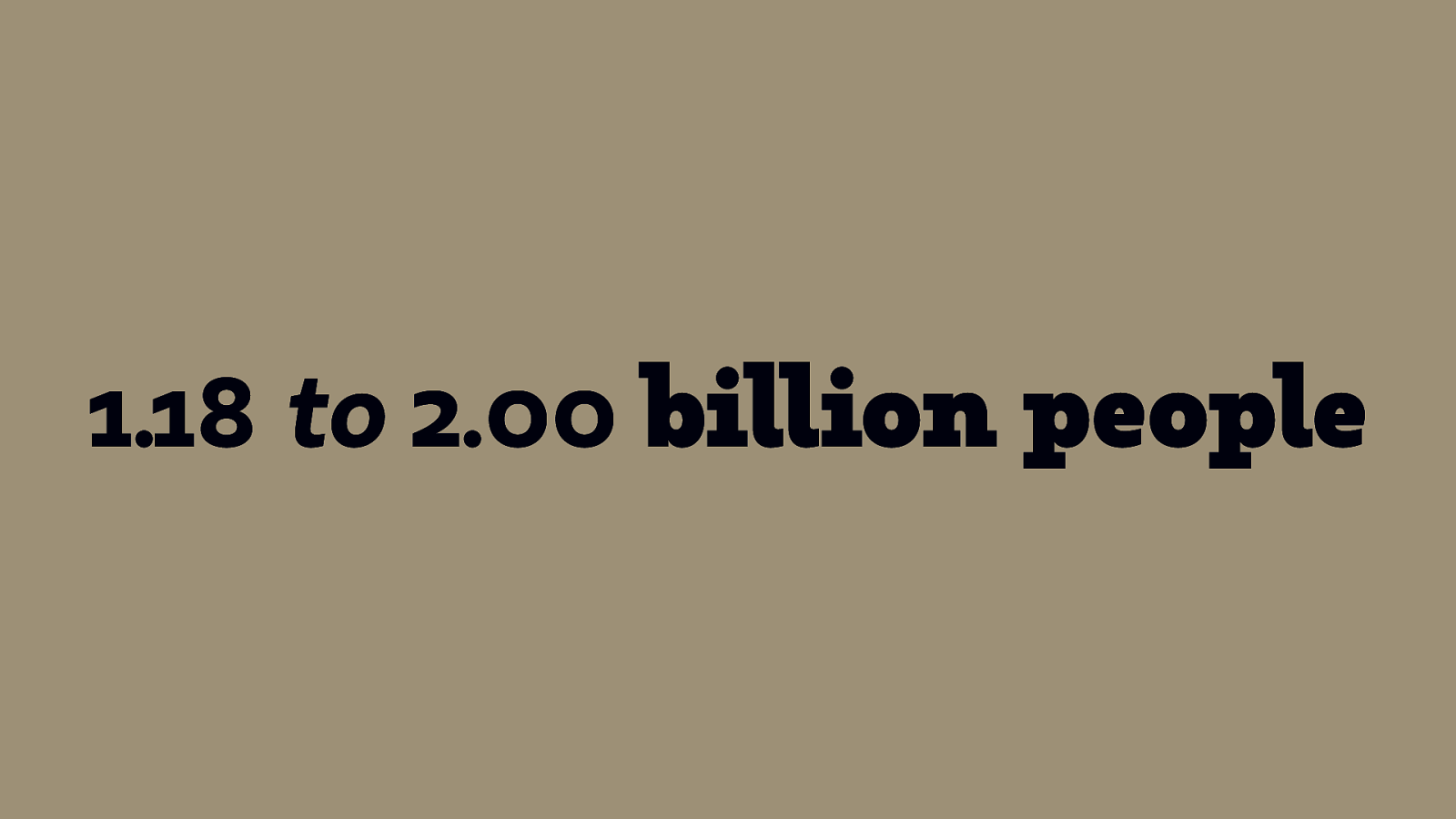
1.18 to 2.00 billion people
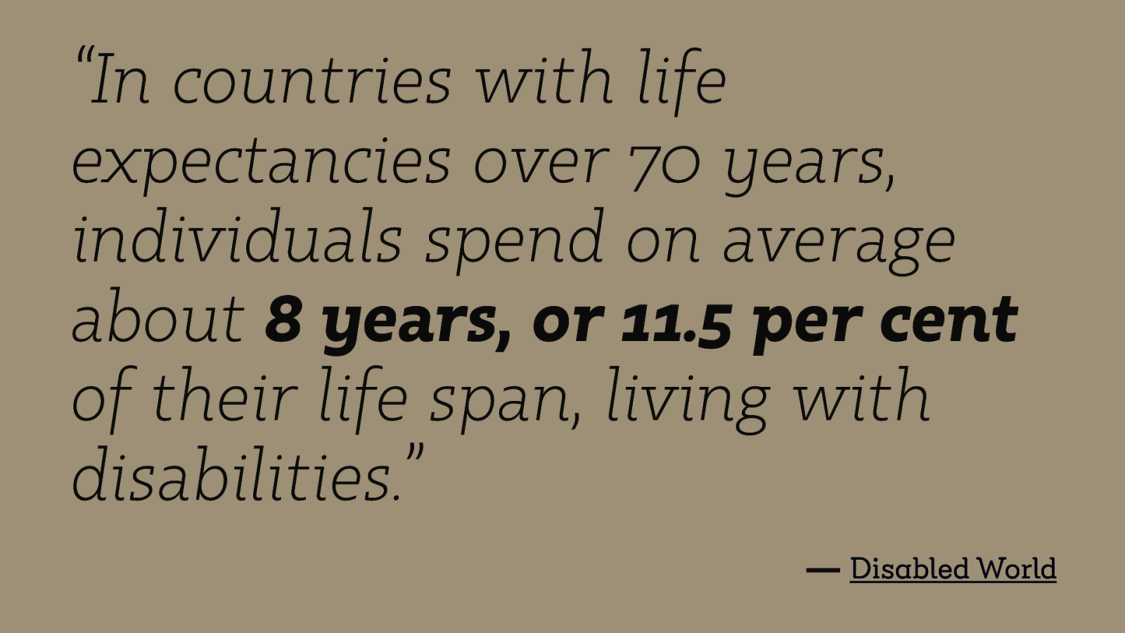
“In countries with life expectancies over 70 years, individuals spend on average about 8 years, or 11.5 per cent of their life span, living with disabilities.” — Disabled World
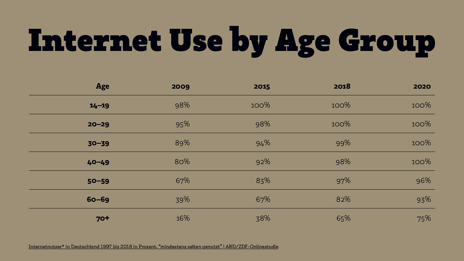
Internet Use by Age Group Age 2009 2015 2018 2020 14–19 98% 100% 100% 100% 20–29 95% 98% 100% 100% 30–39 89% 94% 99% 100% 40–49 80% 92% 98% 100% 50–59 67% 83% 97% 96% 60–69 39% 67% 82% 93% 70+ 16% 38% 65% 75% Internetnutzer* in Deutschland 1997 bis 2018 in Prozent, “mindestens selten genutzt” | ARD/ZDF-Onlinestudie
Make the web accessible for your future selves.
Convention on the Rights of Persons with Disabilities or: “CRPD”
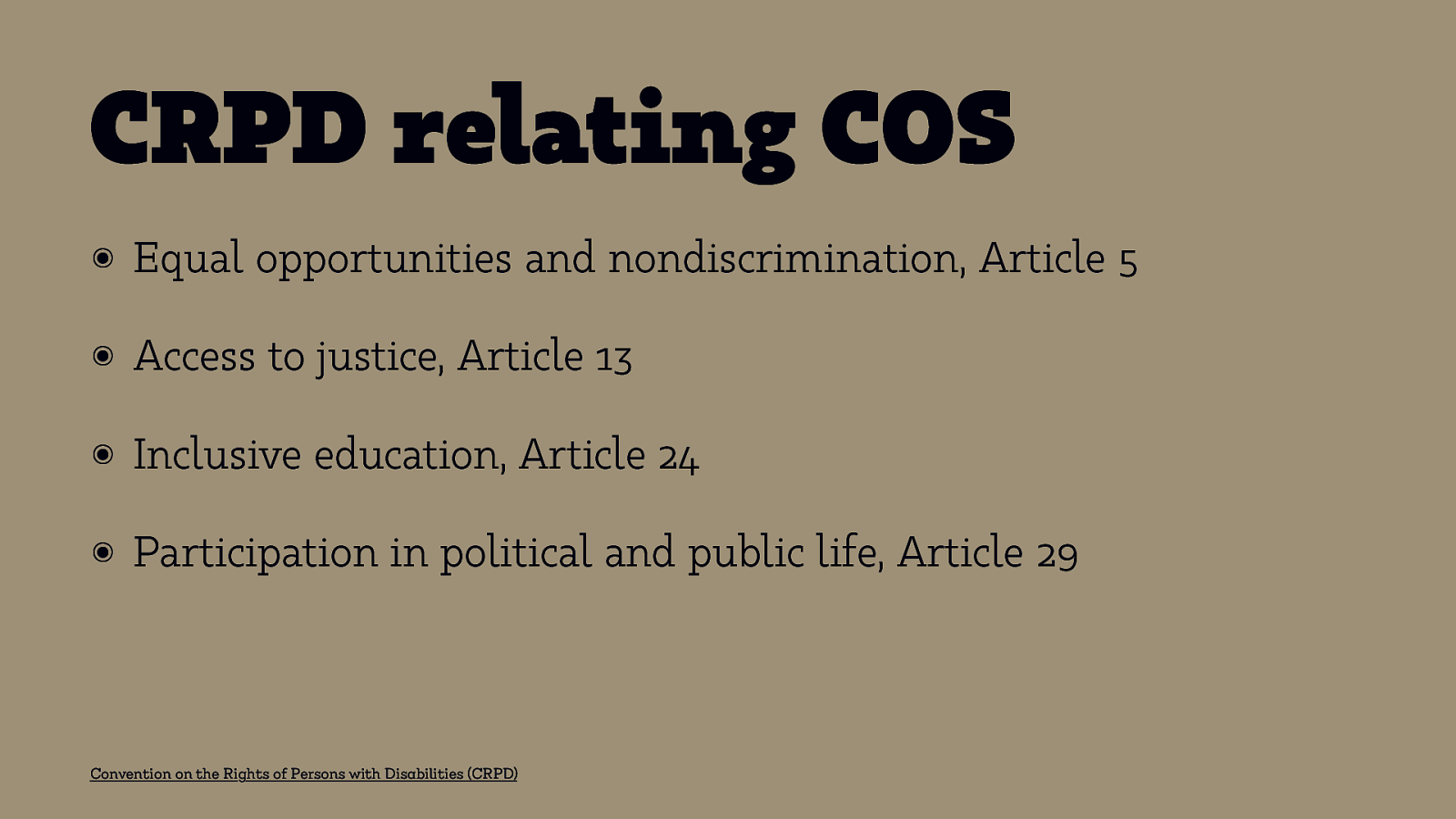
CRPD relating COS ๏ Equal opportunities and nondiscrimination, Article 5 ๏ Access to justice, Article 13 ๏ Inclusive education, Article 24 ๏ Participation in political and public life, Article 29 Convention on the Rights of Persons with Disabilities (CRPD)
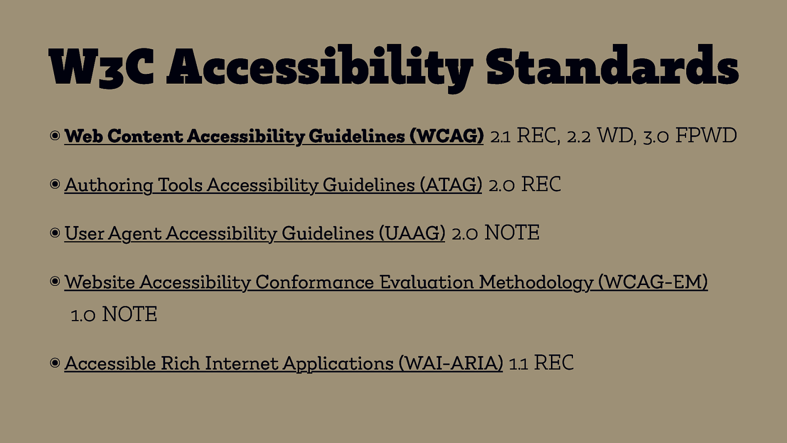
W3C Accessibility Standards ๏ Web Content Accessibility Guidelines (WCAG) 2.1 REC, 2.2 WD, 3.0 FPWD ๏ Authoring Tools Accessibility Guidelines (ATAG) 2.0 REC ๏ User Agent Accessibility Guidelines (UAAG) 2.0 NOTE ๏ Website Accessibility Conformance Evaluation Methodology (WCAG-EM) 1.0 NOTE ๏ Accessible Rich Internet Applications (WAI-ARIA) 1.1 REC
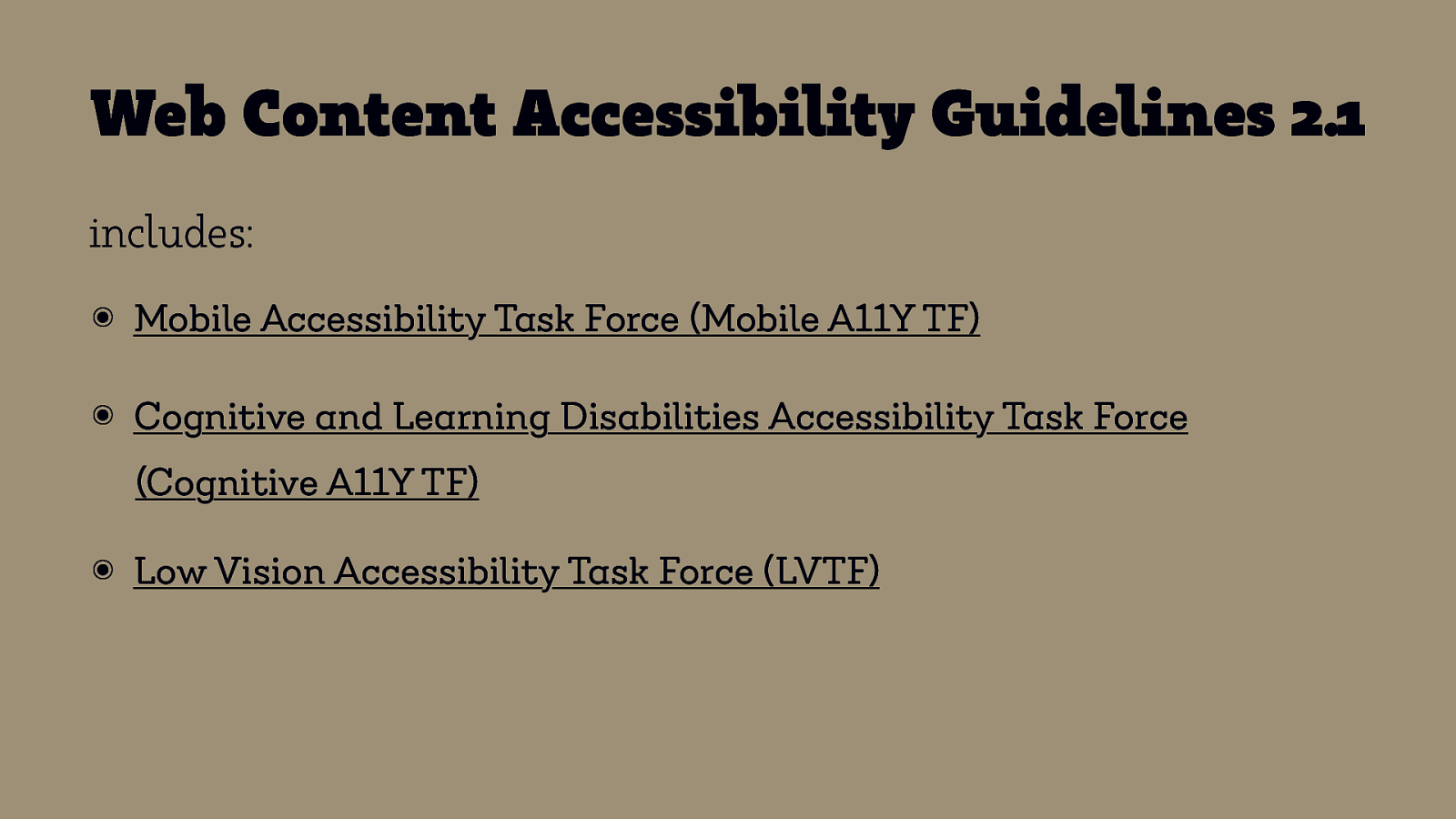
Web Content Accessibility Guidelines 2.1 includes: ๏ Mobile Accessibility Task Force (Mobile A11Y TF) ๏ Cognitive and Learning Disabilities Accessibility Task Force (Cognitive A11Y TF) ๏ Low Vision Accessibility Task Force (LVTF)
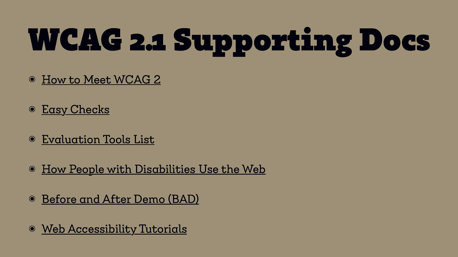
WCAG 2.1 Supporting Docs ๏ How to Meet WCAG 2 ๏ Easy Checks ๏ Evaluation Tools List ๏ How People with Disabilities Use the Web ๏ Before and After Demo (BAD) ๏ Web Accessibility Tutorials
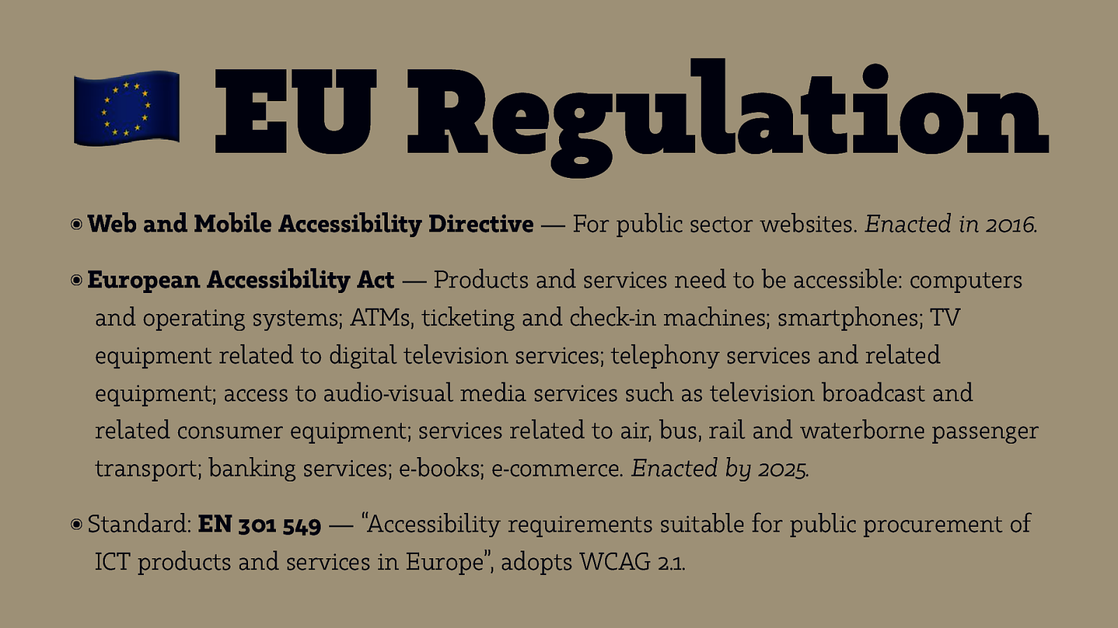
! EU Regulation ๏ Web and Mobile Accessibility Directive — For public sector websites. Enacted in 2016. ๏ European Accessibility Act — Products and services need to be accessible: computers and operating systems; ATMs, ticketing and check-in machines; smartphones; TV equipment related to digital television services; telephony services and related equipment; access to audio-visual media services such as television broadcast and related consumer equipment; services related to air, bus, rail and waterborne passenger transport; banking services; e-books; e-commerce. Enacted by 2025. ๏ Standard: EN 301 549 — “Accessibility requirements suitable for public procurement of ICT products and services in Europe”, adopts WCAG 2.1.
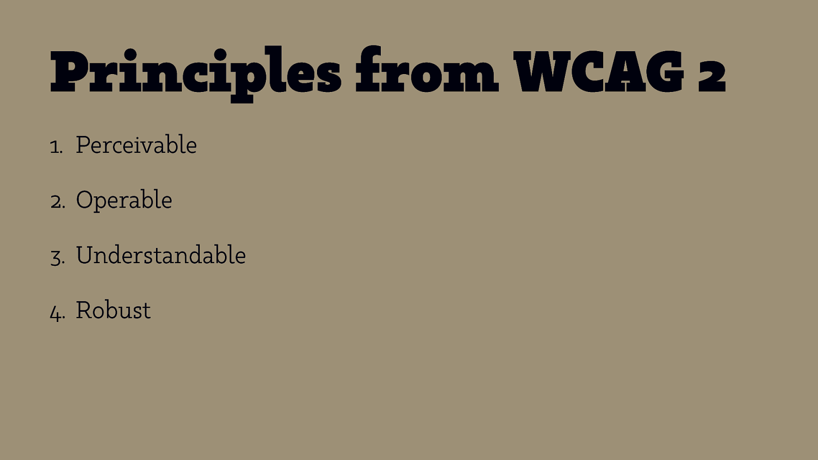
Principles from WCAG 2 1. Perceivable 2. Operable 3. Understandable 4. Robust
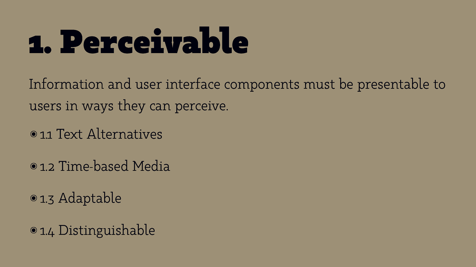
- Perceivable Information and user interface components must be presentable to users in ways they can perceive. ๏ 1.1 Text Alternatives ๏ 1.2 Time-based Media ๏ 1.3 Adaptable ๏ 1.4 Distinguishable
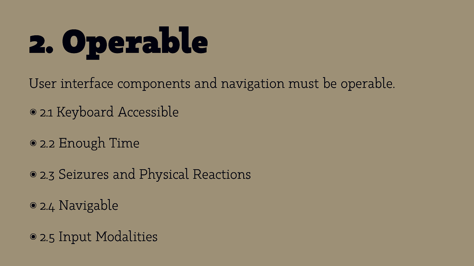
- Operable User interface components and navigation must be operable. ๏ 2.1 Keyboard Accessible ๏ 2.2 Enough Time ๏ 2.3 Seizures and Physical Reactions ๏ 2.4 Navigable ๏ 2.5 Input Modalities
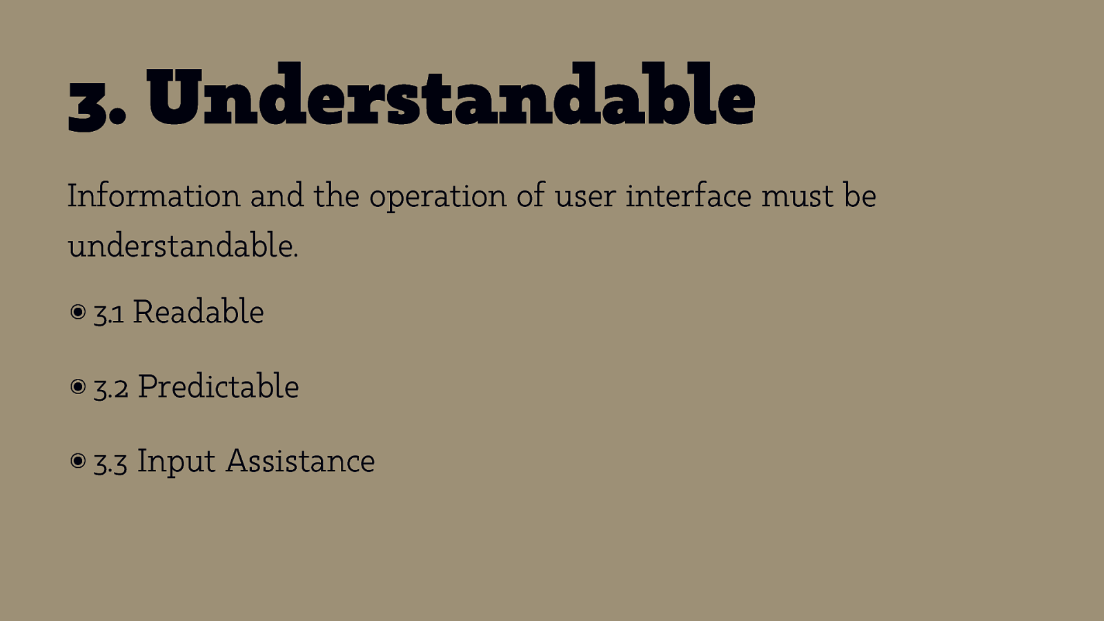
- Understandable Information and the operation of user interface must be understandable. ๏ 3.1 Readable ๏ 3.2 Predictable ๏ 3.3 Input Assistance
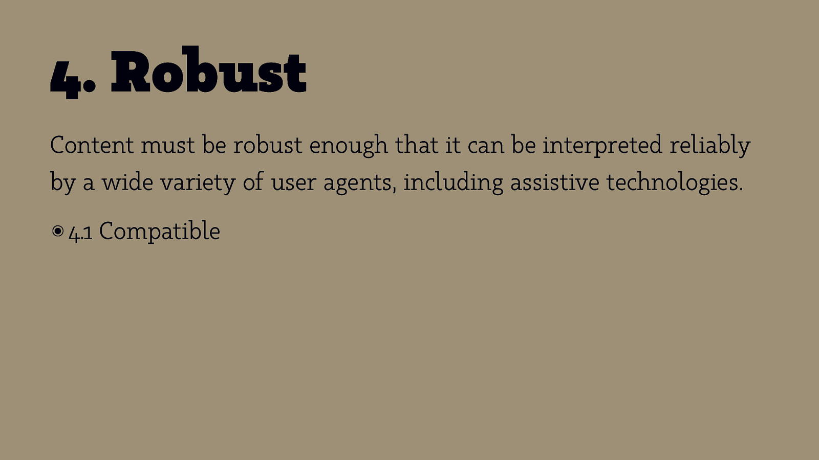
- Robust Content must be robust enough that it can be interpreted reliably by a wide variety of user agents, including assistive technologies. ๏ 4.1 Compatible
Principles & Guidelines: The Spirit of the Law
Success Criteria: The Letter of the Law
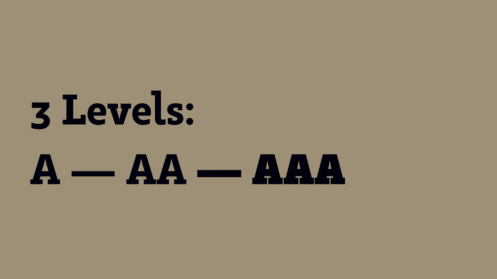
3 Levels: A — AA — AAA
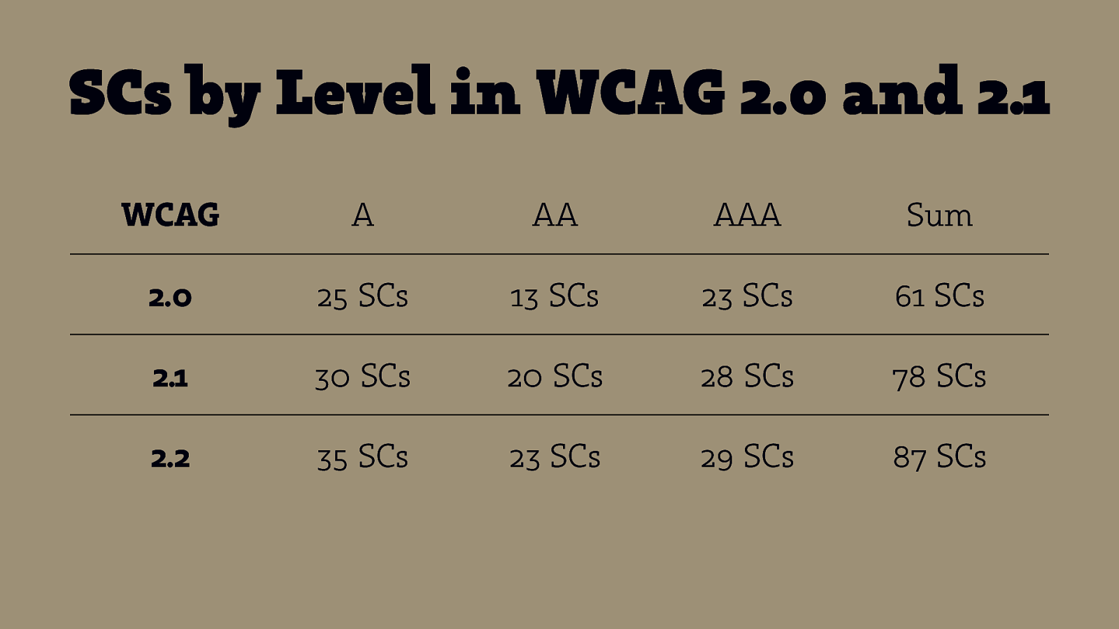
SCs by Level in WCAG 2.0 and 2.1 WCAG A AA AAA Sum 2.0 25 SCs 13 SCs 23 SCs 61 SCs 2.1 30 SCs 20 SCs 28 SCs 78 SCs 2.2 35 SCs 23 SCs 29 SCs 87 SCs
AA+
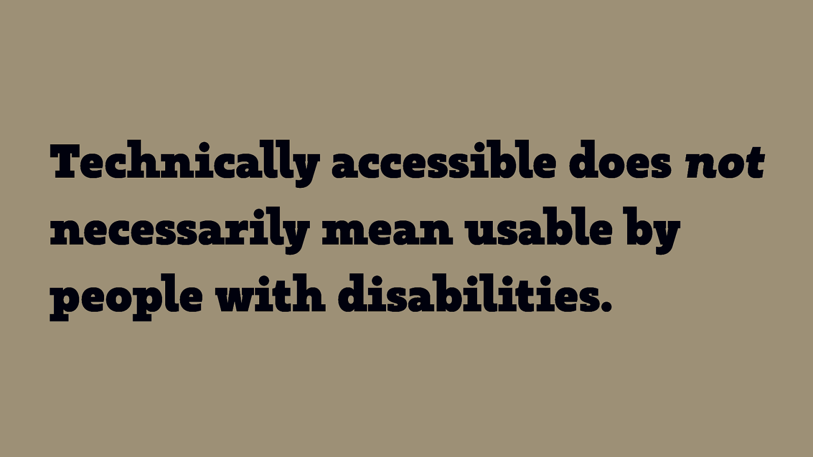
Technically accessible does not necessarily mean usable by people with disabilities.
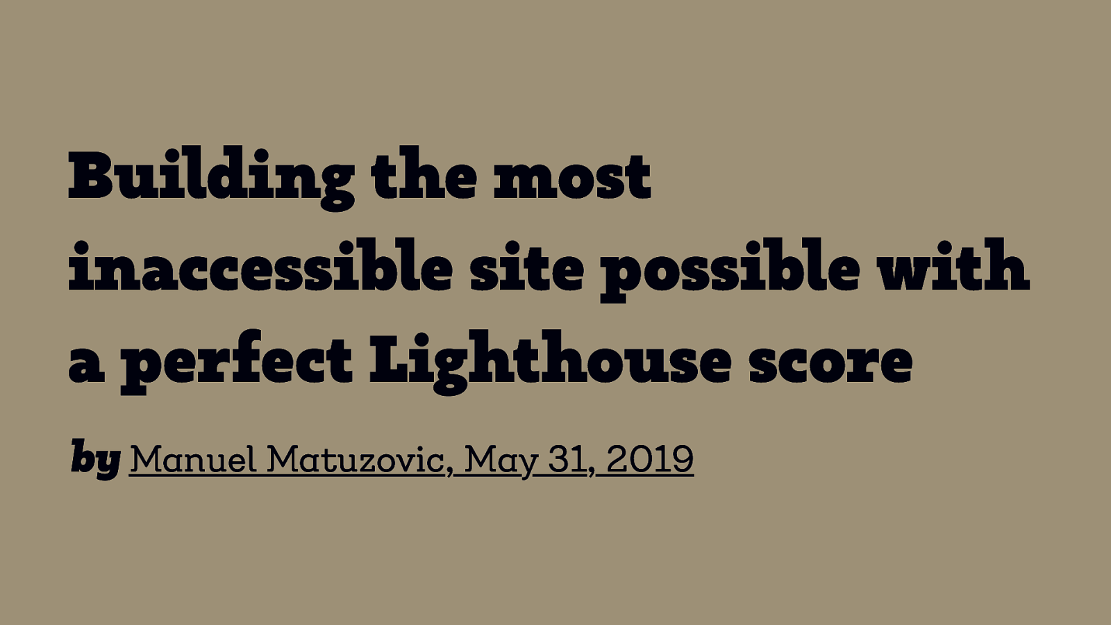
Building the most inaccessible site possible with a perfect Lighthouse score by Manuel Matuzovic, May 31, 2019

Break Back at 10:45!
Accessibility: Group Activity
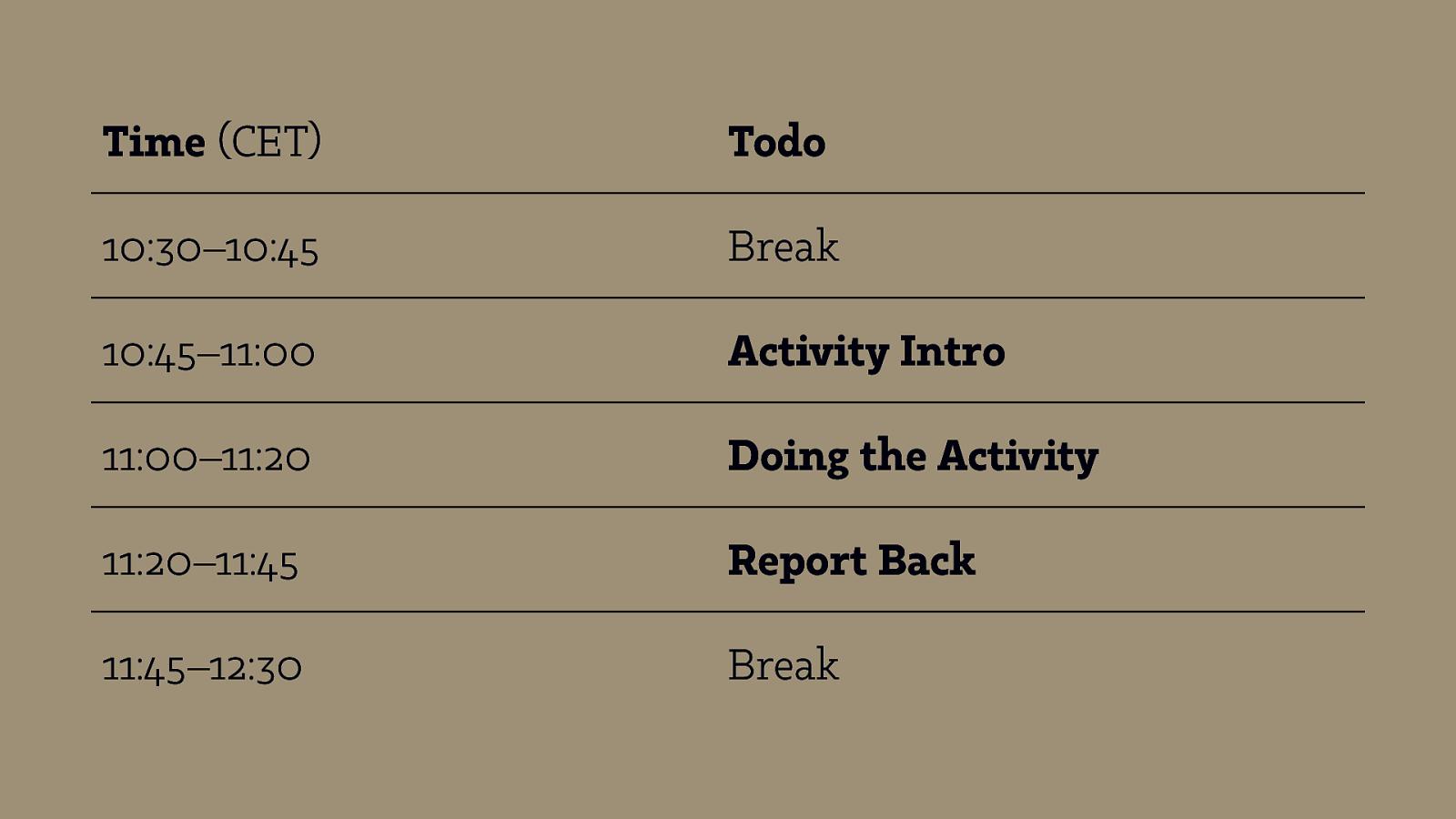
Time (CET) Todo 10:30–10:45 Break 10:45–11:00 Activity Intro 11:00–11:20 Doing the Activity 11:20–11:45 Report Back 11:45–12:30 Break
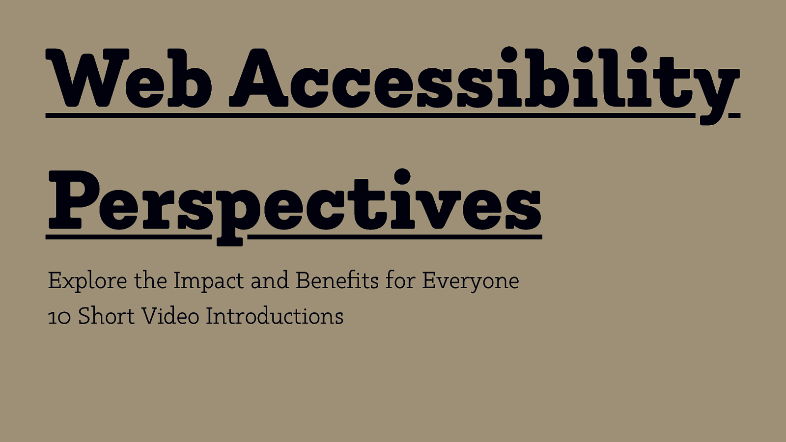
Web Accessibility Perspectives Explore the Impact and Benefits for Everyone 10 Short Video Introductions
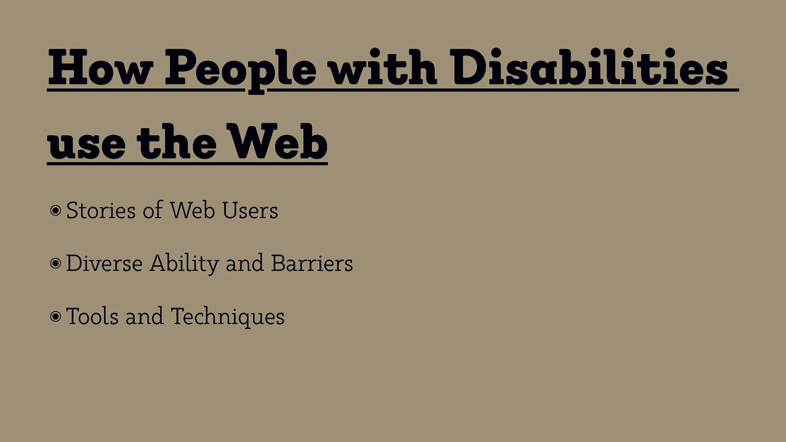
How People with Disabilities use the Web ๏ Stories of Web Users ๏ Diverse ๏ Tools Ability and Barriers and Techniques

Activity!
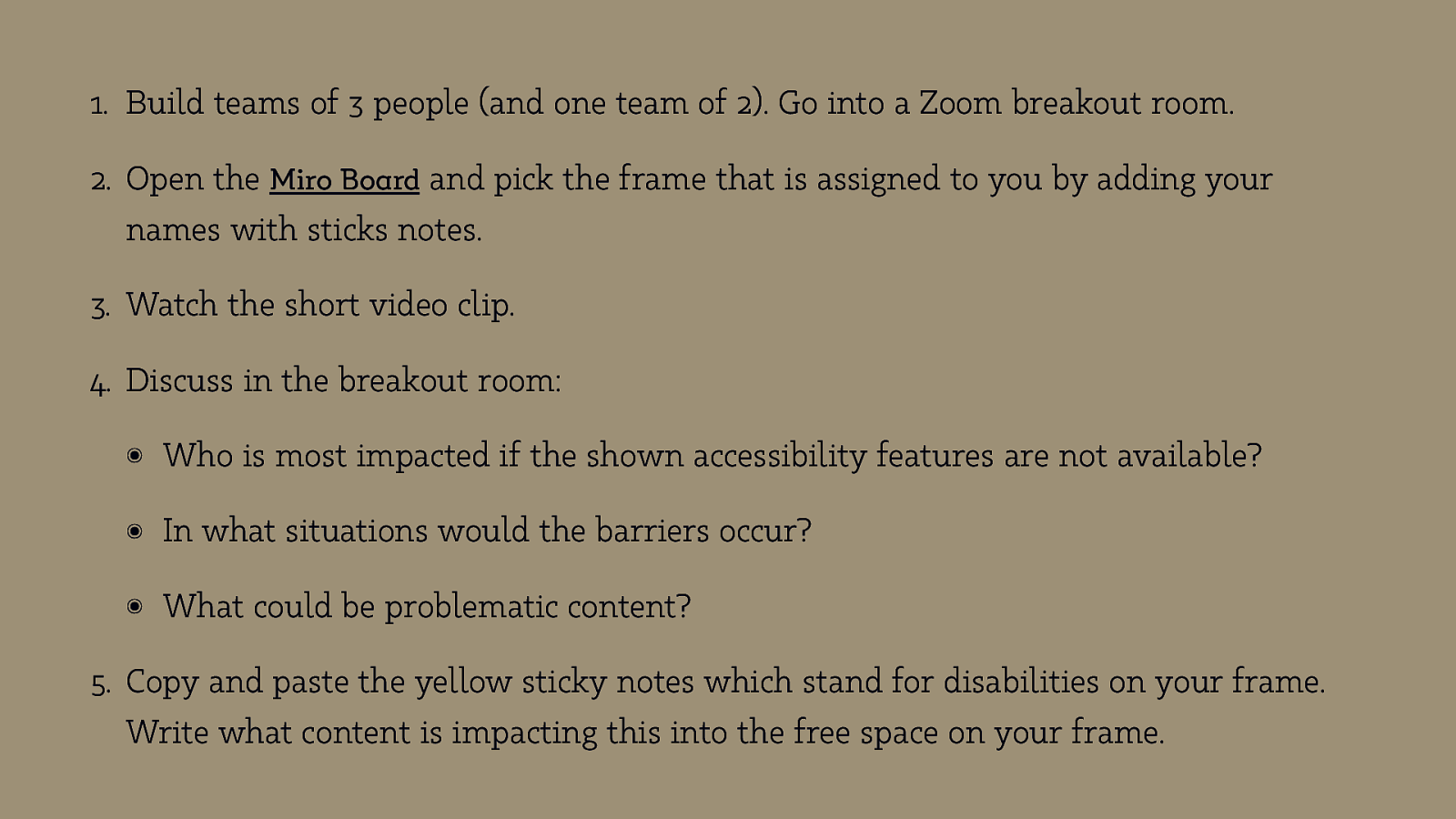
- Build teams of 3 people (and one team of 2). Go into a Zoom breakout room. 2. Open the Miro Board and pick the frame that is assigned to you by adding your names with sticks notes. 3. Watch the short video clip. 4. Discuss in the breakout room: ๏ Who is most impacted if the shown accessibility features are not available? ๏ In what situations would the barriers occur? ๏ What could be problematic content?
- Copy and paste the yellow sticky notes which stand for disabilities on your frame. Write what content is impacting this into the free space on your frame.
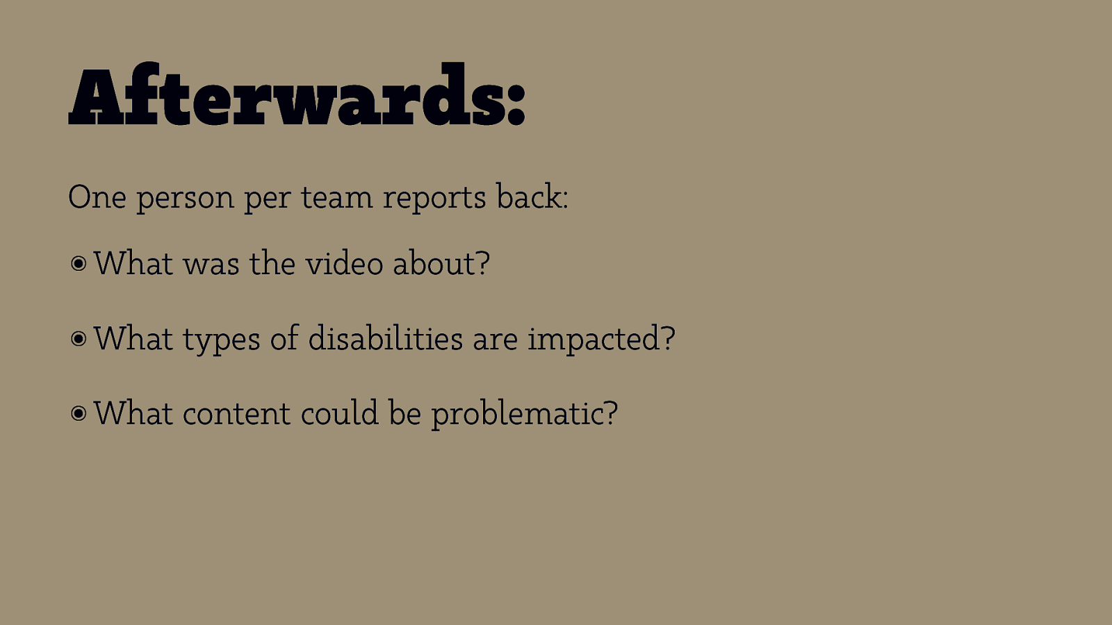
Afterwards: One person per team reports back: ๏ What was the video about? ๏ What types of disabilities are impacted? ๏ What content could be problematic?
Activity away! Until 11:20.
Break Back at 12:30!
Images Accessibility & Multi-Screen Design Eric Eggert — Accessibility & Multi-Screen Design — #cos20
Overview ๏ The img element ๏ alt attribute ๏ srcset attribute for Display Density ๏ srcset attribute for Width Descriptions ๏ sizes attribute ๏ The ๏ picture element type attribute
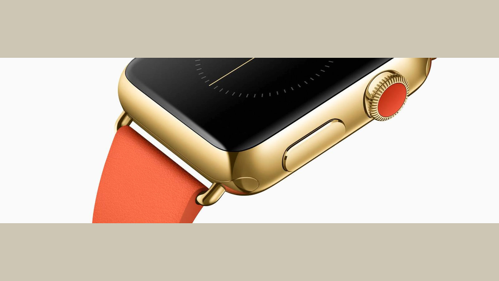
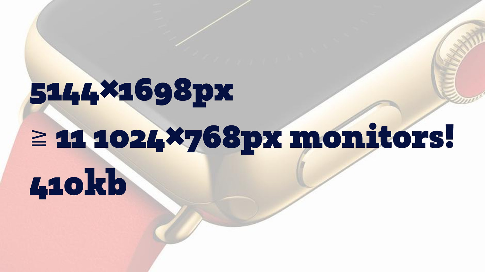
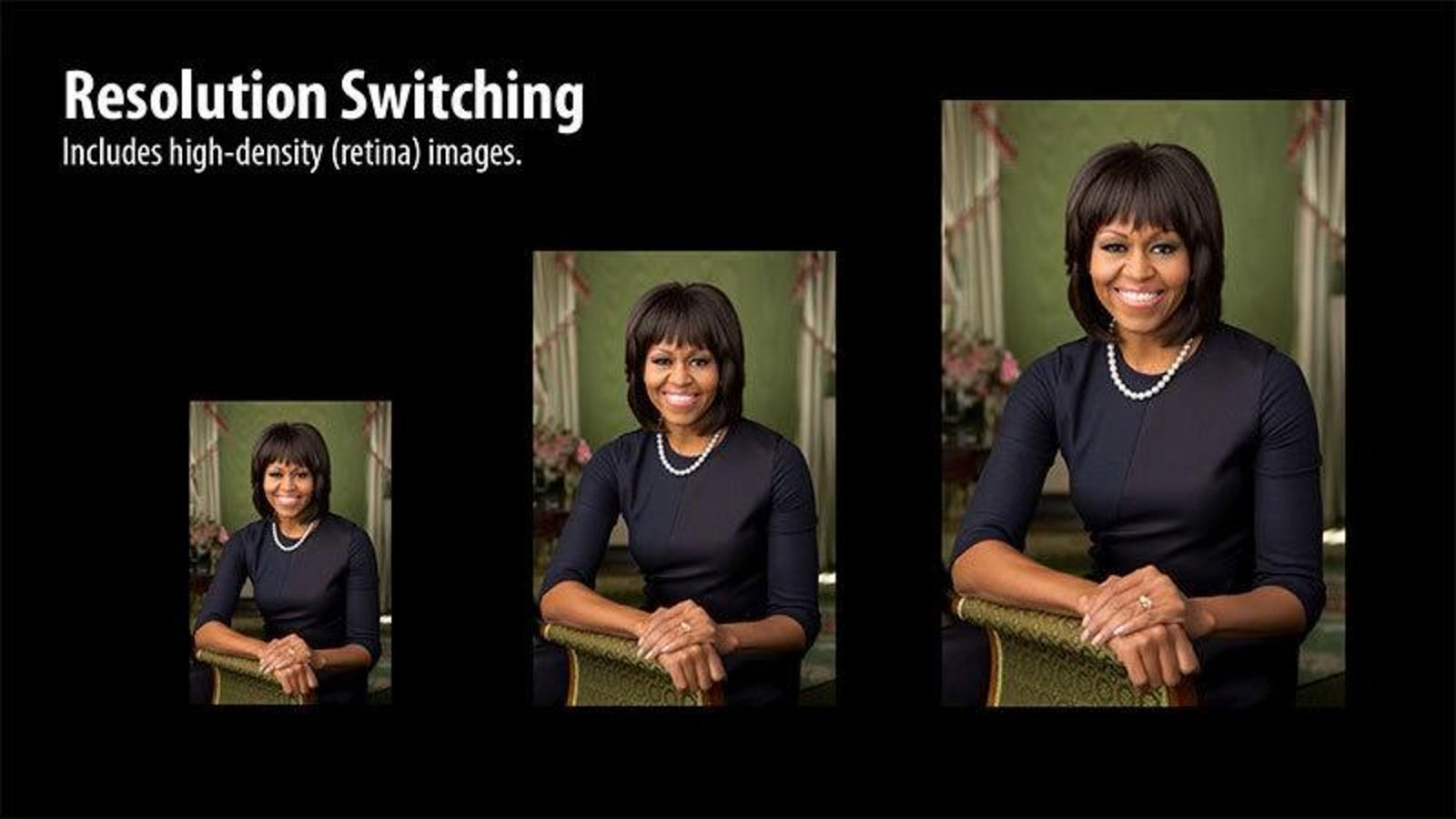
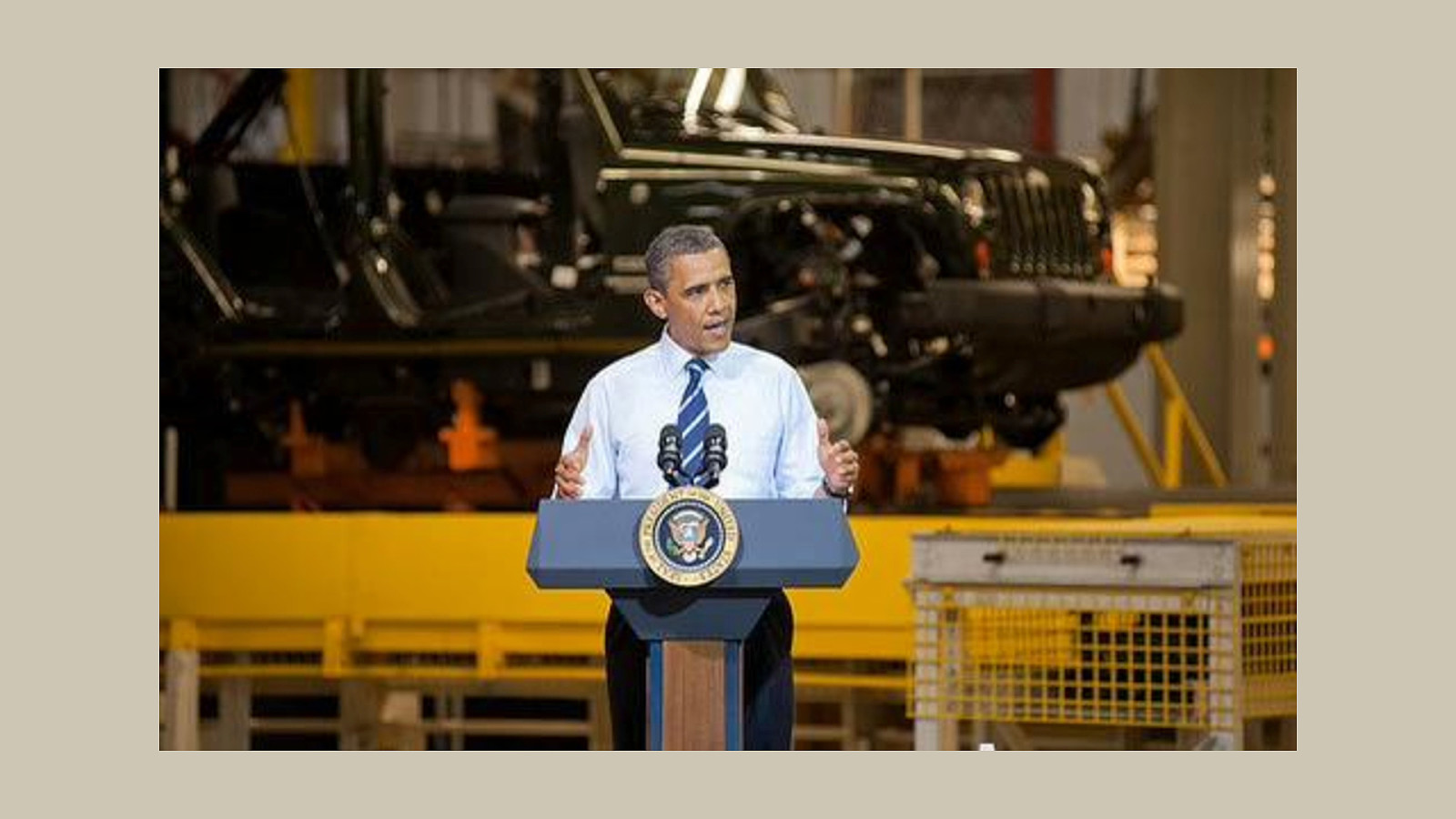
5144×1698px ≧ 11 1024×768px monitors! 410kb
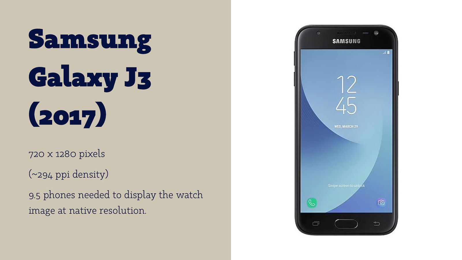
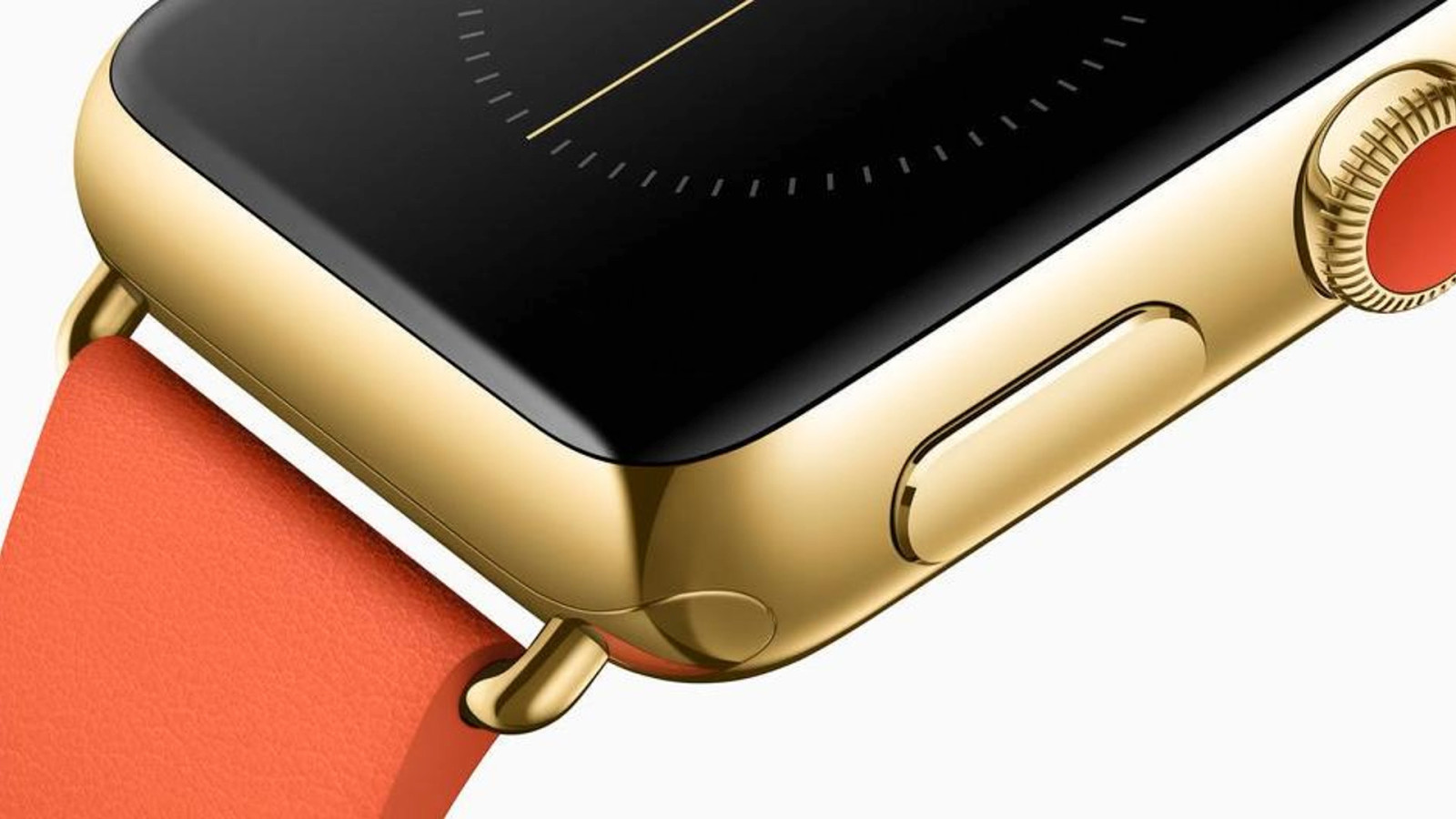
Samsung Galaxy J3 (2017) 720 x 1280 pixels (~294 ppi density) 9.5 phones needed to display the watch image at native resolution.
Two Main Use Cases for Responsive Images (More defined by RICG.)
- Switch Resolution & Density

- Art Direction
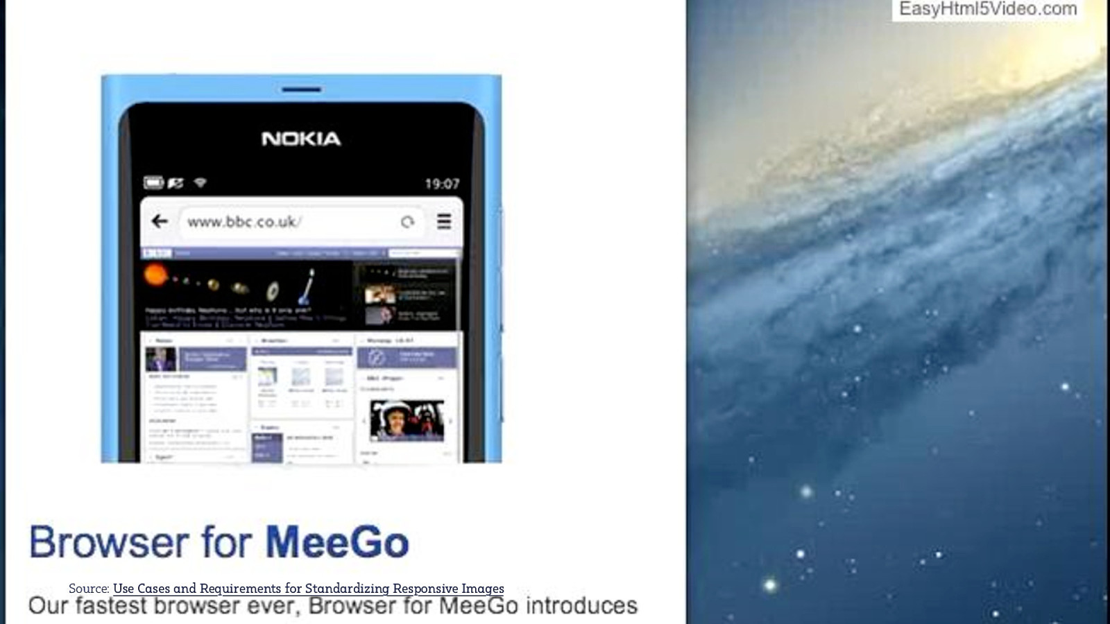
Source: Use Cases and Requirements for Standardizing Responsive Images
The img element
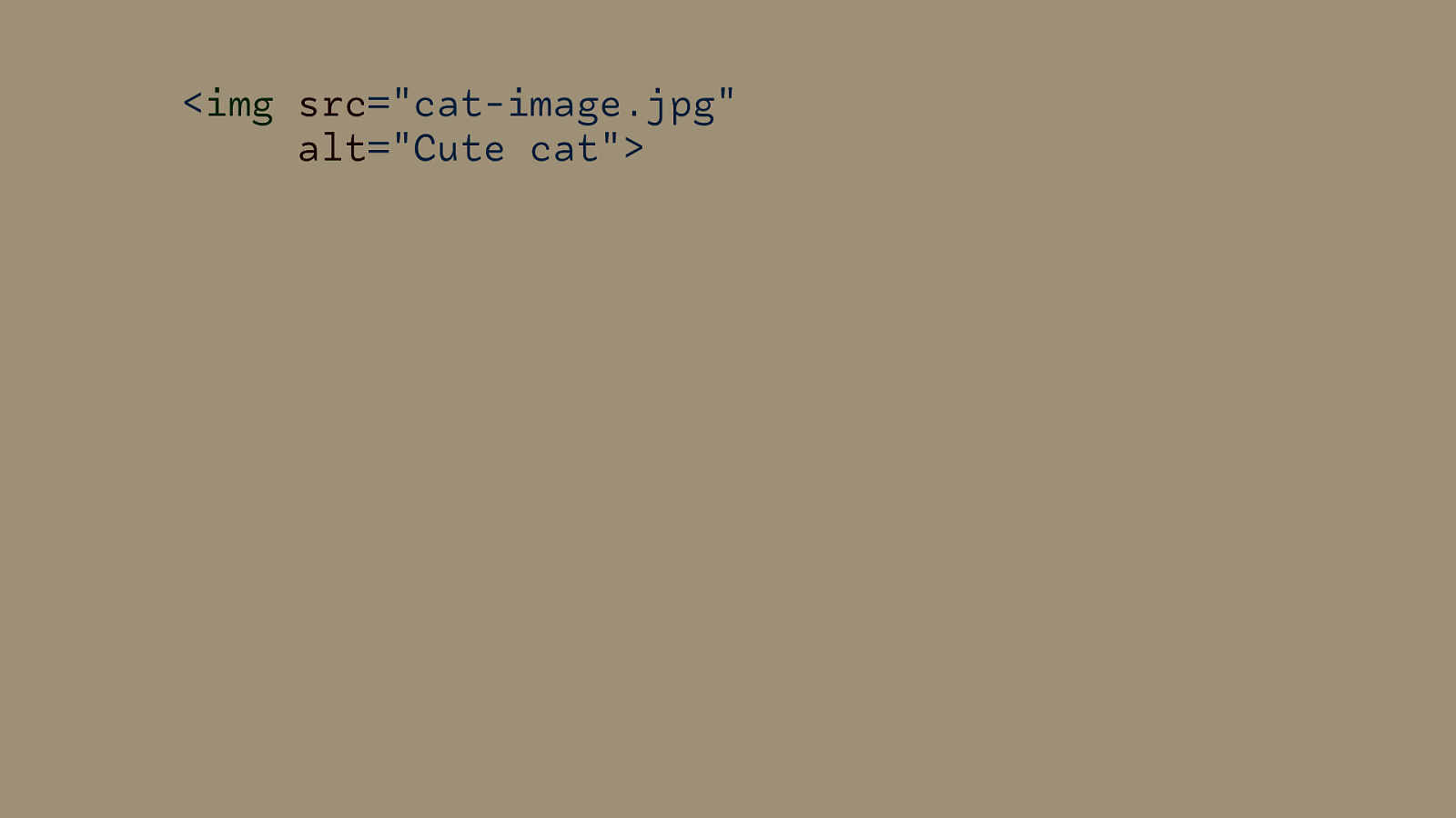
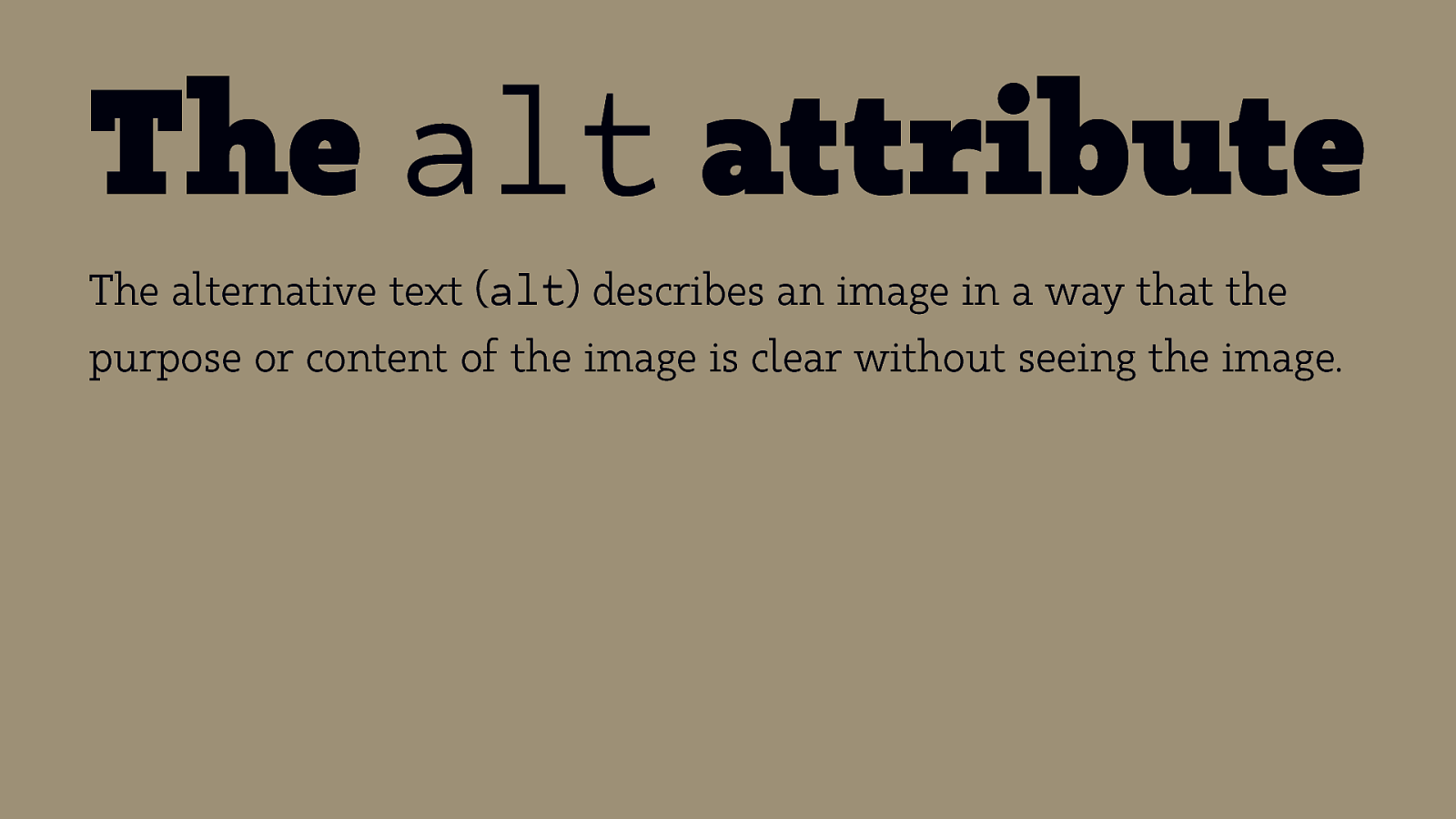
The alt attribute The alternative text (alt) describes an image in a way that the purpose or content of the image is clear without seeing the image.

WAI Images Tutorial
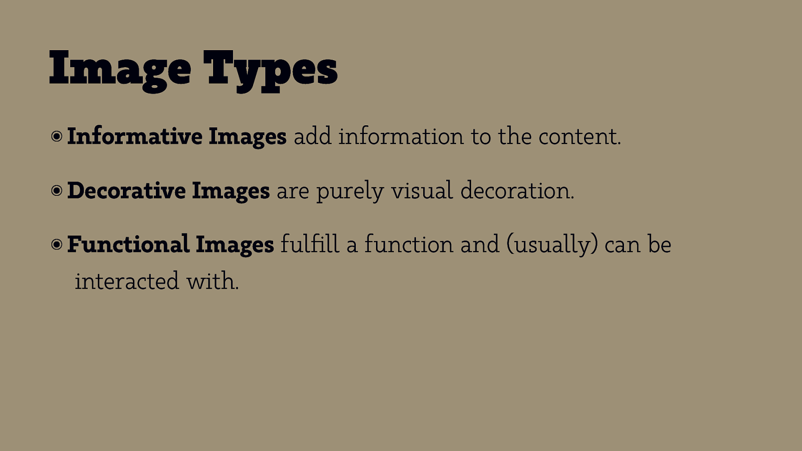
Image Types ๏ Informative Images add information to the content. ๏ Decorative Images are purely visual decoration. ๏ Functional Images fulfill a function and (usually) can be interacted with.
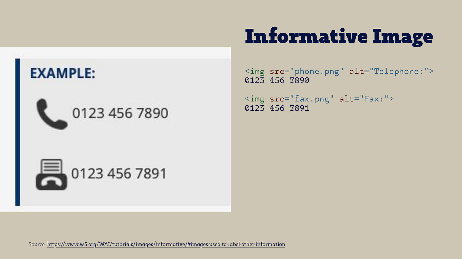
Informative Image <img src=”phone.png” alt=”Telephone:”> 0123 456 7890 <img src=”fax.png” alt=”Fax:”> 0123 456 7891 Source: https://www.w3.org/WAI/tutorials/images/informative/#images-used-to-label-other-information
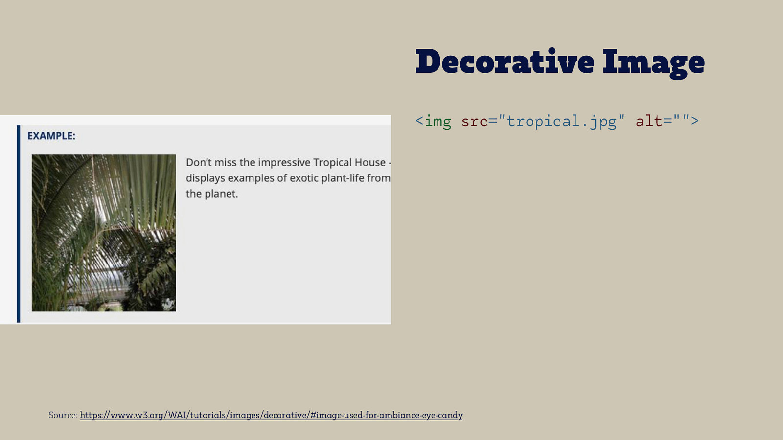
Decorative Image <img src=”tropical.jpg” alt=”“> Source: https://www.w3.org/WAI/tutorials/images/decorative/#image-used-for-ambiance-eye-candy
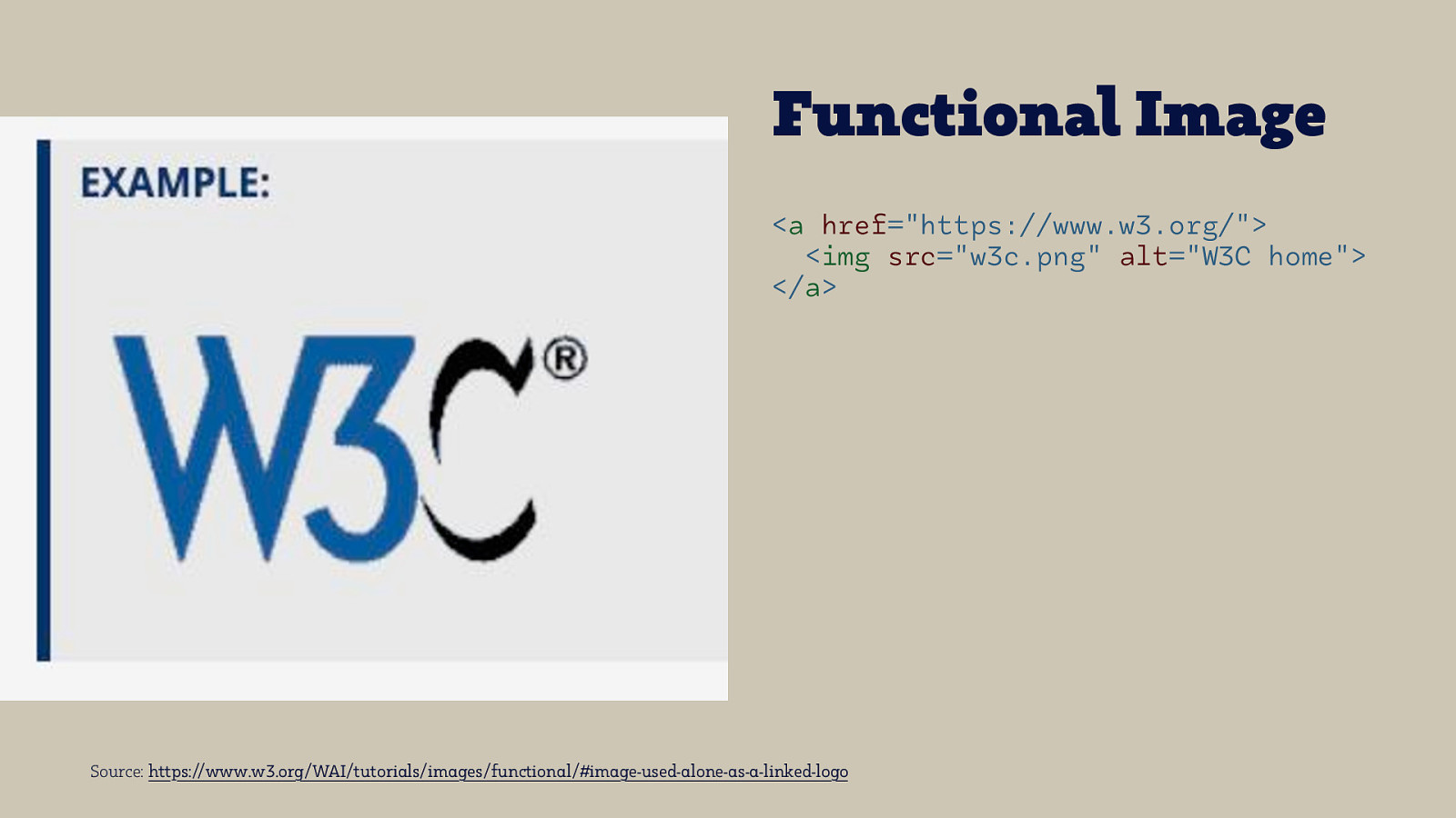
Functional Image <a href=”https://www.w3.org/”> <img src=”w3c.png” alt=”W3C home”> </a> Source: https://www.w3.org/WAI/tutorials/images/functional/#image-used-alone-as-a-linked-logo
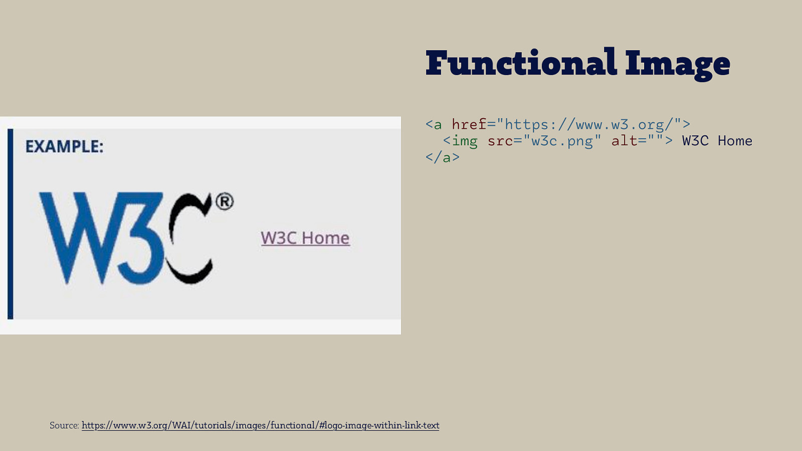
Functional Image <a href=”https://www.w3.org/”> <img src=”w3c.png” alt=”“> W3C Home </a> Source: https://www.w3.org/WAI/tutorials/images/functional/#logo-image-within-link-text
Responsive Images Everything starts with an img element

When is it just a simple img element? ๏A fixed width, single density web page ๏ Small differences in file size ๏ Using vector-based images like SVG

High Density Images Image Source: Pixel Density Explained

srcset
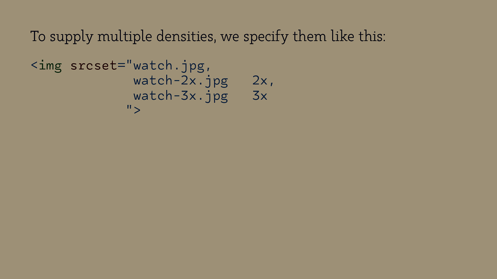
To supply multiple densities, we specify them like this: <img srcset=”watch.jpg, watch-2x.jpg watch-3x.jpg “> 2x, 3x
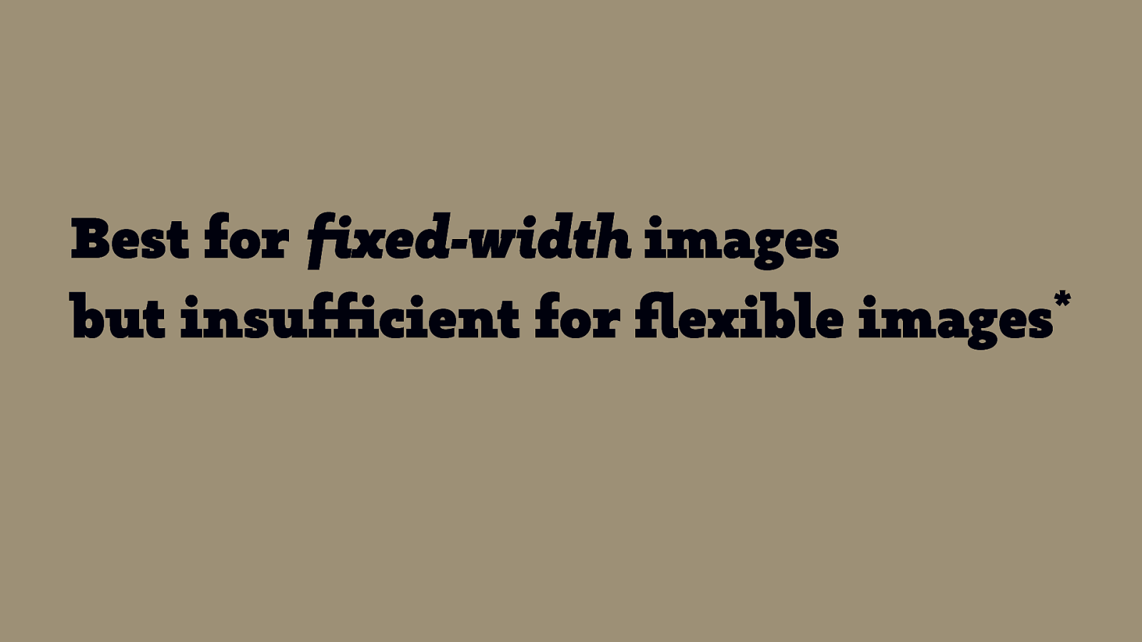
Best for fixed-width images * but insufficient for flexible images * Flexible images are a core principle of Responsive Web Design.
srcset width descriptors
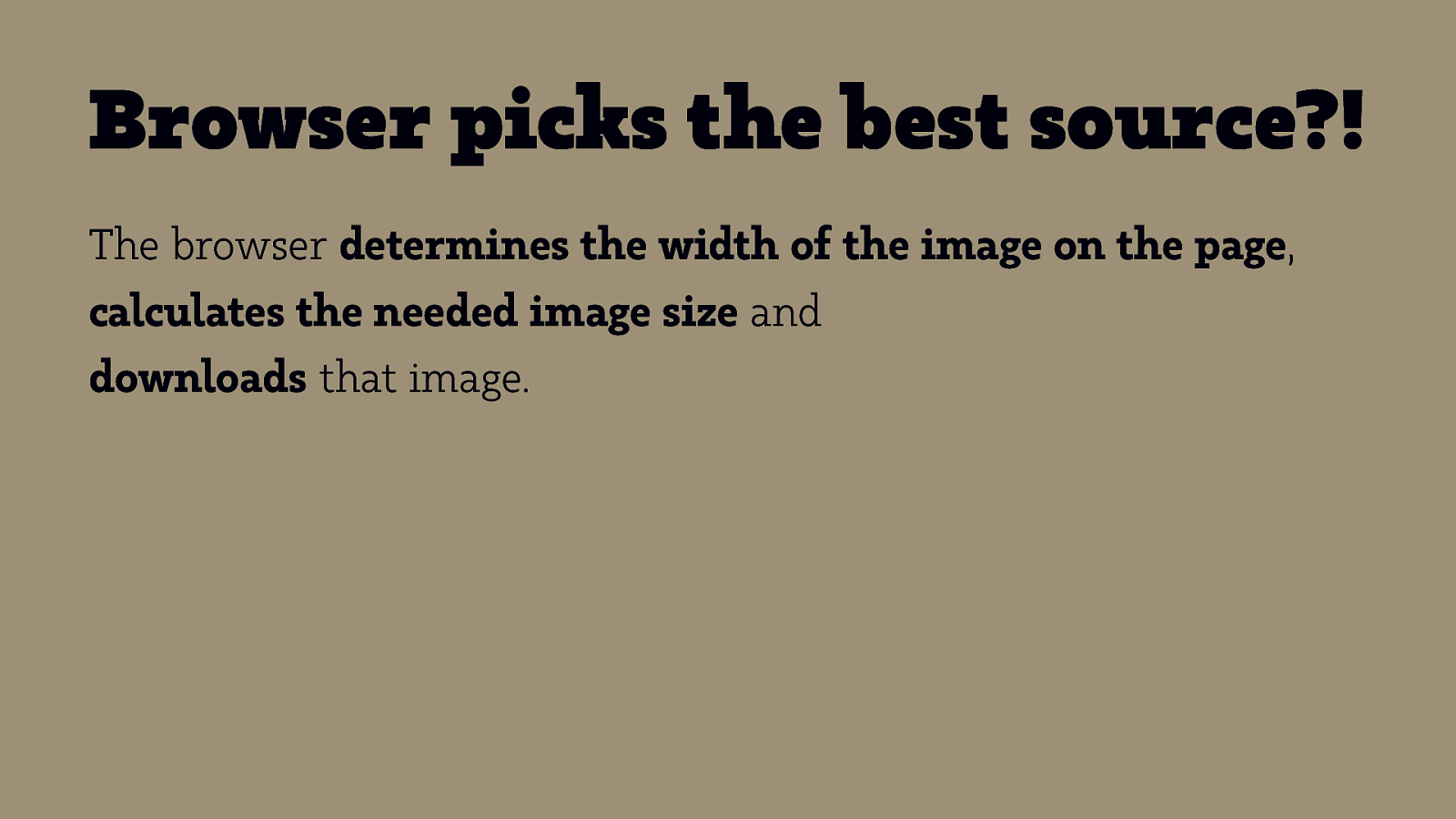
Browser picks the best source?! The browser determines the width of the image on the page, calculates the needed image size and downloads that image.
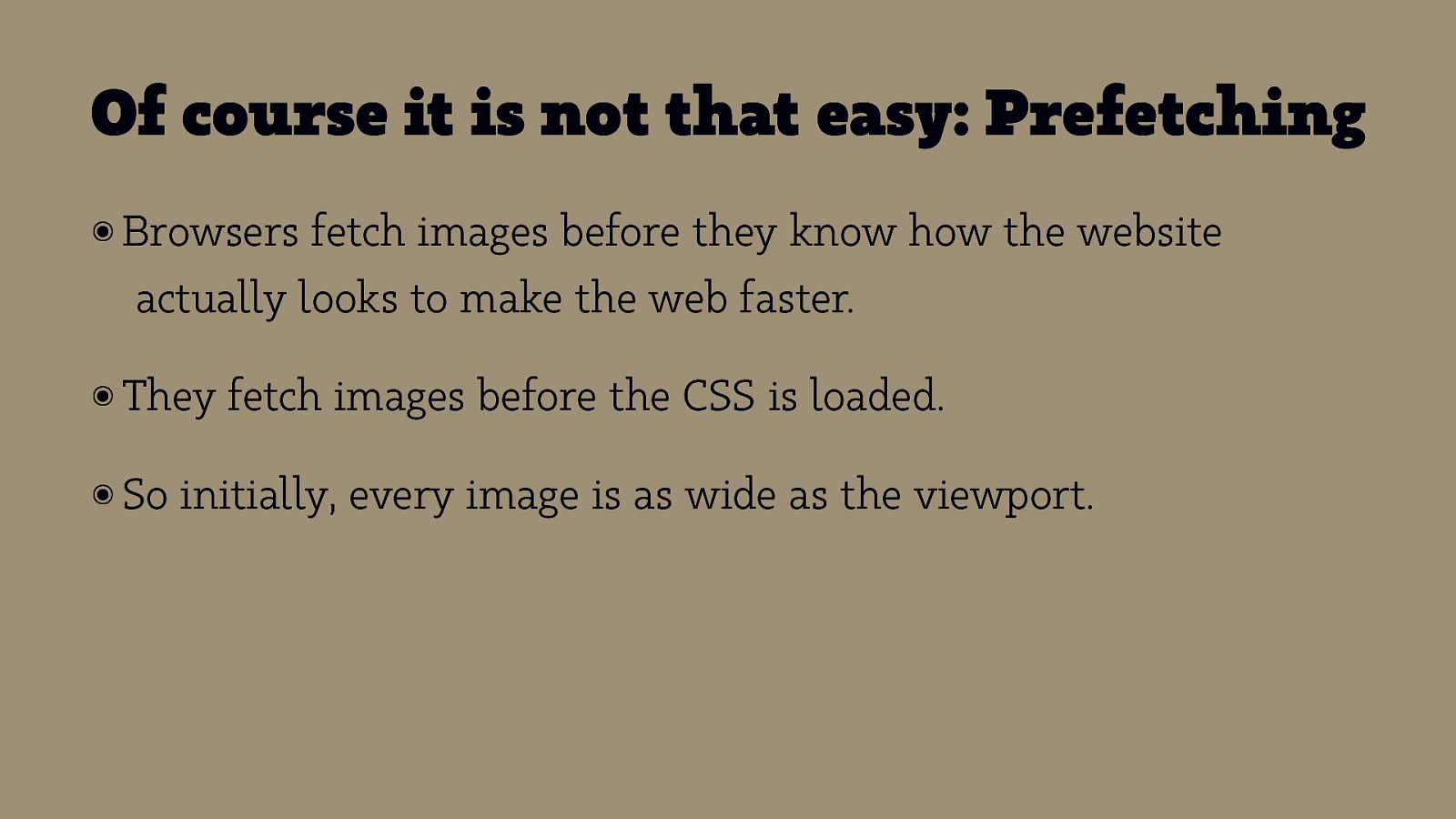
Of course it is not that easy: Prefetching ๏ Browsers fetch images before they know how the website actually looks to make the web faster. ๏ They ๏ So fetch images before the CSS is loaded. initially, every image is as wide as the viewport.


What to do?!
sizes FTW! sizes: required when using width descriptors
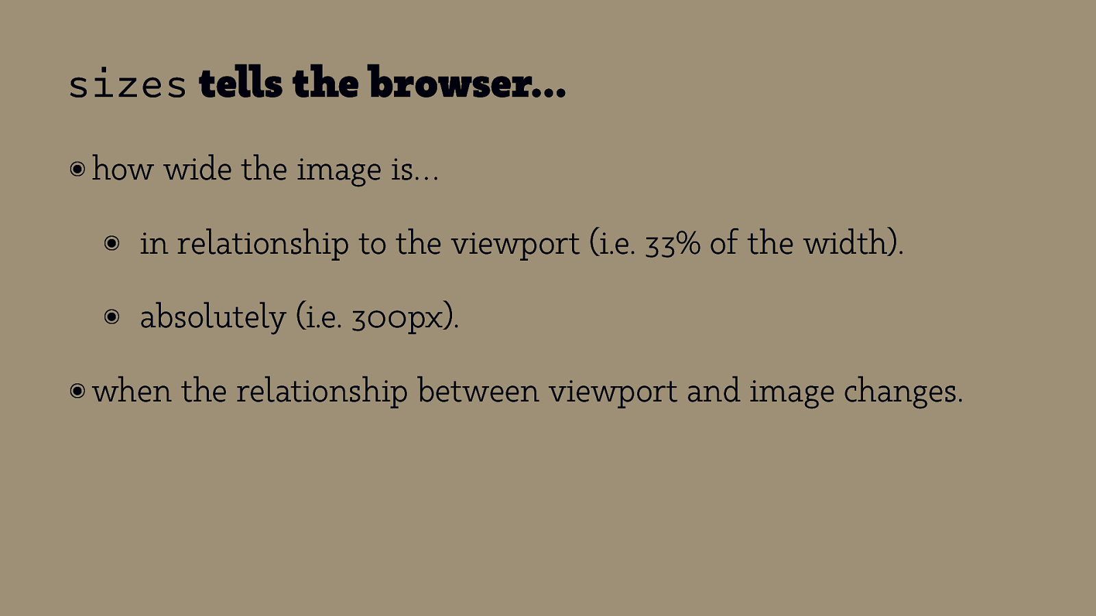
sizes tells the browser… ๏ how wide the image is… ๏ in relationship to the viewport (i.e. 33% of the width). ๏ absolutely (i.e. 300px). ๏ when the relationship between viewport and image changes.
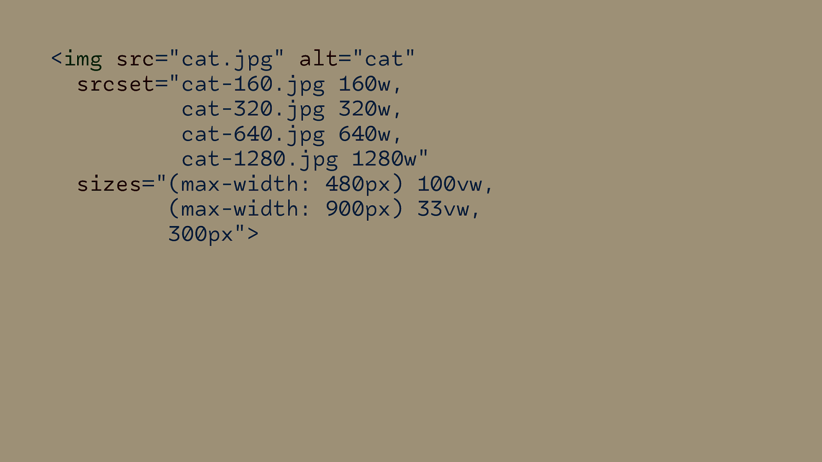
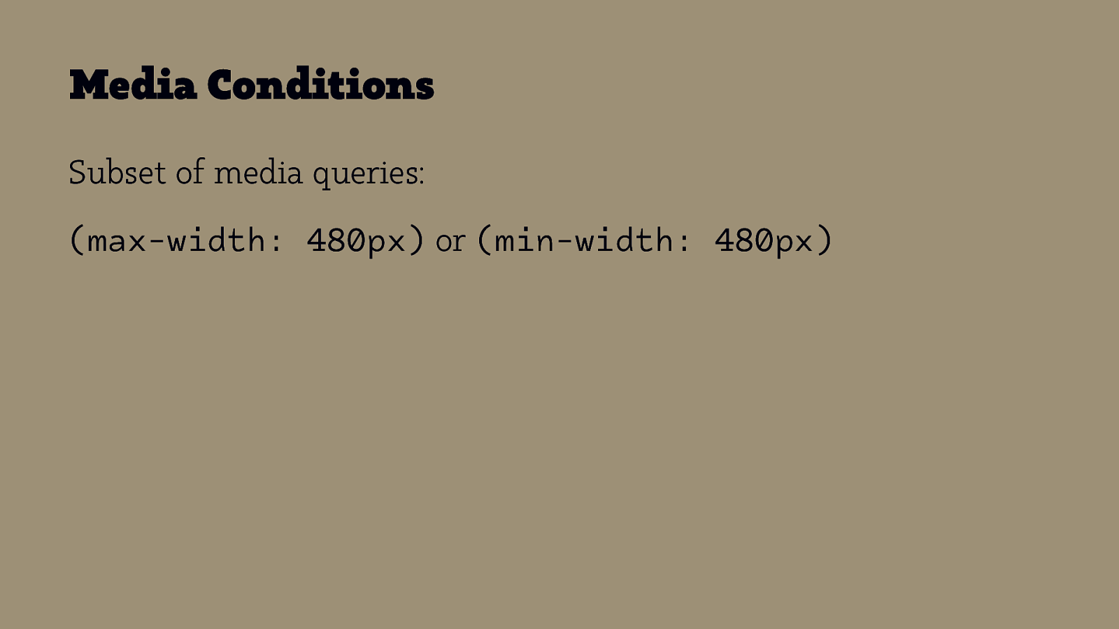
Media Conditions Subset of media queries: (max-width: 480px) or (min-width: 480px)
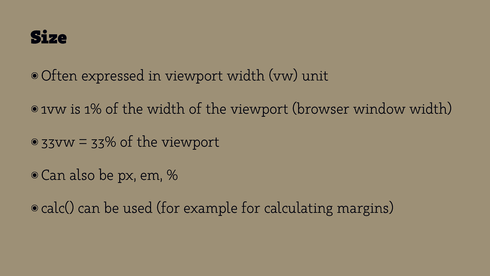
Size ๏ Often ๏ 1vw is 1% of the width of the viewport (browser window width) ๏ 33vw ๏ Can expressed in viewport width (vw) unit = 33% of the viewport also be px, em, % ๏ calc() can be used (for example for calculating margins)

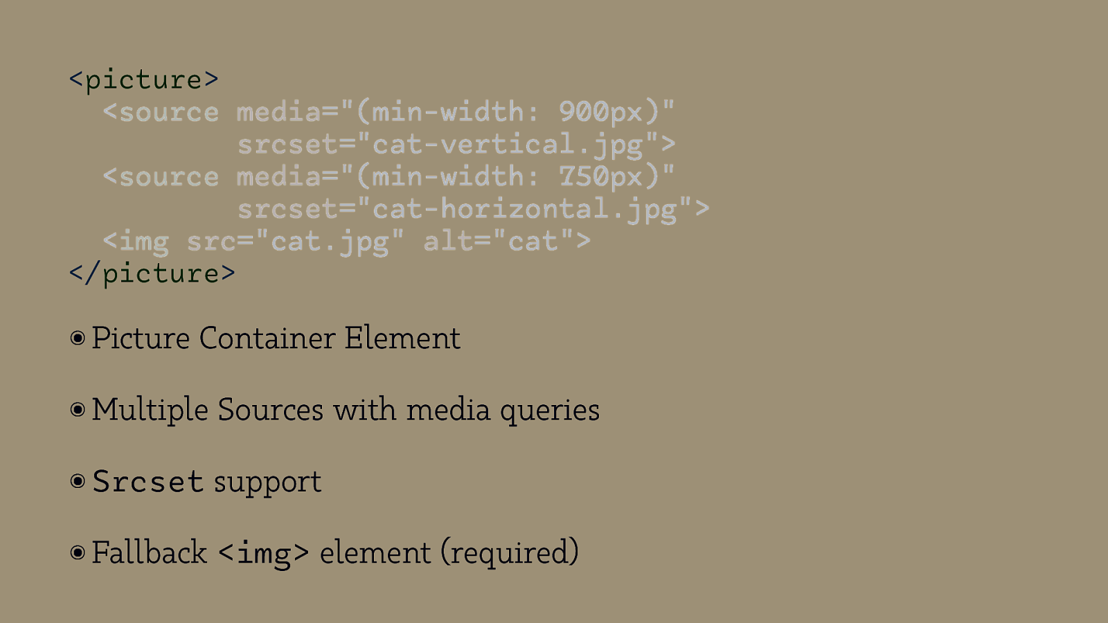
<picture> <source media=”(min-width: 900px)” srcset=”cat-vertical.jpg”> <source media=”(min-width: 750px)” srcset=”cat-horizontal.jpg”> <img src=”cat.jpg” alt=”cat”> </picture> ๏ Picture Container Element ๏ Multiple Sources with media queries ๏ Srcset support ๏ Fallback <img> element (required)
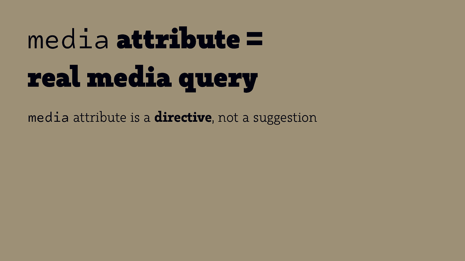
media attribute = real media query media attribute is a directive, not a suggestion

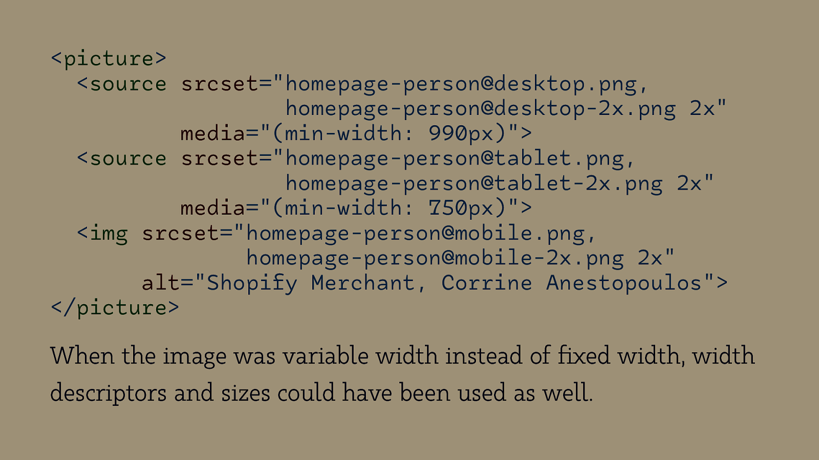
<picture> <source srcset=”homepage-person@desktop.png, homepage-person@desktop-2x.png 2x” media=”(min-width: 990px)”> <source srcset=”homepage-person@tablet.png, homepage-person@tablet-2x.png 2x” media=”(min-width: 750px)”> <img srcset=”homepage-person@mobile.png, homepage-person@mobile-2x.png 2x” alt=”Shopify Merchant, Corrine Anestopoulos”> </picture> When the image was variable width instead of fixed width, width descriptors and sizes could have been used as well.
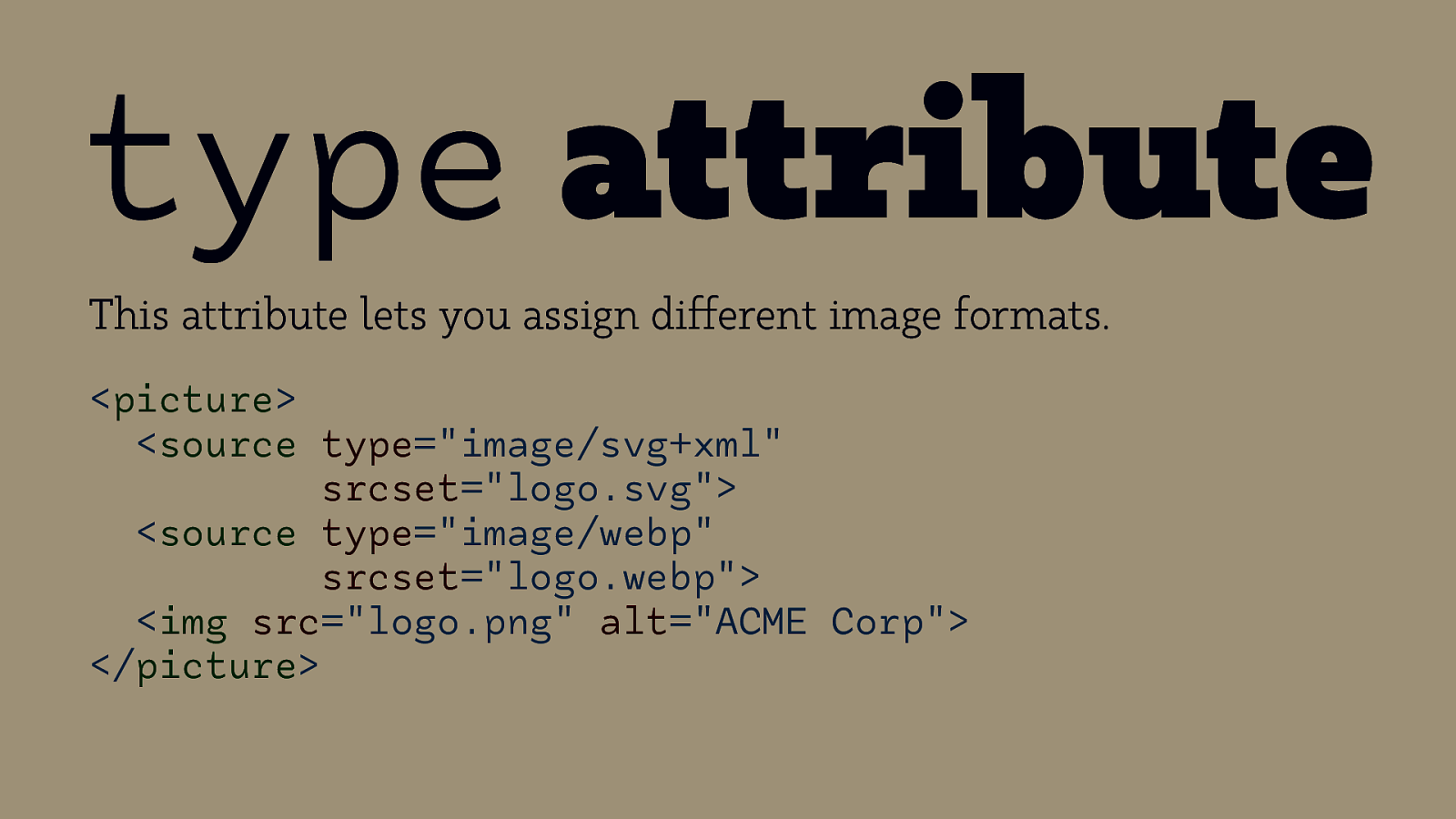
type attribute This attribute lets you assign different image formats. <picture> <source type=”image/svg+xml” srcset=”logo.svg”> <source type=”image/webp” srcset=”logo.webp”> <img src=”logo.png” alt=”ACME Corp”> </picture>

Summary
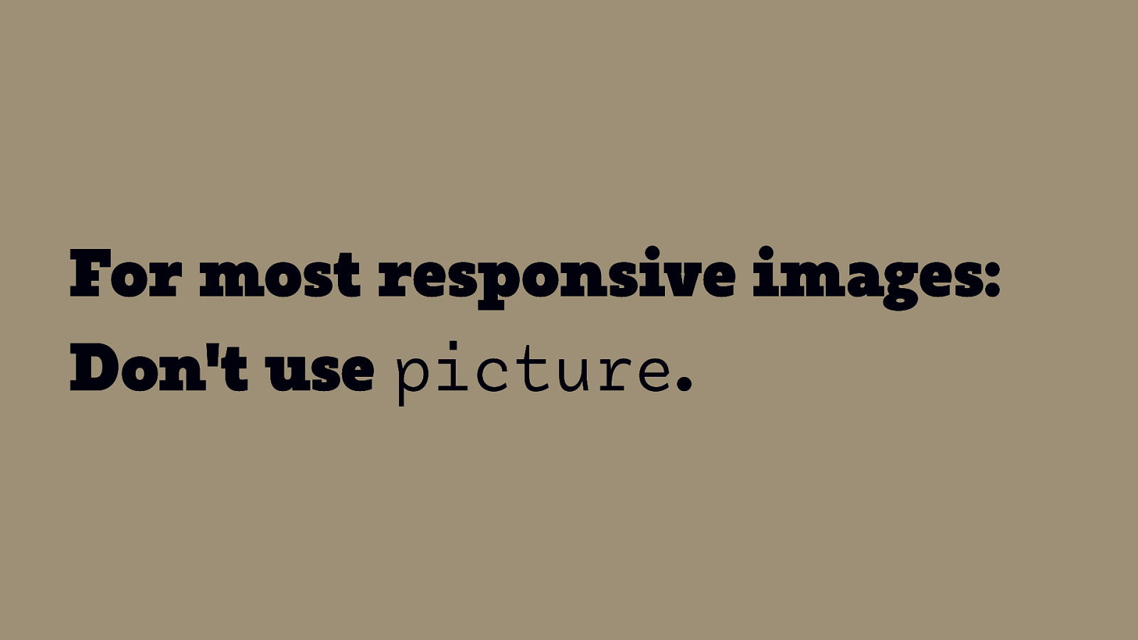
For most responsive images: Don’t use picture.
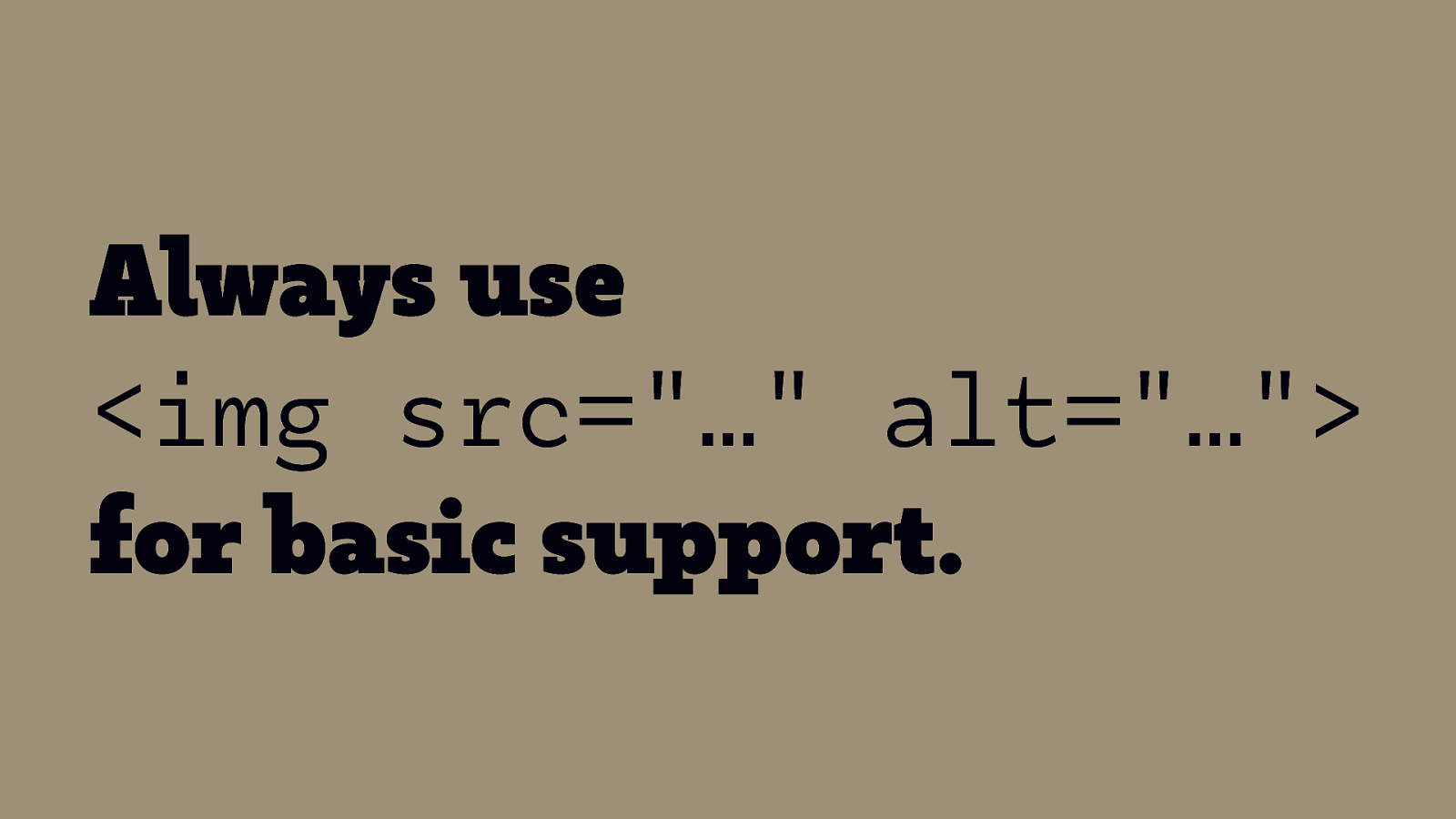
Always use <img src=”…” alt=”…”> for basic support.
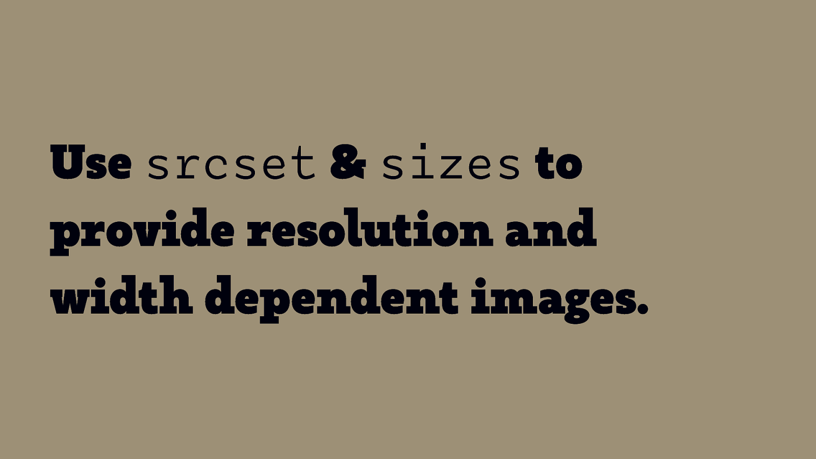
Use srcset & sizes to provide resolution and width dependent images.
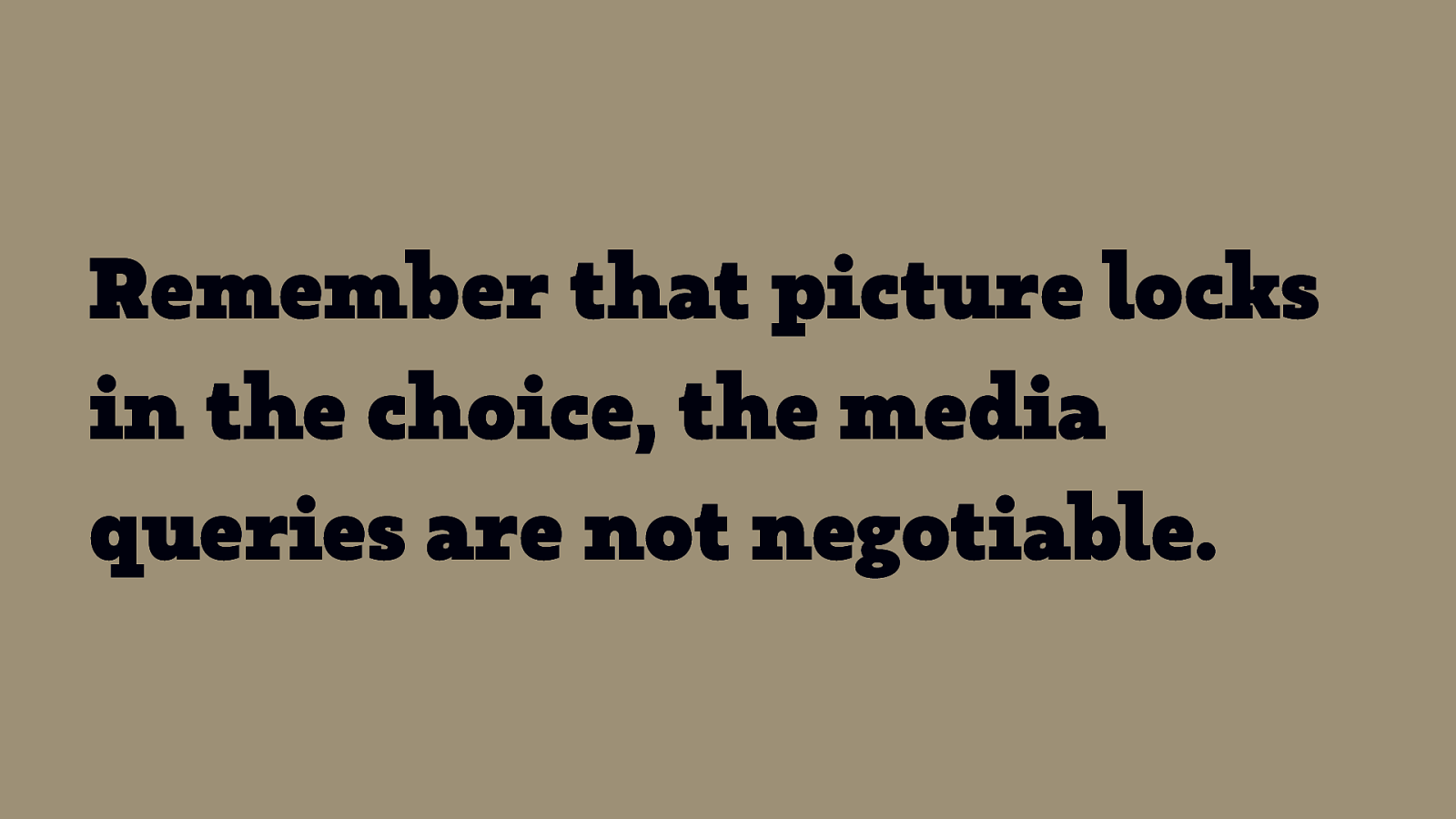
Remember that picture locks in the choice, the media queries are not negotiable.
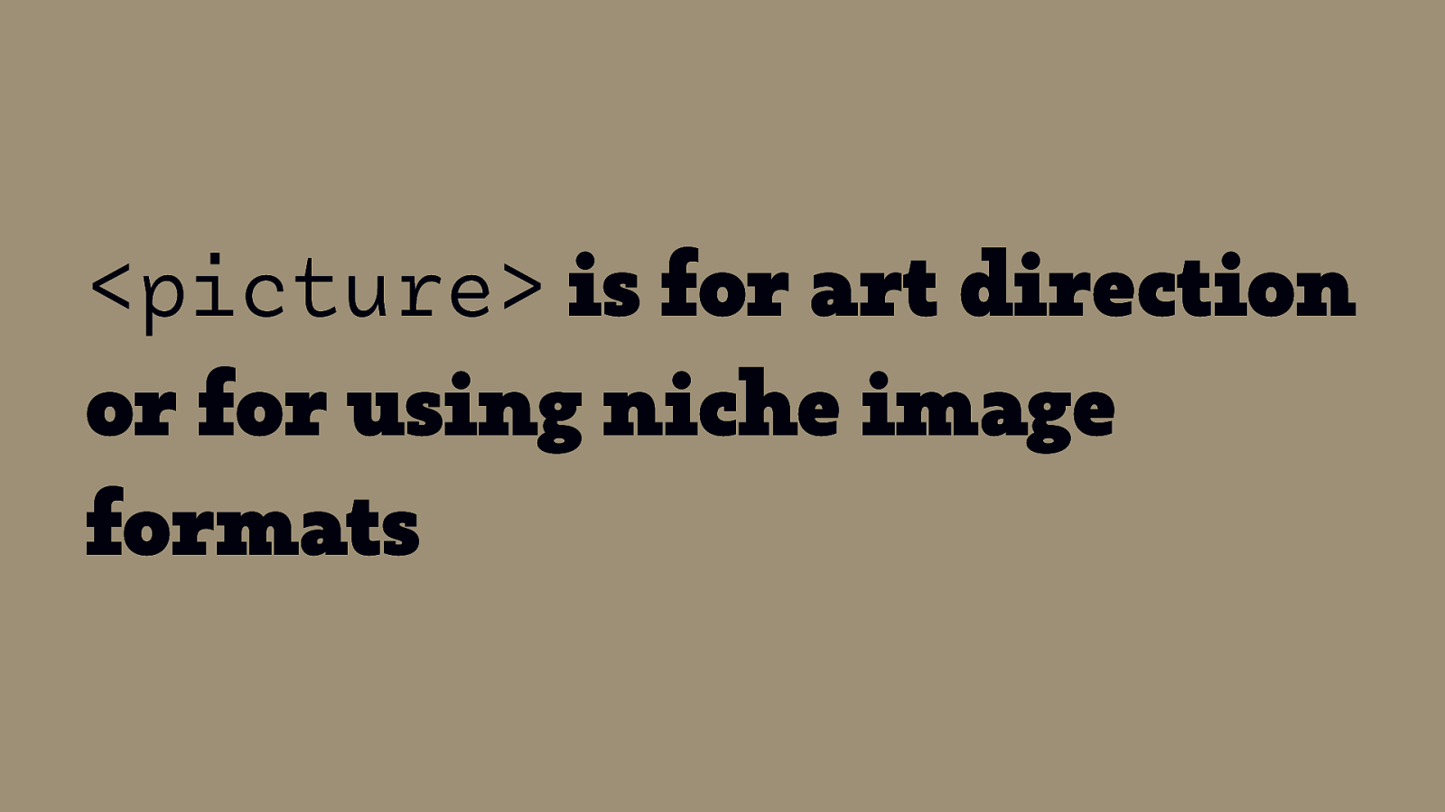
<picture> is for art direction or for using niche image formats
More Info: Source: Jason Grigsby – Responsive Images 101
Audio, Video & † Animation Accessibility & Multi-Screen Design ! † If there’s enough time. Eric Eggert — Accessibility & Multi-Screen Design — #cos20
Audio

Audio Player Example
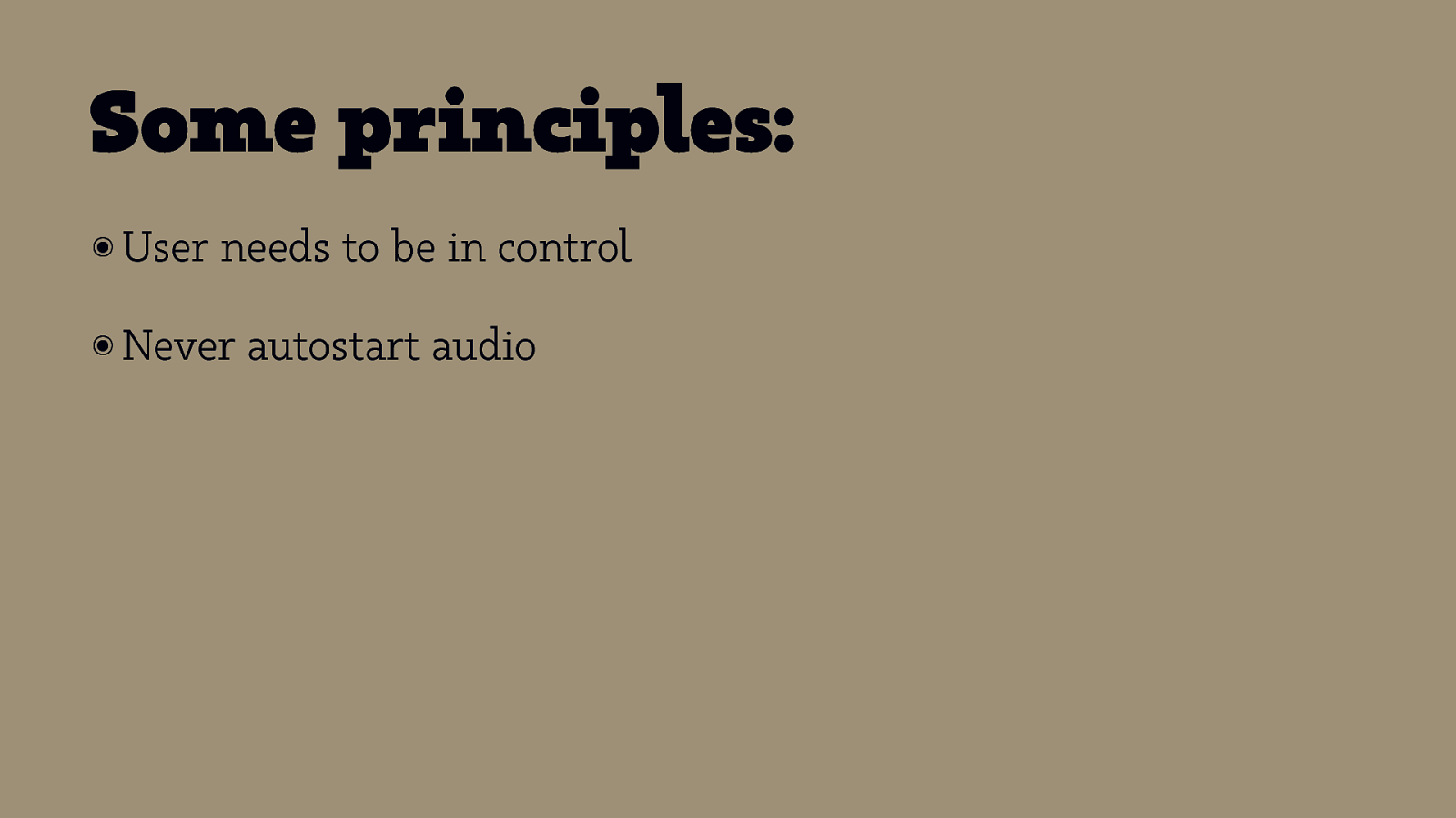
Some principles: ๏ User needs to be in control ๏ Never autostart audio

Use the audio element

Video
Video Player Example
Going beyond technical accessibility

Four UX Principles ๏ Give ๏ Put users choice. users in control. ๏ Design with familiarity in mind. ๏ Prioritize features that add value.


Accessibility Originates With UX: A BBC iPlayer Case Study by Henny Swan
Use the video element
How do audio and video elements work?
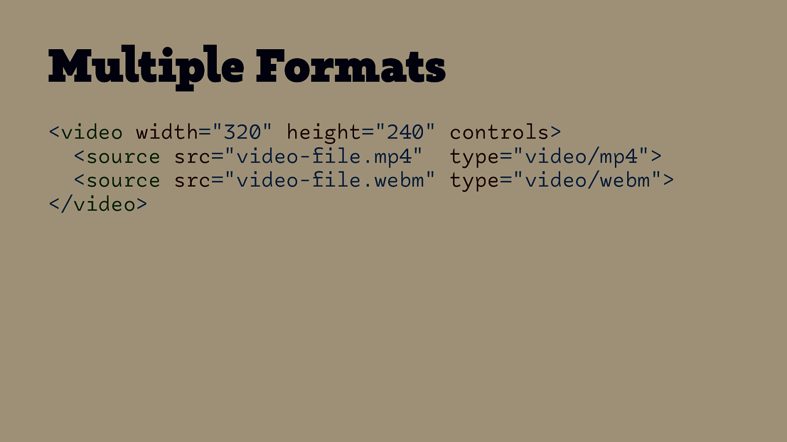
Multiple Formats <video width=”320” height=”240” controls> <source src=”video-file.mp4” type=”video/mp4”> <source src=”video-file.webm” type=”video/webm”> </video>
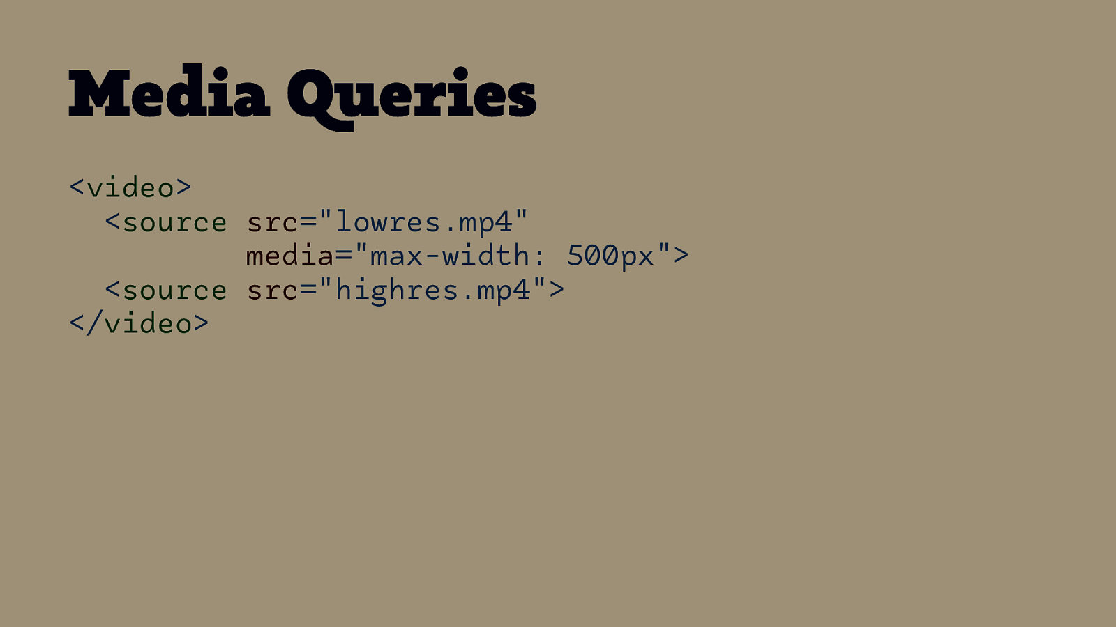
Media Queries <video> <source src=”lowres.mp4” media=”max-width: 500px”> <source src=”highres.mp4”> </video>
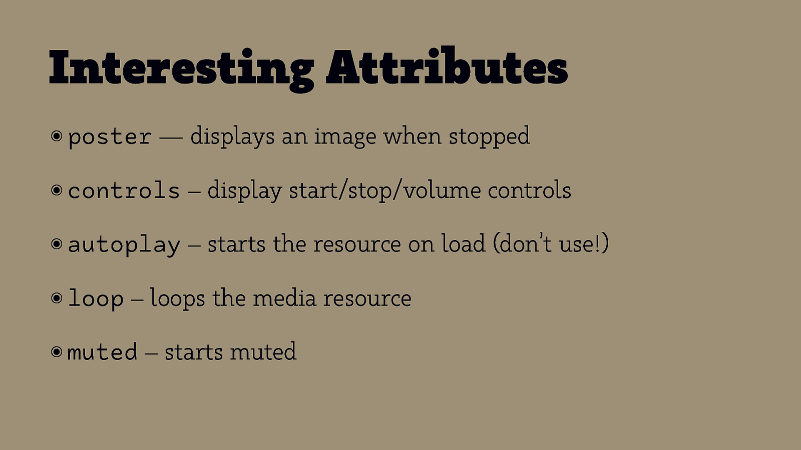
Interesting Attributes ๏ poster — displays an image when stopped ๏ controls – display start/stop/volume controls ๏ autoplay – starts the resource on load (don’t use!) ๏ loop – loops the media resource ๏ muted – starts muted

On Autoplay
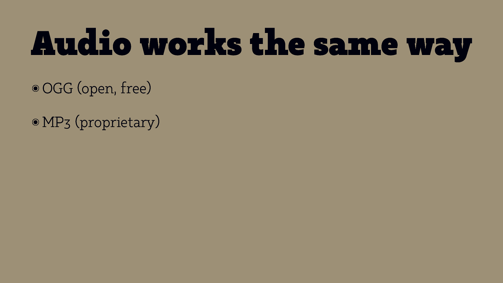
Audio works the same way ๏ OGG (open, free) ๏ MP3 (proprietary)

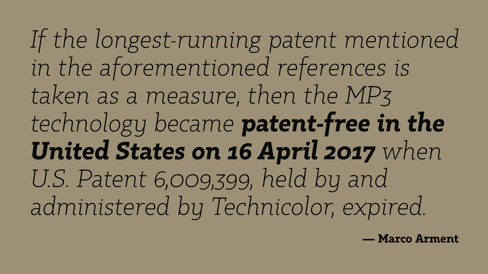
If the longest-running patent mentioned in the aforementioned references is taken as a measure, then the MP3 technology became patent-free in the United States on 16 April 2017 when U.S. Patent 6,009,399, held by and administered by Technicolor, expired. — Marco Arment
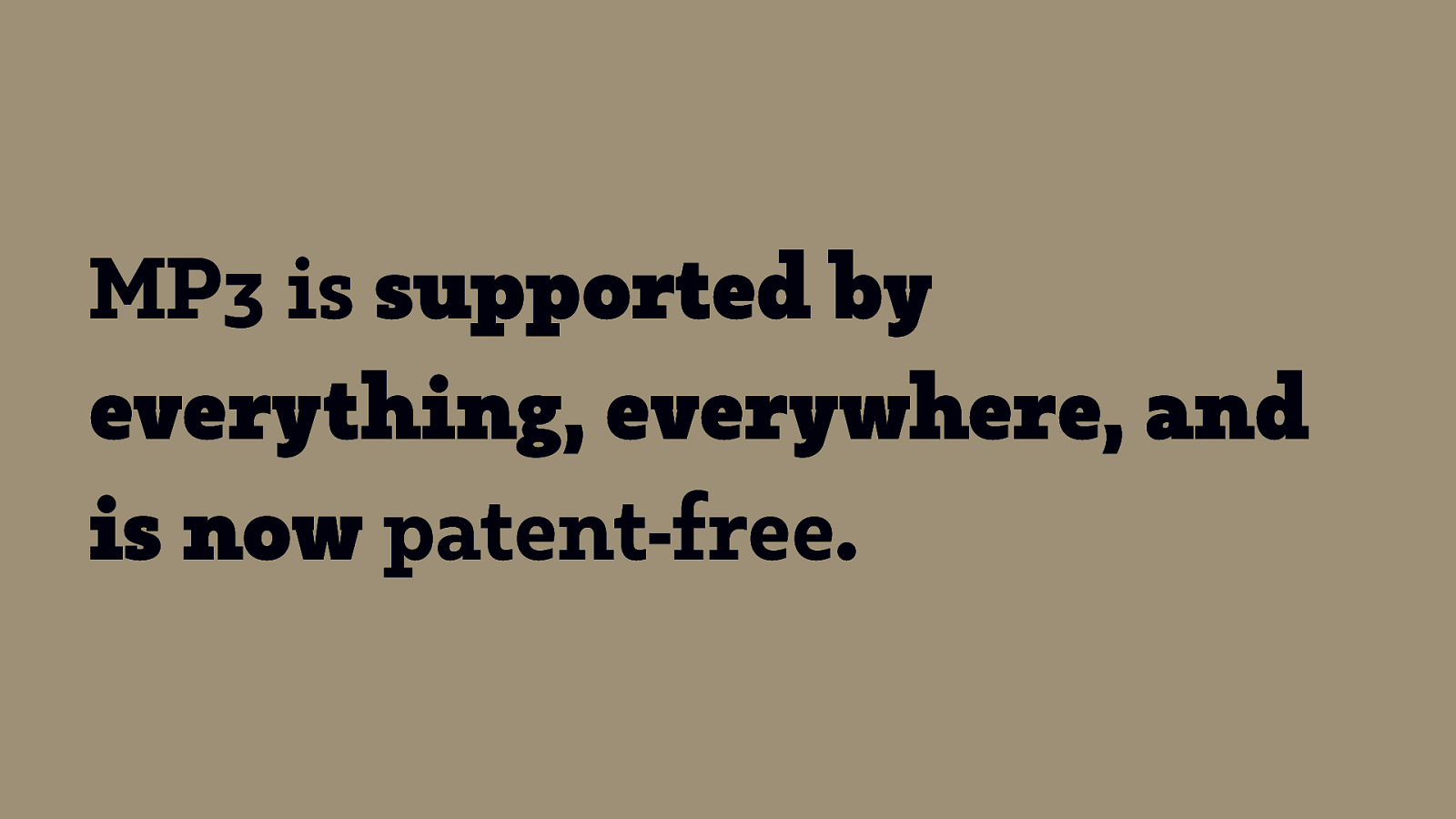
MP3 is supported by everything, everywhere, and is now patent-free.
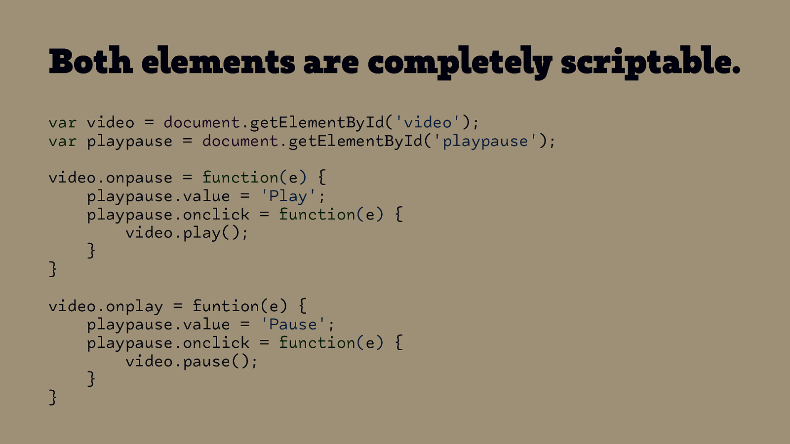
Both elements are completely scriptable. var video = document.getElementById(‘video’); var playpause = document.getElementById(‘playpause’); video.onpause = function(e) { playpause.value = ‘Play’; playpause.onclick = function(e) { video.play(); } } video.onplay = funtion(e) { playpause.value = ‘Pause’; playpause.onclick = function(e) { video.pause(); } }
How to make Audio and Video accessible
Transcripts ๏ The ๏ TED Web Ahead – A Magna Carta for the web
Captions ๏ TED – A Magna Carta for the web
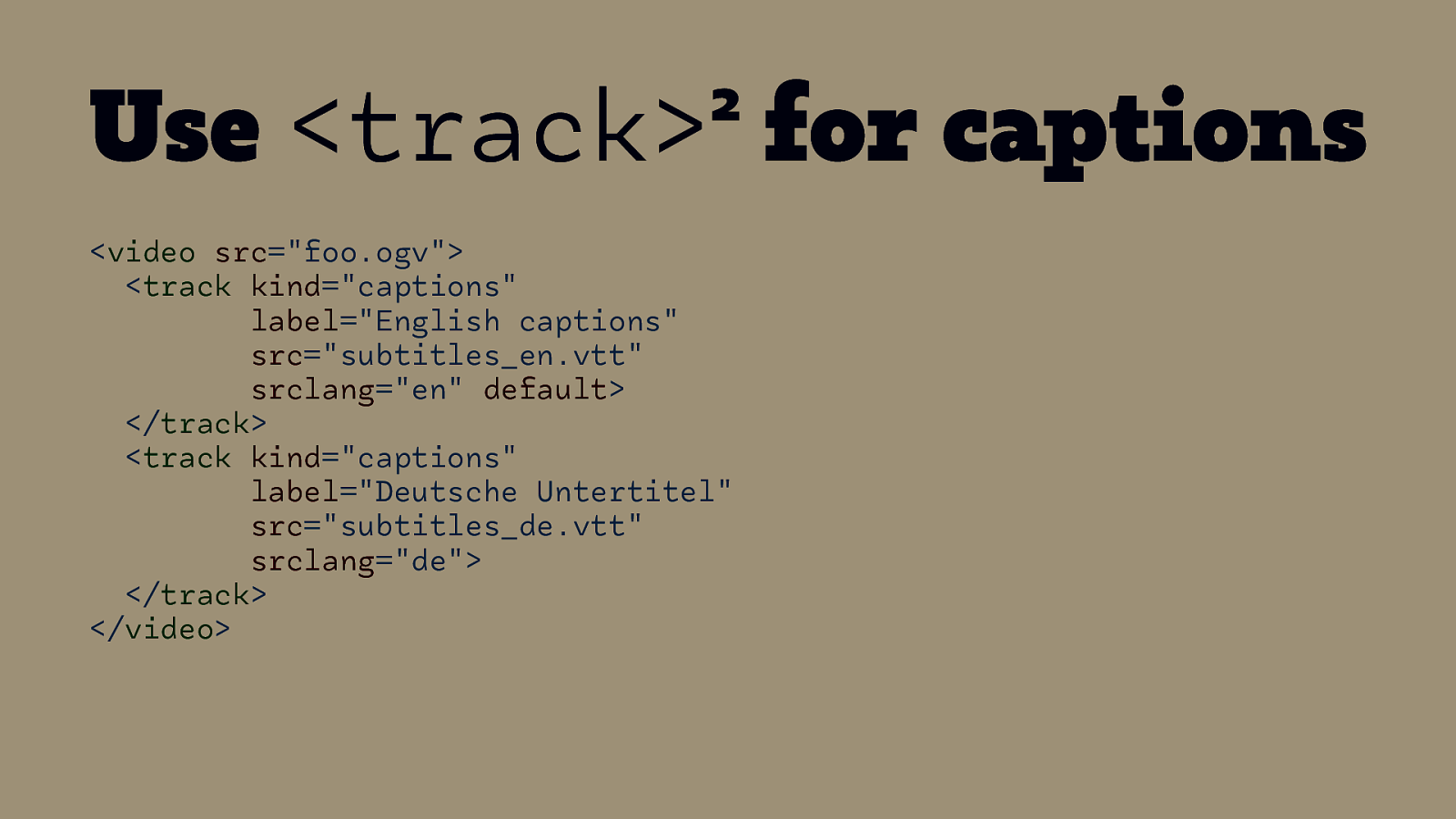
2 Use <track> for captions <video src=”foo.ogv”> <track kind=”captions” label=”English captions” src=”subtitles_en.vtt” srclang=”en” default> </track> <track kind=”captions” label=”Deutsche Untertitel” src=”subtitles_de.vtt” srclang=”de”> </track> </video> 2 More information @ HTML5Rocks.com
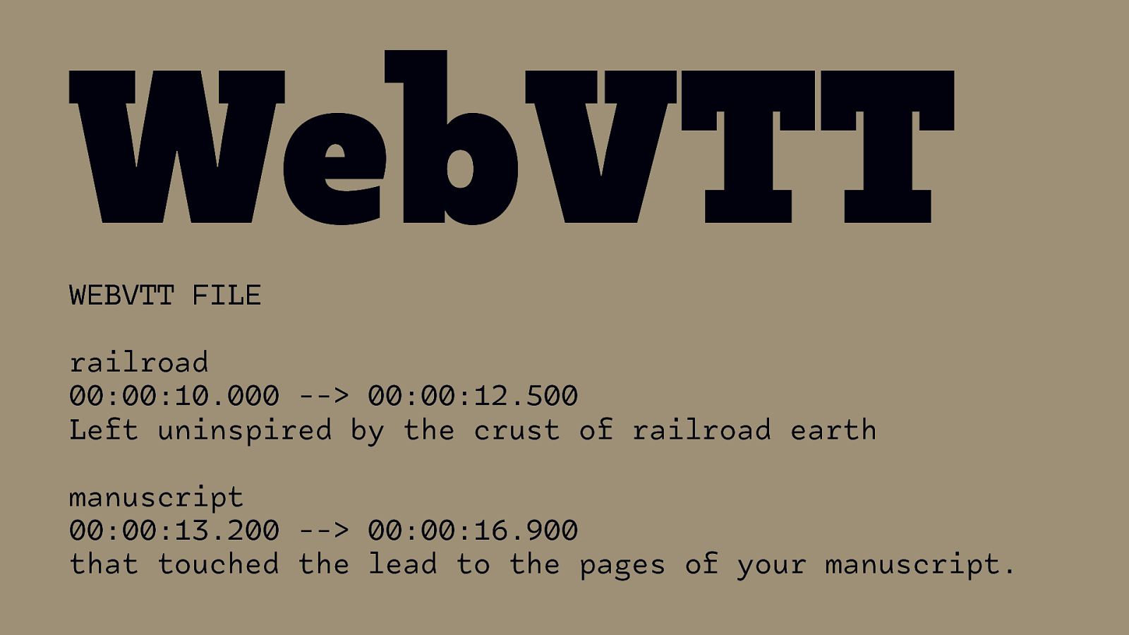
WebVTT WEBVTT FILE railroad 00:00:10.000 —> 00:00:12.500 Left uninspired by the crust of railroad earth manuscript 00:00:13.200 —> 00:00:16.900 that touched the lead to the pages of your manuscript.
Audio Descriptions

Additional Features in Media Players W3C/WAI Perspective Videos
Making Audio and Video Media Accessible
Animation in General

Operating System
OS Settings
prefers-reduced-motion Media Query
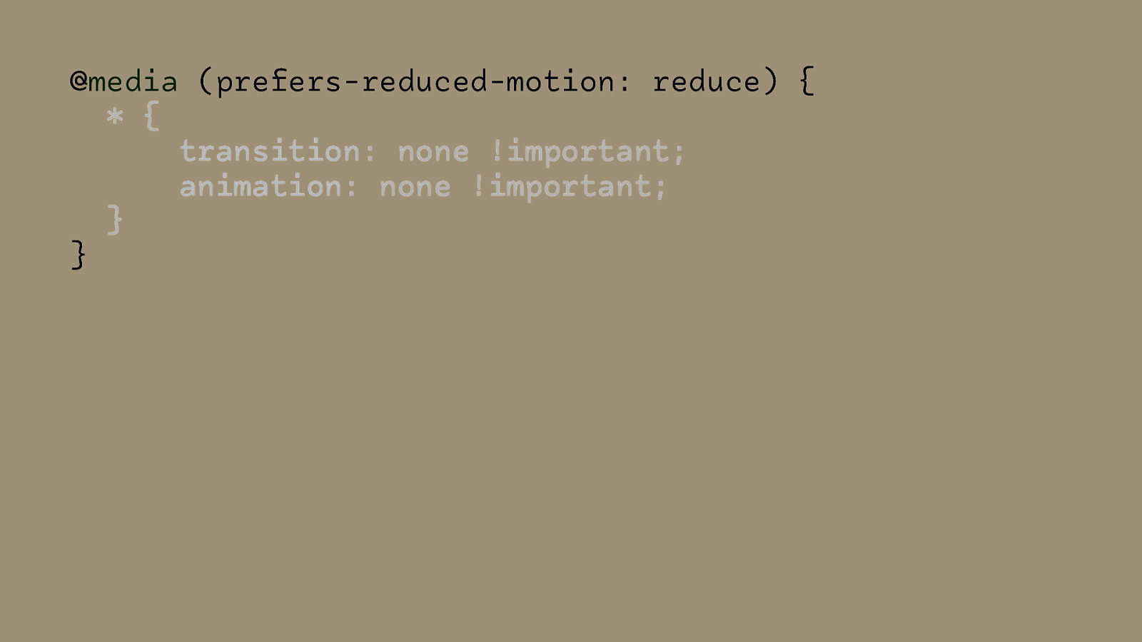
@media (prefers-reduced-motion: reduce) { * { transition: none !important; animation: none !important; } }
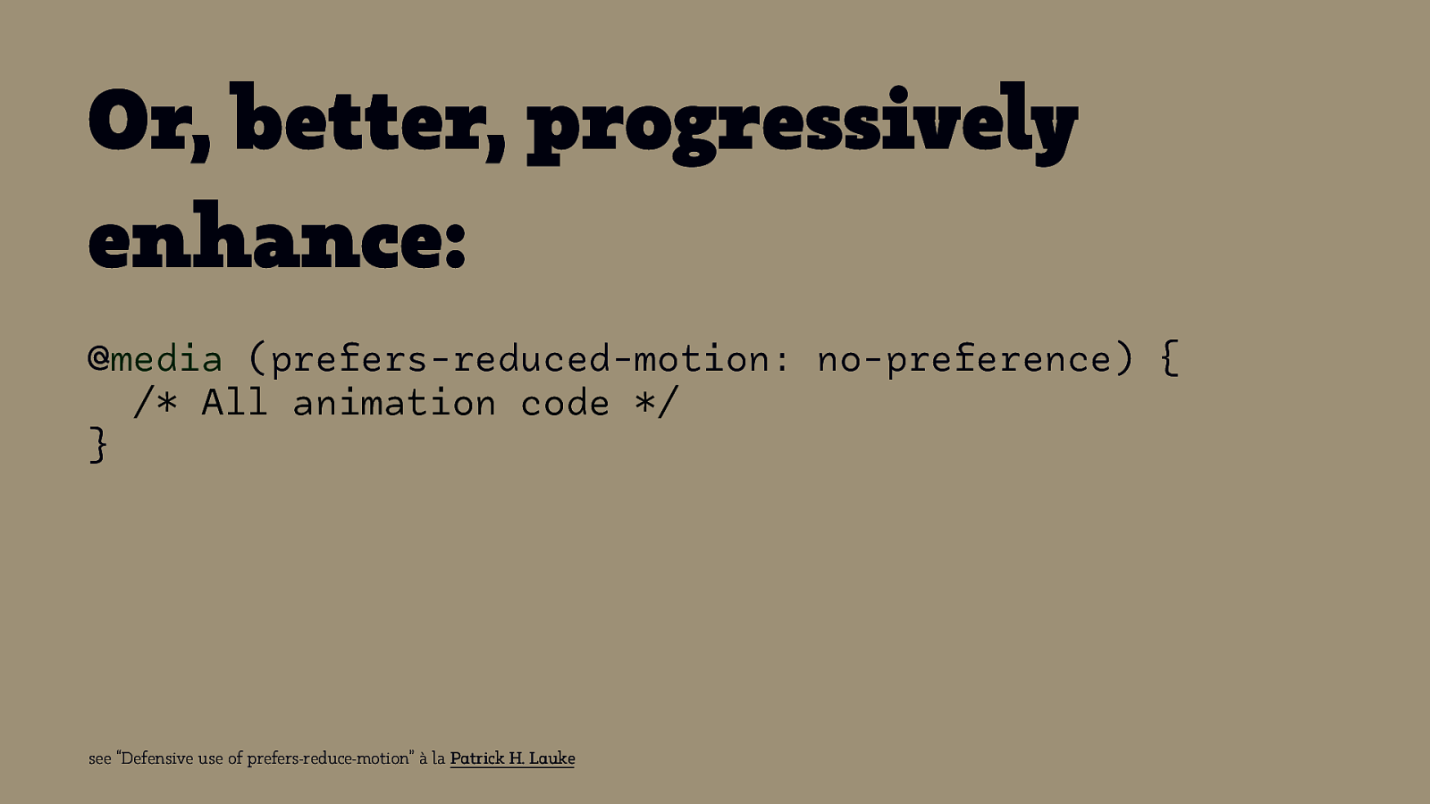
Or, better, progressively enhance: @media (prefers-reduced-motion: no-preference) { /* All animation code */ } see “Defensive use of prefers-reduce-motion” à la Patrick H. Lauke

Support Source: Can I Use
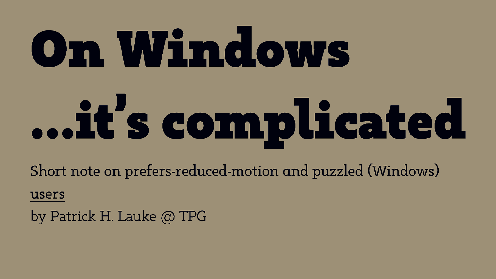
On Windows …it’s complicated Short note on prefers-reduced-motion and puzzled (Windows) users by Patrick H. Lauke @ TPG
Responsive Design for Motion

The End.
