Connecting the Accessibility Dots Eric Eggert · AccessU · May 2020
Slide 1
Slide 2
Eric Eggert Eric Eggert is a Web Developer and Teacher who works with on improving the Web for People with Disabilities, and everyone else. 2013–2020: W3C/Web Accessibility Initiative My name is Eric Eggert and I work with Knowbility and the W3C to improve the Web for People with Disabilities. I work with Knowbility as the tech team lead. And have worked with W3C in the past.
Slide 3

Slide 4

Slide 5
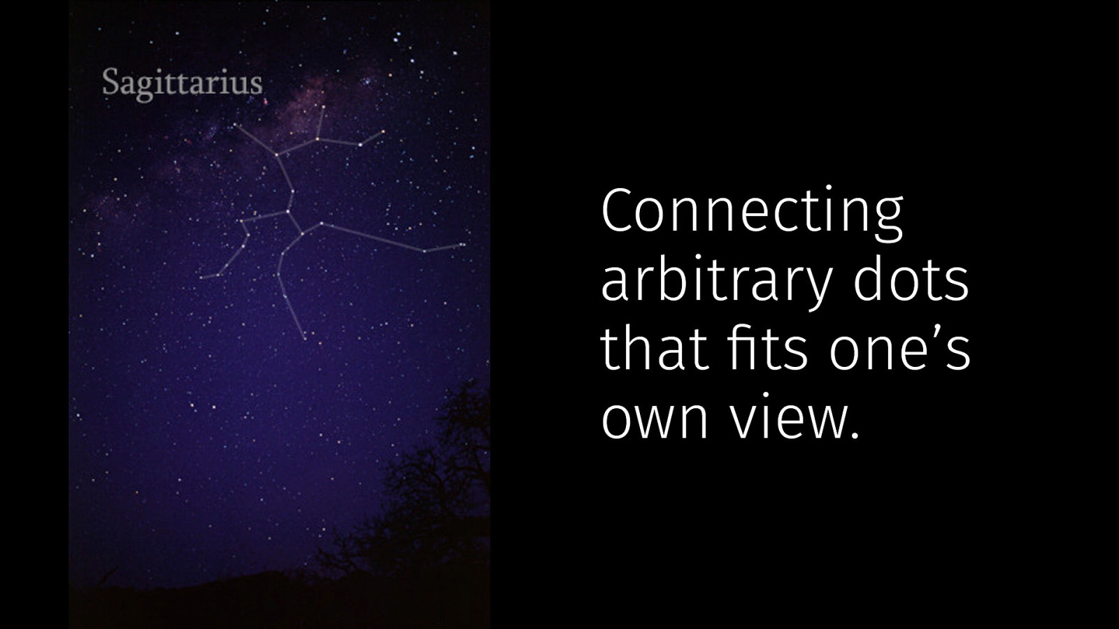
Connecting arbitrary dots that fits one’s own view.
Slide 6

Images: Till Credner, https://commons.wikimedia.org/wiki/User:Till_Credner
Slide 7
The Big Picture
Slide 8
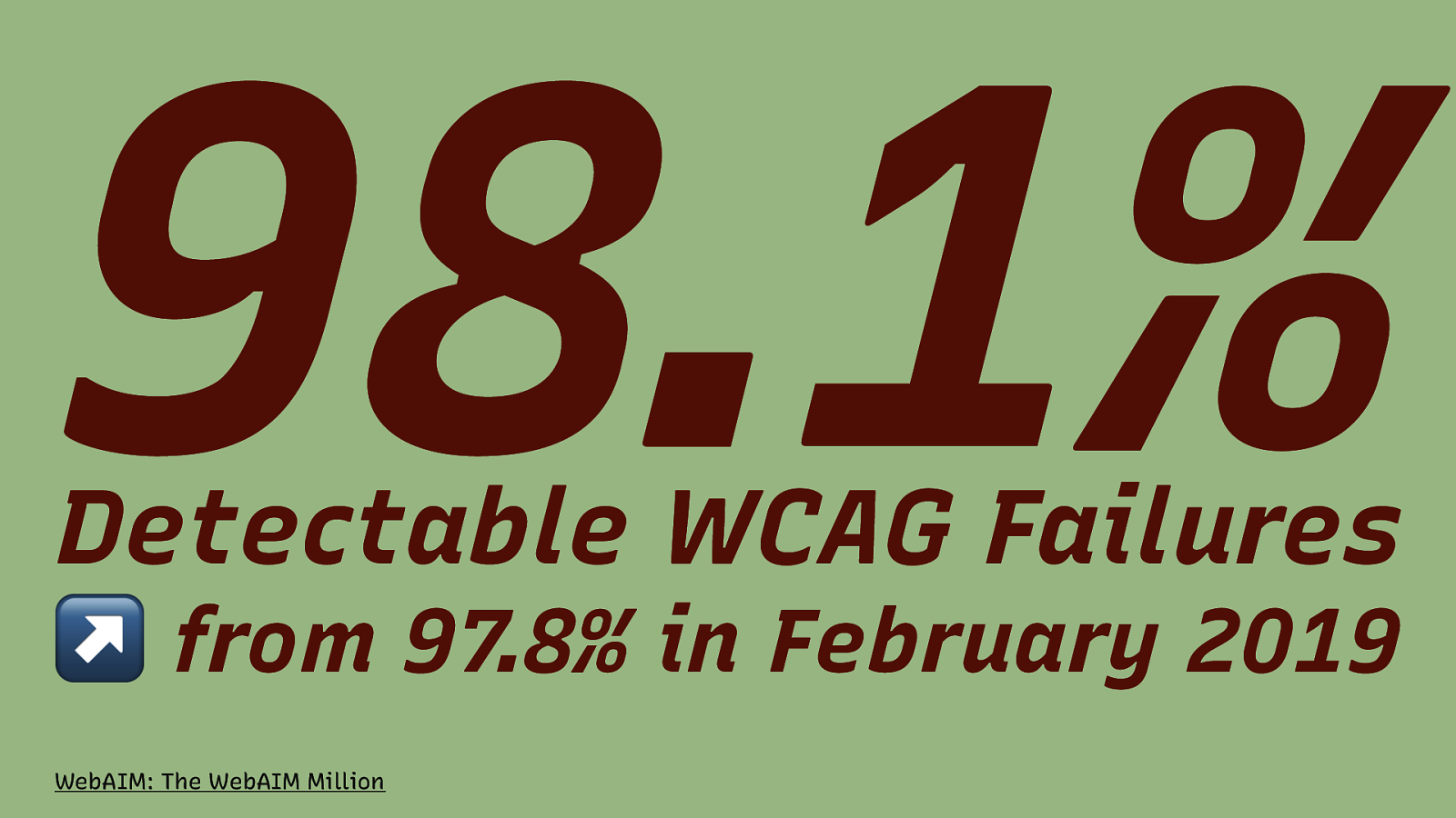
98.1% Detectable WCAG Failures ↗ from 97.8% in February 2019 WebAIM: The WebAIM Million
Slide 9
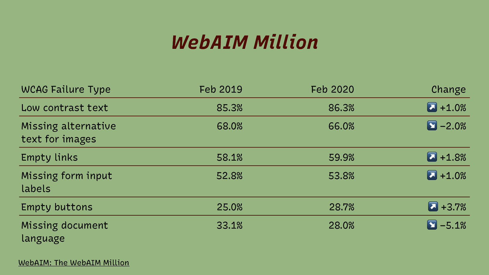
WebAIM Million WCAG Failure Type Feb 2019 Feb 2020 Change Low contrast text 85.3% 86.3% +1.0% Missing alternative text for images 68.0% 66.0% −2.0% Empty links 58.1% 59.9% +1.8% Missing form input labels 52.8% 53.8% +1.0% Empty buttons 25.0% 28.7% +3.7% Missing document language 33.1% 28.0% −5.1% WebAIM: The WebAIM Million
Slide 10
How do I make this accessible?
Slide 11

this
Slide 12
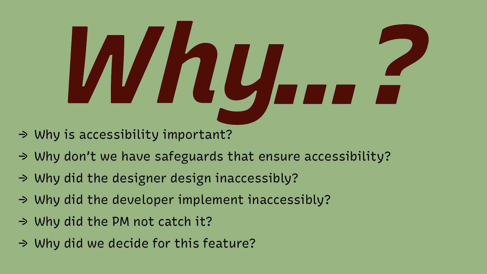
Why…? → Why is accessibility important? → Why don’t we have safeguards that ensure accessibility? → Why did the designer design inaccessibly? → Why did the developer implement inaccessibly? → Why did the PM not catch it? → Why did we decide for this feature?
Slide 13
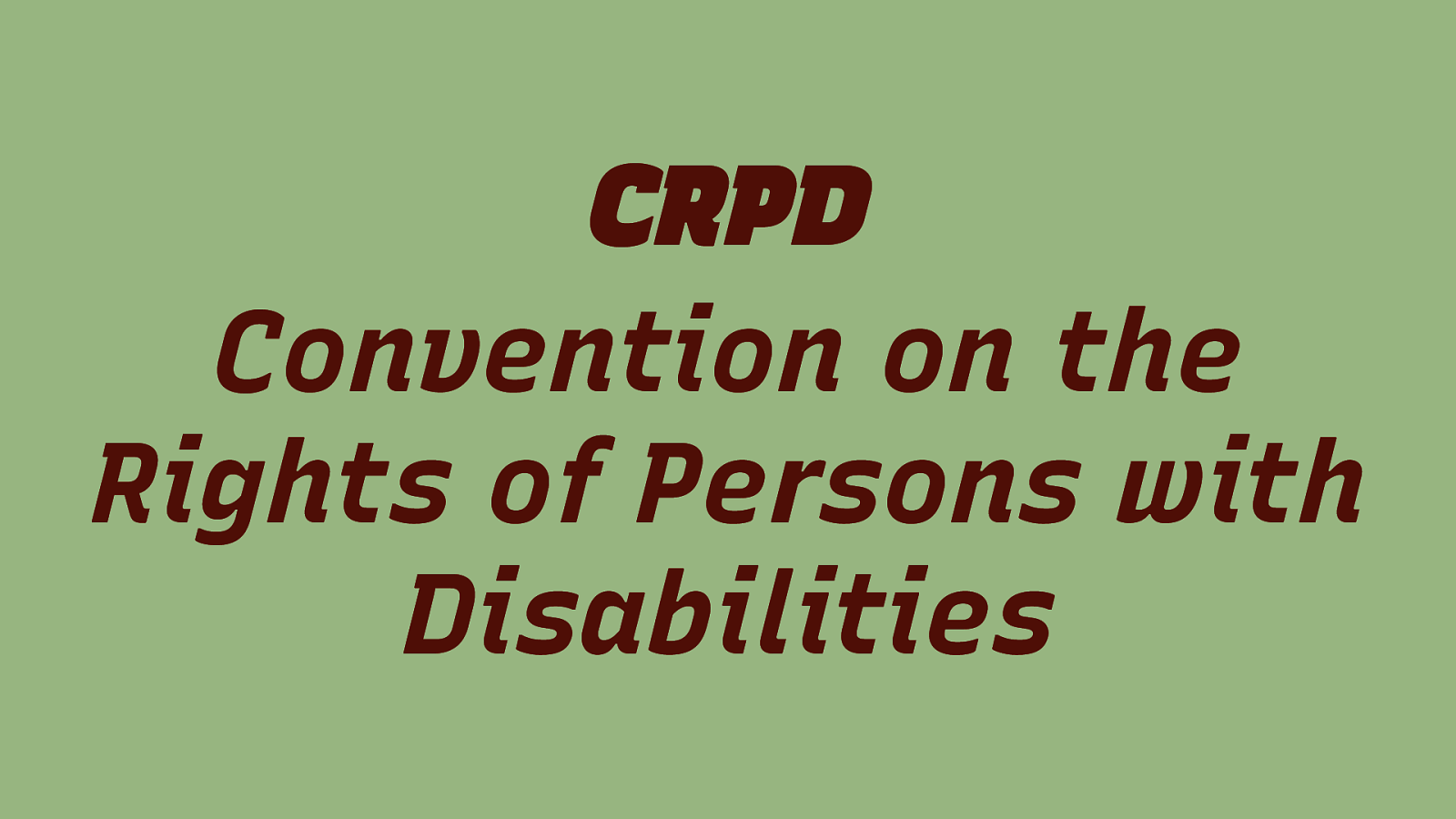
CRPD Convention on the Rights of Persons with Disabilities
Slide 14
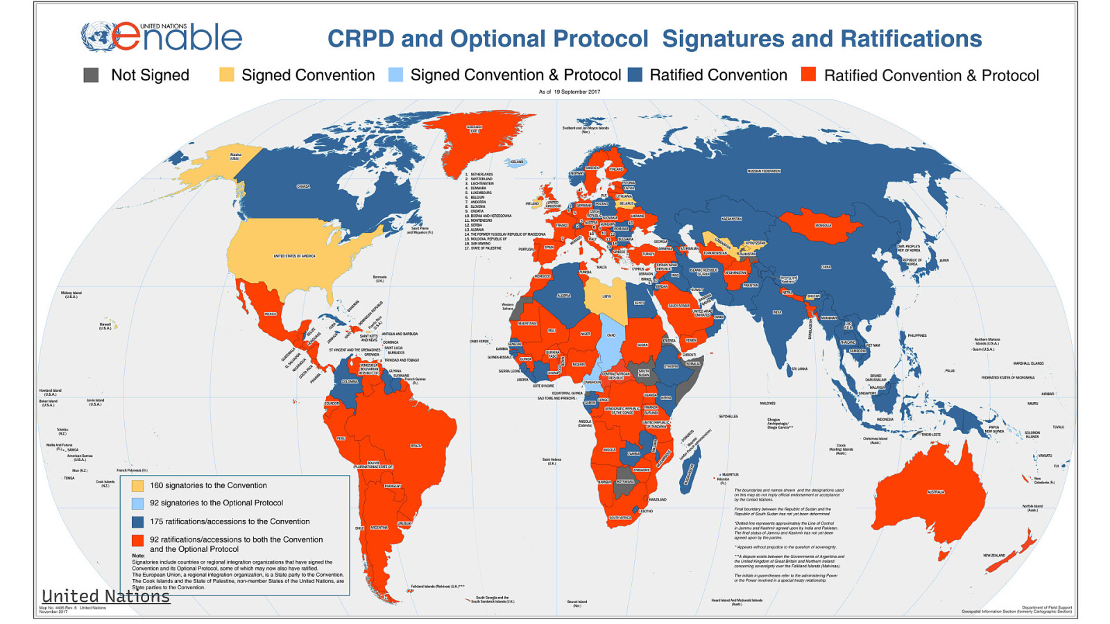
United Nations
Slide 15

Slide 16
If ensuring accessibility is something that we as a society agree is the right thing to do, we need to work together to move it forward.
Slide 17
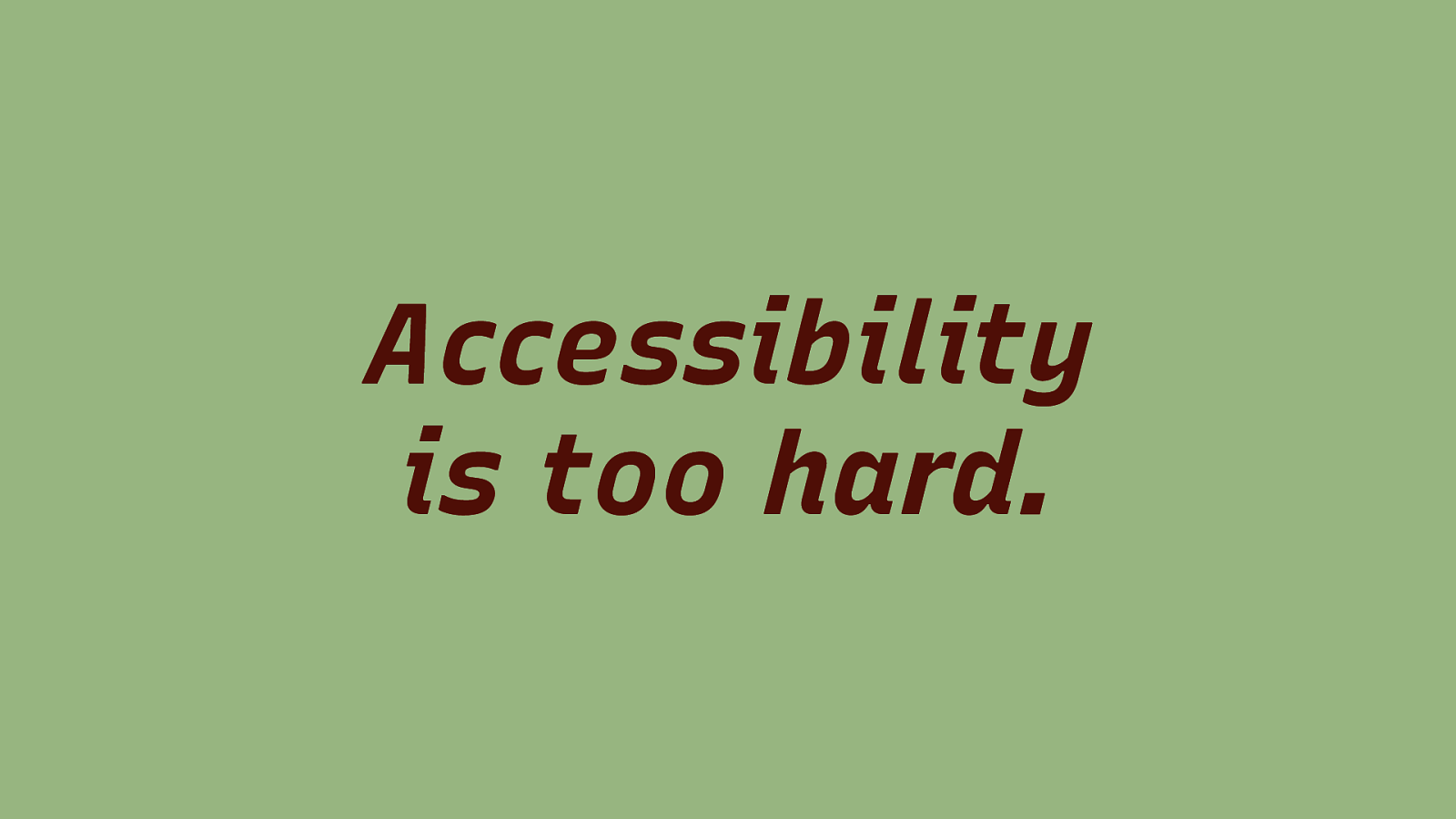
Accessibility is too hard.
Slide 18
Accessibility is easy.
Slide 19
Accessibility is easy to do wrong.
Slide 20
Why is Accessibility so easy to do wrong?
Slide 21

People are set up to fail. Not on purpose, of course. But accessibility can only be a reality if we all pull into the same direction
Slide 22
We need to prioritize accessibility higher. We must make sure that it is an integral part of building products.
Slide 23
Guidance needs to be better.
Slide 24
Guidance needs to include everyone.
Slide 25
Design Principles
Slide 26
Design Principles make projects successful
Slide 27
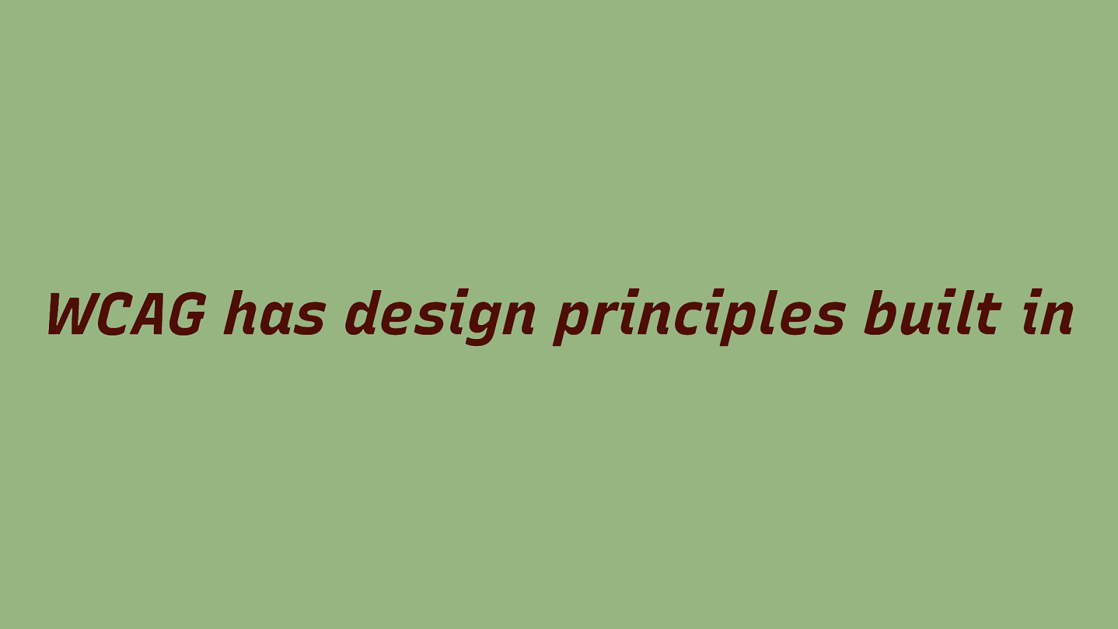
WCAG has design principles built in
Slide 28
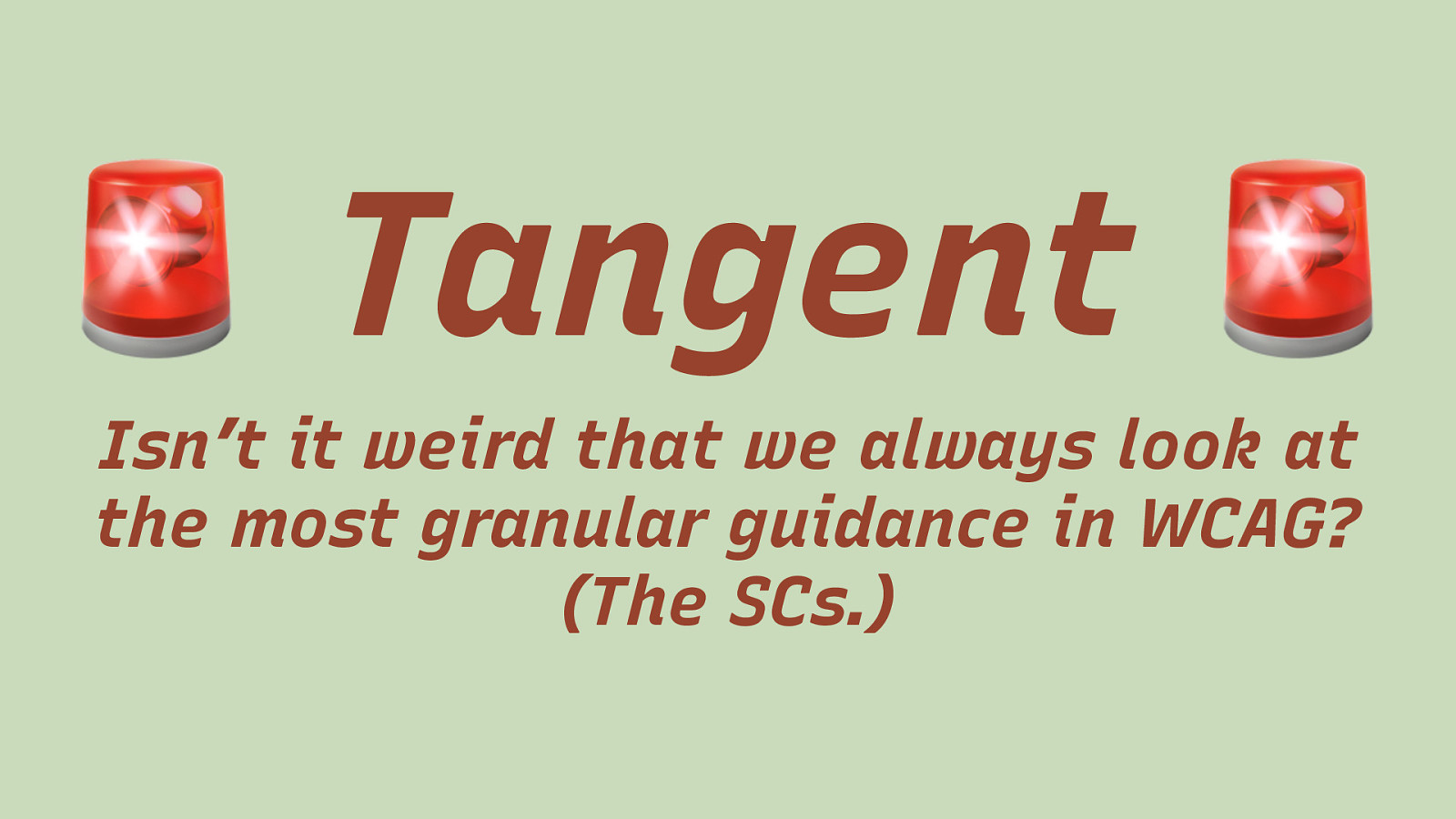
! Tangent Isn’t it weird that we always look at the most granular guidance in WCAG? (The SCs.) The SCs are the hurdle and we run towards the hurdle without concentrating on the point where we need to jump. We run and run and run and suddenly – there it is. The hurdle. And then we try to jump over it without getting up to speed first.
Slide 29

WCAG Design Principles
Slide 30

Your product must be → 1. Perceivable → 2. Operable → 3. Understandable → 4. Robust
Slide 31
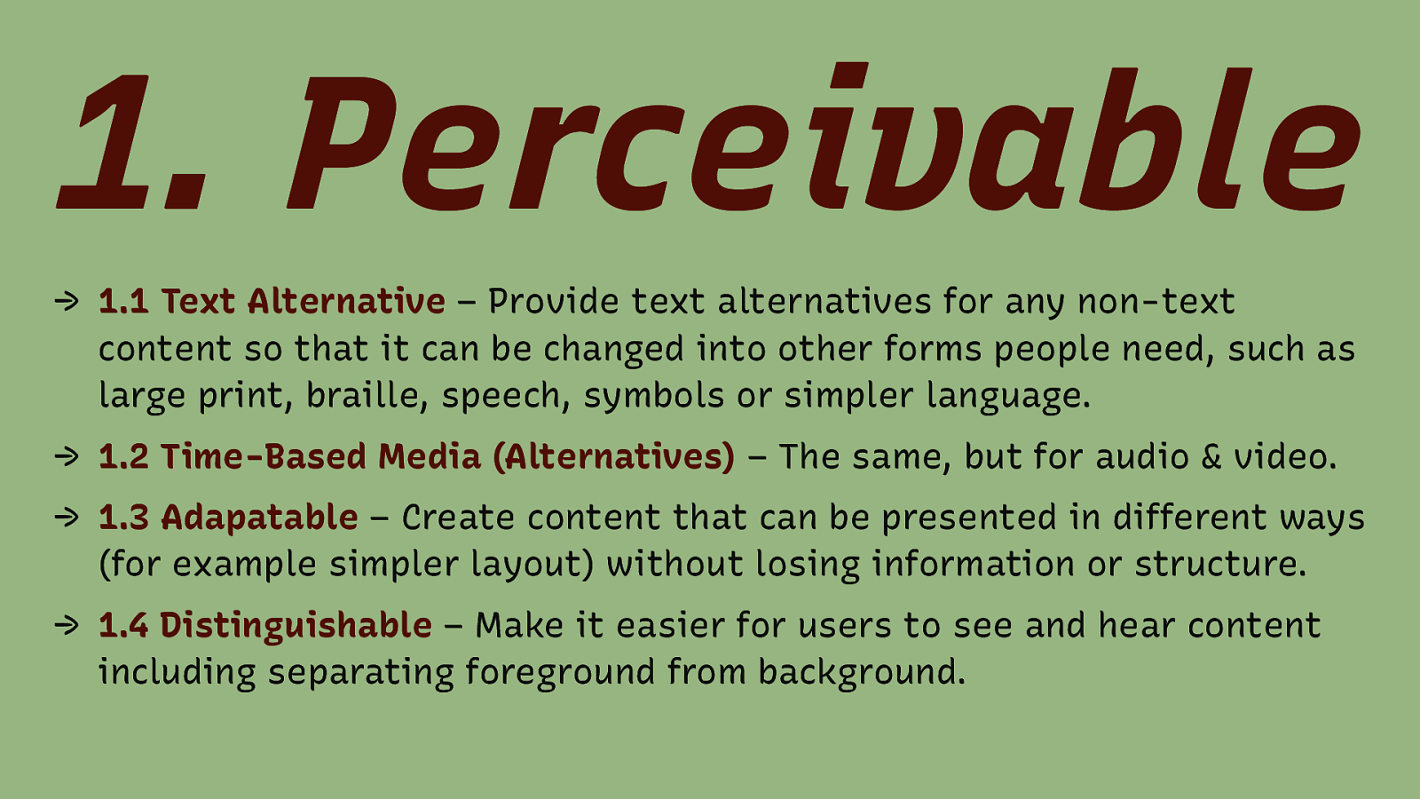
- Perceivable → 1.1 Text Alternative – Provide text alternatives for any non-text content so that it can be changed into other forms people need, such as large print, braille, speech, symbols or simpler language. → 1.2 Time-Based Media (Alternatives) – The same, but for audio & video. → 1.3 Adapatable – Create content that can be presented in different ways (for example simpler layout) without losing information or structure. → 1.4 Distinguishable – Make it easier for users to see and hear content including separating foreground from background.
Slide 32
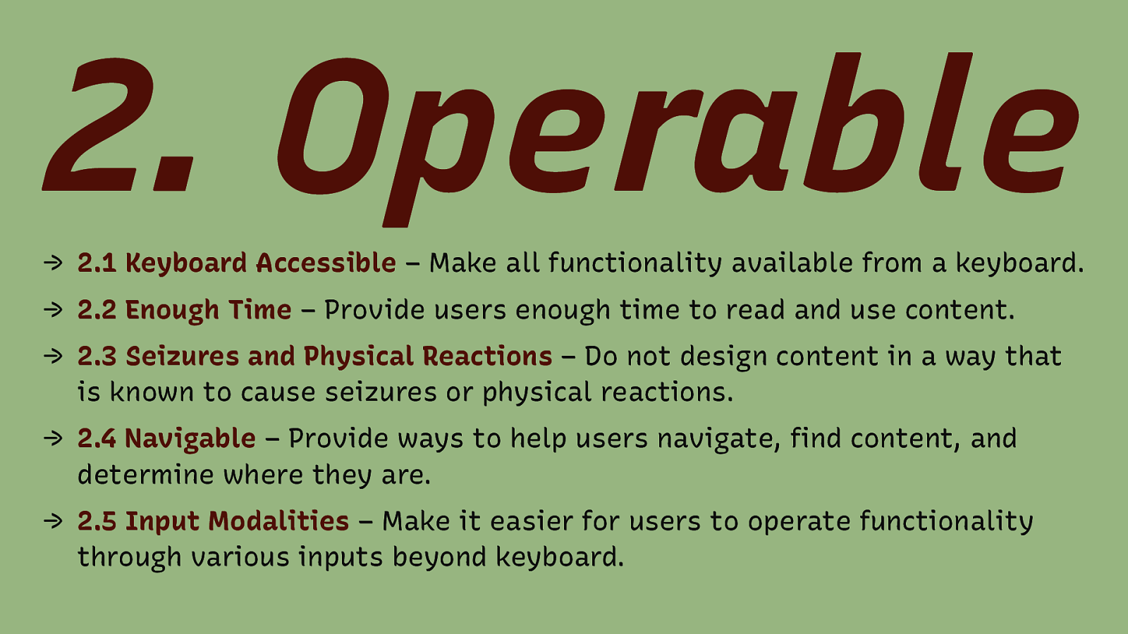
- Operable → 2.1 Keyboard Accessible – Make all functionality available from a keyboard. → 2.2 Enough Time – Provide users enough time to read and use content. → 2.3 Seizures and Physical Reactions – Do not design content in a way that is known to cause seizures or physical reactions. → 2.4 Navigable – Provide ways to help users navigate, find content, and determine where they are. → 2.5 Input Modalities – Make it easier for users to operate functionality through various inputs beyond keyboard.
Slide 33
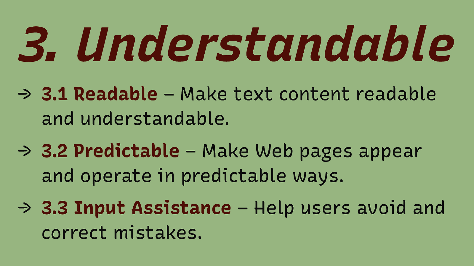
- Understandable → 3.1 Readable – Make text content readable and understandable. → 3.2 Predictable – Make Web pages appear and operate in predictable ways. → 3.3 Input Assistance – Help users avoid and correct mistakes. Content text is often overlooked. Make sure it is easy to read, use no jargon. Use proper grammar. Write engaging.
Slide 34
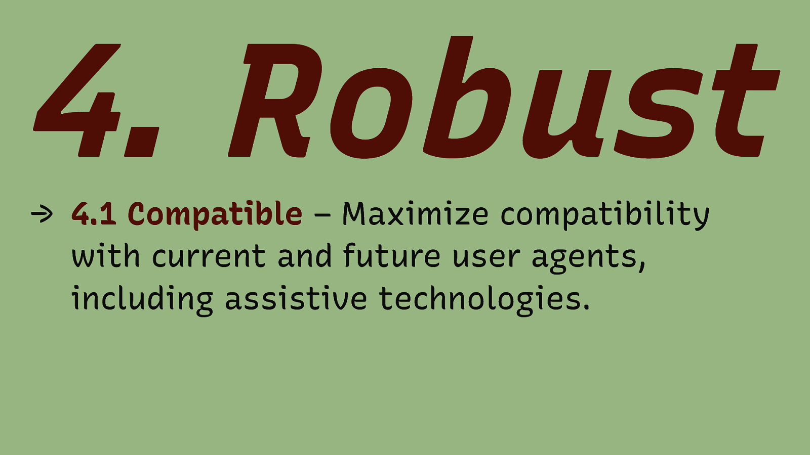
- Robust → 4.1 Compatible – Maximize compatibility with current and future user agents, including assistive technologies.
Slide 35
Other Design principles…
Slide 36
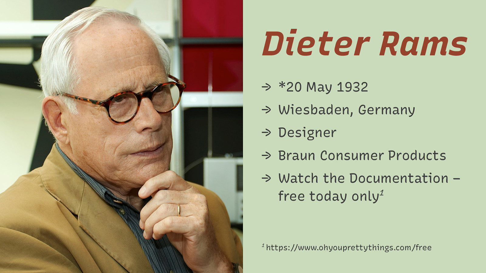
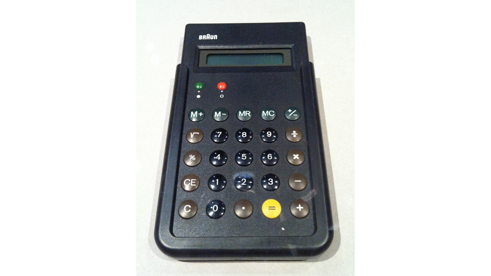
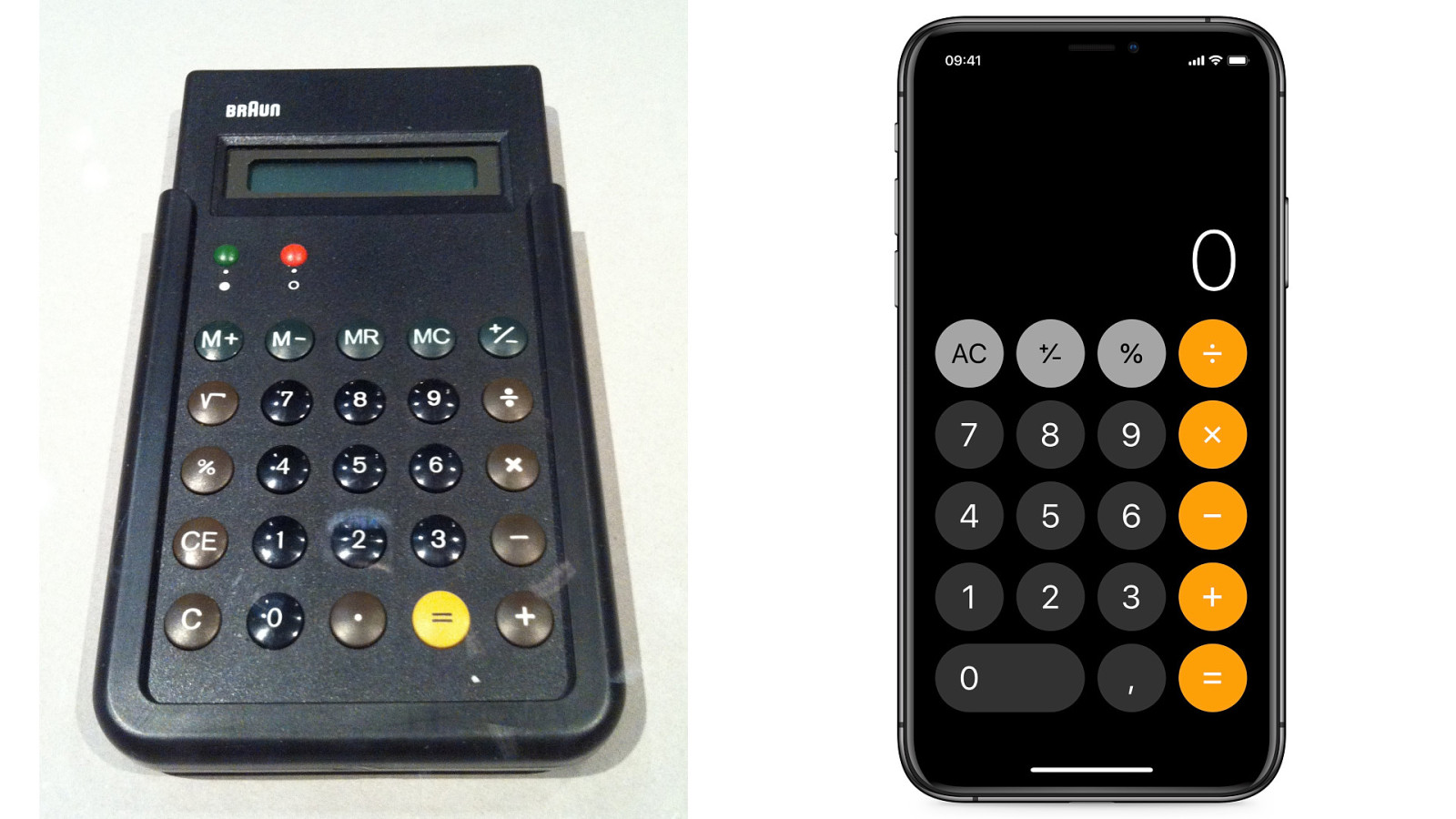
Dieter Rams → *20 May 1932 → Wiesbaden, Germany → Designer → Braun Consumer Products → Watch the Documentation – 1 free today only 1 https://www.ohyouprettythings.com/free
Slide 37
Slide 38
Slide 39
Slide 40

Good Design… 1. is innovative 2. makes a product useful 3. is aesthetic 4. makes a product understandable 5. is unobtrusive 6. is honest 7. is long-lasting 8. is thorough down to the last detail 9. is environmentally friendly 10. is minimal
- is innovative – The possibilities for progression are not, by any means, exhausted. Technological development is always offering new opportunities for original designs. But imaginative design always develops in tandem with improving technology, and can never be an end in itself. 2. makes a product useful – A product is bought to be used. It has to satisfy not only functional, but also psychological and aesthetic criteria. Good design emphasizes the usefulness of a product whilst disregarding anything that could detract from it. 3. is aesthetic – The aesthetic quality of a product is integral to its usefulness because products are used every day and have an effect on people and their wellbeing. Only well-executed objects can be beautiful. 4. makes a product understandable – It clarifies the product’s structure. Better still, it can make the product clearly express its function by making use of the user’s intuition. At best, it is self-explanatory. 5. is unobtrusive – Products fulfilling a purpose are like tools. They are neither decorative objects nor works of art. Their design should therefore be both neutral and restrained, to leave room for the user’s self-expression.
Slide 41
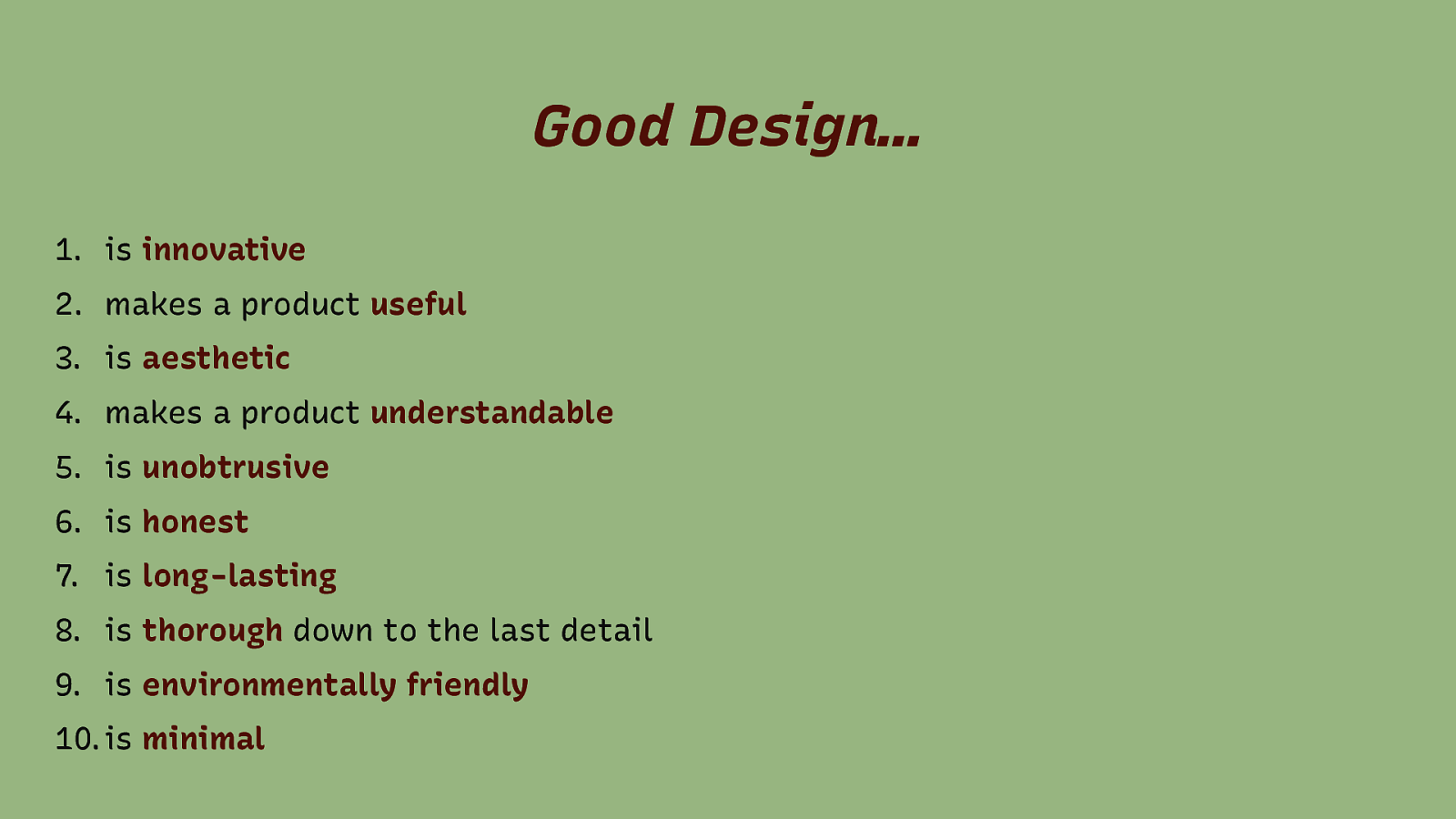
Good Design… 1. is innovative 2. makes a product useful 3. is aesthetic 4. makes a product understandable 5. is unobtrusive 6. is honest 7. is long-lasting 8. is thorough down to the last detail 9. is environmentally friendly 10. is minimal 6. is honest – It does not make a product appear more innovative, powerful or valuable than it really is. It does not attempt to manipulate the consumer with promises that cannot be kept. 7. is long-lasting – It avoids being fashionable and therefore never appears antiquated. Unlike fashionable design, it lasts many years – even in today’s throwaway society. 8. is thorough down to the last detail – Nothing must be arbitrary or left to chance. Care and accuracy in the design process show respect towards the consumer. 9. is environmentally friendly – Design makes an important contribution to the preservation of the environment. It conserves resources and minimizes physical and visual pollution throughout the lifecycle of the product. 10. is minimal – Less is more. Simple as possible but not simpler. Good design elevates the essential functions of a product.
Slide 42
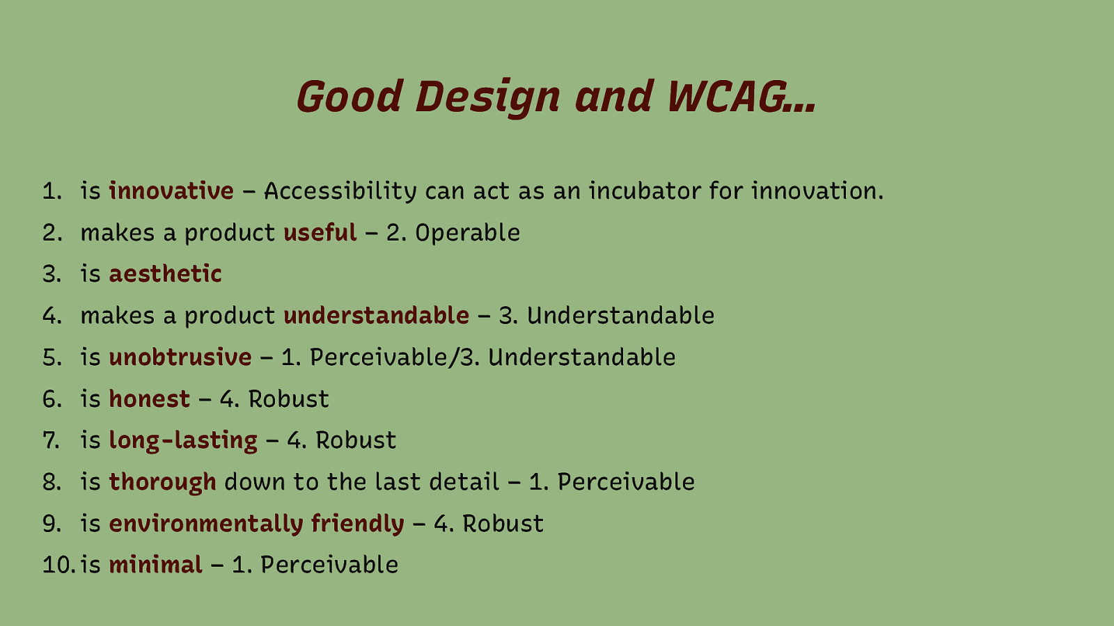
Good Design and WCAG… 1. is innovative – Accessibility can act as an incubator for innovation. 2. makes a product useful – 2. Operable 3. is aesthetic 4. makes a product understandable – 3. Understandable 5. is unobtrusive – 1. Perceivable/3. Understandable 6. is honest – 4. Robust 7. is long-lasting – 4. Robust 8. is thorough down to the last detail – 1. Perceivable 9. is environmentally friendly – 4. Robust 10. is minimal – 1. Perceivable
Slide 43
Good design centers on the user
Slide 44
Slide 45
Designers and Developers work for users
Slide 46
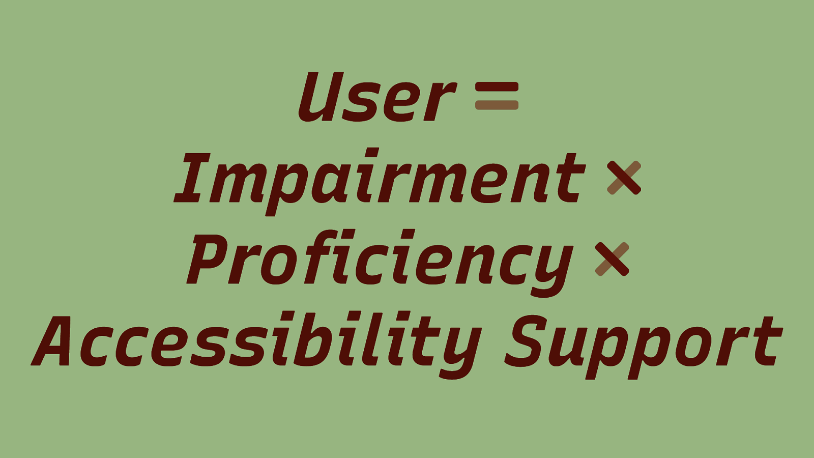
User Impairment Proficiency Accessibility Support
Slide 47
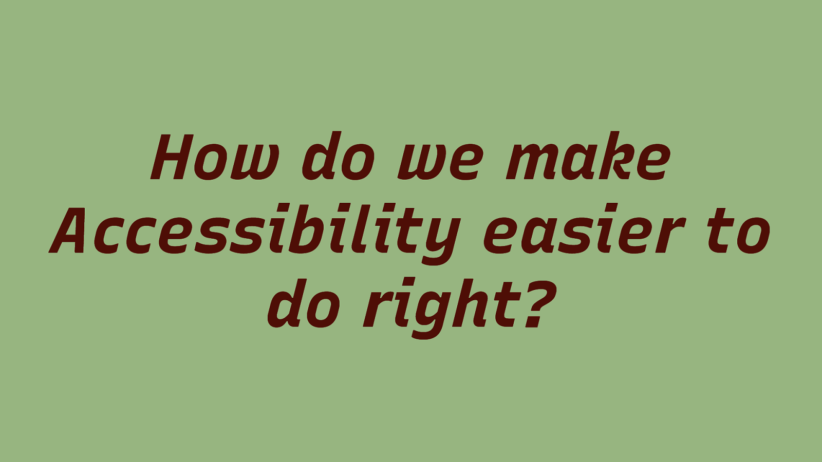
How do we make Accessibility easier to do right?
Slide 48
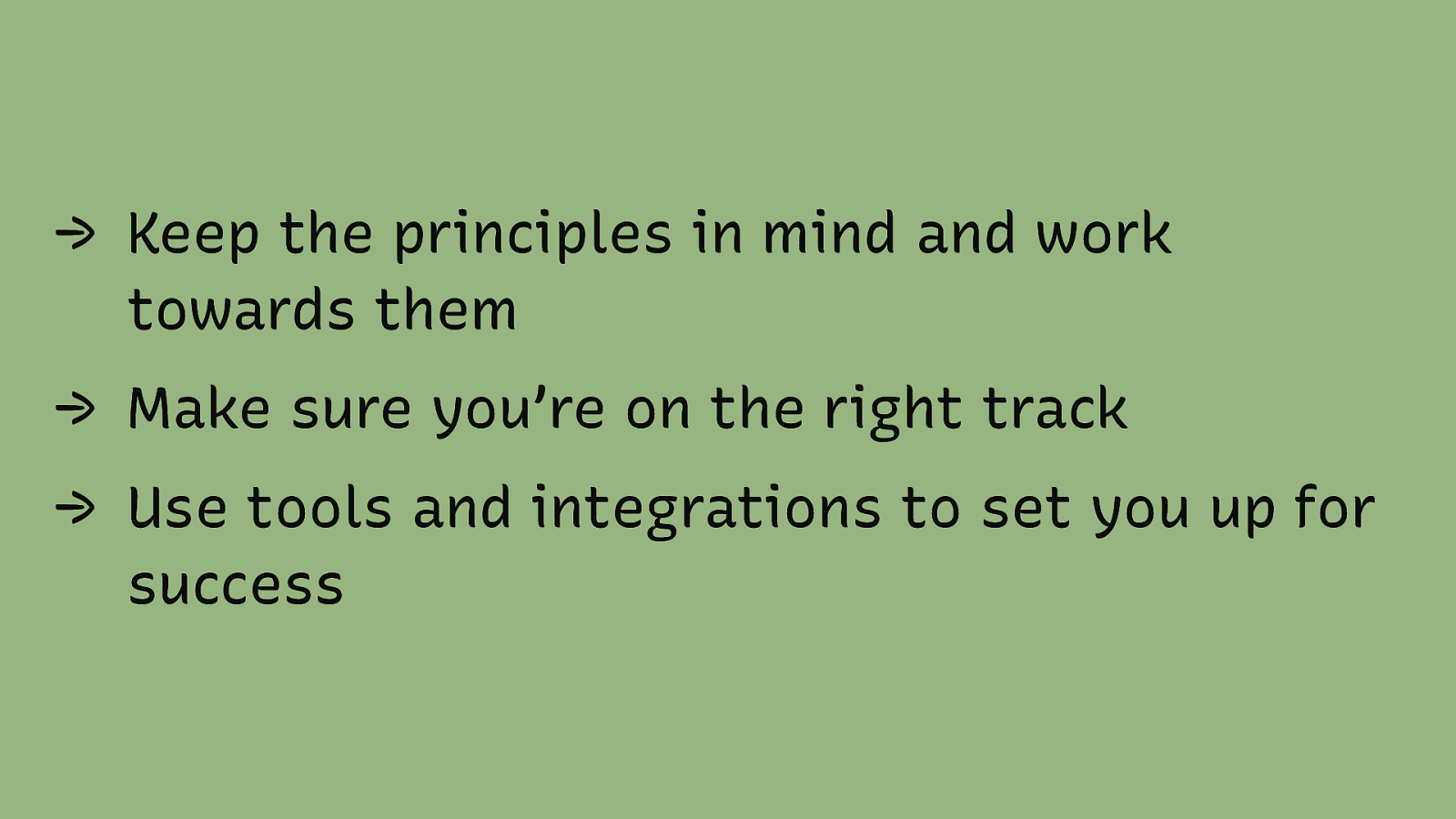
→ Keep the principles in mind and work towards them → Make sure you’re on the right track → Use tools and integrations to set you up for success
Slide 49
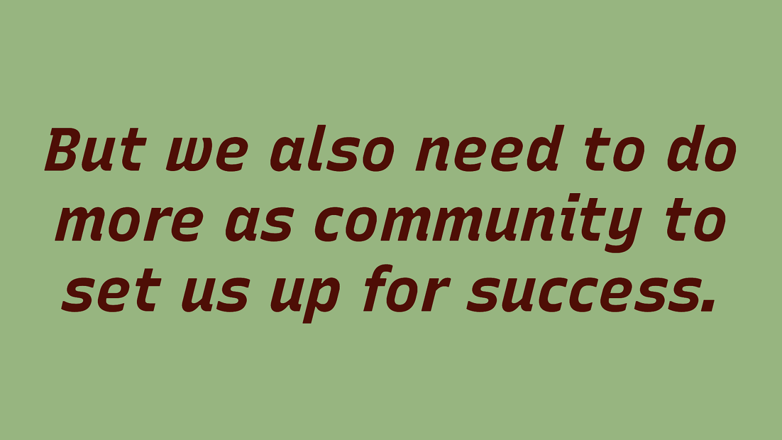
But we also need to do more as community to set us up for success.
Slide 50
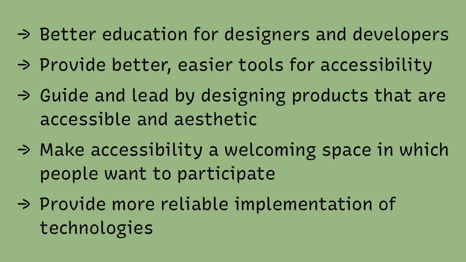
→ Better education for designers and developers → Provide better, easier tools for accessibility → Guide and lead by designing products that are accessible and aesthetic → Make accessibility a welcoming space in which people want to participate → Provide more reliable implementation of technologies
Slide 51
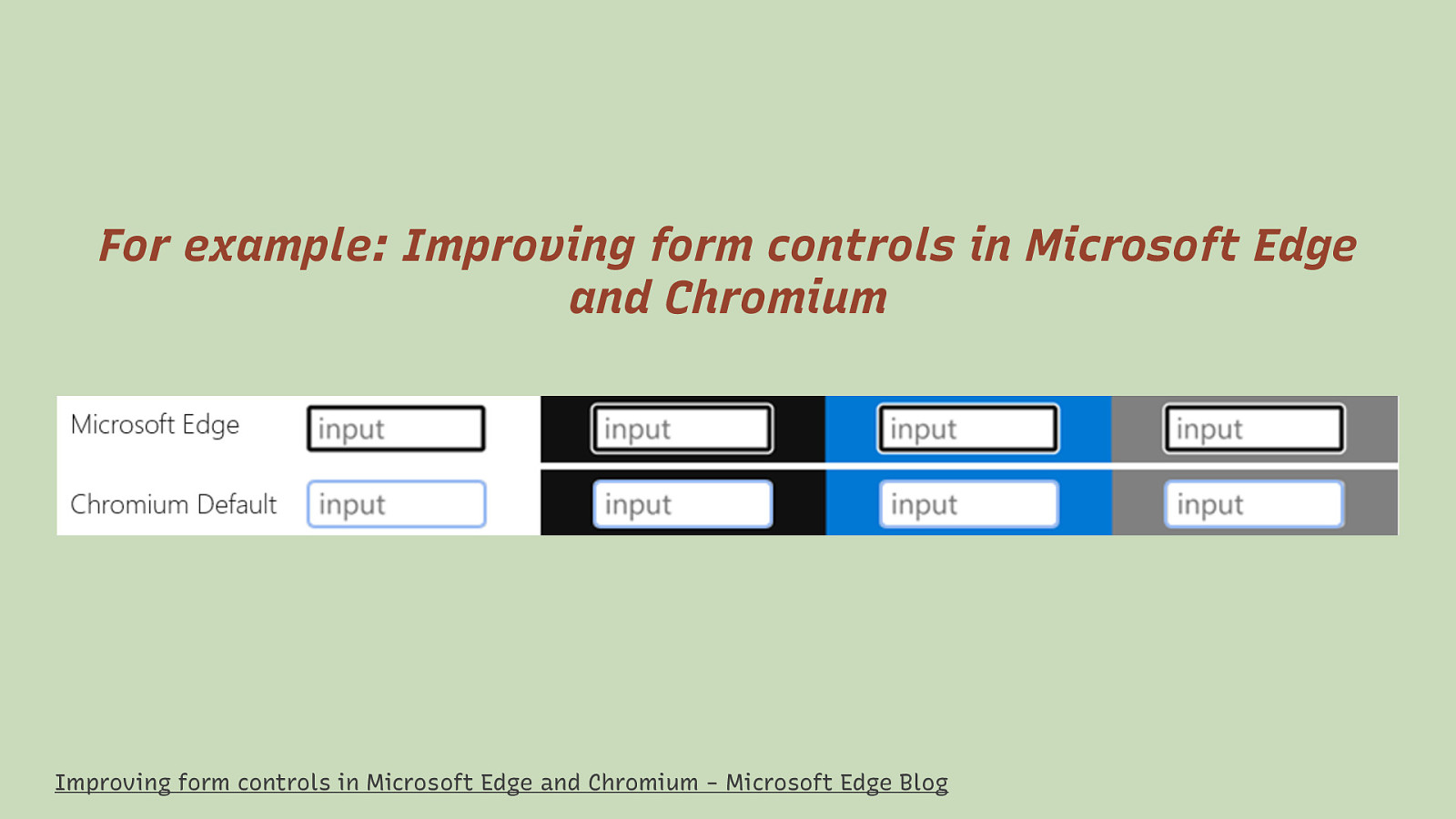
For example: Improving form controls in Microsoft Edge and Chromium Improving form controls in Microsoft Edge and Chromium - Microsoft Edge Blog
Slide 52

Slide 53
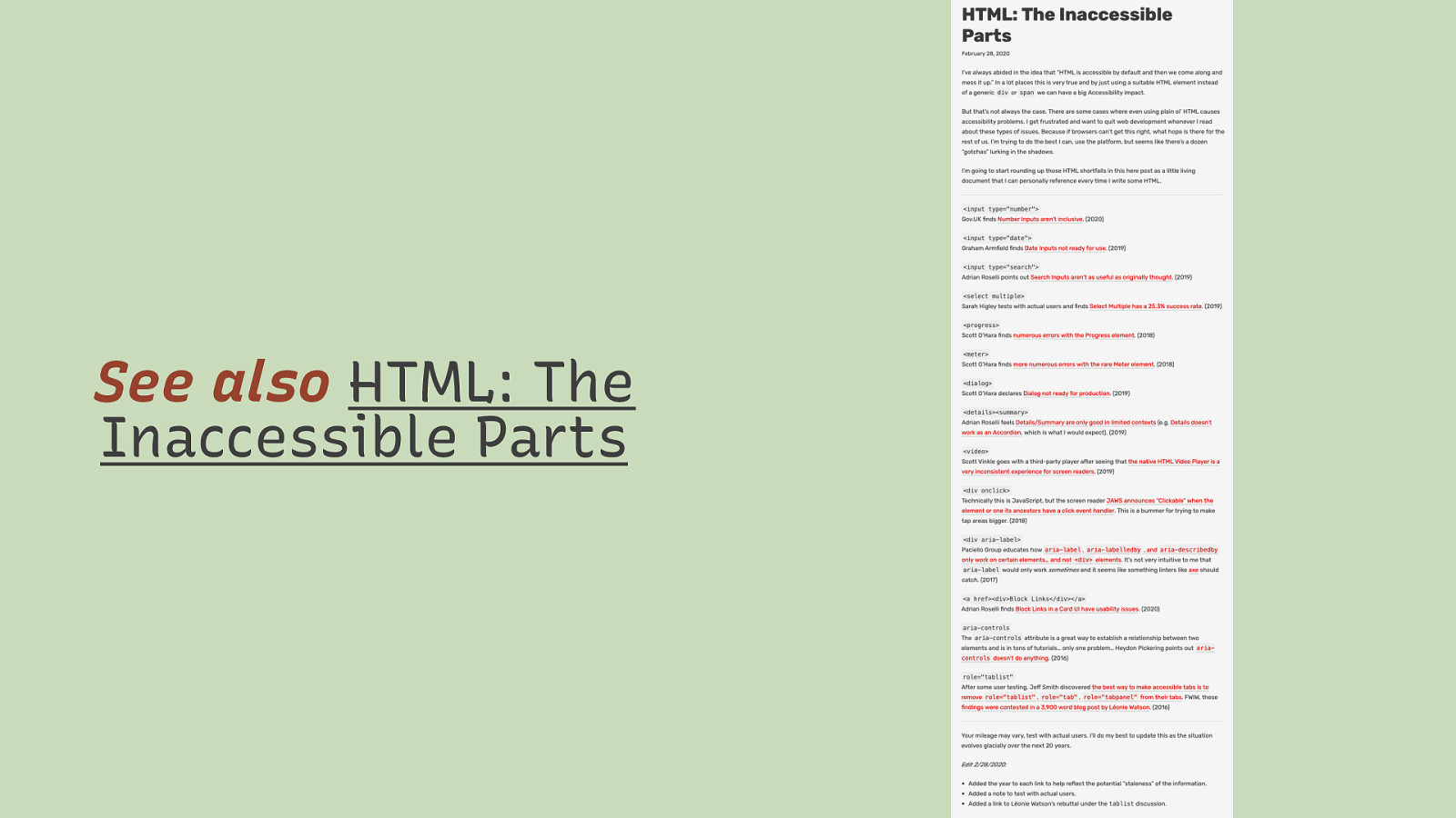
See also HTML: The Inaccessible Parts Dave Rupert
Slide 54
Thank You! Eric Eggert Web: yatil.net E-Mail: mail@yatil.net Social: @yatil