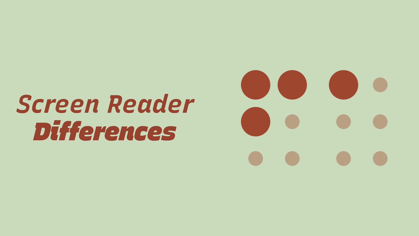
Respecting User Preferences on the Web Eric Eggert · AccessU · May 2020
Slide 1
Slide 2
Eric Eggert Eric Eggert is a Web Developer and Teacher who works with on improving the Web for People with Disabilities, and everyone else. 2013–2020: W3C/Web Accessibility Initiative My name is Eric Eggert and I work with Knowbility and the W3C to improve the Web for People with Disabilities. I work with Knowbility as the tech team lead. And have worked with W3C in the past.
Slide 3

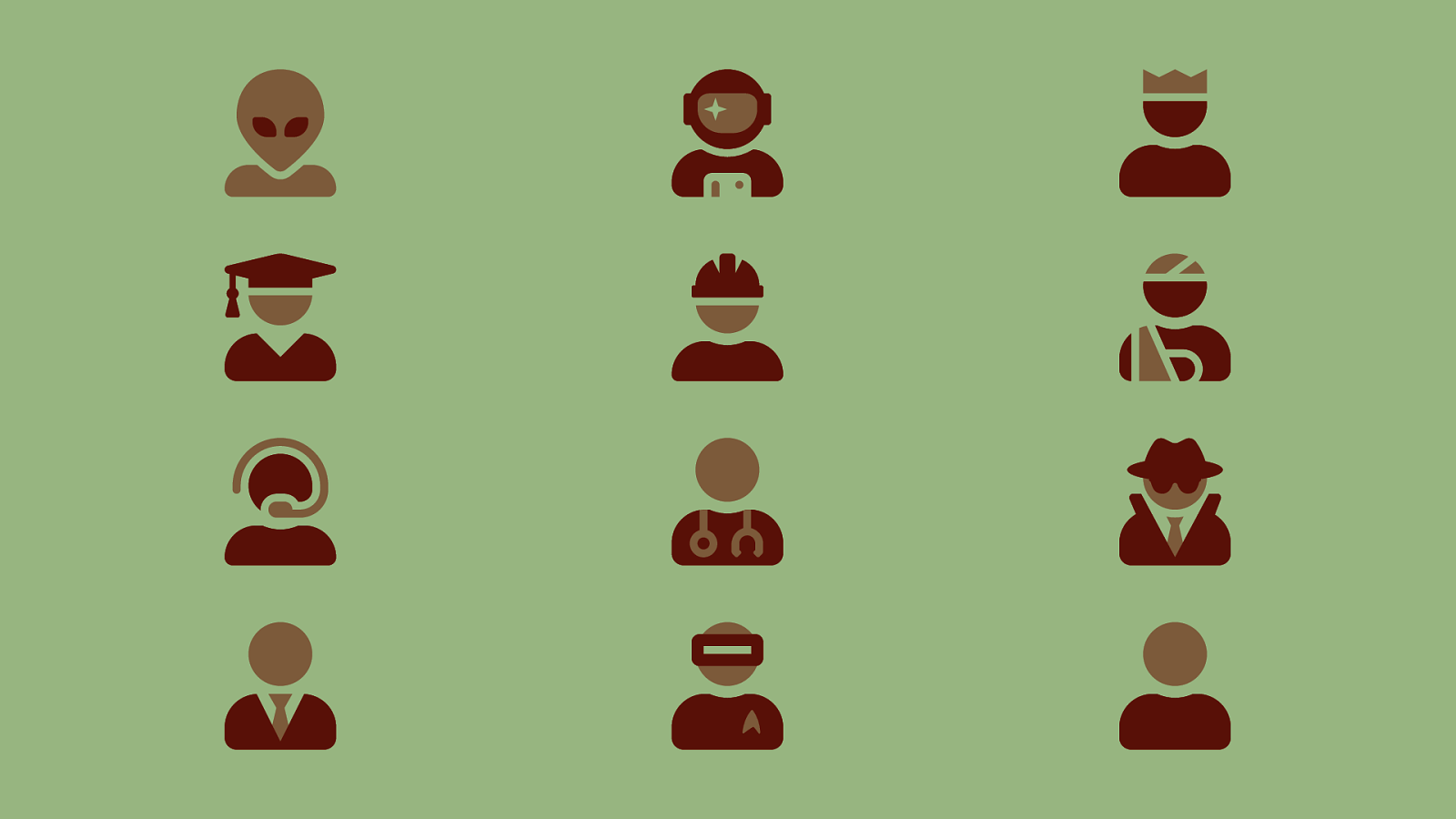
Users Today, I want to focus on the users and how we can make the web better for them.
Slide 4
Slide 5
No User is the Same
Slide 6

The “Average Man”?
Slide 7
Slide 8
Thanks Matt! Does The Average Person Exist? — standupmaths
Slide 9
Why do we design like they are?
Slide 10

Why do we develop like they are?
Slide 11
What Does Inclusive Design Even Mean?
Slide 12
Slide 13
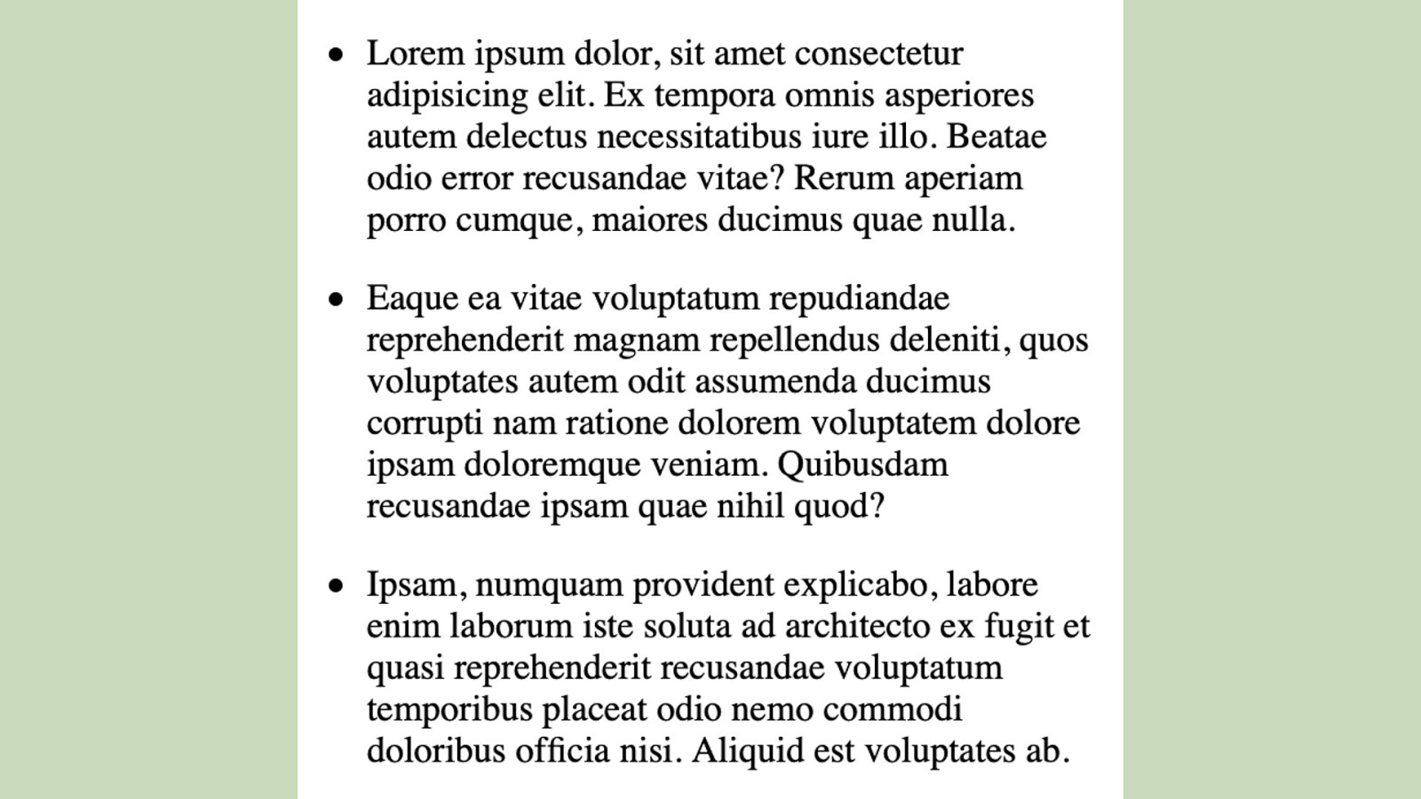
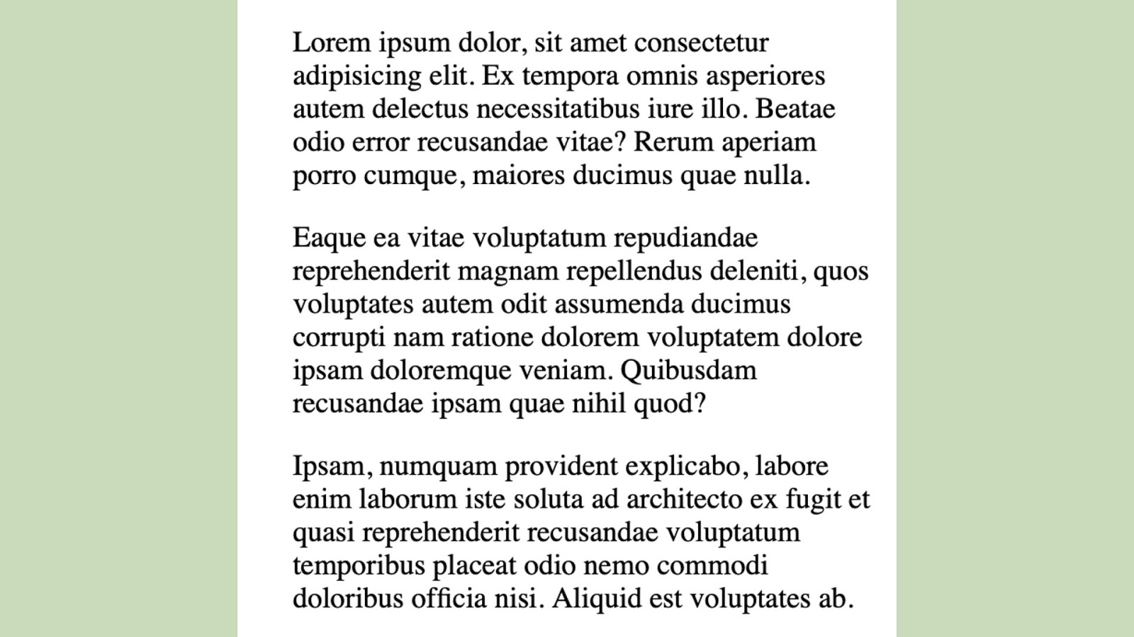
Screen Reader Differences In January 2019, Scott O’Hara, who is always on top of those things made a discovery:
Slide 14
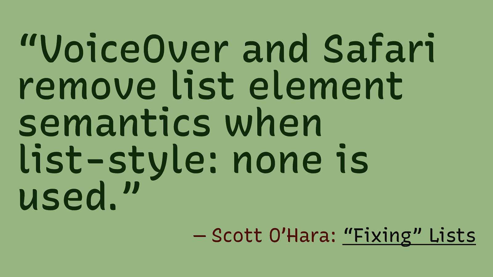
“VoiceOver and Safari remove list element semantics when list-style: none is used.” — Scott O’Hara: “Fixing” Lists
Slide 15
Slide 16
Slide 17
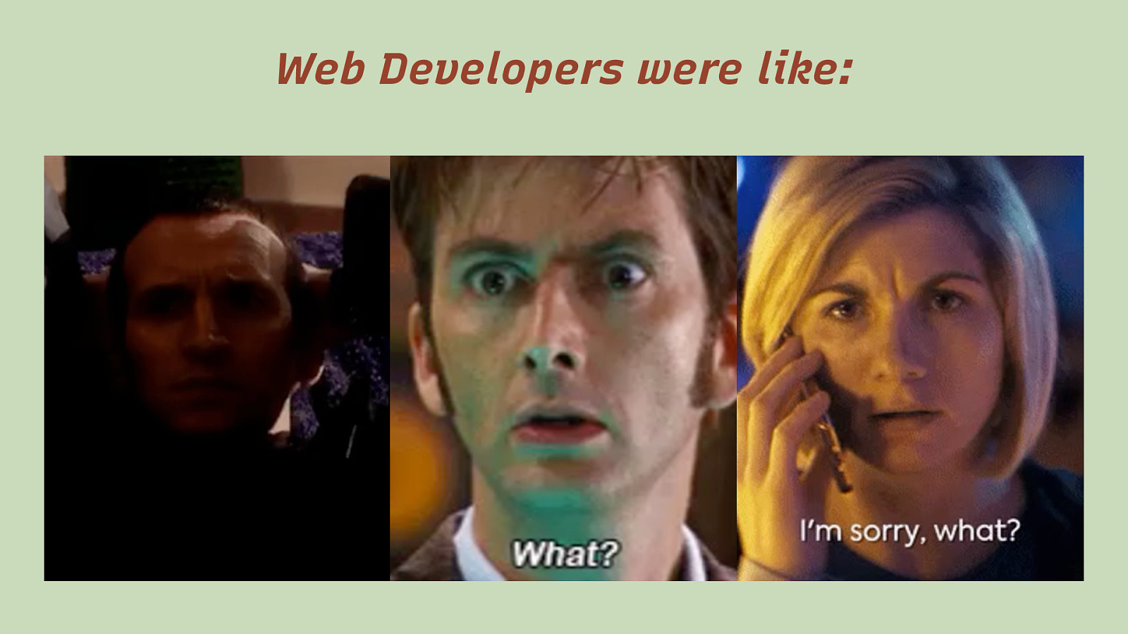
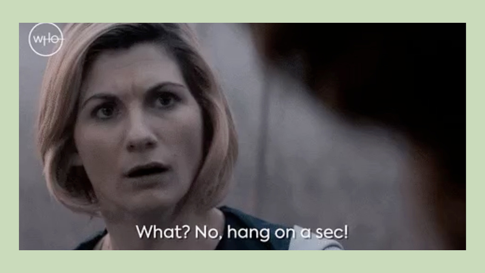
Web Developers were like:
Slide 18
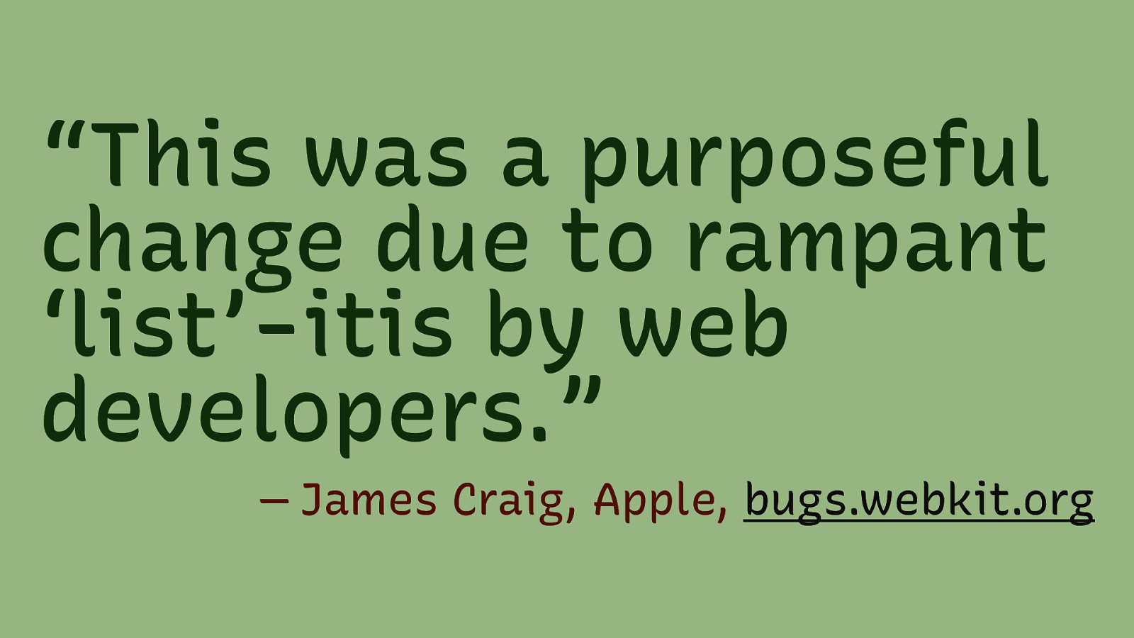
“This was a purposeful change due to rampant ‘list’-itis by web developers.” — James Craig, Apple, bugs.webkit.org
Slide 19
Slide 20
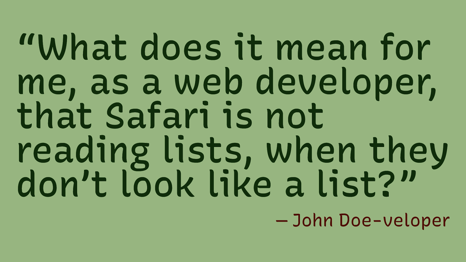
“What does it mean for me, as a web developer, that Safari is not reading lists, when they don’t look like a list?” — John Doe-veloper
Slide 21
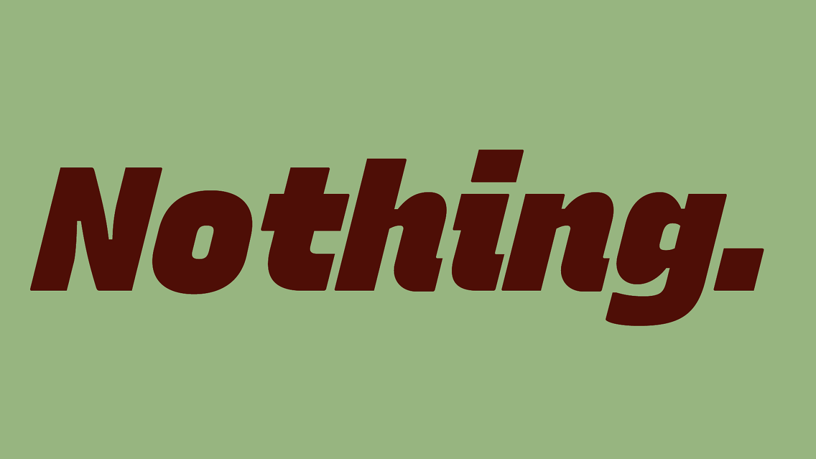
Nothing.
Slide 22
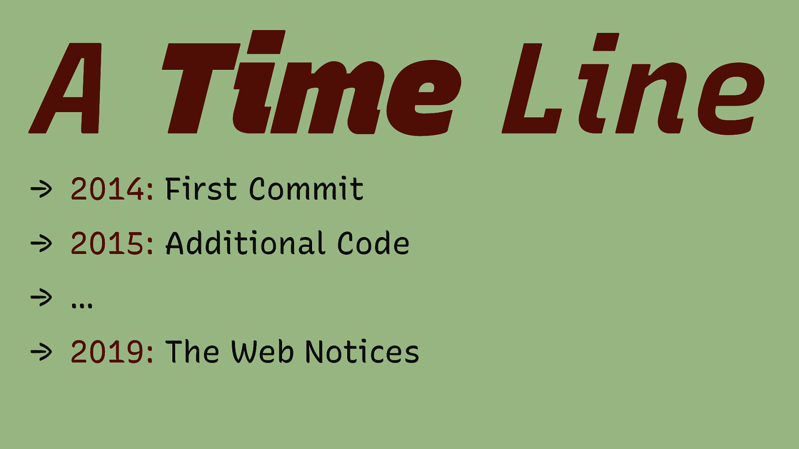
A Time Line → 2014: First Commit → 2015: Additional Code → … → 2019: The Web Notices
Slide 23
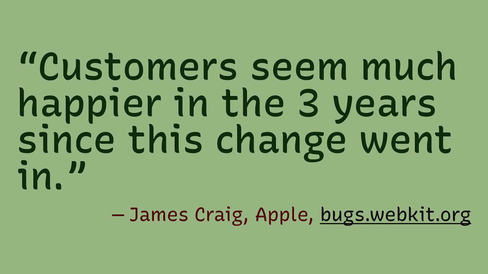
“Customers seem much happier in the 3 years since this change went in.” — James Craig, Apple, bugs.webkit.org
Slide 24
dowebsitesneedtolookexactlythesameineverybrowser.com
Slide 25
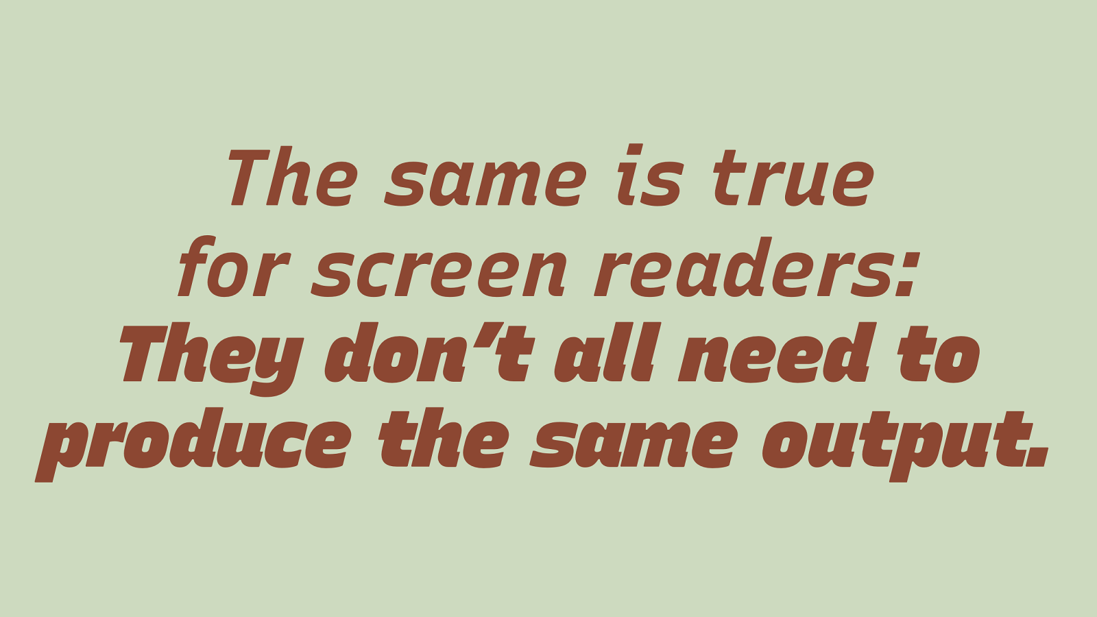
The same it true for screen readers: They don’t all need to produce the same output.
Slide 26
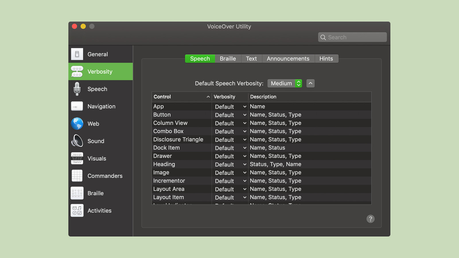
Screen readers have extremely granular verbosity settings. In VoiceOver, you can chose between Medium, Low and High verbosity. Users can chose individually the level of verbosity they are comfortable with.
Slide 27
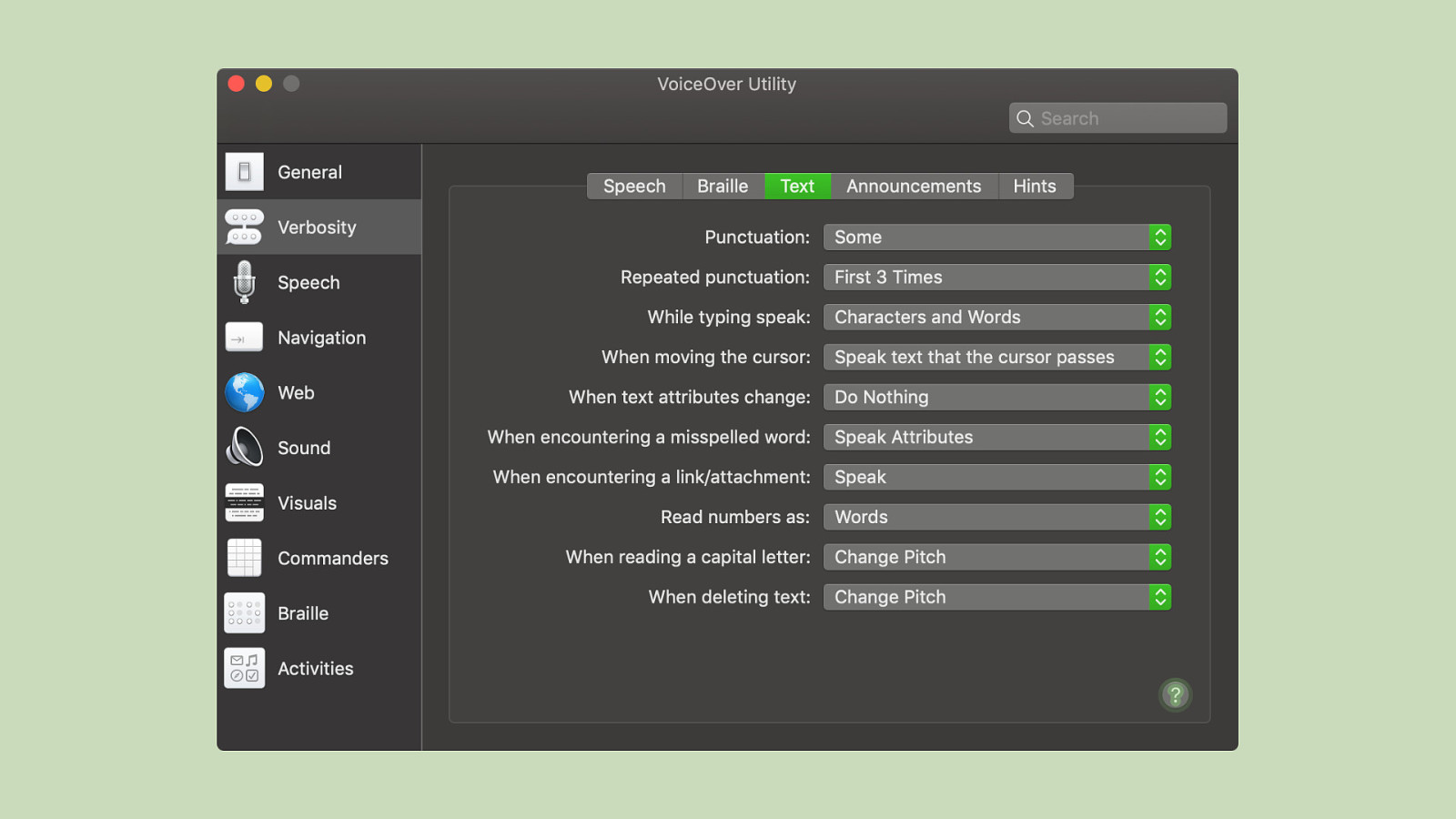
The same goes for punctuation. Some users might opt to hear most or all of the punctuation, some only to hear a couple.
Slide 28
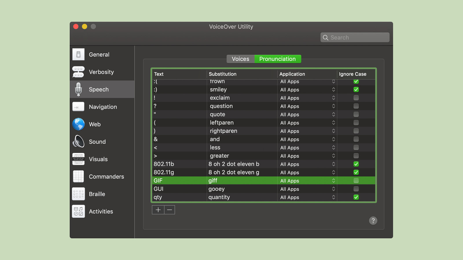
You can even overwrite certain abbreviations or symbols. You can even make VoiceOver pronounce GIF as jiff, if you want to.
Slide 29
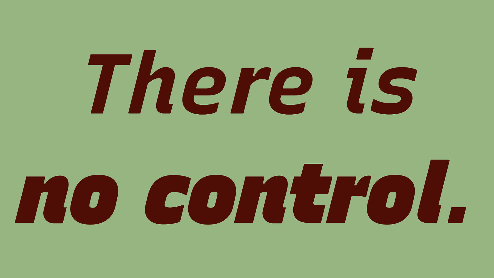
There is no control.
Slide 30
Slide 31
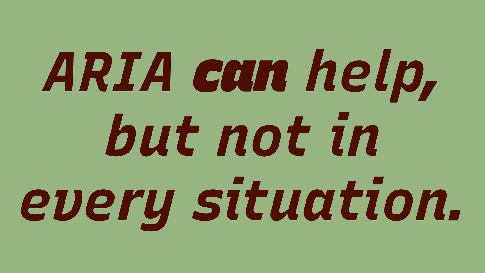
ARIA can help, but not in every situation.
Slide 32
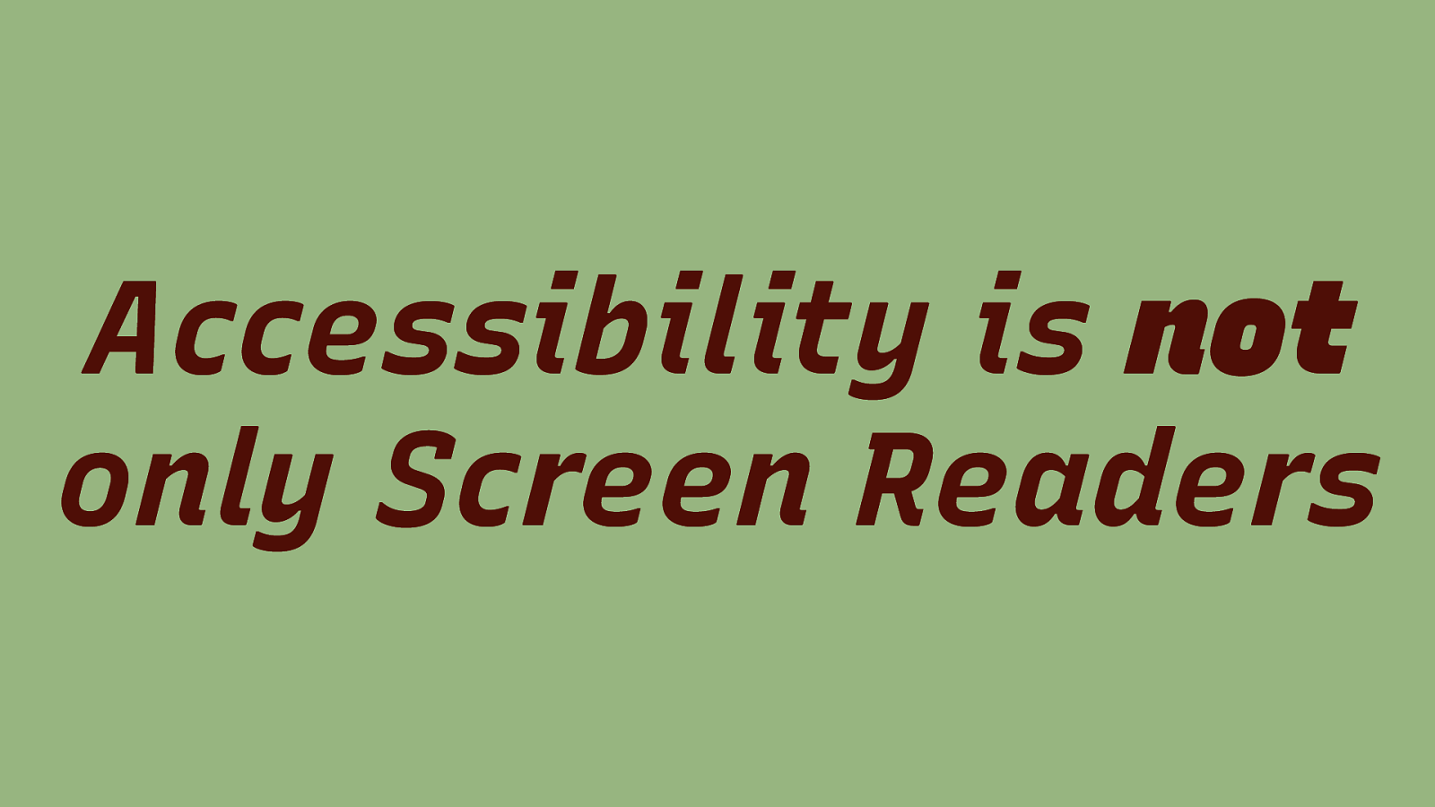
Accessibility is not only Screen Readers
Slide 33
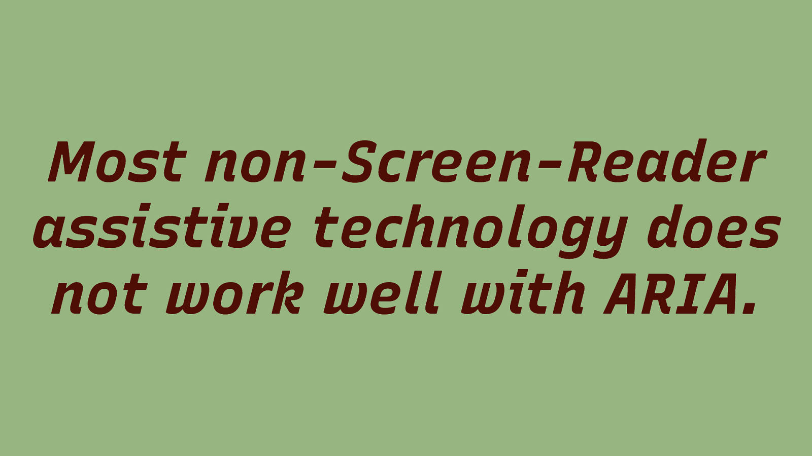
Most non-Screen-Reader assistive technology does not work well with ARIA.
Slide 34
Slide 35
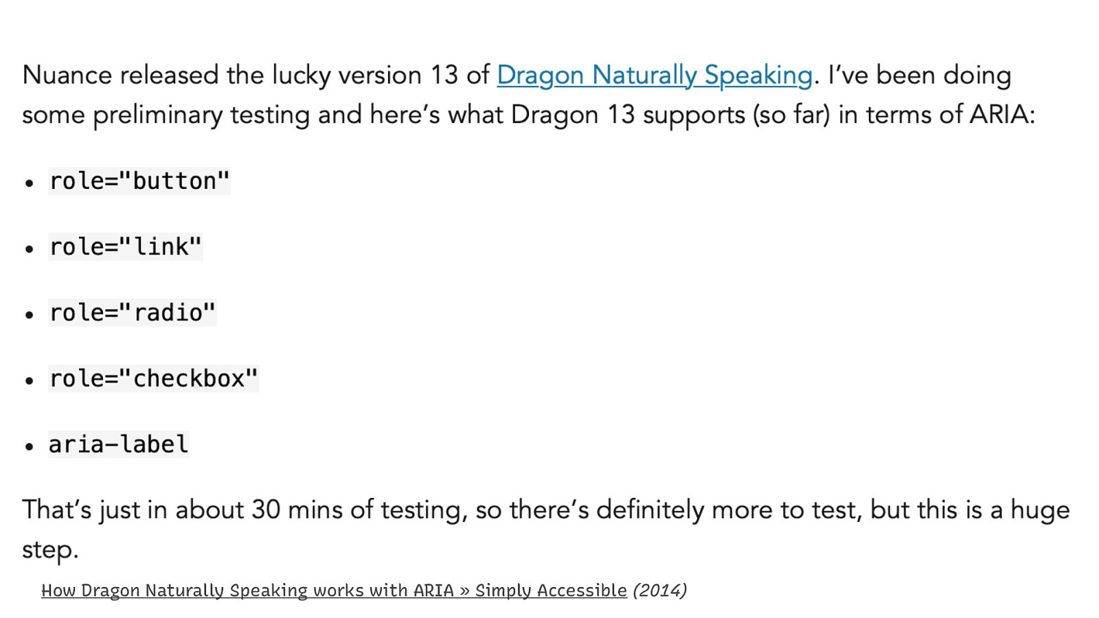
How Dragon Naturally Speaking works with ARIA » Simply Accessible (2014)
Slide 36
High Contrast Mode
Slide 37
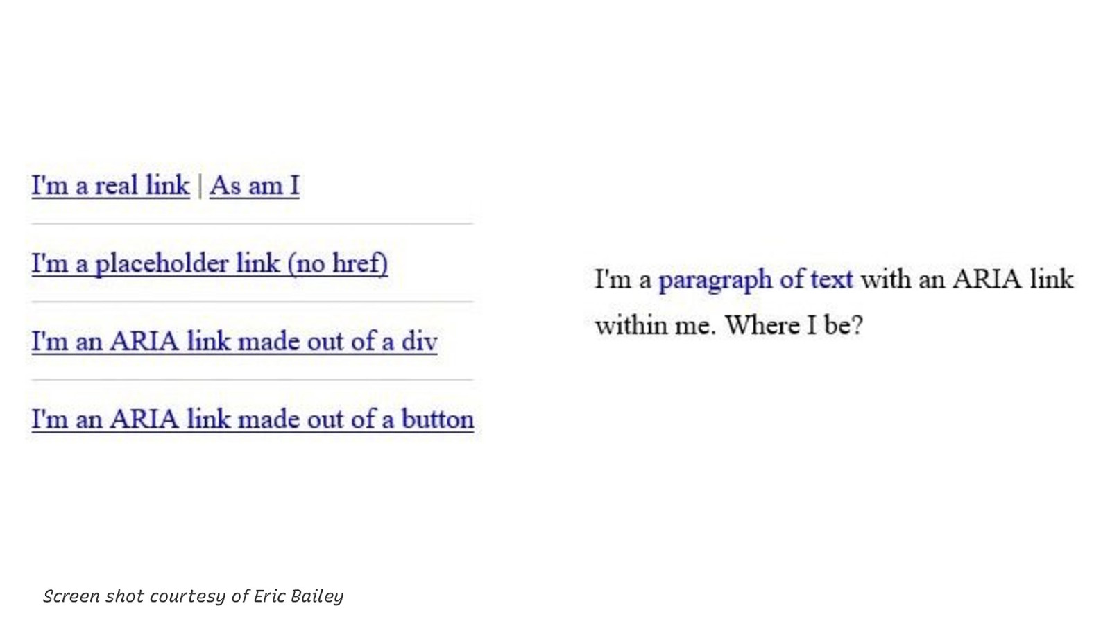
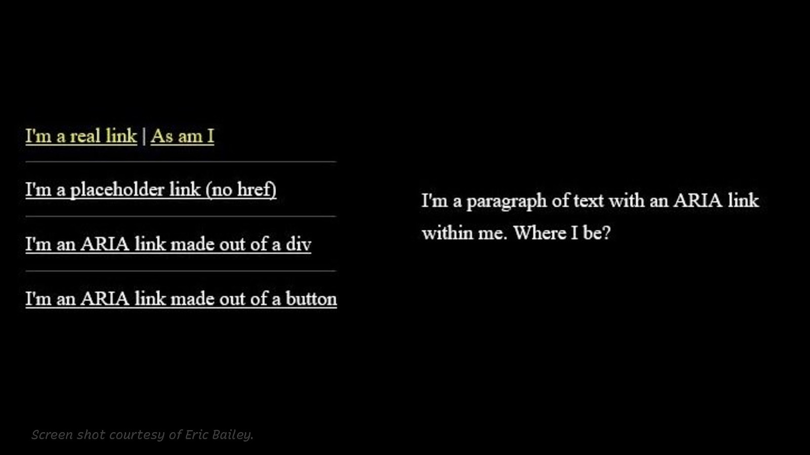
Screen shot courtesy of Eric Bailey This screen shot shows a couple of links: Normal links, placeholder links without href, links that are faked using ARIA, even one without a button. On the right, there’s a paragraph of text with a styled ARIA link in it (Non-underlined dark blue text link in black text paragraph.)
Slide 38
Screen shot courtesy of Eric Bailey. This is the same page with High Contrast Mode enabled. Only real links are colored differently compared to the normal text. ARIA links have the same color as the text.
Slide 39
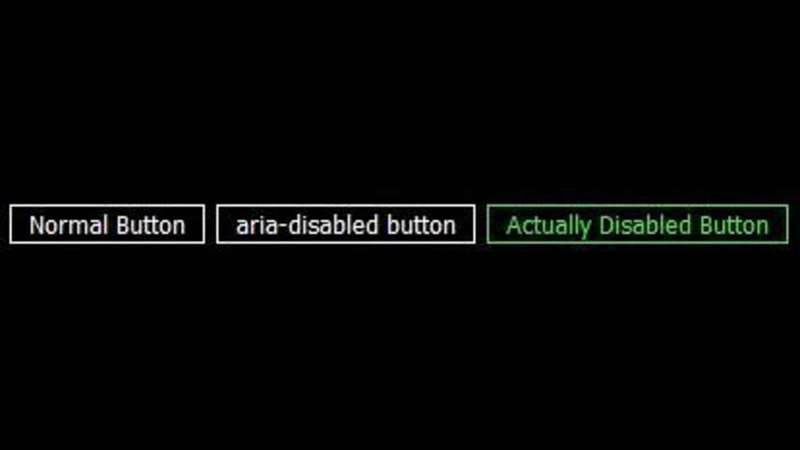
The same goes for buttons – when you use aria-disabled=true, the disabled button will not look inactive, like a button that has the disabled attribute set. This can confuse users.
Slide 40

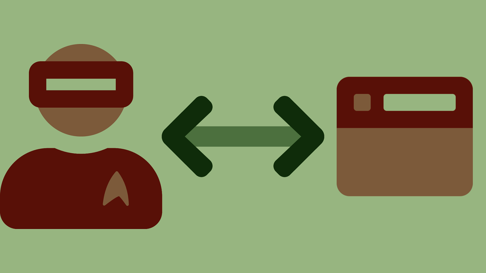
Users!
Slide 41

Knowledge Levels Vary Greatly
Slide 42
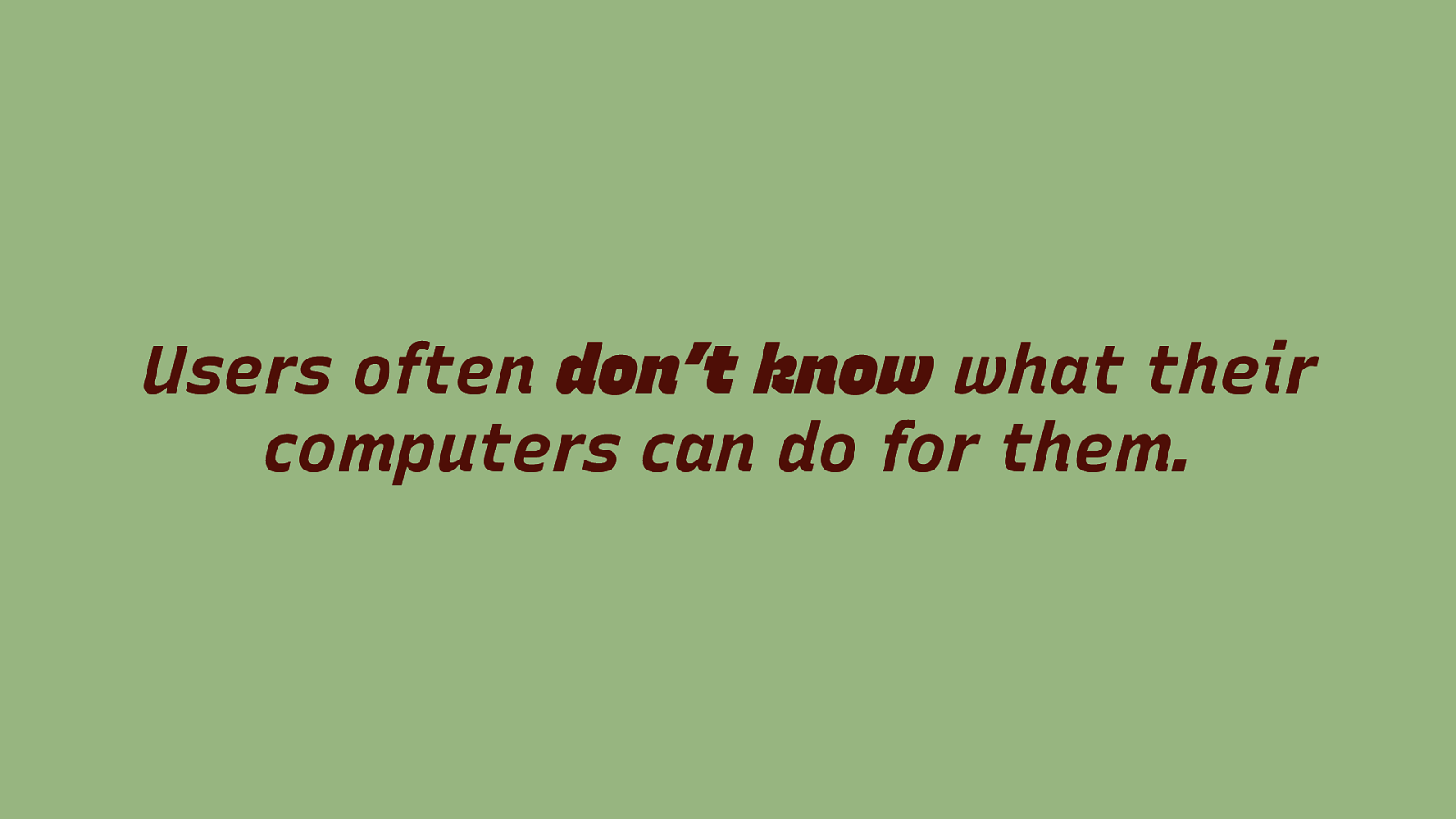
Users often don’t know what their computers can do for them.
Slide 43
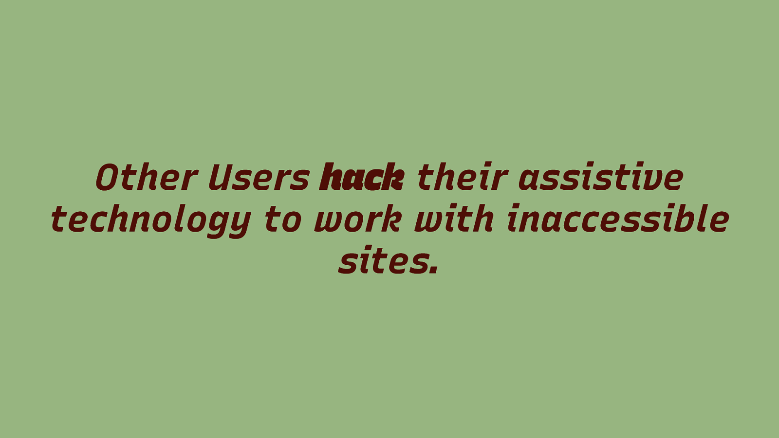
Other Users hack their assistive technology to work with inaccessible sites.
Slide 44
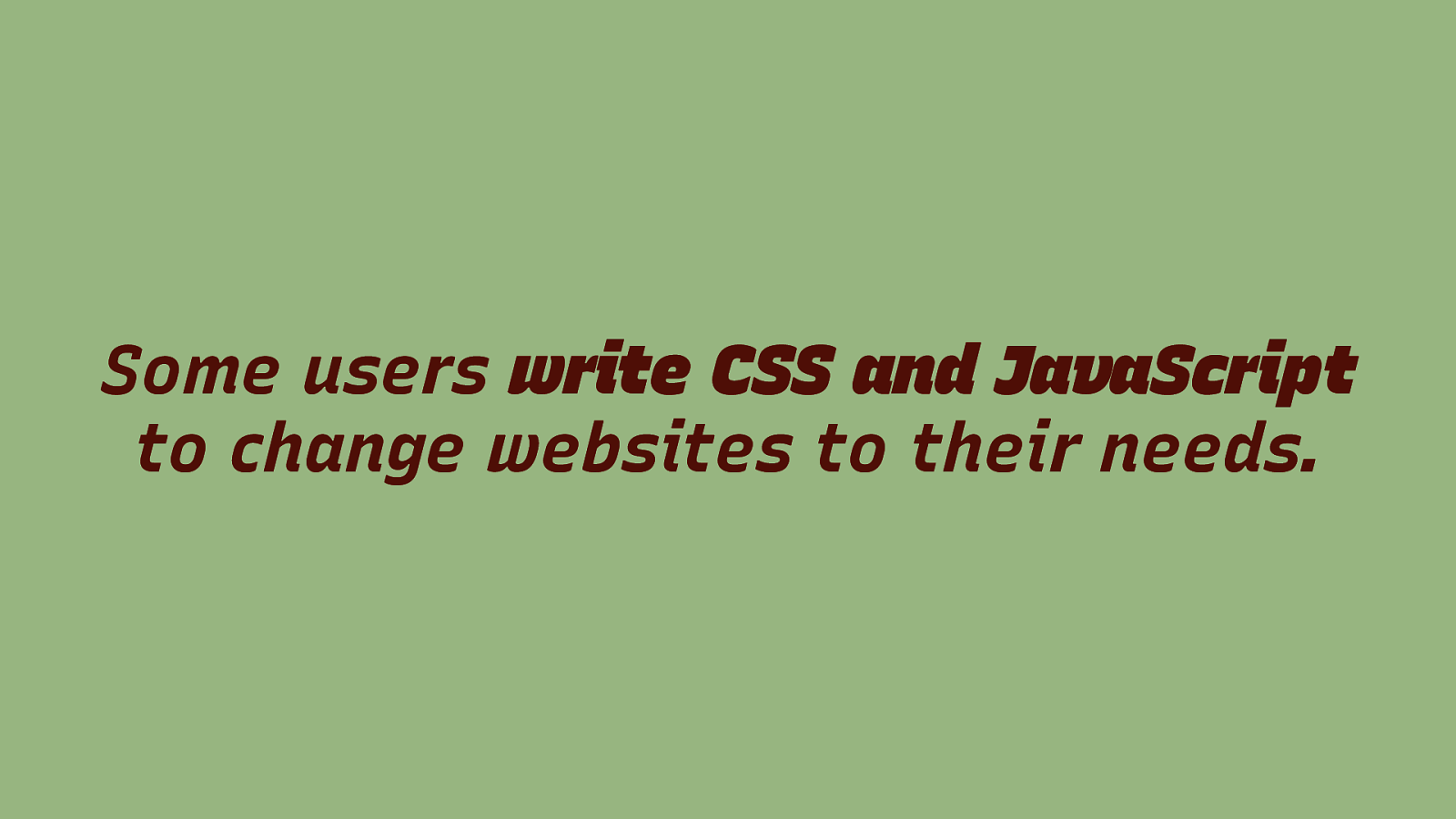
Some users write CSS and JavaScript to change websites to their needs.
Slide 45
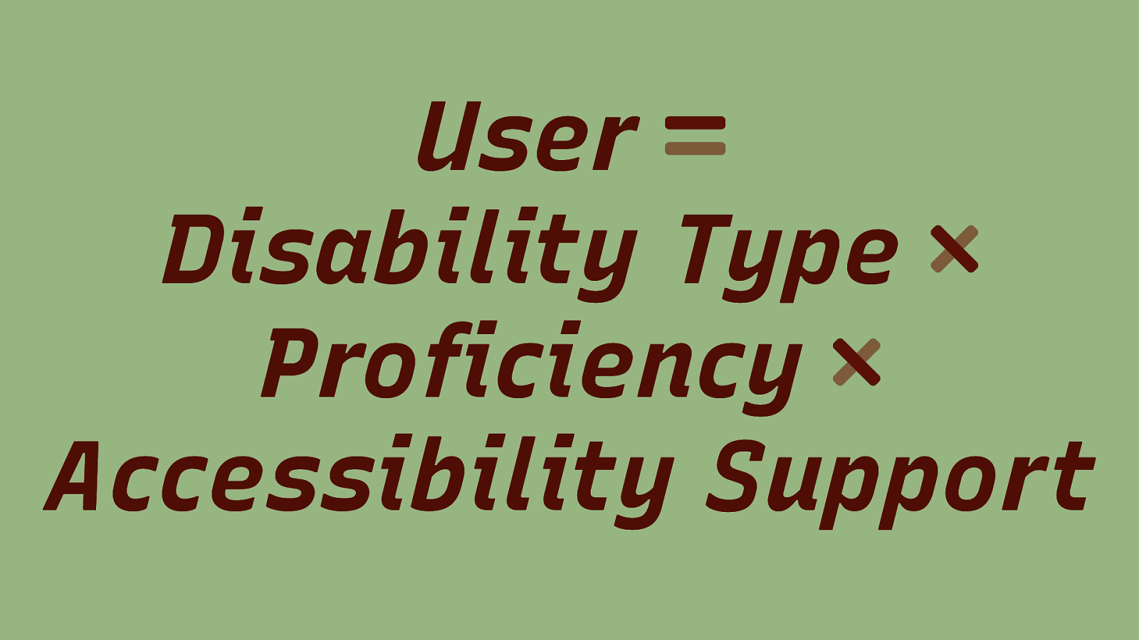
User Disability Type Proficiency Accessibility Support
Slide 46
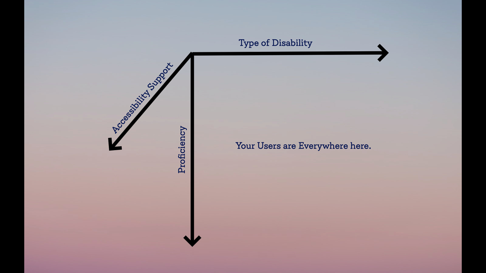
Users are somewhere on this spectrum between type of disability, accessibility support of the tools they use and the proficiency that they have to actually use those tools.
Slide 47

Test with Diverse Users
Slide 48

Give Users Agency they can decide the technology that works best for them
Slide 49
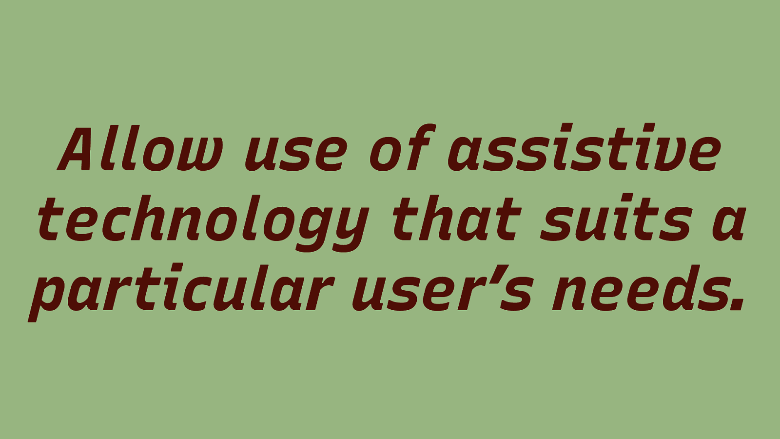
Allow use of assistive technology that suits a particular user’s needs.
Slide 50
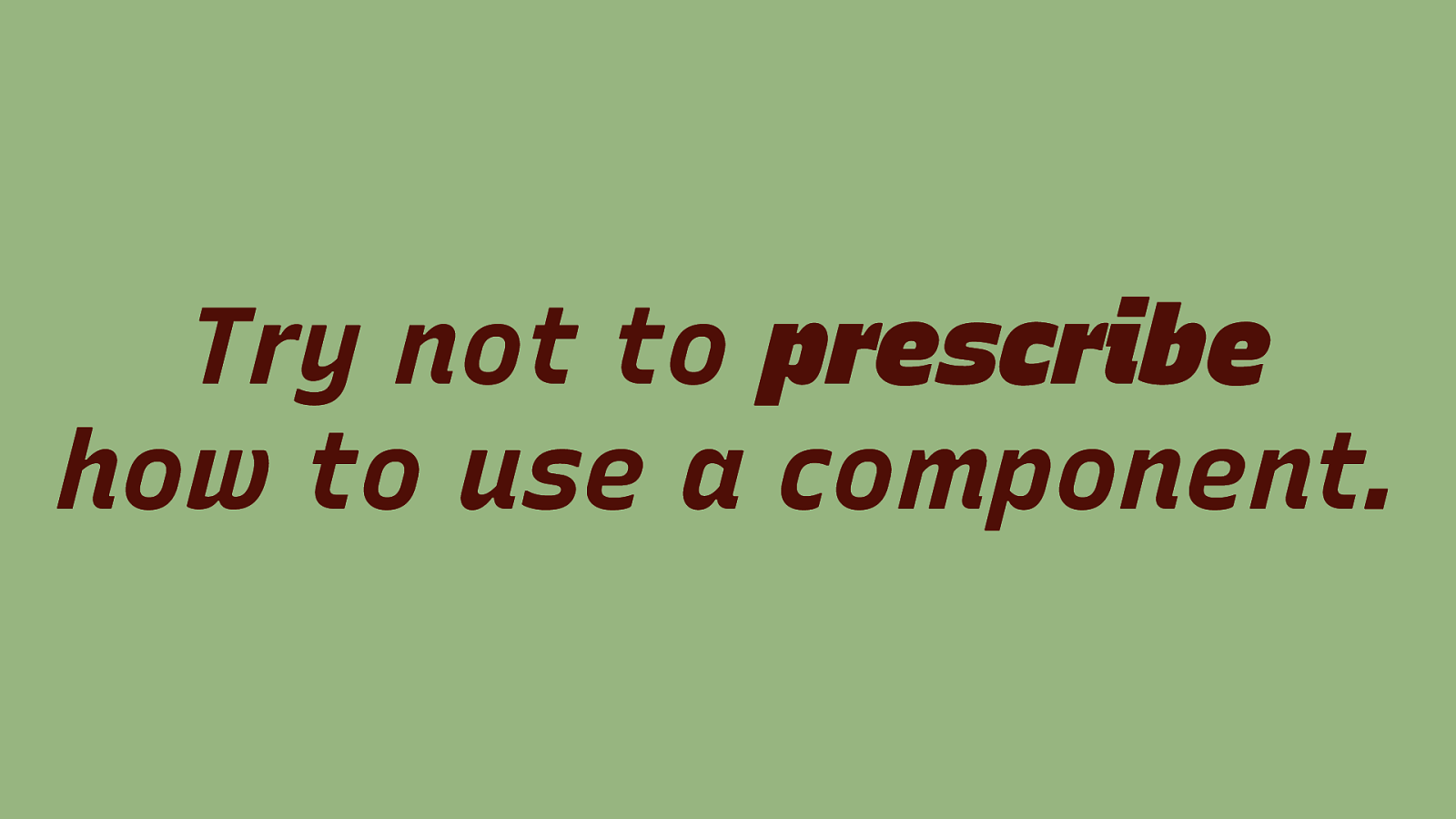
Try not to prescribe how to use a component.
Slide 51
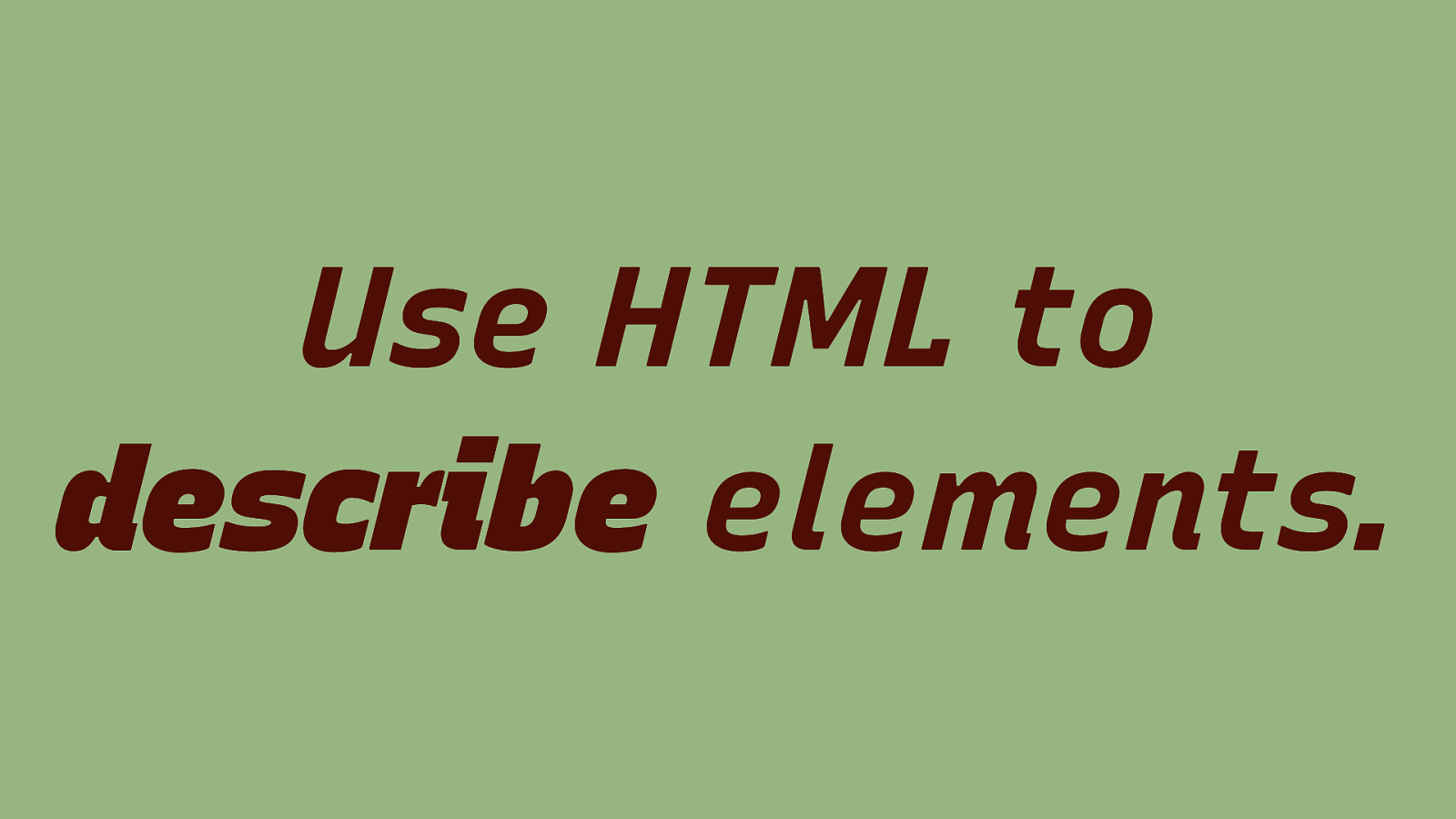
Use HTML to describe elements.
Slide 52
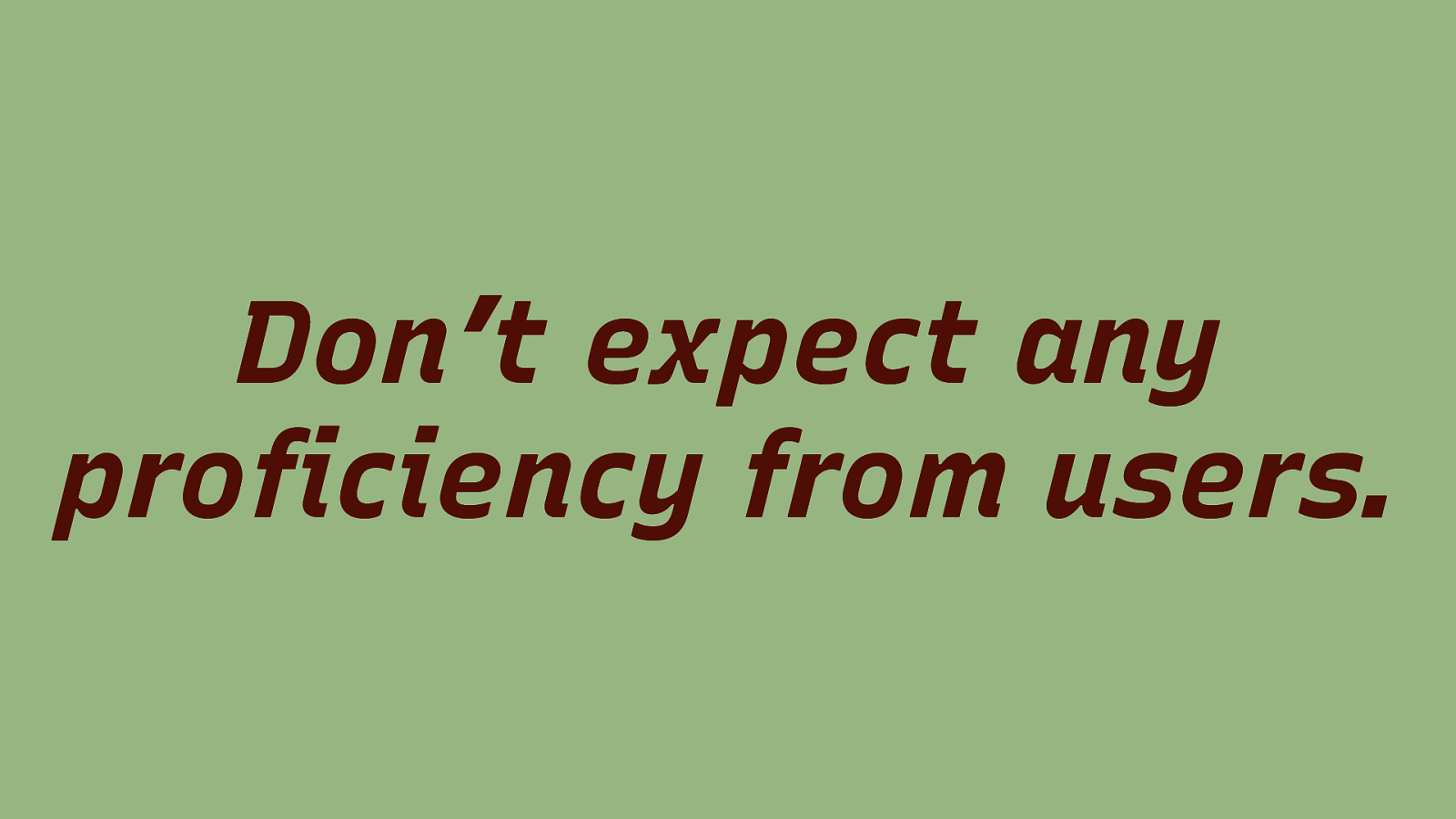
Don’t expect any proficiency from users.
Slide 53

Don’t break conventions!
Slide 54
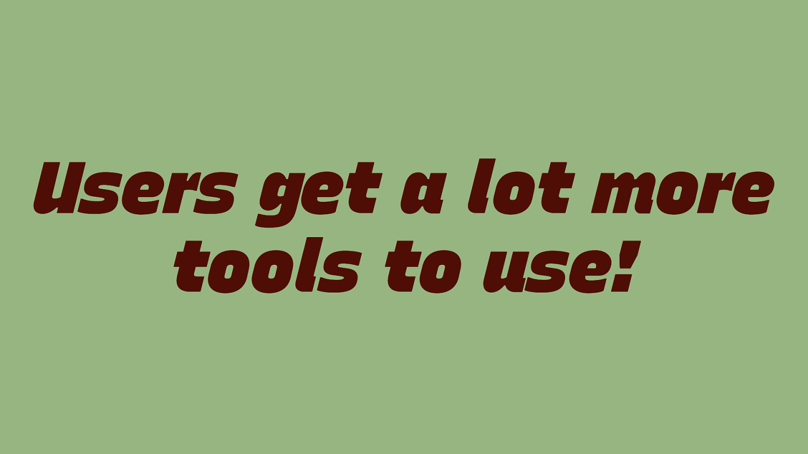
Users get a lot more tools to use!
Slide 55

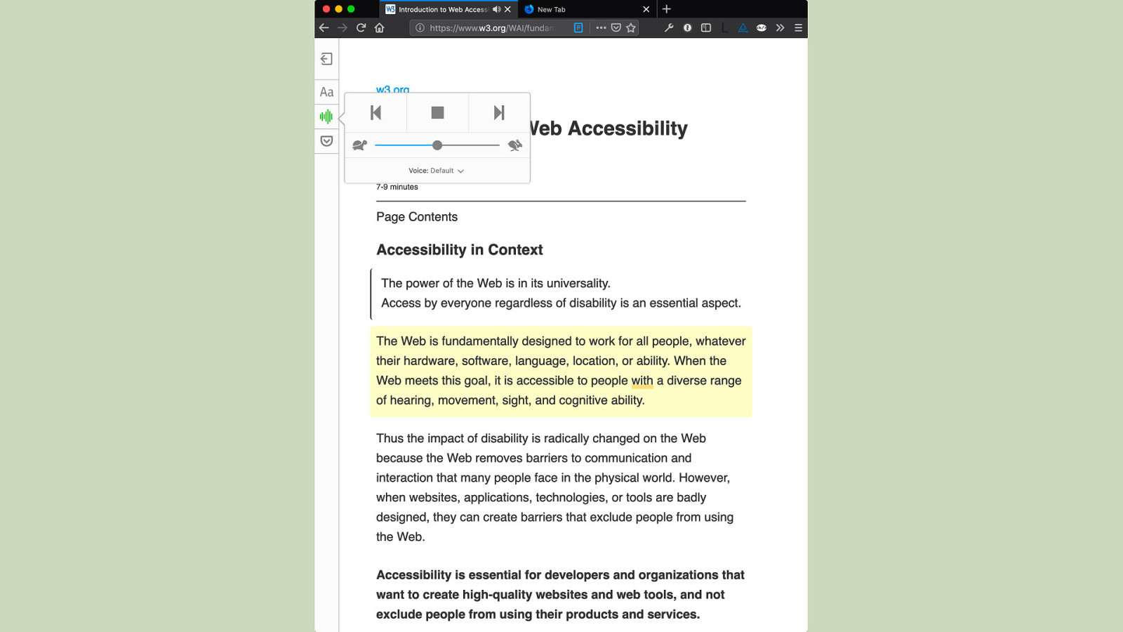
Reader Mode
Slide 56
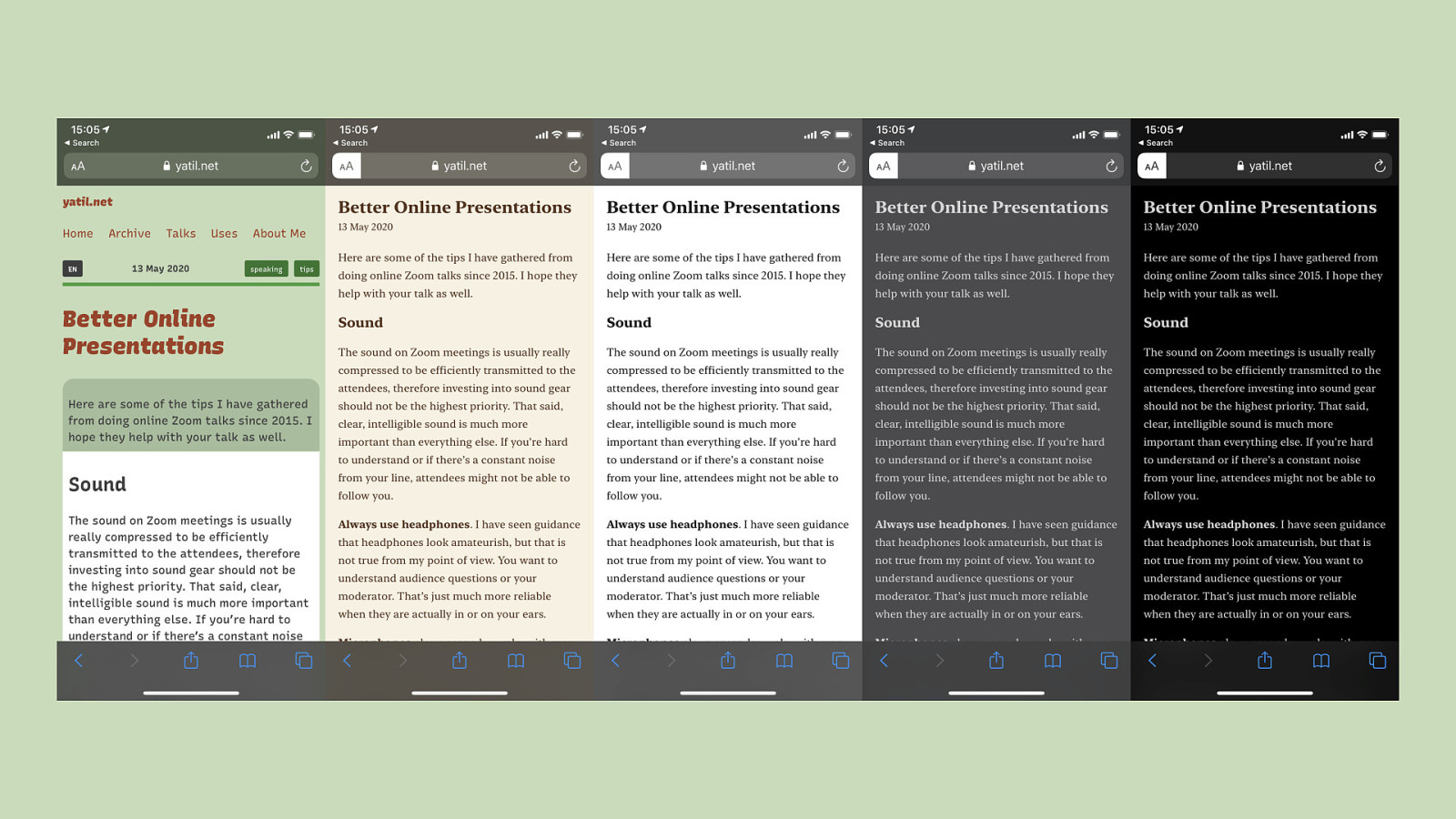
This is reader mode in Safari. Clicking on the reader mode icon in the top left transforms the page (in the first screen shot) to an easy to read layout that focuses on the content of the page.
Slide 57
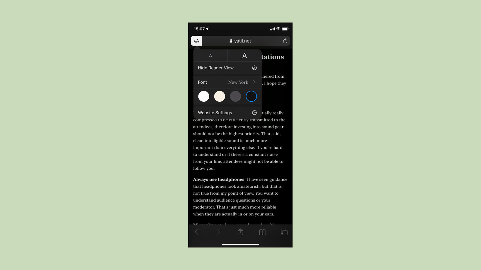
You can change fonts and colors to your liking.
Slide 58
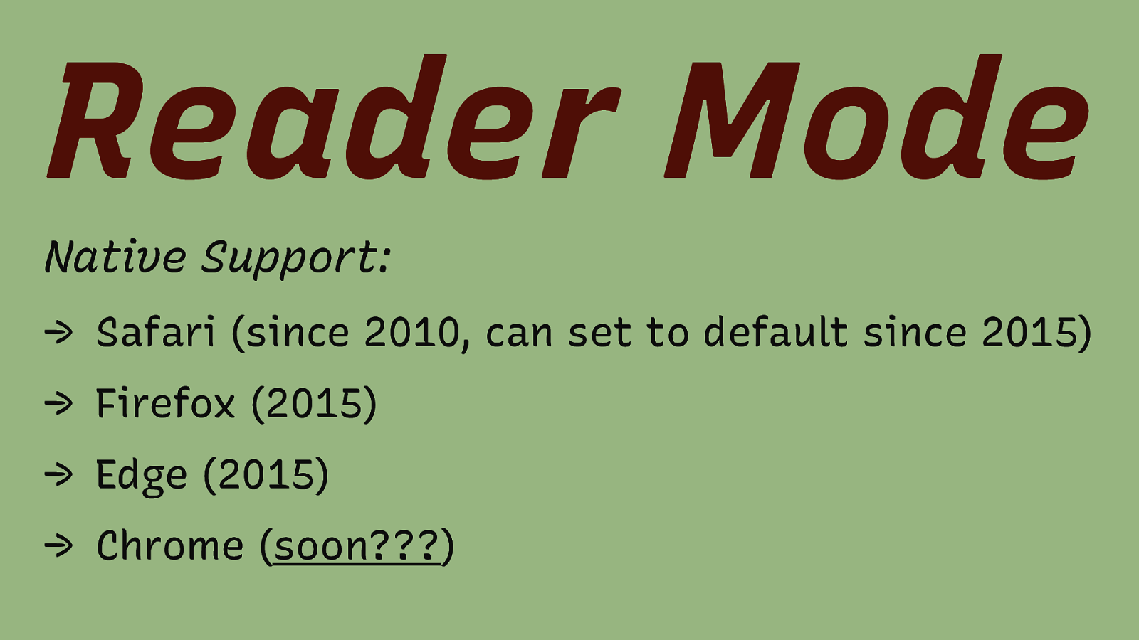
Reader Mode Native Support: → Safari (since 2010, can set to default since 2015) → Firefox (2015) → Edge (2015) → Chrome (soon???)
Slide 59
This is the reader mode in Firefox.
Slide 60
It can read the content to you, which is important for users with cognitive disabilities.
Slide 61
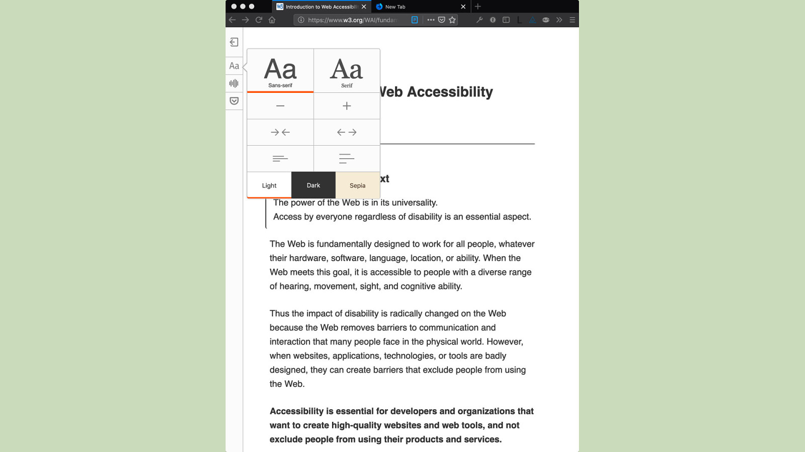
It also has theme options.
Slide 62

More Website Settings
Slide 63
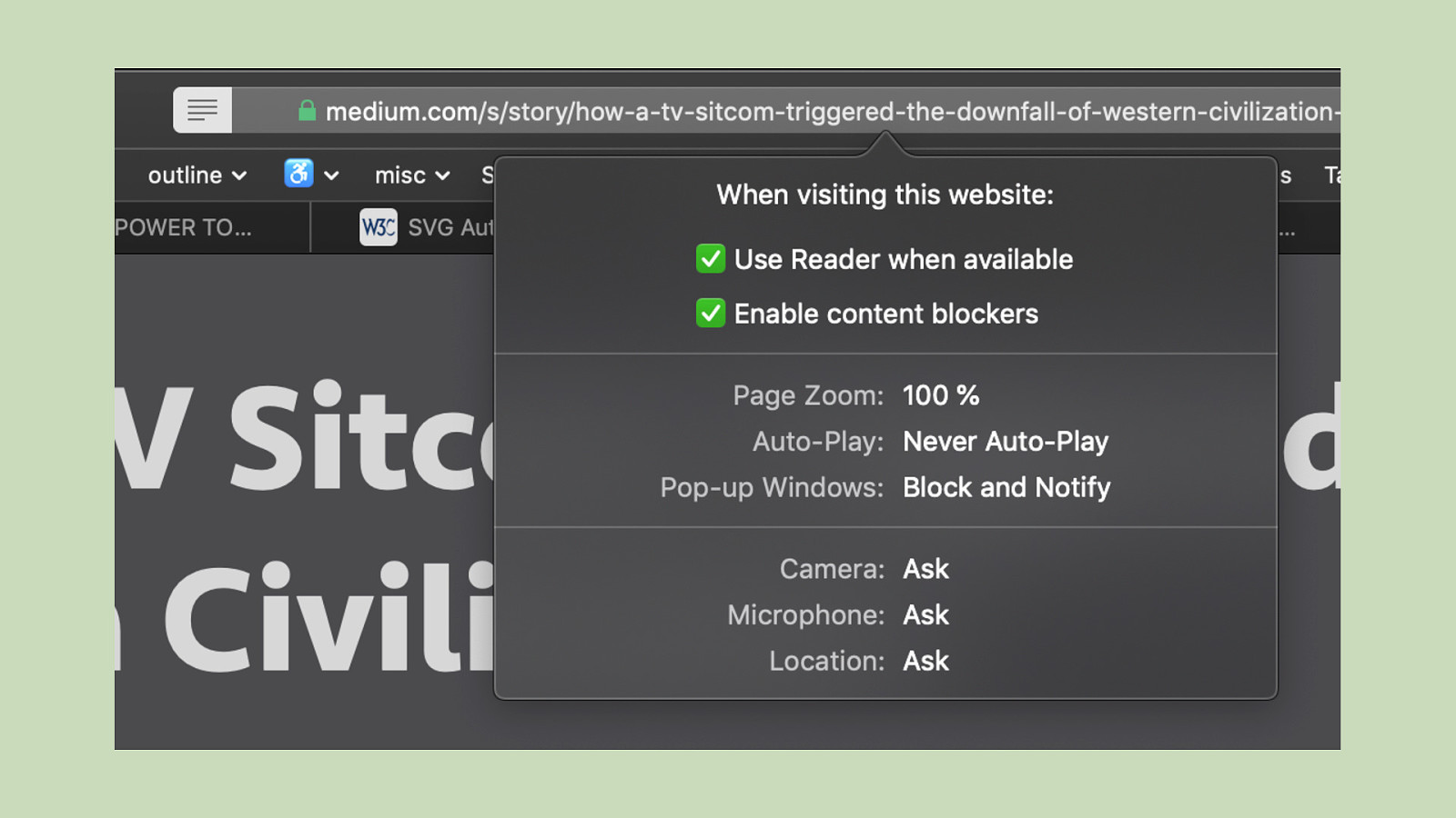
You can nowadays set different default settings for a website. Here I set to use reader mode when it is available, enable content blockers and never auto-play video on medium.com.
Slide 64
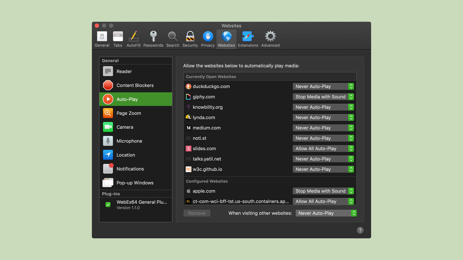
It’s also possible to get an overview, and change, the settings on a site basis.
Slide 65
Leveraging Operating System Preferences
Slide 66
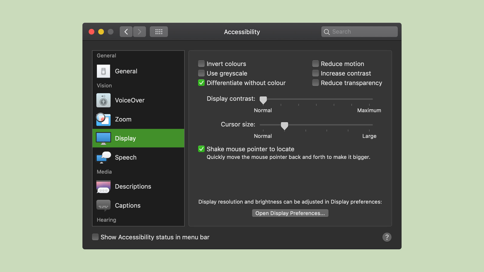
The Operating System, here macOS, has a diverse set of settings, including “invert colors”, “reduce motion”, “use greyscale”, “increase contrast” and “reduce transparency”. We can use those settings on the web:
Slide 67
prefers-reduced-motion Media Query
Slide 68
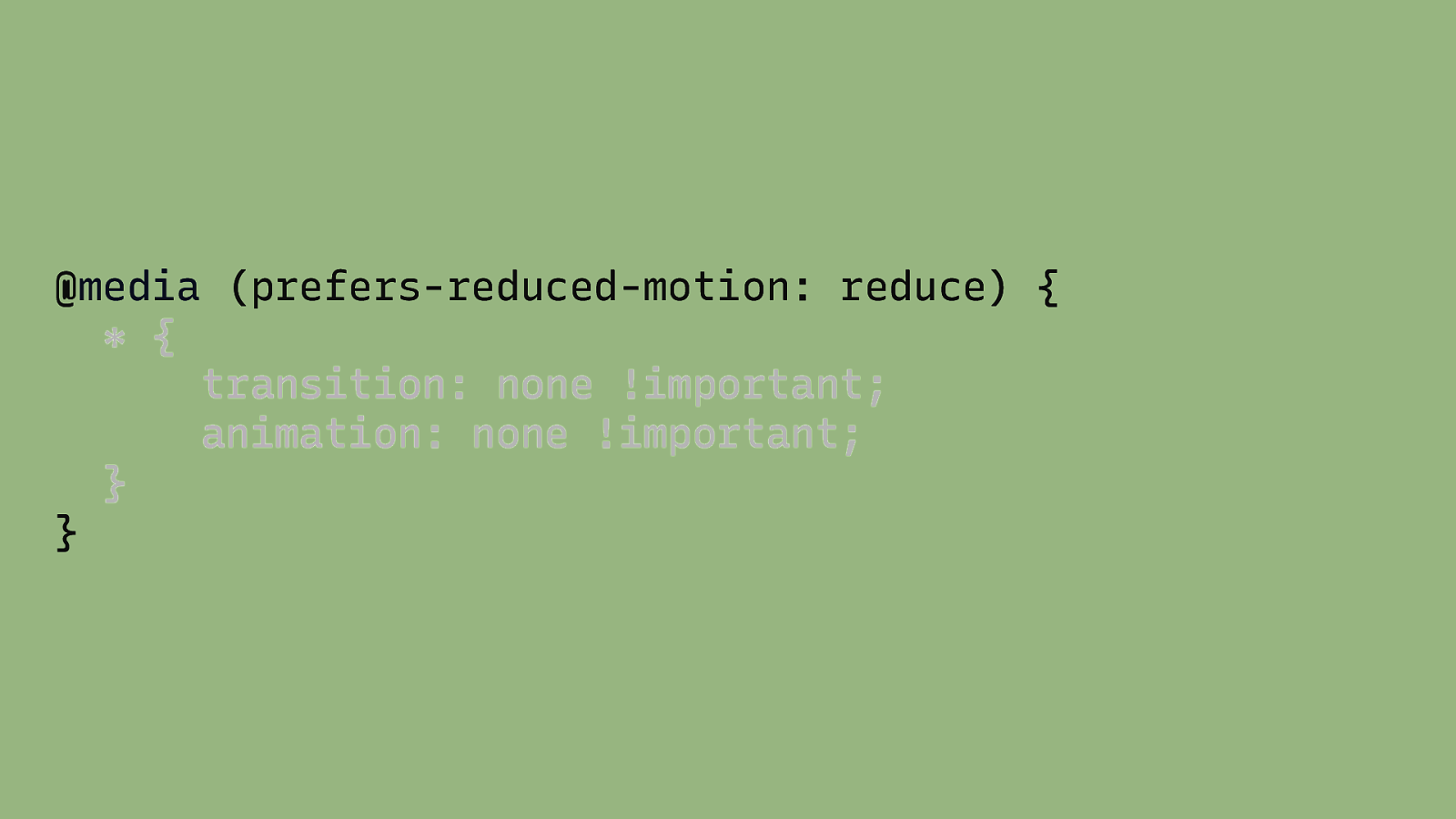
@media (prefers-reduced-motion: reduce) { * { transition: none !important; animation: none !important; } }
Slide 69
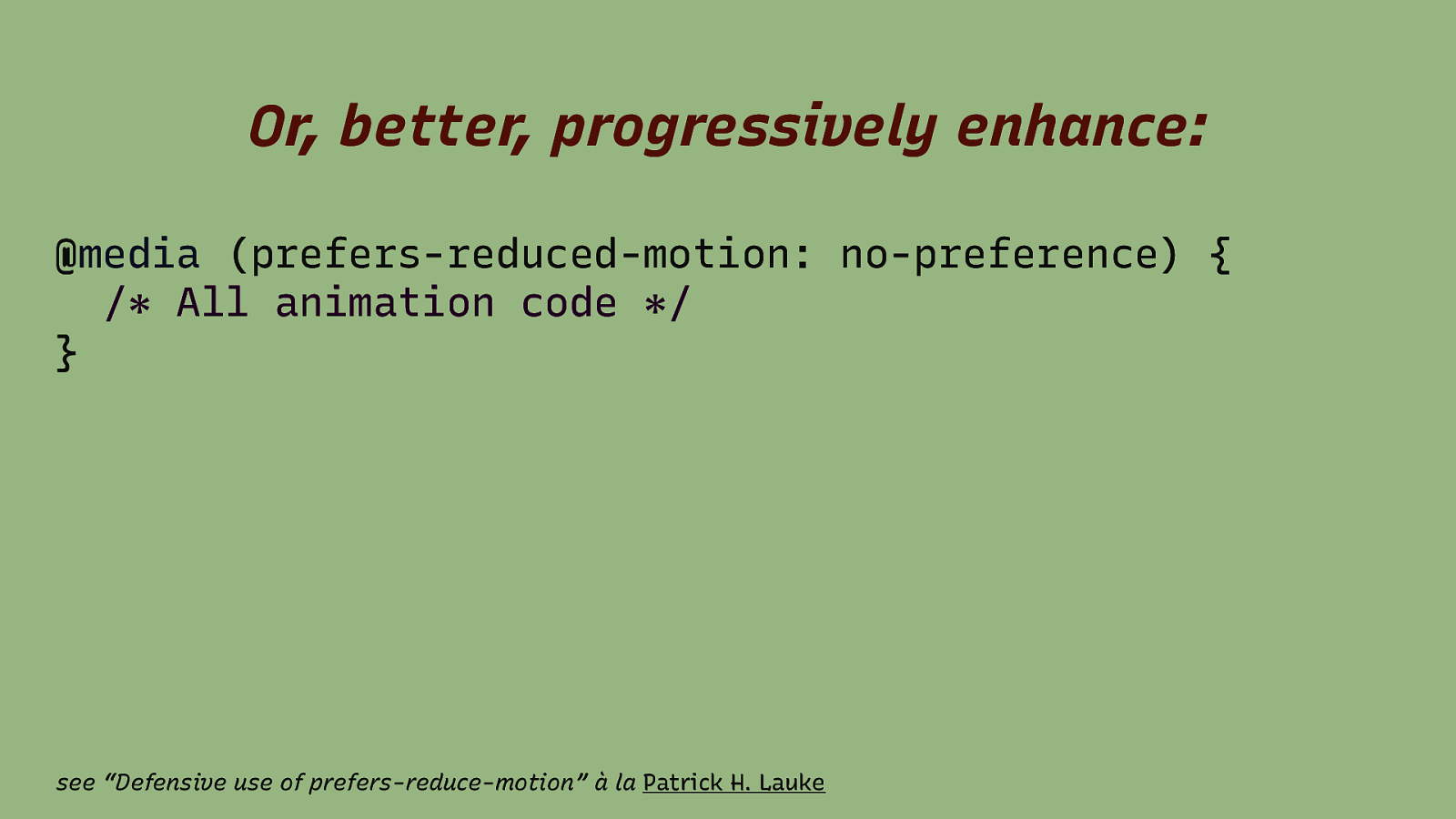
Or, better, progressively enhance: @media (prefers-reduced-motion: no-preference) { /* All animation code */ } see “Defensive use of prefers-reduce-motion” à la Patrick H. Lauke
Slide 70
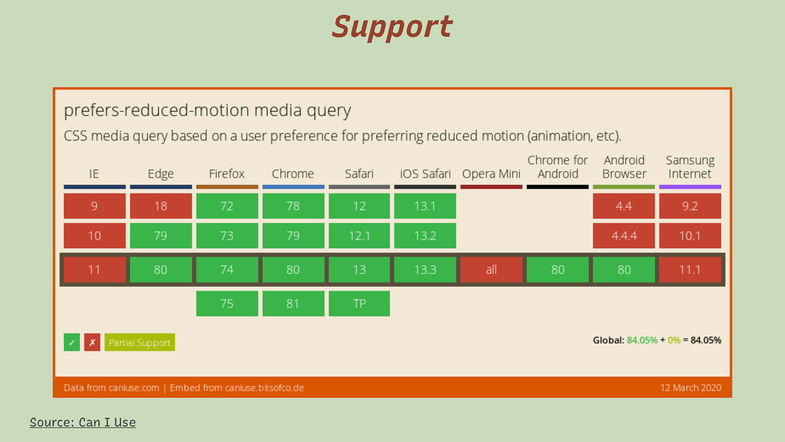
Support Source: Can I Use Support across browsers is very good.
Slide 71
On Windows …it’s complicated
Slide 72
Short note on prefers-reduced-motion and puzzled (Windows) users Patrick H. Lauke @ TPG Blog
Slide 73
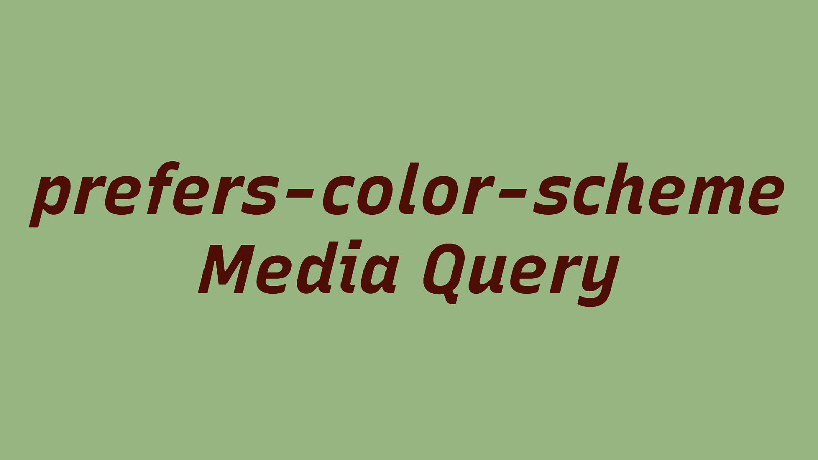
prefers-color-scheme Media Query
Slide 74
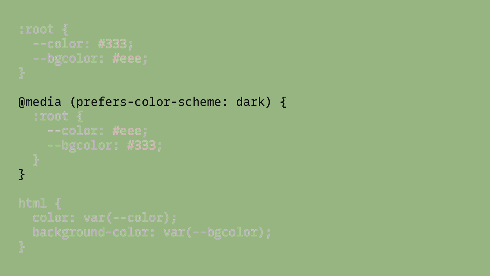
:root { —color: #333; —bgcolor: #eee; } @media (prefers-color-scheme: dark) { :root { —color: #eee; —bgcolor: #333; } } html { color: var(—color); background-color: var(—bgcolor); }
Slide 75

DEMO
Slide 76
We also get a lot more tools to use! 3 3 Designers & Developers
Slide 77

Media Queries Level 5(?)
Slide 78
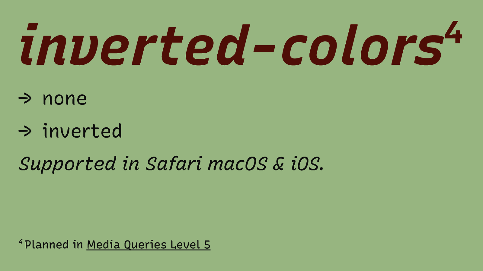
inverted-colors 4 → none → inverted Supported in Safari macOS & iOS. 4 Planned in Media Queries Level 5
Slide 79
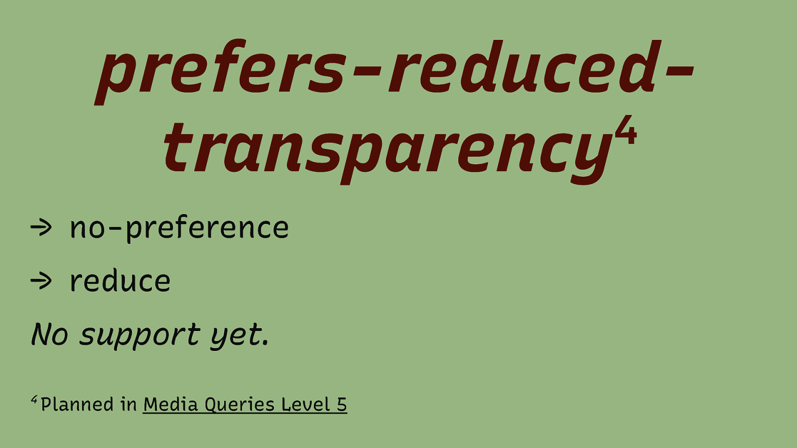
prefers-reduced4 transparency → no-preference → reduce No support yet. 4 Planned in Media Queries Level 5
Slide 80
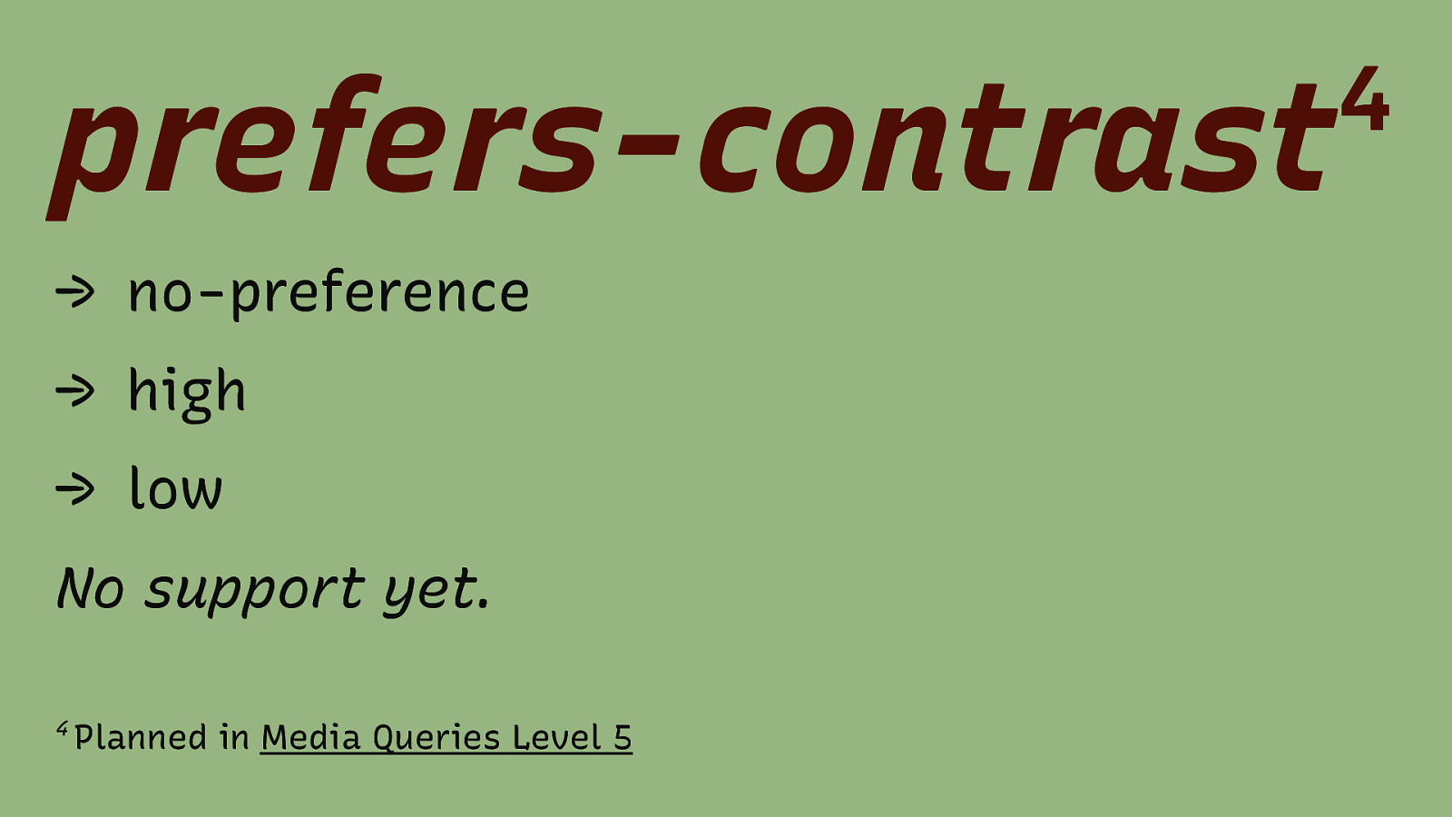
prefers-contrast 4 → no-preference → high → low No support yet. 4 Planned in Media Queries Level 5
Slide 81
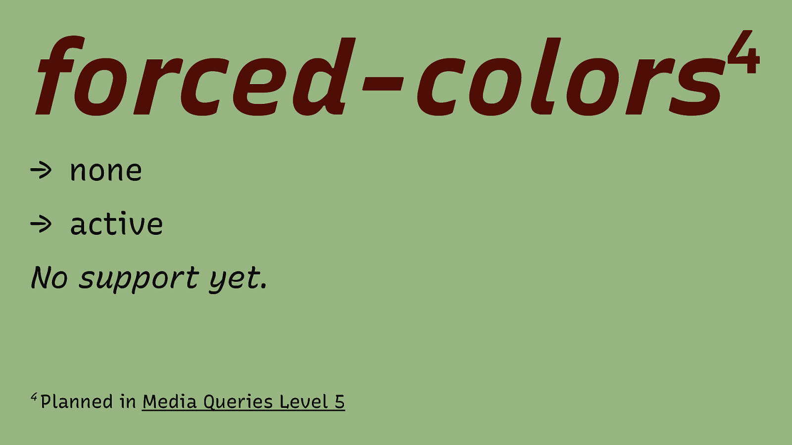
forced-colors → none → active No support yet. 4 Planned in Media Queries Level 5 4
Slide 82
Environment MQs 4 4 Planned in Media Queries Level 5
Slide 83
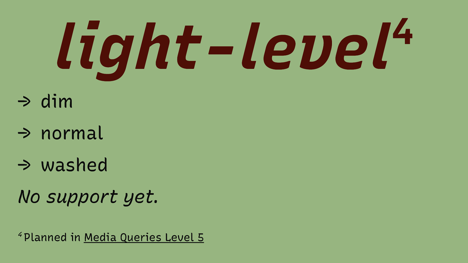
light-level → dim → normal → washed No support yet. 4 Planned in Media Queries Level 5 4
Slide 84
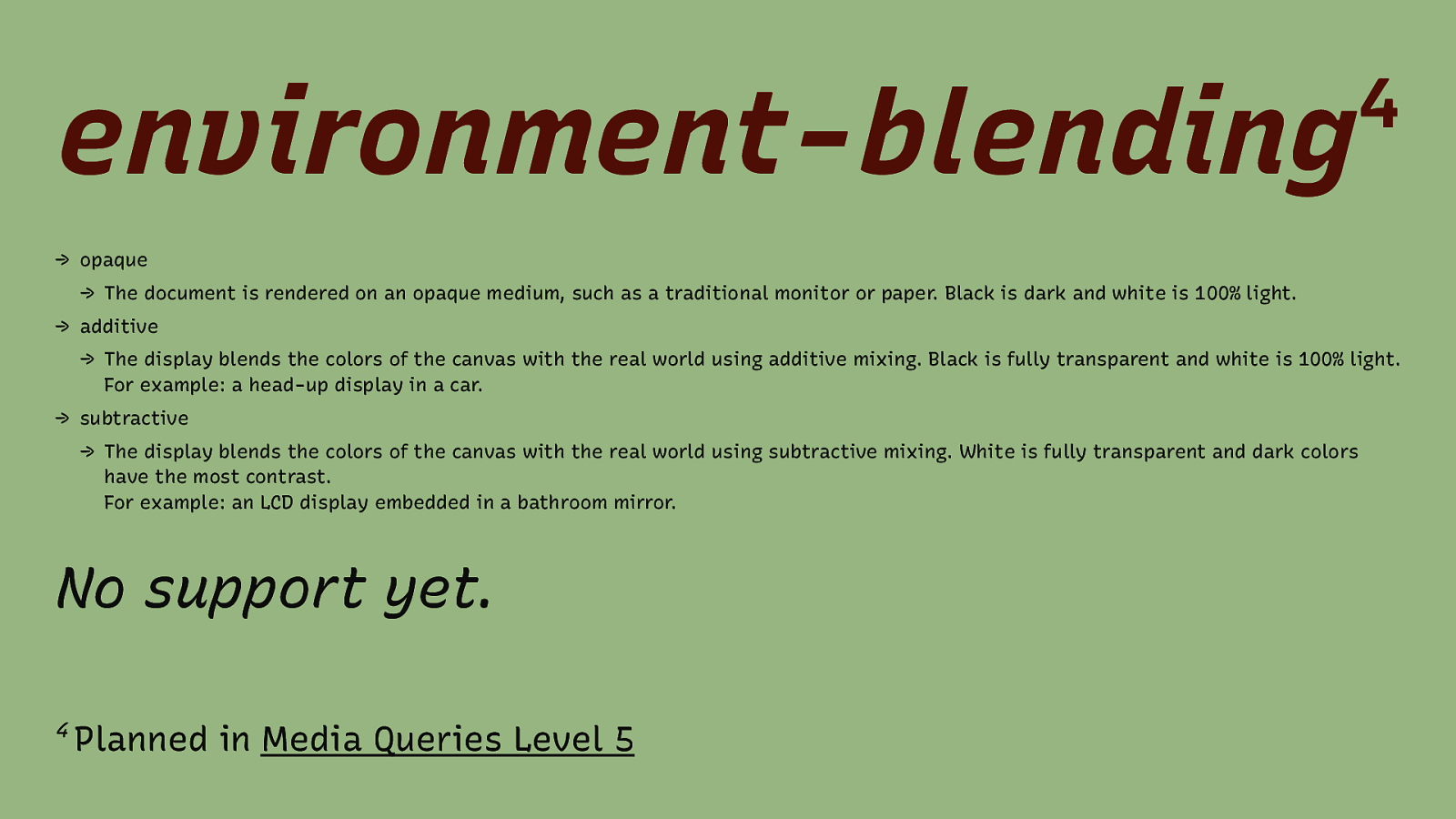
environment-blending 4 → opaque → The document is rendered on an opaque medium, such as a traditional monitor or paper. Black is dark and white is 100% light. → additive → The display blends the colors of the canvas with the real world using additive mixing. Black is fully transparent and white is 100% light. For example: a head-up display in a car. → subtractive → The display blends the colors of the canvas with the real world using subtractive mixing. White is fully transparent and dark colors have the most contrast. For example: an LCD display embedded in a bathroom mirror. No support yet. 4 Planned in Media Queries Level 5
Slide 85
Conclusion → Do not make assumptions about users and the tools they use → Prepare your content and design for different circumstances → Embrace the uncertainty
Slide 86

Thank You! Eric Eggert Web: yatil.net E-Mail: mail@yatil.net Social: @yatil Never be cruel, never be cowardly. And never ever eat pears! Remember – hate is always foolish… and love, is always wise. Always try, to be nice and never fail to be kind. […] Laugh hard. Run fast. Be kind. — 12th Doctor